How Czc A/B Tested Trust Factor To Increase Its Revenue
About CZC
Czc.cz is a leading online retailer dealing in computers, mobile phones, gaming devices, and other electronics in the Czech Republic. CZC is a VWO client and uses the VWO platform and tools for ongoing testing of improvements to its website.
Goals
CZC decided to undertake a split URL testing campaign to encourage first-time visitors to buy from its website and to boost their revenue.
Tests run
Buyers in the Czech Republic are especially price-sensitive. Tomas from CZC felt that revenue could be boosted if CZC could credibly convey that its prices were indeed competitive. To encourage first-time visitors to buy from its website, CZC decided to add ratings from Heureka, one of the Czech Republic’s most popular price comparison sites.
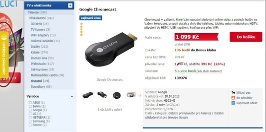
This is what control looked like:
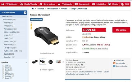
The Heureka badge test was run on all product pages. The Heureka widget runs a script which shows real-time customer reviews, ratings, and statistics to visitors. CZC’s initial hesitation to share their customer details with a third party (Heureka) prompted them to test the Heureka badge for only 50% of the traffic to its site.
When thinking about testing the Heureka Badge, Tomas also wondered if the placement of the Heureka Badge would make a difference to engagement and conversions. He felt that optimal placement of the badge would give CZC more strategic advantage.
Tomas and his team came up with four variations for a split URL test. More than 90,000 visitors became a part of the test. The primary goal tracked was revenue.
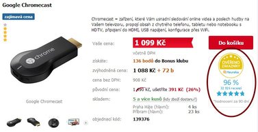
Variation 1: Heureka badge along with ratings just below the “add to cart” button
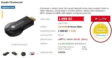
Variation 2: Only the badge just below the “add to cart” button
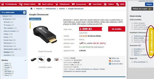
Variation 3: Slide-in ratings on the right side
Variation 4: Slide-in ratings on the left side
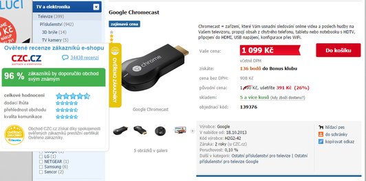
A visitor hovering over the ratings sidebar would see details of ratings and reviews:
Conclusion: 7.5% increase in revenue
The results were statistically significant. Variation 4, with slide-in ratings on the left, emerged as the winner. It recorded a 7.5% increase in revenue with a 95% confidence level.
Analyzing each of the versions to understand why they did not win is instructive. The insights are helpful in envisioning future optimization possibilities and designing tests in the future.
Variation 3
Because of the F-shaped reading pattern of the web, it is quite likely that the slide-in ratings on the right side were easily missed in visitors’ eye path. Test data supported this, as there was no improvement in conversion rate.
Variation 2
This version had only the Heureka badge and no reviews or ratings. Visitors clicking on the badge would be taken to the Heureka website where the odds of them being distracted by competitors’ reviews and other purchase options goes up. This may have contributed either to lower motivation level in prospects or simply resulted in a bounce.
Variation 1
Many people instinctively felt that this version would be the winner. But it wasn’t. Here are two reasons that might explain why this variant did not win.
- Czc.cz recorded the number of times people clicked on the Heureka badge for each variation. A large number of people clicked on the circular badge in both versions 1 and 2, while no one clicked on it in versions 3 and 4, where the badge was displayed within the slide-in ratings. Thus, the badge might have distracted visitors, causing them to click through to the Heureka site (and hence be a bounce for Czc.cz).
- While making a purchase, people tend to look at many options within their budget. This means they look at a lot of product pages before the actual purchase. So the ratings and reviews on every product page right next to the “add to cart” button can increase the likelihood of the badge being clicked to verify the claims on it.
It is just as important to understand why variation 4 won.
Variation 4 emerged as a winner as the prominent review bar in yellow on the left-hand side did only the job it was required to- let people know this website can be trusted. The placement of the widget on the left didn’t impede the typical F-shaped reading pattern of the page; yet, it was quite noticeable. Hovering over the review bar displayed several ratings and numbers that gave a big boost to the site’s credibility; it also prevented visitors’ clickthrough to the Heureka site.

Location
Prague, The Czech Republic
Industry
Retail
Impact
7.5% increase in Revenue


