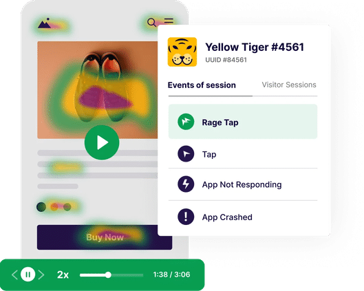
A Product Manager’s Guide to Improve App UX
53% of users uninstall an app within a month of downloading it.
This is quite concerning, given the time, effort, and budget required to acquire new users. While there are quite a few reasons behind why a user uninstalls an app, bad UX sits right at the top of the list.
Most apps today struggle with retention issues mainly because users cannot accomplish their goals. From high loading times and constant crashes to unresponsive elements and confusing layouts, users continue to face UX problems while using apps.
This is extremely challenging for product managers as these UX issues impact crucial product KPIs like user engagement, retention, conversions, referrals, and so on.
But, a major cause for concern is that most of the time businesses are unaware of these problems. This is why you need a strategy that not only helps you discover crucial UX issues but also enables you to optimize mobile app UX.
In this blog, you’ll learn exactly how to do that with a specially curated 5-step framework that covers the entire cycle of mobile app UX optimization.

Step 1: Identify where users are facing problems in your app
Before you go about optimizing your app and fixing UX issues, you first need to find out where exactly your users are facing these problems.
Are they leaving your app during the signup flow, or is an unknown crash occurring on another screen?
While there are quite a few ways to identify problem areas, let’s look at some strategies commonly used.
App store reviews
The most obvious way to get feedback about your app is through reviews left by users on platforms like Apple’s App Store or Google Play Store.
By tracking these reviews consistently, you can identify common issues in your app or even discover problem areas that were previously unknown.
However, since writing a review requires additional effort, a lot of users tend to skip it entirely. Also, most of these reviews are shared by users who either had an amazing or terrible experience.
This could prevent you from gaining any honest, nuanced feedback from these reviews.
Support emails
Another commonly used method brands rely on to discover issues within their apps is support emails.
Users generally send these messages to your customer support team when they require some kind of help or encounter a problem in the app.
However, users only opt for this option when they encounter a problem. Also, not every user would take the time or effort to raise an issue or write an email about it. This again limits your visibility of user experience.
In-app surveys
Using surveys is a great way to establish two-way communication with your customers. It also allows you to collect crucial feedback that can be leveraged to optimize user experience.
For example, when users complete a purchase, you can prompt a survey to know more about their experience or you can use it to get feedback about new updates or features.
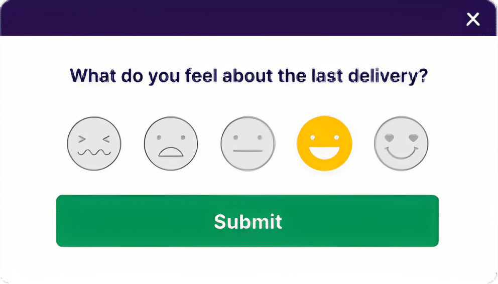
However, a common issue with this method is the number of people who fill up a survey. Since surveys tend to interrupt the user journey, people might either not take them or rush through their responses. In this case, the data might not capture the pulse of visitors.
Also, there could be a gap in the data collected about user behavior as surveys fail to capture the voice of the silent audience.
Quantitative analysis
In addition to previous methods, you can use analytics tools like Google Analytics, CleverTap, Moengage, or Mixpanel for deeper insights into user interactions with your app.
These tools offer data on user demographics, actions, and engagement. They provide user data like time spent on a screen, number of user sign-ups, location of users, etc.
However, these tools primarily answer the ‘where’ of user behavior. For example, Google Analytics tracks user drop-offs from the sign-up screen of your app. But this information still does not tell you why this happened.
This limitation leaves you making assumptions about user actions, rather than having concrete reasons for decision-making.
Qualitative analysis
Why do you need mobile app session recordings?
The best way to overcome the app optimization challenge is to opt for tools that enable you to conduct qualitative analysis. Through this analysis, you notice certain patterns or nuances in user behavior that are not clearly evident with quantitative metrics like session duration or bounce rate.
For example, let’s say you manage an e-commerce app. A user is exploring your collection of t-shirts and tries to choose a different size. However, the button to change the size is non-responsive. After a couple of attempts, the user quits the app.
In this scenario, a tool like Google Analytics or CleverTap will show an increase in the number of people who left this screen and quit the app. However, this information does not reveal the reason behind this action.
On the other hand, using mobile app session recordings, you will be able to watch this user event in real-time.
This means you no longer have to wait for users to report an issue within your app. You can review these recordings to discover these issues and fix them proactively before they cause major damage.
Tools like VWO Insights for Mobile Apps help you do this by offering deeper insights into customer behavior with powerful features like mobile session recordings and mobile heatmaps.
Secondly, when you release a new app version, you may want to know how new users interact with it compared to returning users. Or, maybe you want to study specific scenarios where the app crashed and failed to respond.
This type of analysis provides some much-needed context to user behavior and allows you to make data-driven decisions to optimize the app. Depending on your tool, segmentation of recordings can be done in different ways.
For example, with VWO Insights for Mobile Apps, you can filter all recordings based on various factors like device type, location, android version, iOS version, screen viewed, app crashed, app not responding, etc.
Why do you need mobile app heatmaps?
A heatmap is a visual representation of data that shows how users interact with your app.
Color overlay is used to visualize where exactly users are tapping on a particular screen within your app. This is a crucial feature as it gives you a clear idea of how users are interacting with important sections of your app.
Let’s say you added a new section called ‘What’s Trending’ on the home screen of your news app. Since it’s an important section, you can use heatmaps to study the taps it receives and guide improvements based on this data.
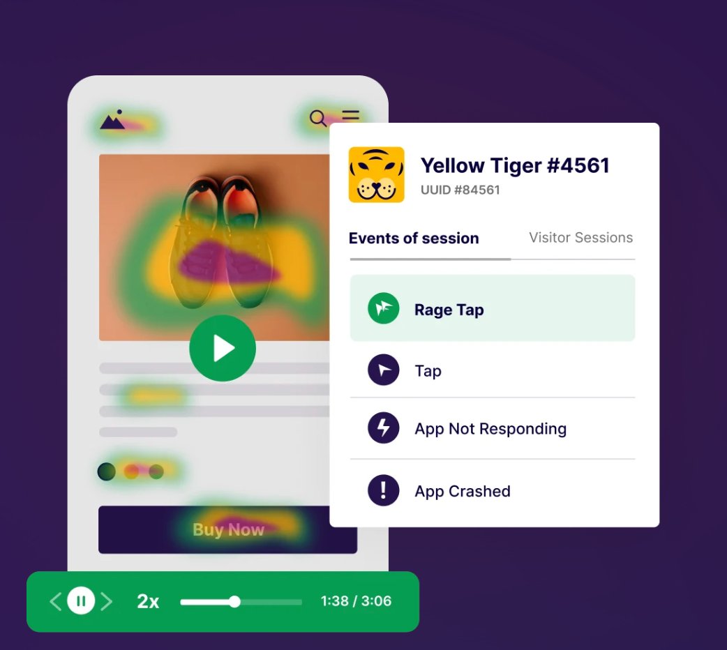
As another example, say your gaming app has a section where users can buy new gear and accessories. When you check the heatmap of this section, you notice that a very small number of users are clicking on the ‘View More’ button even though the product screen is receiving a lot of clicks.
Based on these insights, you can either change the placement of the ‘View More’ button or you can add a new ‘Infinite scroll’ feature that allows users to see more products without clicking anywhere.
How can your business benefit from qualitative analysis?
No matter what industry you belong to, qualitative analysis will give you deeper insights into user behavior and help you understand the factors that influence their actions.
Let’s look closely at how businesses across industries can benefit from this qualitative analysis.
1. Shopping apps
Qualitative analysis is extremely crucial for e-commerce apps. It can help you to understand why users abandon the purchase journey.
E-commerce apps often run flash sales or special offers to attract more customers. Since the traffic is relatively higher during this period, you may want to study user behavior and identify key areas that should be improved.
For example, your checkout screen has a section called ‘You Might Also Like’ just before the ‘Buy Now’ CTA button. The section recommends relevant products to the users based on what they are purchasing, making it an important part of your cross-sell or up-sell campaign.
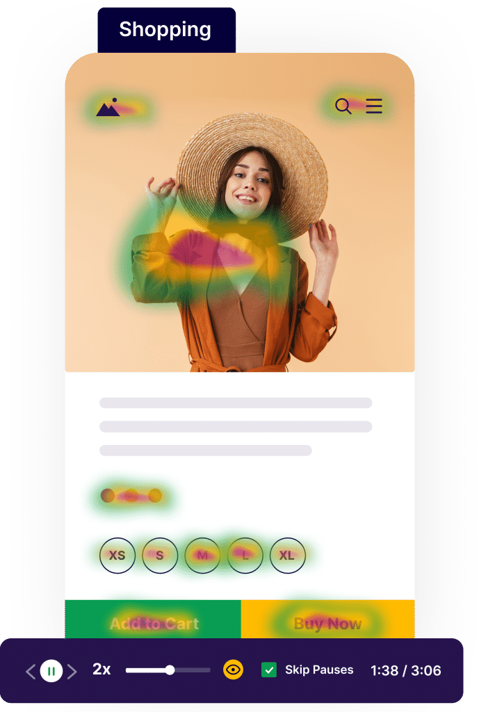
However, during one of the flash sales, you observe the heatmap of this screen and notice that the ‘You Might Also Like’ section is receiving much fewer clicks. To understand this issue better, you watch session recordings of users who reach the checkout screen.
Surprisingly, you see that the product images in this section are taking almost 8-10 seconds to load, which is why users are skipping it altogether.
Based on these observations, you can optimize the product images in this section and ensure that they load along with other elements on the screen.
This will result in faster loading times and will also increase cross-sell purchases from the checkout screen.
2. Finance apps
Industries from the financial sector can also use session recordings to analyze critical screens such as a loan application form or new account opening form.
For example, consider you have an ’Insurance’ section in your app where users can buy a health insurance plan.
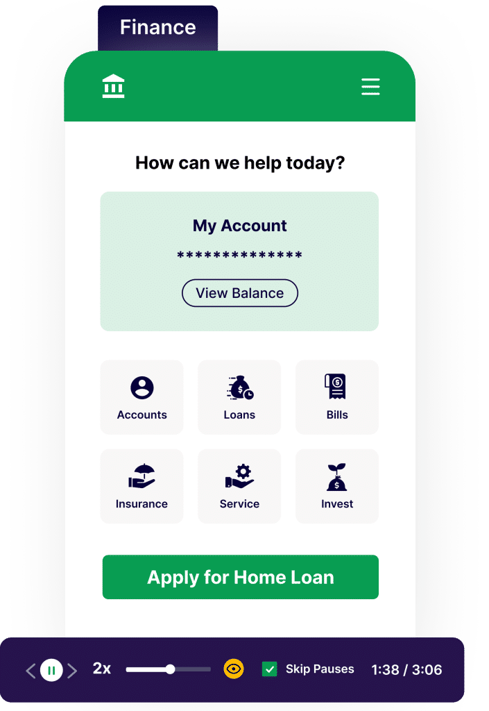
Here, when users want to compare different plans, they can select their desired options and click on ‘Compare’, which takes them to a new screen where an in-depth comparison table is displayed.
To optimize this comparison section, you want to study user behavior and identify possible friction points. Let’s say, you use the session recordings feature to know how users interact with the screen.
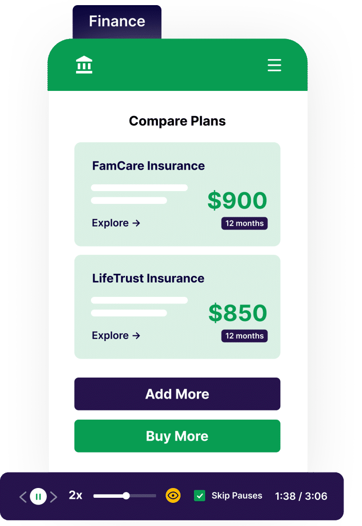
Here, you see that users have no issues while comparing the two insurance plans. However, since there is no option to add another plan, users have to go back to the ‘Insurance’ screen. This action resets their choices and they are again asked to select their previous options along with the new plan.
This issue complicates the entire comparison process and causes users to abandon the screen altogether.
Now that you’ve identified a critical pain point, you can improve the flow of this process by adding a new button that allows users to choose a new plan directly from the comparison screen.
Also, you can use these insights to further optimize the ‘Insurance ’ section and guide improvements to the design or layout of the screen.
3. Food & drink apps
Apps that deliver food and groceries deal with a large number of users on a daily basis, which is why it is critical to observe behavioral patterns.
For example, let’s you want to simplify the checkout process in your app. To know what changes are required and get a better understanding of user behavior, you analyze the heatmap of the checkout screen.
Here, you notice that even though users are interacting with important elements like adding an address or choosing the payment method, the ‘Apply Promo Code’ section is not receiving a lot of clicks.
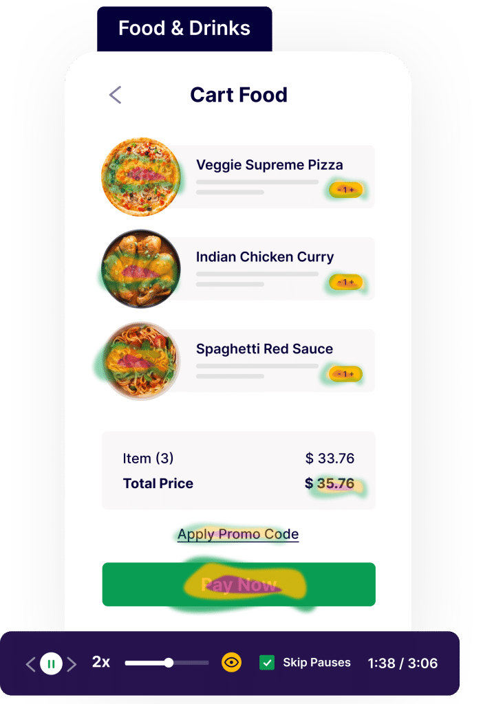
To further understand this behavior, you looked at session recordings of this screen and saw that users are scrolling down without noticing the ‘Apply Promo Code’ section, hence you got a hypothesis that it might not be really visible.
Based on these key insights, you can make certain changes to ensure that the section receives good visibility so that users can easily benefit from it.
4. Travel & local apps
Another industry that can greatly benefit from qualitative analysis is travel or hotel booking. Let’s say, your app allows users to book tickets for inter-city buses.
You notice that users are spending a lot of time on the ‘Bus Listings’ screen, but very few are proceeding to the ‘Booking Confirmation’ screen. To understand why this is happening, you watch recordings and analyze user behavior.
Here, you observe that users are scrolling through a long list of buses and they are even struggling to find the right one. While analyzing the heatmap for this section, you also notice that the ‘Sort & Filter’ option is receiving very few clicks.
This suggests that users are not using this feature effectively to narrow down their choices.
To overcome this issue, you can improve the visibility of the ‘Sort & Filter’ feature or you can also recommend commonly used filters at the top of search results.
5. Gaming apps
When dealing with gaming apps, session recordings can reveal glitches or bugs during gameplay and can also show how new versions or updates are affecting user engagement.
For example, you want to know how users play through a challenging level in the game and whether they encounter any difficulties. To do so, you analyze the session recordings and notice that a lot of users are quitting the app after repeatedly failing at a series of tricky jumps.
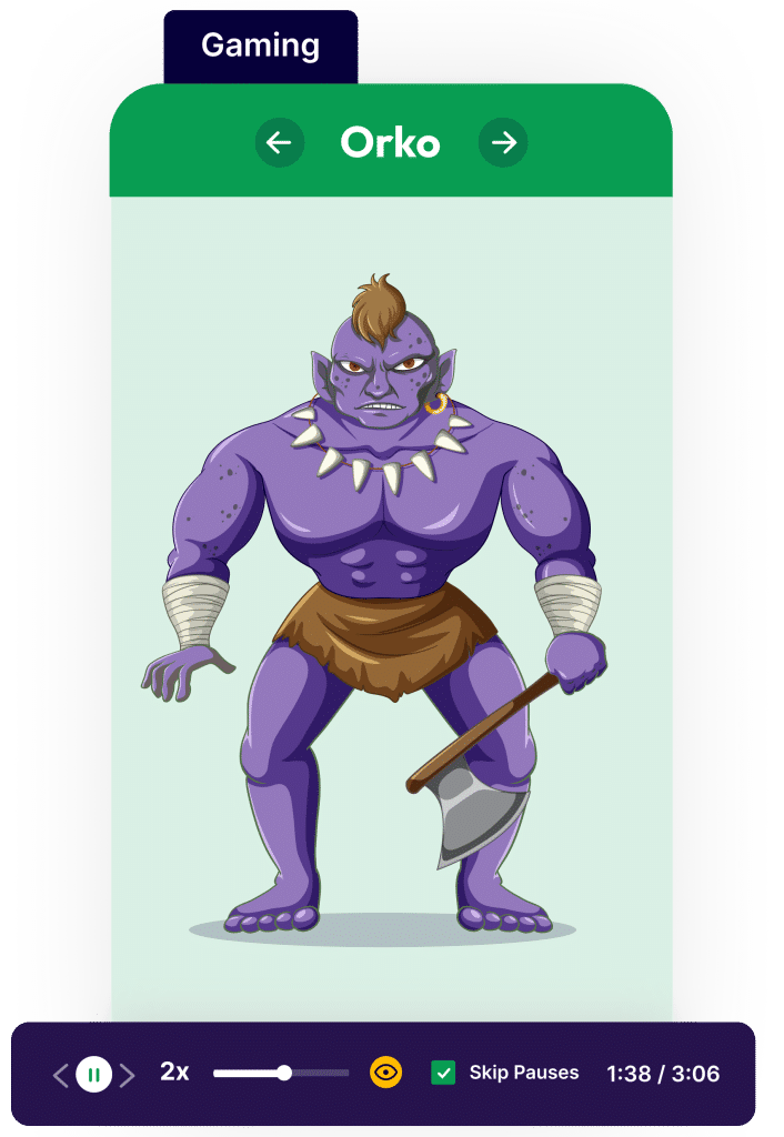
You observe that users are struggling with the timing of these jumps. A possible reason might be the lack of pop-up tutorials at this particular level, which means users are unaware of the advanced controls required to clear the jump.
To solve this problem, you can introduce a couple of tutorials or demos just before users start this level. By doing so, you can help them understand the controls and also avoid interrupting their experience.
Step 2: Decide which issues should be tackled first
Identifying user issues in your app is crucial, but what you do next matters most.
For example, let’s say you have a travel booking app where users can search and book flights, hotels, trains, etc. Since a major source of your revenue comes from users who book international flights, you want to optimize their experience.
To achieve this goal, you check the recordings of users who dropped off while booking an international flight. Here, you notice that when users try to add coupon codes on the final checkout screen, the app stops responding and crashes.
On the other hand, a few users have also reported issues with the filter option on the screen that displays all available international flights.
While both these issues are affecting user experience, the one on the checkout screen should be high priority as it directly results in abandoned bookings and loss of revenue.
An optimization framework thrives when you prioritize critical app sections, allowing efficient resource allocation and addressing key user experience issues.
Step 3: Share data-backed insights with your stakeholders
To create optimized experiences, avoid relying solely on intuition. Instead, continually track and share data-driven insights with all stakeholders involved in the optimization process.
For example, suppose you are studying the heatmap for an e-commerce home screen and notice a lot of clicks on one of the image banners. But, since the banner is non-interactive, it results in dead clicks and creates frustration among users.
Use a tool like Insights for Mobile Apps to share findings. Backed by data, these observations facilitate discussions with stakeholders to find efficient solutions and enhance user experience.
This approach ensures everyone is informed about user interactions, streamlining decision-making for future changes.
Step 4: Turn insights into hypotheses for your tests
After identifying critical issues, gathering data, and sharing insights, it’s time to optimize your app. However, implementing changes directly from observations might involve risk and create new problems.
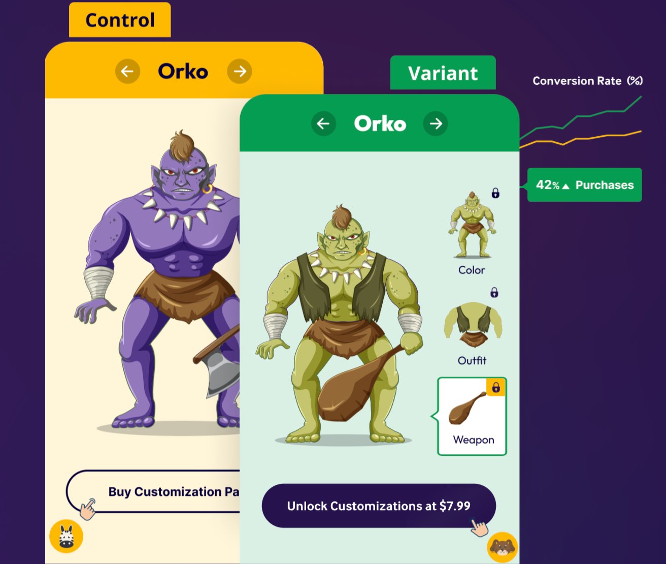
To avoid this, convert your insights into hypotheses and conduct A/B tests. A/B testing involves showing different app screen versions to user groups and analyzing data to determine which performs better in terms of app UX and engagement.
Follow these key A/B testing best practices for optimal results.
1. Define your hypothesis and identify a goal
Before you start with mobile app A/B testing, it is important to have a well-defined hypothesis.
For example, while analyzing the heatmap of your home screen, you notice that the CTA button is not getting enough clicks. You also observe that the button is placed a little lower on the screen which is why users are probably unaware of it.
Based on this, you create a hypothesis that bringing the CTA button to the top of the home screen will result in more clicks. Using this hypothesis, you create a variant of the screen where the button is placed higher on the screen. The metric you are tracking for this A/B test here is now clear: The number of clicks on the CTA. Your goal is to increase the same.
2. Test small before you go big
Making any kind of change to your app is bound to impact performance and UX.
However, if you start your optimization journey by testing big changes like a complete app redesign, you face a higher risk of impact on revenue and sales.
To avoid this challenge, you should start testing small, incremental changes and focus on building a culture of experimentation within your organization.
With this approach, you not only prevent any large-scale impact on the app or business, but you also gain the trust of other stakeholders by sharing consistent results and insights.
So, when you do come around to run complex tests, it would be easier to get approval and support from the rest of the organization.
3. Choose the right A/B testing tool for your mobile app
Once you are prepared to begin your optimization journey, you will need an A/B testing tool to get started.
While there are a lot of mobile app A/B testing tools available today, you should choose one that matches your requirements and business goals.
You must also ensure that the A/B testing tool has minimal impact on your app’s performance.
VWO empowers you to launch your experiments effortlessly and allows you to test a wide range of features such as in-app messaging, app layout, UI copy, and much more.
Step 5: Monitor behavior after the UX is modified
Once you start running experiments and implement certain changes to the app, it will gradually have some kind of impact on the overall UX and user engagement.
This is where you double down on your efforts and closely analyze how users are interacting with all the changes and tweaks.
Again, you can use the mobile heatmaps or session recordings feature with Insights for Mobile Apps to study user behavior after the changes have been implemented.
Track the impact of your optimization efforts and look for ideas or opportunities to further improve app UX.
By combining your testing efforts with advanced behavior analysis, you create an optimization cycle that will not only improve in-app user engagement but will also drive business growth in the long run.
Register now for a product tour of VWO Insights for Mobile Apps and enjoy free 90-day access to discover real-time insights and drive app conversions.


