Form Analytics Guide
What is website form analytics?
Form analytics is a quintessential qualitative tool that measures a visitor’s interaction with a web form such as the interaction time, hesitation time, abandonment rate, etc. It typically comprises many elements that aim to find and highlight a user’s experience or their overall journey through the form filling process. It also analyzes their pain points, provides the right measures to solve the issues, and gathers all the necessary data for internal business use.
Simply put, form analytics provides conversion-centric information that helps track just about every move a visitor makes while filling a form on your website – from where they started, the places they hesitated, the areas where they abandoned the form, the movement of their mouse throughout the process, and so on.
What makes website visitors abandon your forms?
Over 80% of visitors abandon a form even after starting to fill it out. Below we discuss the exact issues visitors face that drive them to abandon a form.
Demanding a lot of information
Online customers are busy and want to get the most done in the shortest time possible. If your website form is lengthy with several fields, your visitors are unlikely to complete filling it out and give you their information. In such cases, you can consider condensing your form, eliminating unnecessary form fields, and highlighting the mandatory fields.
Security concerns
Sometimes users don’t fill in forms because they are unsure if their information will be safe. This mostly happens when users are to share their credit card information or even their home address in a form. Let your website visitors know how you’re handling their data and what you’re doing to keep their data safe. That way, they will feel more confident about sharing their information and filling out forms.
Asking for information that they think you shouldn’t have
Users will frown and abandon a form when they think you’ve asked for a piece of information that was not required to accomplish the task they wanted to by filling out the form. For example, it makes little sense to ask for credit card information when a user is signing up for a free trial. Such instances raise suspicion in the minds of visitors who quit filling out a form thinking it to be a scam.
Distrust in your website or products
Your website should clearly show how your products and services can help solve the challenges faced by your visitors. If you’re not doing that, it can lead to a gap between users’ expectations and what you’re offerings. This also leads to an overall user distrust in your brand and offerings. Hence, you must explain what your business offers and what benefits your visitors can draw from it on your website.
Inevitable abandonments
Some cases of form abandonments are simply inevitable and unavoidable, no matter how well your website forms are. There will always be visitors who have a change of mind and leave your form without filling it out.
The ABC of web forms
Contrary to what’s conventionally known about web forms and despite heavy advances in the field of human-computer interaction, web forms remain as one of the most effective and predominant ways for users to interact with a website. They’re not just any other tool to gather information from perspectives, but one of the most effective mediums for businesses to indirectly establish a cordial relation with them. From as simple as a subscription form to a complex survey, forms have been helping both users and organizations behind the websites to align their goals with each other and fulfill their respective objectives.
But, for web forms to be successful – help businesses achieve their goals – they must be designed keeping in mind some basic usability factors. For if they do not make sense to your visitors or are highly complicated in nature, the chances are that visitors will not fill out the form or even abandon the site.
So, let’s get started and learn how to create effective, efficient, and satisfactory web forms for your website.

A) Define the purpose of your form
The first and foremost step to creating a web form is to comprehensively define its purpose. Your visitors must know exactly what the form is about and why they should fill it. Here are a couple of ways to do so.
1. Understand different types of forms
Giving the right title to your web form is crucial, for it’s one of the primary ways to make your visitors understand why they’re filling a particular form. For example, a form titled ‘Contact Us’ clearly states that it’s meant for visitors to leave you an enquiry or feedback. Meanwhile, a form titled ‘Subscribe Now’ is meant to get more people to subscribe to your blogs, newsletters, and more.
2. Provide clear instructions
It’s a good practice to clearly communicate the kind of information you’re seeking from your visitors. For instance, add a sentence or two on top of the form which clearly states the purpose of the form, or specific instructions for a particular field, such as “the password should be at least 8 to 12 characters long,” etc. You can also add a short statement about why you need this information to maintain transparency.
3. Include easy-to-understand form headline
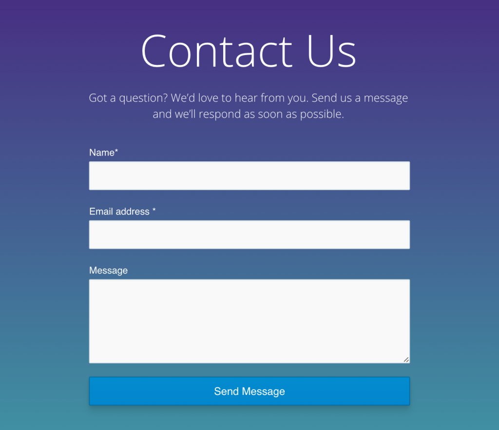
Easy-to-understand and straightforward headlines effectively help visitors to fill in the right information in the right fields. They also help avoid any confusion and ensure that visitors spend the least amount of time on the web form. “Name,” “Email Address,” and “Message” headers shown in the image below are a perfect example of easy-to-understand forms.
4. Appearance matters
Clean and organized forms are always welcoming. They not only provide a clear picture of what needs to be filled in the defined spaces but also promise a good end-to-end experience. At the same time, ensuring that these forms are mobile and website responsive is equally important. If they’re not, they’ll surely ruin a visitor’s experience and cause them to abandon the form and even the website.
5. Focus on usability
The way web forms are created, customized, maintained, and presented to a visitor on a site defines the effectiveness, efficiency, and level of satisfaction they offer. Usability not only promises a good user experience but also helps increase conversions over time.
B) How to choose the right web forms
No matter how beautifully designed or aesthetically strong your website is, if it doesn’t have the right forms embedded on the right pages, you’re bound to lose out on a lot of potential business. At the same time, web forms widely vary in length, appearance, format, and content type. Carefully selecting the correct forms for your landing pages is critical.
Below mentioned are some common web forms along with a few words on where and how to best use them on your website.
1. Contact forms
These are the simplest yet the most important of all web forms. They’re also considered as an extension of your company’s email address. Ideally, contact forms are concise and contain about two to three fields only.
A smartly designed contact form helps cultivate a strong visitor relationship and enhances the overall user experience. Although every business running on the internet is different (with an equally different target audience), the advantages of having a contact form are practically the same. They:
- Promise better engagement with the prospects
- Help gather essential visitor data
- Vet new prospects and boost your email list
- Protect business mailbox from spam emails
- Help decrease the bounce rate and improve the conversion rate
Here are some examples of great contact forms:
Example 1: Marvel is one of the leading digital platforms that allows individuals to build digital products such as wireframes, prototypes, design specs, and more with utmost ease and comfort.
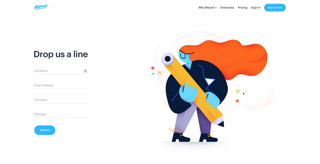
Of the many things that fascinate us about this quirky website, its contact form tops the list. Simple, sober, and chic, the form comprises not more than four generic fields. This allows prospects to communicate with the business behind the website easily and quickly. The addition of beautiful illustrations on the right side of the form helps catch a user’s attention, subconsciously urging them to take the desired action.
Example 2: Stripe is one of the best and most trusted technology companies. It helps online businesses to easily accept payments and manage their day-to-day activities.
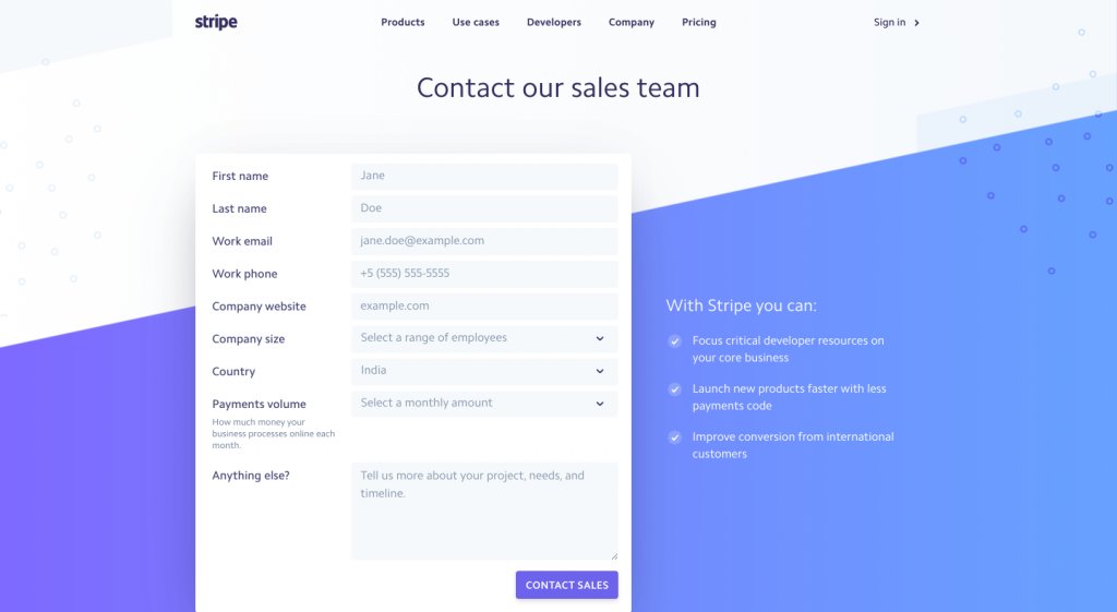
If you take a look at Stripe’s contact sales forms, you’ll note that besides having a clean design and direct messaging, the form has a warm and friendly tone. What really captures our attention is that despite having more fields than a usual contact form, it still doesn’t feel like a lengthy form to fill. Moreover, the way Stripe has added examples around what kind of content a visitor should enter in each of the form fields makes it more compelling. It is easy to understand and promises a high form fill rate.

2. Lead Generation forms
No matter how good your website is, if it doesn’t have the right elements to push your visitors down the conversion funnel, it’s not doing a great job. Of course, compelling content and strong CTAs top the list, but high converting lead generation forms are equally crucial for a website.
Here are some examples of good lead generation forms:
Example 1: Slack is a cloud-based online collaboration tool that enables teams to stay connected and work in a synchronized manner. Unlike its counterparts, Slack likes to keep things simple, including its lead generation form. This is pretty much evident from the image attached below.
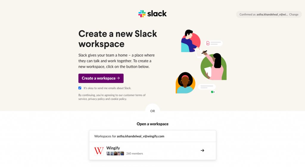
Unlike a typical lead generation form with multiple fields, Slack starts by simply asking for your email address. It then directs you to another landing page to create a new workplace or join an existing one. You can easily choose according to your preference and get started in a matter of minutes.
From a UI perspective, the addition of quirky animation and choice of colors makes Slack all the more appealing for a user to explore.
Example 2: eToro is a well-known social trading and investing platform that allows individuals to invest in stocks, currencies, indices, commodities, etc., and earn huge profits.
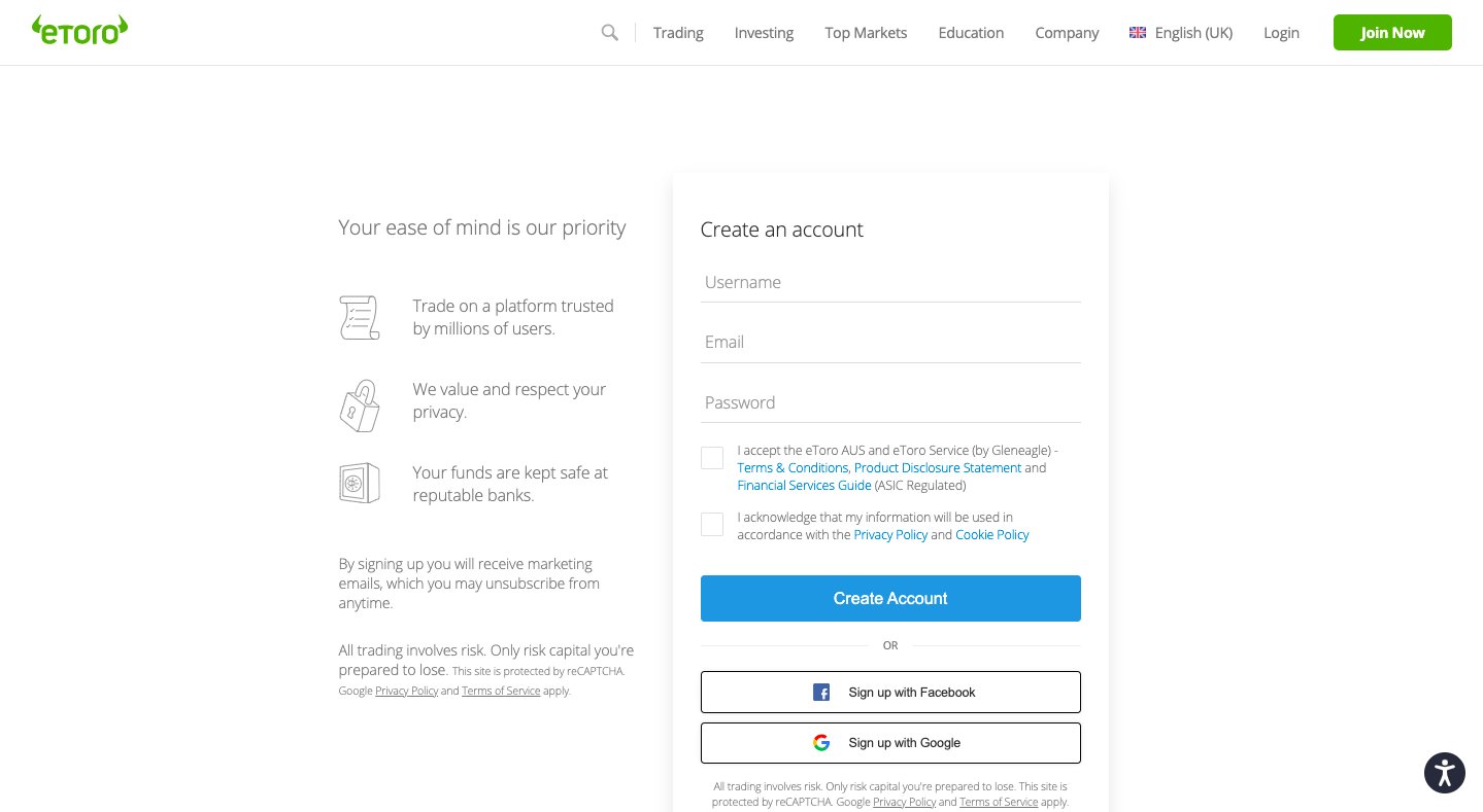
One of the best ways to get people to sign-up for your services is by providing them with the ease to do so. And, eToro understands this quite well.
The online trading and investment platform gives you the leverage to sign up using a variety of options. You can either sign up using social platforms such as Facebook and Google as they fast track the entire account creation process or simply create a new account by filling in your choice of username, email address, and password. Adding easy sign-up options significantly increases the chances of conversions.

3. Checkout forms
Checkout forms today have become a basic necessity, especially for eCommerce businesses. They not only help the companies gather all the necessary customer information to quickly process orders, but also create a streamlined procedure to maintain internal functionality.
Usually, checkout forms are lengthy with a minimum of 8 to 10 fields, and spread across multiple steps and/or pages to smoothen the entire purchasing process. It can be daunting and time consuming to fill such lengthy forms but, the way you design them can pose a huge difference. The simpler the checkout form, the more shall be the conversions.
Here are some examples of good, easy-to-fill checkout forms:
Example 1: BaubleBar is a New York-based jewellery store that’s primarily known for its exotic and trendy everyday jewelry. As you journey through the website, you’ll be charmed by the site’s mesmerizing and appealing UX design. The brand has paid much attention to detailing, ensuring that customers do enter its conversion funnel. It’s checkout page is equally chic and speaks simplicity. You can proceed to place an order and make the payment in just a few steps.
The brand understands that not everyone who comes to their site would like to go through the tedious process of registering as a user first to place an order.
Instead, BaubleBar allows visitors to place an order by checking out as a guest user and furnishing some basic details only. This way, they not only promote a simple, straightforward checkout process but gather essential visitor data as well.
Example 2: Crate&Barrel is another website that offers a good and easy-to-fill checkout form. It’s an international brand that offers an excellent range of contemporary and modern furniture, housewares, and decor. Crate&Barrel is also one of the early adopters of online sales and pays much attention to the ease of placing orders online.
Besides maintaining a clean and intuitive checkout page, Crate&Barrel pays much attention to providing all the necessary order-related details in the first fold of the page itself. They understand that users are bad scrollers and hence, strategically placing essentials in front of the eyes of the users is the best way to ensure conversions.
Further, the brand gives you two options to checkout. You can either click on the “Checkout Now” button and follow some basic steps to place your order, or simply click on “PayPal” to express the process. No matter which option you choose, you’re promised an extremely easy and fast checkout process.
4. Sign-up/Registration forms
From SaaS to eCommerce and media platforms, sign-up forms are everywhere. Also known as registration forms, these practically act as a primary source of data collection and lead generation for most companies operating in the online business arena. The key to creating a high-converting sign-up form is to be minimalist. The simpler the sign-up or registration process, the higher are the chances of your visitors filling them out and becoming a part of your lead database.
Here are some examples of great sign-up/registration forms:
Example 1: As of 2021, Facebook has over 2.7 billion active users and these numbers are increasing even as we speak. But, how did a social media platform gain such heights? The answer is quite simple – easy sign-up. To access Facebook, one needs to sign-up on the platform, only then can they explore the site and make the most of it. Here’s how its sign-up form looks like:
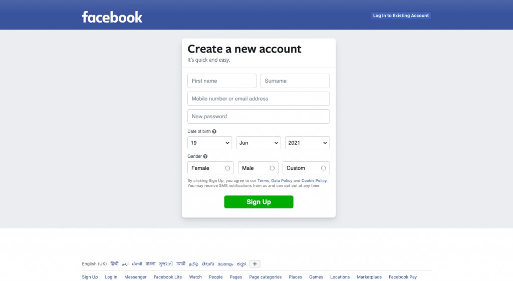
Facebook has a crisp and compact sign-up form that asks for only the most basic information from an individual. As per the research done by Martech, having the least number of fields in your sign-up form can uplift your conversion rate by almost 160%. This is because visitors do not feel fatigued or irritated when they have to fill a short, concise form rather than a long and tedious one.
In addition to this, Facebook’s sign-up form is quite flexible. It gives you the leverage to sign-up either by entering one of your email addresses or a phone number. The copy that complements the form is also well-written, “It’s quick and easy.”
Example 2: MailChimp is another excellent example of a great sign-up/registration form. Besides being an easy-to-fill form with not more than three input fields, the platform also provides necessary instructions to visitors, eliminating the chances of errors.
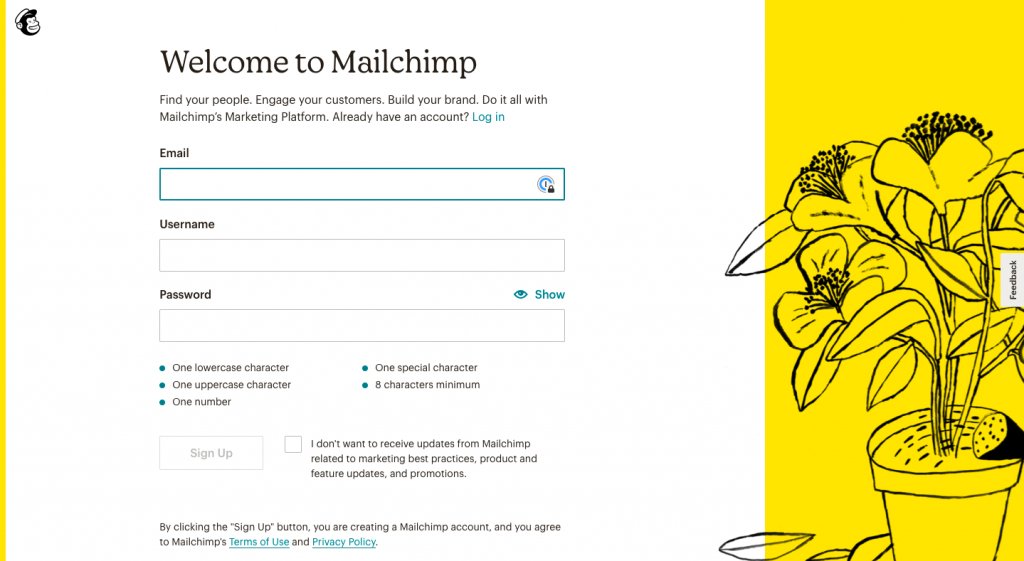
What’s good about the MailChimp signup form is that it gives you the option to see your password while creating it. This not only helps you create the right password in the first attempt but also removes the need to confirm the password again. This further saves time as well as improves the UX design of the form.

5. Subscription forms
Subscription forms are quite similar to sign-up or registration forms. The only line of difference between the two is that while sign-up forms aim to give you access to the inside world of a site – Facebook’s feeds, groups, and other features, to say – subscription forms allow you to subscribe to a site’s services such as its newsletters, blogs, articles and so on.
Just like any other type of form, subscription forms too come with an agenda – to increase a website’s subscriber base. The more the subscribers, the higher are the chances of converting them into paying customers.
Let’s take a look at some of the best examples of subscription forms.
Example 1: Most online businesses like to keep their subscription forms simple and embedded either above the footer or in the sidebar. But, neither they’re attractive, nor they fulfill the basic agenda of having a subscription form on the website. Instead, pop-up subscription forms help convert better. And, Framebridge understands this quite well.
The site uses a simple pop-up subscription form to lure its visitors to subscribe to its services. The pop-up appears within the five seconds of a visitor’s stay on the website, which is typically an ideal time to grab the attention of a prospect.
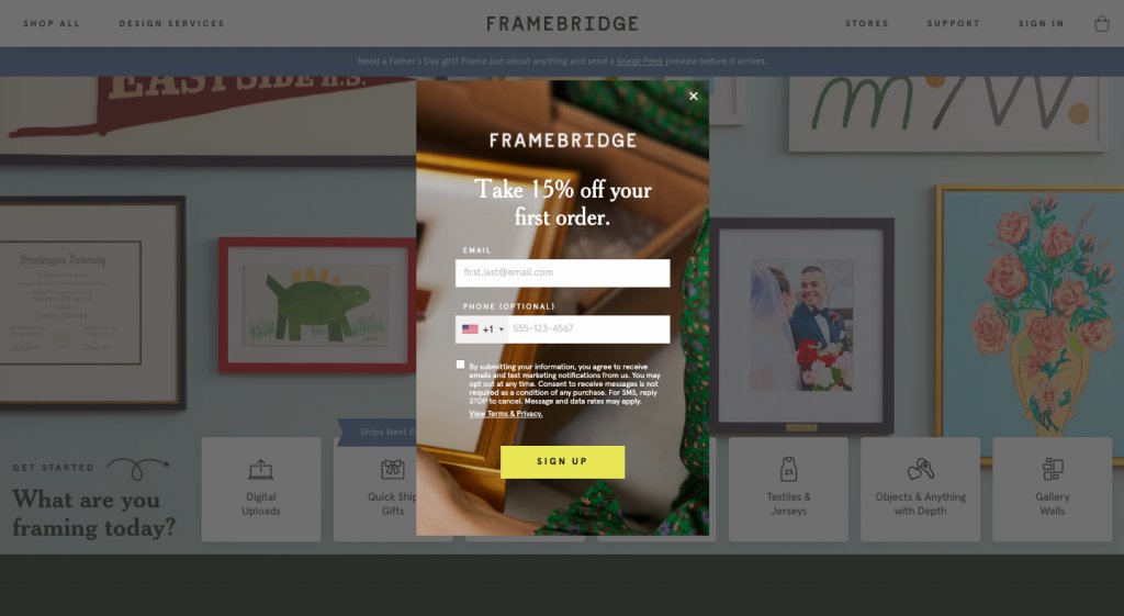
Along with a quirky design and crisp content, the company offers a 15% discount to all its first-time subscribers. With this, the brand achieves two goals – increasing its subscriber base and getting visitors to buy its products to avail the 15% first-time user discount.
Example 2: Ripped Body likes to keep its subscription form equally simple. The popular fitness website run by Andy Morgan greets all its visitors with this eye-catching newsletter subscription form:

Greeting visitors with a catchy headline that’s the pain point of most visitors today, Ripped Body compels you to subscribe to its ebooks and courses to get fit in no time. It’s just one single field with a clear CTA button. And, the fact that these ebooks are free, adds to the incentives.
6. Survey forms
Agree or not, but no business, be it a software company, a travel agency, or an eCommerce site, can succeed without market research and customer feedback. For the simple reason that market research helps organizations understand the needs and demands of their target audience and helps them make sound business decisions.
This is where survey forms come into play. They’re not only the oldest form of gathering first-hand customer data but also the most effective one. Online survey forms help you to collect accurate and measurable feedback from your potential and existing customers regarding your business’s operations and products and/or services offered in real-time. They also help you study the market trends, understand future prospects, design your marketing campaigns to maximize conversions.
Let’s take a look at some of the best survey forms out there:
Example 1: When it comes to offering the best customer experience, none has mastered the art as Netflix.
With a strong AI-driven recommendation system, the platform is highly customer-friendly. It utilizes every microsecond to study user behavior and shares recommendations for shows, movies, and television series based on the likes/dislikes, ratings, and recent searches. It also uses survey forms to collect necessary user information to augment its services and enhance customer experience.
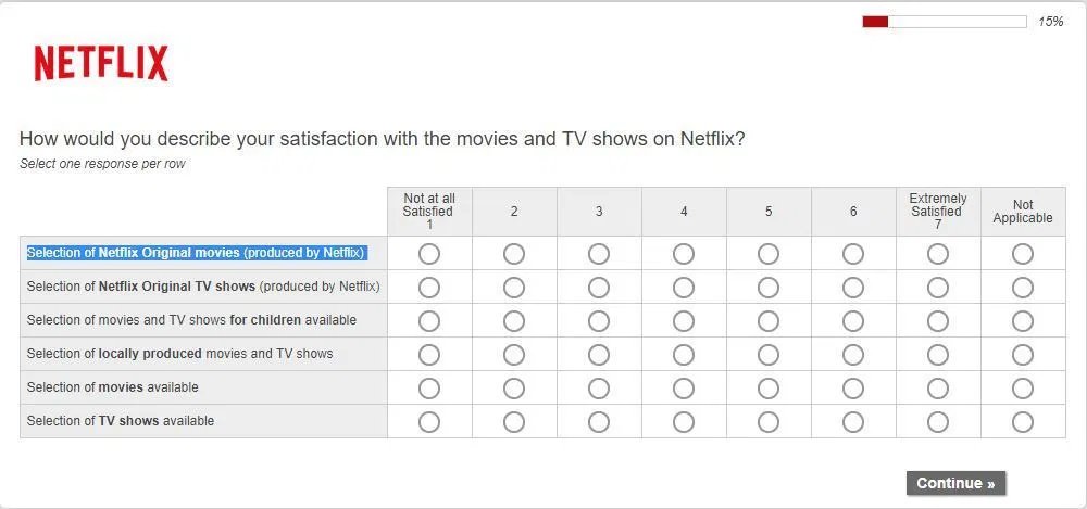
The OTT giant understands that individuals today do not have time to type in their answers and share their feedback. Instead they’re more happy to tick a box and express their feelings. Its survey form represents the exact same ideology.
Example 2: Amazon is another market giant that extensively uses survey forms to collect customer information and feedback. The reason being, no matter how good and strong your recommendation algorithms are, authenticity strikes when customers themselves share their thoughts.
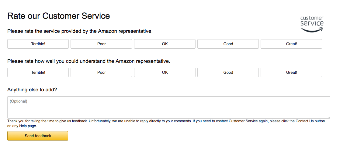
The brand’s survey forms are usually very concise and even give an option to users to provide more details if they’re willing to do so. They’re to-the-point, easy-to-fill, and ask only the most relevant questions.
C) Pay attention to form design details
Not everyone landing on your site pays much attention to your web forms unless they’re mandatory to fill to proceed such as in the case of Facebook. But, no matter how important a step they may be, if they’re not simple, straightforward, and aesthetically pleasing, visitors will ignore them and even abandon your site.
To simply put, attractive web form designs with engaging content not only help provide an excellent user experience but increase conversions as well. The examples quoted in the section above are testimony to our claim.
But, how to ensure that you’re creating the right kind of web forms? Here are some tips and tricks to designing web forms that not only convert and promise a great user experience as well.
1. Follow the KISS rule
One of the basic facts to keep in mind while designing a form is to follow the KISS Rule – Keep it Simple Silly!
The simpler and straightforward your forms are, the more are the chances of people filling and submitting them, and aiding to conversions. For a reason that people only fill up those forms which either have a limited number of fields, spread across two to three steps or are compelling enough to keep their attention focused on filling the entire form.
A piece of research by Hubspot very well proves our point. After researching the contact form of more than 40k of your customers, Hubspot found that the conversion rate can improve by almost half when the number of form fields is reduced from eight to four.
But, just because a form converts more doesn’t mean it’s doing wonders for your business. The real test is when the quality of leads that get generated through these forms is good and authentic. So, when designing a web form, try to include only the most important information and eliminate adding any unnecessary fields or questions that can ruin a user’s experience.
If you’re unsure how to optimize your web form, try running an A/B test. Testing helps understand which form fields are best engaging the users and which ones are causing friction. For more details read through our Complete Guide to A/B Testing.
optimizing the fields through A/B testing. Research tells you that form fields should be limited, but what fields you should go for can be learned through testing. We can also mention that we speak about this in detail in the below sections and maybe give an option to jump to that section
2. Use the single-column layout
By organizing your form fields in a single-column layout, your visitors are least likely to miss out on filling a form field. They’ll complete the entire form in an order that makes sense and even submit it sooner than when they have to fill a multi-column form.
As per a study conducted by CXL Institute, it was found that people were able to complete a single-column form about 15.4 seconds faster than a multi-column form. Meaning, visitors appreciate filling a form that’s simple and straightforward, has a synchronized design, and makes sense to them.
3. Follow a logical order
Ask for details logically. Think from a visitor’s perspective rather than from an application or database’s perspective. Ideally, you should only ask for a person’s name, email address, and phone number, instead of asking for their home/work address, designation, or credit card details right away. Building trust is critical. The sooner you’re able to build a level of trust and confidence in the minds of the customers, the more open they’ll be to furnish their critical details with your brand.
- Group related information together
- In case your form is too lengthy, try using multiple columns.
- Logically use input fields. Common methods include, text fields, password fields, drop downs, checkboxes, radio buttons, and date-pickers.
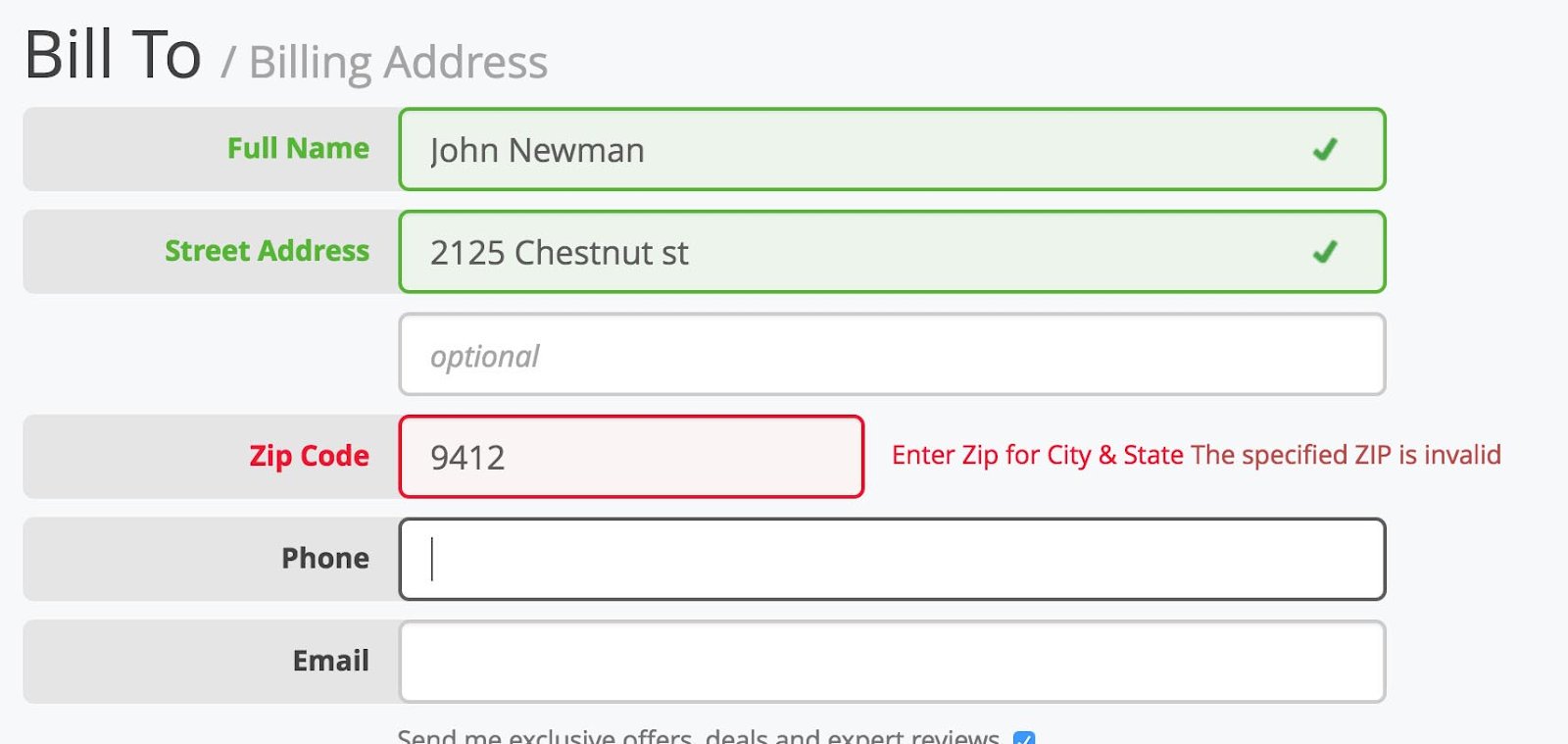
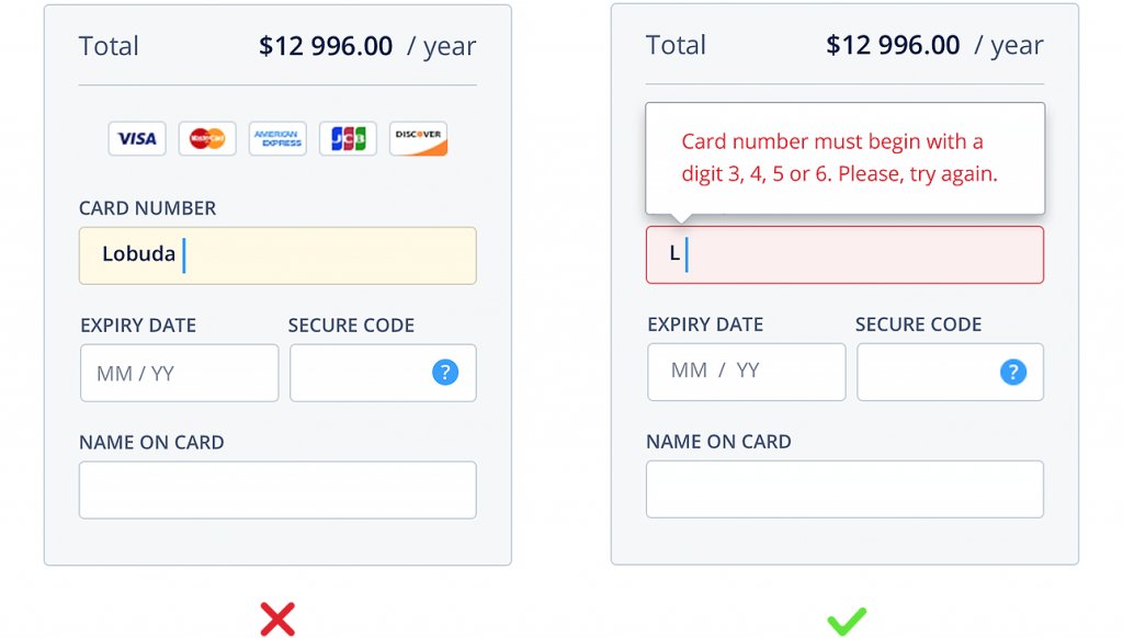
4. Use inline form fields for validation
It’s a process wherein a visitors’ information is reviewed and validated in real-time as they move from one form field to the other. If a visitor fills in incorrect information in a field, for instance, their email address or credit card details, show them an error message then and there to notify them of the error. This not only helps visitors correct their mistakes quickly and move to the next question but also reduces form friction.
5. Align text to the left
As a rule of thumb, always align your text, including labels and questions, to the left side of the form. This is because we humans have a natural tendency to read from left to right. Aligning text on the left side of the form and typically above each field box, reduces friction along with the amount of time spent on completing it.
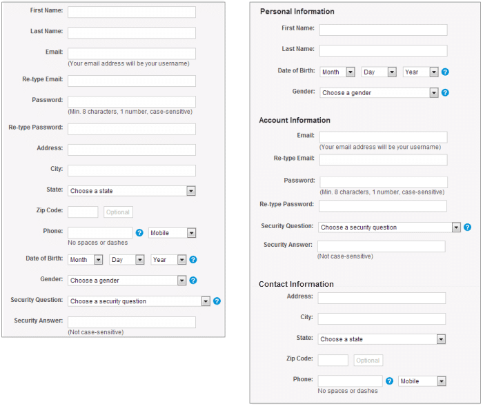
6. Put related information together
Grouping related information fields and in a local manner serves a dual purpose. It helps maintain the flow of the questions in a form and helps visitors make sense of the information they need to fill in every form field. Here’s a great for your reference:
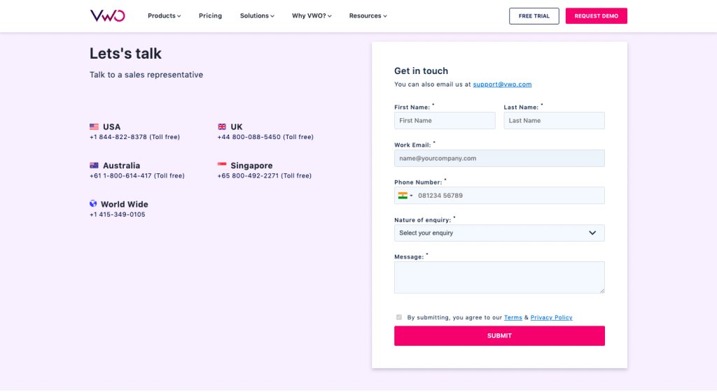
7. Clear titles are always appreciated
As stated above, adding a line or two as form title gives visitors a clear vision of what exactly the form is about.
For example, a simple title like “Get in Touch” clearly states that the form will help visitors contact the business behind the website. Or, “Grab Your Copy” means that the form will give visitors access to the site’s gated content, such as a case study, a research paper, and so forth.
8. Use auto-fill feature
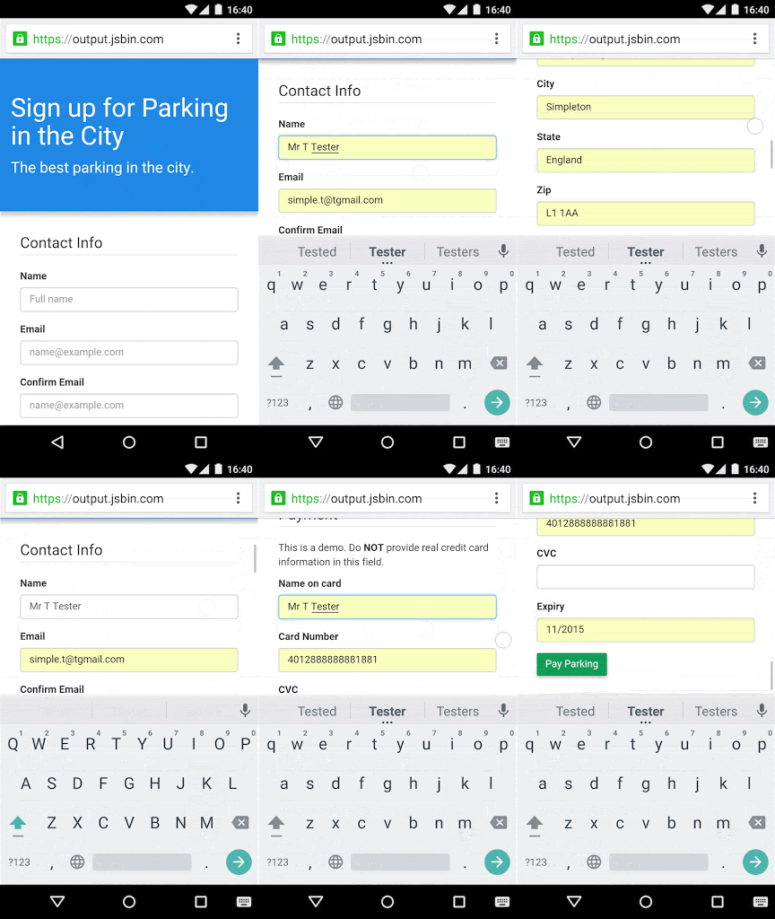
Typing is one of the most time-consuming and daunting aspects of filling a web form. And, more often than not, this also leads to errors, increasing interaction time. Replacing text boxes with buttons, using sliders with the relevant option, and integrating autocomplete feature can reduce efforts as well as increase conversions.
9. Add summary boxes for every plausible user concern
It’s always a good idea to add a summary to each form field where visitors are likely to face a problem. For instance, add proper instructions related to password creation, such as “Your password must contain at least eight alphabets with one case character and one special character.” Addressing concerns by adding summary boxes next to important form fields not only helps clarify the intent behind the asked information, but also aids to fast track the form filling process.
10. Add progress bars in case of long forms
The mere thought of filling a lengthy form is intimidating for most of us, let alone actually filling them. But, when you do not have a choice and use long forms on your website, smartly break them down into multiple steps or sections, and add a progress bar. Amazon uses the same technique on its Amazon Associates page.
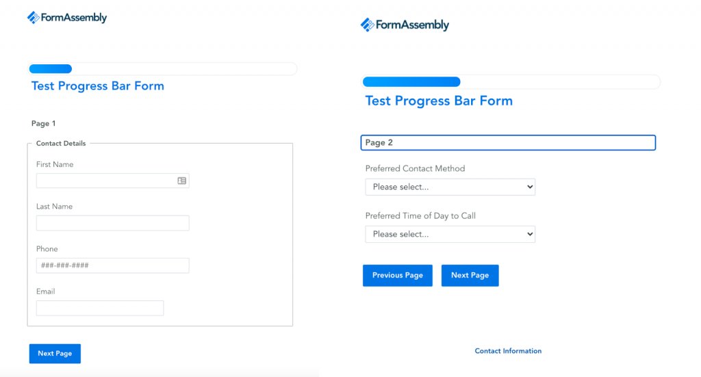
By doing so, users can not only track their progress throughout the form-filling process but also know when they’re almost done. More than anything, it’s a psychological ploy that plays with the minds of the fillers and triggers user behavior. If a user thinks that the forms are never-ending, they’re more likely to bounce off even before completing the entire form.
On the other hand, adding sections or showing progress helps make them understand that they’re halfway through and only a couple of more questions demand their attention. The lesser the field time, the lesser shall be form abandonments.
11. Indicate the intent of importance (mandatory vs. optional)
In addition to the above-mentioned best practices, indicating the intent of importance, i.e., whether a form field is mandatory or optional, is equally important. By doing so, you make sure that visitors fill in all the essential data while giving them the option to leave out fields that are least important in nature. The convention states to use an asterisk (*) to mark the mandatory fields and the word “optional” for ones that are not required.
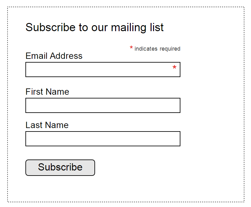
Now that we’ve established what web forms, their types, and the best practices to create effective and engaging forms are, let’s deep dive into their analytics – study their intent and their importance in increasing conversions.
Why is form analytics important?
The primary aim behind using form analytics is to measure the behaviour of a website visitor on a web form. Further, use the gathered information to optimize the forms as well as look for the right opportunities to convert visitors into potential leads.
Form analytics as a process helps you:
1. Get deeper insights into which customer segment to focus on and how to organize data accordingly
Filter, sort, and export data collated from web forms to match your business needs. Build individual data views by focusing on the most critical data points, and further use them to achieve business goals.
2. Reduce form abandonment
On average, 76% of people who start filling an online form never reach the form completion stage. For reasons that either the form was too long for them to attempt or asked for information, visitors were uncomfortable to furnish. So finding such details and friction in the form filling process can help you reduce form abandonment.
3. Identify new opportunities
By understanding the exact intent of your target audience, you can use the gathered information to spark new business ideas. For example, if most of your visitors are abandoning your form as they get to the pricing or budget field, you augment the option and provide them with lower-priced or other relevant choices, reducing hesitation. You can further use such information to target an altogether different market segment and expand your business opportunities.
4. Learn valuable lessons from input errors
Analysing errors help identify cause and effect, further enables you to improve your form(s) in terms of their design, the information asked, and other related essential elements, and maximize their usability.
How to analyze the performance of your web forms
There are approximately a dozen metrics you can use to analyze the performance of your online forms. But, deciding which ones to focus on and when can be a daunting task. To make things easy and convenient for you, we’ve divided the entire form analysis process into two prime stages.
- When people visit the form page
- When people interact with the form
So, let’s get started and learn about the best tools for form analytics.
1. When people visit the form page
When a person pays a visit to any webpage, they look at a plethora of things – a page’s overall design, its content, embedded images, products or services offered, and so on. Amid this, forms are usually among those page elements which get the least amount of attention. For the reason that either they’re not visually appealing or visible enough (merged in the site design) for people to see them right away, or they’re too lengthy (or intimidating) for people to even consider filling them in the first place. This is where the initial lag happens.
To check these fallouts and the reasons behind such intimidations, quantitative, and qualitative analytical tools like analytics, VWO’s AI-powered free heatmap generator, clickmaps, and session recordings come in handy. These tools not only allow you to analyze the overall performance of your web forms but also help keep a tab on the movement of your visitors throughout their journey.
A. Quantitative Analytics
There are several quantitative analytical tools that you can use to track visitor interaction with web forms. With analytics, you can check the total page views time spent by a visitor on a form, its bounce rate, and so forth.
In addition to this, the analytical tool also furnishes information about the location of a visitor, the operating system and devices they’re using to access the form, their demography, and even shows the number of visitors currently active or filling a form on the site, total time spent, bounce rate, and more in real-time.
B. Heatmaps
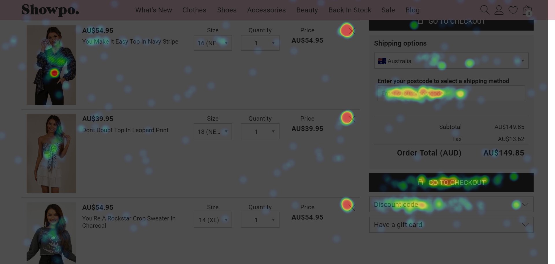
Heatmap is a qualitative analytical tool that offers a visual representation of how visitors interact with a web form, which elements are catching their attention, which ones are distracting them, and so forth. For instance, in the image below, the highlighted portions, especially the red, orange, and yellow patches, show the areas where people are concentrating their attention the most.
C. Clickmaps
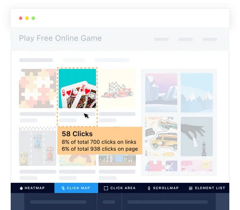
Similar to heatmaps, clickmaps also furnish real-time data about where visitors are clicking on a page and the pattern they’re following while interacting with it. Such information helps find out the key action points and the ones causing a lag or distraction in a visitor’s form filling journey.
D) Session Recordings
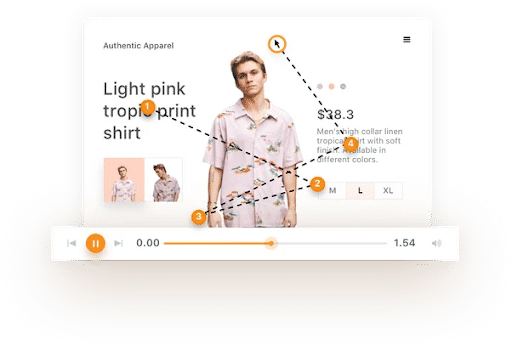
This is another key matric that helps study the behavior of your website visitors while they’re on your website. The tool allows you to:
- Track actual mouse movement of a visitor as he/she moves through the web form.
- Check where they’re hesitating, moving smoothly, spending the maximum amount of time, and where they’re bouncing off.
- Record observations for further analysis.
While these tools give an overall view of how website visitors are viewing your web form, the actual task begins when visitors start filling out the forms.
2. When People Interact with the Form
In this stage, we’ll typically talk about field-level statistics of a visitor’s interaction with a web form. Meaning, how they begin their form filling journey, where do they hesitate the most, the total time they spend on the form, where do they drop off, and so forth.
Primary form metrics to study at this stage are as follows:
A) Total time spent on the form
The metric typically defines the total amount of time taken by a visitor to complete a form along with the total time spent by them on every form field. This data typically helps identify form fields where visitors are concentrating their attention and even where they’re hesitating.
Total Time = Interaction Time + Hesitation Time
B) Interaction time with the web form
Interaction time counts as the time spent by a visitor actively filling a form. This includes everything – their movement from one field to another, their hesitations, filling and refilling fields, and finally submitting the form.
C) Visitor hesitation time
Hesitation time counts as the average time spent by a visitor on a particular form field. This generally includes a detailed time report that uncovers insights like minutes (or hours) spent by a person thinking about what to fill in a field, what does a specific field mean, whether or not they should furnish the asked information in the form, and other related ambiguities.
D) Refill Rate
This metric typically calculates the percentage of visitors who refilled a particular form field. A high percentage of refills means that visitors are facing difficulty in interpreting what a specific field means.
E) Ignore Rate
This metric underlines the number of people who submit the form but leave some form fields empty. Ideally, the fields which are ignored by visitors are the ones which spike the form abandonment rate.
F) Drop Off Rate
Drop off rate indicates the percentage of people who do not submit the form, either because they’re asked for specific information which they do not have handy, or find the form too difficult to attempt.
In addition to the above-mentioned, you can also pull out form submit data in the form of funnel reports and date range graphs to study overall customer engagement and identify pain points.
G) Form Funnel Report
Form funnel reports help you deep dive into the nitty-gritty of how visitors landed on one of your web forms, what percentage of them actively interacted with the form, and how many of these visitors finally submitted one. The report also furnished additional information and specific reasons behind drop-offs at each form field stage.
H) Date-Range Graphs
Date-range graphs enable you to compare form conversion data over a period of time. You can also use these graphs to track changes made on specific dates. For instance, adding a couple of fields to an existing form or replacing some with a new field such as the phone number field replaced with an email address, and so forth.
To conclude, form analytics platforms are not just another tool to fetch data, make assumptions, and amend forms on a trial and error basis. Rather they offer a streamlined process allowing you to take advantage of their advanced capabilities and metrics to derive tangible information about your web forms, their performance, and their engagement rate.
How to optimize web forms using A/B testing and form analytics
Understand that designing forms while keeping in mind the above-mentioned best practices is the first step to creating effective and engaging web forms. But, using the gathered data from qualitative and quantitative analytical tools to optimize them in the most comprehensive manner is what leads us to more quality conversions.
In a nutshell, optimizing your forms is typically a three-step process:
- Evaluate the information collected from the forms, respective pages, visitor analytics reports
- Turn the gathered insights into a set of discrete observations and hypothesis, followed by an actionable strategy for tackling each of the observations, and
- Execute the plan and iterate until you achieve satisfactory results
While there are many ways to improve the performance of your web forms – making a couple of changes here and there, adding and omitting form fields, or changing button text – validating whether these changes would surely help increase conversions sustainably is tricky question.
This is where A/B testing comes into play. A/B testing is nothing but a statistical tool that helps evaluate the performance of an existing form based on the data gathered from form analytics tools against its variations and comparing their individual results for better conversions.
But, first things first, let’s understand what you should actually test. For the simple reason that an A/B testing tool allows you to test anything and everything that you can think of. So, draw a line here!
Prepare a list of the top form elements using the data collected from form analytics tools, which you think can directly impact your form’s conversion rate. Essentially there are five primary form components which you should A/B test.
These are as follows:
1. Length
As established above, the length of your form can make or break a deal for you. So, test this form element for frictions. Roll out a variation or two. Test them on a custom audience segment and track their performance using form analytics. For instance, remove just one field. Test it against control for volume and quality of leads, and finally analyze the impact of the field on the overall performance of the form. You’ll get a fair idea of whether or not the removed field was the actual cause of the problem.
2. CTA button
This is usually an overlooked form element. A small change to your CTA color and text copy can showcase surprising results. As per recently published data, it has been seen that changing the text of your submit button can typically increase submissions by 250%. It’s just a small swap which can significantly boost your conversion rate.
3. Form design (fonts, colors, field placement, desktop vs mobile)
Using contrast colors in a form or changing the font of the text, playing with the fields and their alignment, and also checking their responsiveness on desktop, mobile and other platforms are some basic components which can make a form attractive and get more conversions. For instance, if your form is white it color, use yellow or orange (contrasting color) to highlight its fields and black for text input. Then run an A/B test to check whether or not your selected colors schemes are working well for your form.
4. Form workflow (single-step vs multi-step, progressive vs static)
Certain types of forms work better in certain types of situations. Understanding where you must integrate a single-step form and a multi-step one is very important. For example, most customers stop short of filling long checkout forms, especially on an eCommerce site, which results in a high abandonment rate. In such a case, integrating a multi-step form is always a good idea. On the other hand, if you’re only looking for some basic information from your visitors, such as in the case of a lead generation form, a single-step form would best suit your needs. Apply the same logic when it comes to integrating static and progressive forms on your site.
5. Form position
The positioning of your web form plays an important role in getting more leads. But whether you should place it above the fold, below the fold, or use a two-step opt-in process, this can be a tricky thing to analyze. As a rule of thumb, place your form below the fold if your product or service:
- Is expensive
- Is complex and requires more copy for explanation
- Requires a high commitment
In the rest of the cases, it’s best to run an A/B test to find out ideal form placement positions.
Once you’ve decided which element(s) you wish to test, set some goals. For instance, if you want to test the performance of your submit button copy placed on your case study page, your goal should be to get more conversions. Here’s what you should do.
1. Thorough research and come up with observations
Check how the element is currently performing. Pull out data from form analytics tools such as heatmaps, clickmaps, session recordings, etc. and analyse it in a detailed manner.
2. Propose a hypothesis
Create a data-backed hypothesis that aims to satisfy your set goal as per your observation. Without this, your test campaign wouldn’t sustain. In this case, hypothetically speaking, change your existing submit button copy from “Submit” to “Grab a Copy” or “View Case Study.”
3. Create variations
The next step is to create form variations based on your hypothesis. A variation is basically another version of your current version (also known as control) with suggested changes you want to test. You can create as many variations as you want to set against the control to check which one converts better.
4. Test your variations
Once you’ve created the variations, place them on your website and kick off the test. Carefully calculate the duration of your test keeping in mind your average daily and monthly visitors, existing conversion rates, expected conversion rates, number of variations you’ll test, and percentage of visitors you’re targeting.
5. Analyze the results and deploy changes
This is the step where you analyze the test results and see which variations outperformed their control. Check the impact and deploy changes.
Understand, it’s not necessary that a variation will outperform its control. But, continuously testing ideas and looking for ways to improve the performance of your forms is what can help increase conversions.
How to optimize web forms to get better leads?
In this section, we’ll talk about how to optimize your forms to get more quality leads. But remember, there’s no one-size-fits-all. While some of the below-mentioned best practices may work wonders for you, many others may not be much effective.
1. Move your form above the fold
Everything we do on a website is to increase visitor engagement and get the right people on board. Afterall, it’s about conversions. And, although we do advocate running an A/B test to exactly know where to place your form to maximize conversions, as per statistics published by LukeW, visitor engagement usually peaks above the fold. So, try placing it in the first fold and check the engagement. If the engagement rate is low, run an A/B test.
2. Make your form headline a call-to-action
As stated above, a headline helps visitors identify the intent of the form. But, a good headline with a catchy call-to-action encourages visitors to complete the form and enter your sales funnel. For instance, you can use powerful call-to-actions such as, “Save time. Use your preferred social account to sign in,” “Don’t want to use a social account? Easy. Just fill in the fields below,” “Need some help? Ping me!,” etc.
Such headlines grab the attention of your customers and serve as a nudge as well. Here are some more examples of good, catchy headlines you can use for various web forms:
- Save your seat. Book now!
- Insights delivered daily to your inbox!
- Grab your free copy today!
- Where should we send your free copy?
- Yes! Let’s start my free trial
- Are you in? Let’s get started!
3. Include the right number of fields
We often stumble upon articles over the internet insisting us to keep our web form short and simple. Although it’s true, it’s what we call furnishing half-baked information. Long forms can intimidate people and keep them from completing the form, but a shorter form can decrease its perceived value as well.
The length of your form should always match its intent. If you think your form is good-to-go with only two input fields, such as when you’re giving a free checklist or offering subscriptions to your blogs, then keep it short. On the other hand, if you think that you’d want to collect substantial customer information for data check and usage, then keep it long.
4. Use multi-step web forms
Sometimes long forms become a necessity if you’re an eCommerce company, a travel booking platform, or an agency engaged in offering financial advisory services. And, as we know, long forms can be intimidating. So, there’s a catch, either use multi-step forms or allow returning users to skip the hassle by saving their information.
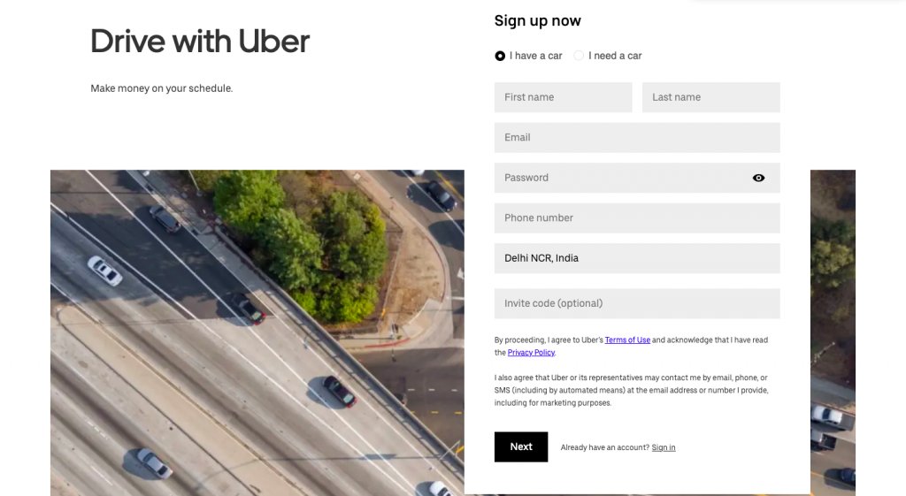
In the case of first-time users, dividing your long forms into multiple stages (as seen in the case of FormAssembly) is a great way to make people fill a form without intimidating them. Uber is another example to quote here.
The multinational transportation network company uses this trick to create a smooth conversion process for its visitors. Notice how the form is short and crisp at each step, and its CTAs effortlessly direct visitors to the next step of the form. The placement of the button “Next” in itself is an indication that there’s another step after this one.
5. Hide previously-completed form fields
Similar to the above-mentioned point, hiding previously completed form fields in a customer’s form filling journey also proves quite effective. To give you an example here, The ‘Who’s Who Of Executives & Professionals’ uses a multi-step form on their homepage to encourage their visitors to check their eligibility to the network.
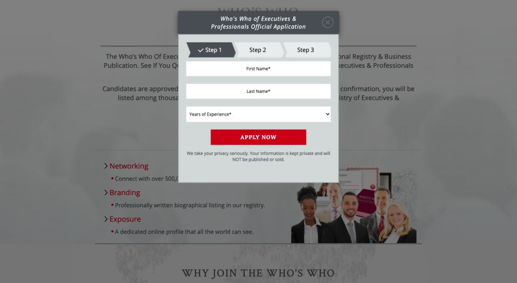
Notice the image above, the business has embedded a well-designed form with step indicator arrows (visual cues) to tell their visitors that they have completed one step and should now move on to the next one. In addition to this, their CTA button also has an arrow indicating the prospects that they aren’t done yet with the application process.
6. Add a Save Button
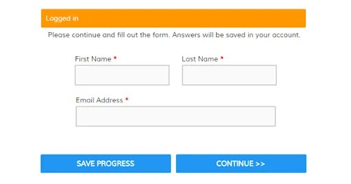
Most often people drop off while filling long forms or when they’re asked to furnish very specific information such as their credit card details or identification document copies, etc. (which they may not have handy). To keep logged-in customers from completely abandoning the form or starting the entire form filling process again, add a “Save” button on your form page. Give them the leverage to continue from where they left.
7. Use real-time form fields for validation
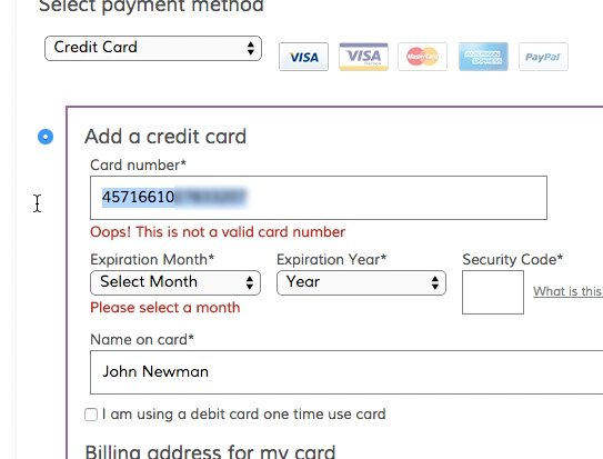
Having a real-time data validation application embedded in your form is important. It not only helps fasten the entire form-filling process but also enhances a visitor’s experience, further reducing drop-offs by a significant level.
Locating errors is easier
Real-time data validation helps users identify errors immediately. Meaning, they’re corrected then and there (at form field level), and prompted to input correct information to reduce frictions.
Builds confidence
Legitimizing data while a user is filling the form helps increase the confidence of the fillers as well. As the fields are validated from one to another, users don’t have to go back and review the form for errors before submitting it.
Reduces the chances of abandonment
If users are prompted about their errors after they’ve completed the entire form and hit the submit button, the chances of them attempting the entire process again are quite low. So, pointing out errors right when users are on-to the task is always better and a good technique to keep users from abandoning the form.
8. Ensure your visitor’s privacy
It’s always a good idea to link your privacy policy either next to your email field or at the bottom of the form, typically below the submit button. This helps assure visitors that whatever information they’re furnishing through the form will not be shared with any third party. This further increases your brand’s credibility makes it trustworthy and enhances conversions.
9. Add sign-up flexibility
If your site requires users to sign-up or register with your platform to use your services, then give them the freedom to sign-up using a medium they’re most comfortable with. For example, give them the liberty to sign-up using a social platform such as Facebook, Gmail, or Linkedin to complete the registration process. This helps achieve two goals:
- Saves users the hassle to go through the tedious registration process, and
- Give you valuable insights into a user’s social network connections.
Truth be told, incorporating social login functionality has become more of an expectation than an option in today’s time as more and more services are entwining with social media.
Some industry-centric examples of form analytic
eCommerce industry
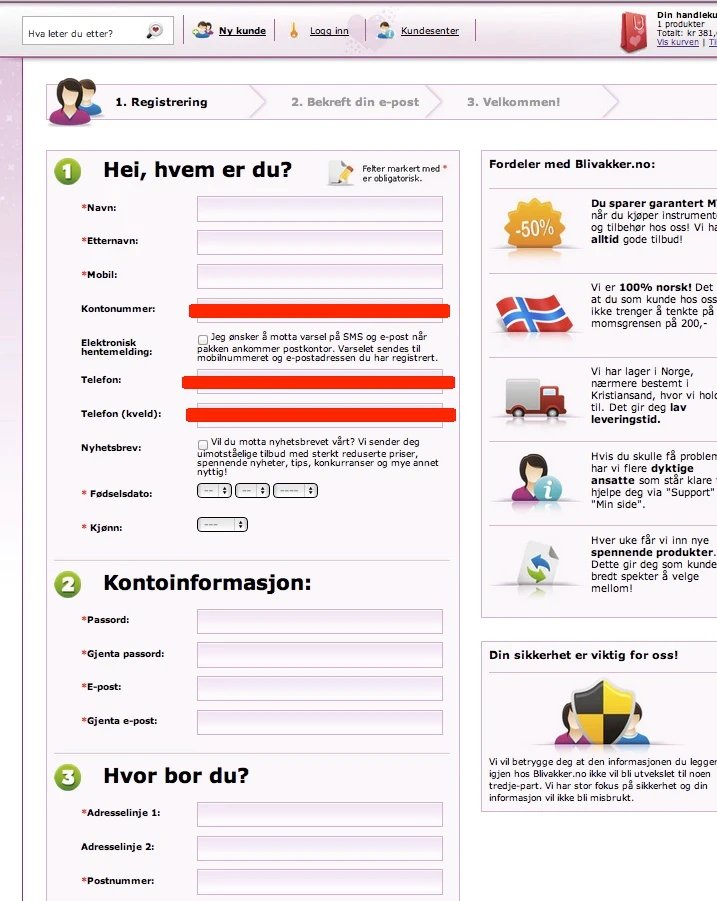
Case Study: BliVakker.no Removed 3 Form Fields from its Registration Form and Saw a Conversion Uplift of 10.48%
BliVakker.no is one of the leading Norway-based online beauty shops that offers a wide range of perfumes, cosmetics, and other toiletries to its global customer base. While the ecommerce company was aware that their registration process is overly complicated, they wanted actual data to support their suspicion.
BliVakker used VWO form analytics to gather necessary data and chose to remove unwanted fields from their registration form immediately. The fields marked with red (in the image below) were the ones which were removed.
The online beauty shop then decided to run an A/B test to validate their hypothesis and created the following versions for A/B testing.
- The original version or the control had about 17 form fields.
- The second version or variation 1 (Skjema-light) had the original 17 fields, minus 3 fields namely, account number, phone number, and evening phone number.
- The third version or Variation 2 (Skjema-uberlight) had far fewer fields along with less navigational elements.
Here are the test results:

As you can see, the second version outperformed the control and the third variation. It showed a 10.48% higher form submission rate than the original rate.
Travel industry
Case Study: Attacat and Flying Scott Parking increased their form submissions by 35% using VWO form analytics
Flying Scot is one of the best 24 hours airport security parking providers in Edinburgh and Glasgow. The company wanted more and more people to sign-up for their services through their website and increase conversions.
While analyzing their “Details” page of the booking process, they knew the form wasn’t appropriate.
This is how the original Details page looked like:
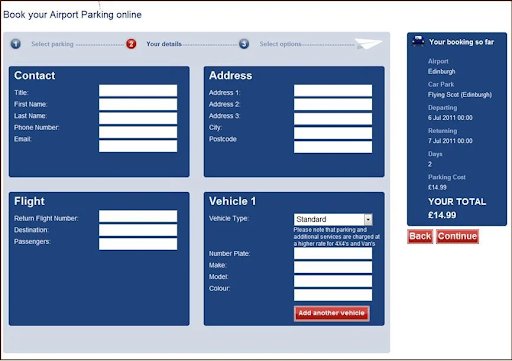
The company decided to deep dive into the problem. They used the VWO form analytics tool to check for frictions on the form. Using the gathered data, they decided to simplify the form-filling process. They further ran an A/B test to validate their hypothesis.
Here’s how the variation looked like:
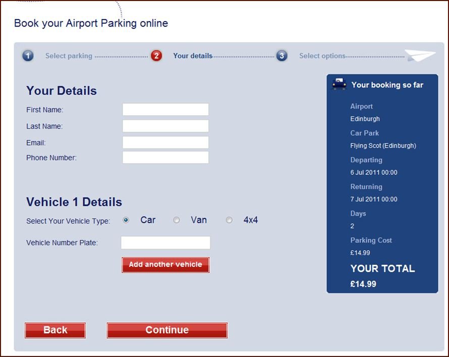
Flying Scot saw a 45.45% increase in visitors moving to the next step and a 35% increase in overall form submissions.
Finance & accounting industry
Case Study: PayU reduced its checkout page drop-off by using form analytics and VWO’s data-driven A/B testing
PayU is a leading fin-tech company that enables businesses across India to accept and manage payments online. As a payment facilitator, it is crucial for Payu to have a simple, intuitive, and convenient checkout process. But, their Checkout page statistics showcased a very different story. The company witnessed a lot of drop-offs on the page, which typically impacted heavily on their sales and revenues.
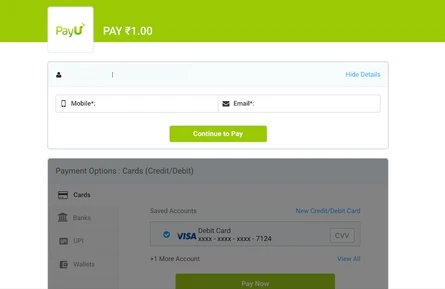
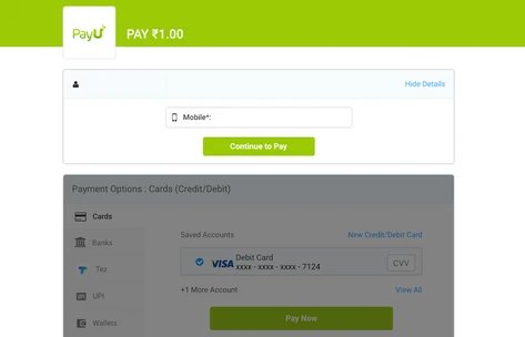
PayU’s old checkout page asked users to input their email address and phone number to complete the purchase as local laws mandated the company to share the final payment receipt with the user post the purchase.
The company used VWO Form Analytics capabilities and found that entering both phone numbers and email addresses was the source of friction on the form, resulting in a lot of drop-offs.
Basis this insight, PayU decided to run an A/B test and check whether removing the email address field would increase their conversions.
Here’s how the control looked like:
Here’s how the variation looked like:
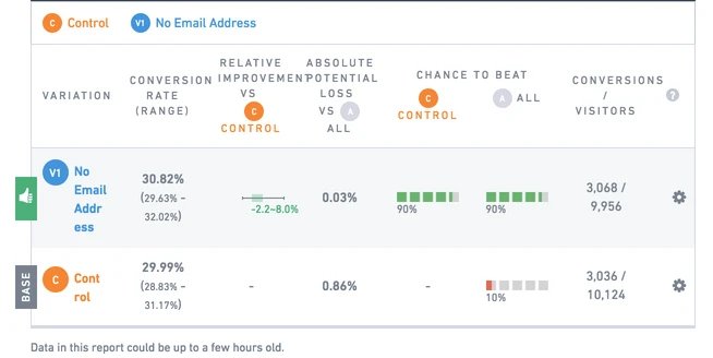
The results showcased that by simply removing the email address field from the form, the company saw 5.8% of improvements in their conversions as compared to the control.
SaaS/IT industry
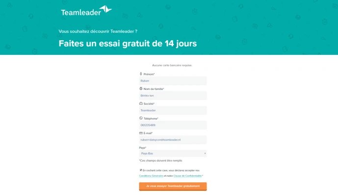
Case Study: Adding “No Credit Card Required” improved Teamleader’s conversion rate by 12.5%
Teamleader is a SaaS technology company headquartered in Ghent, Belgium that offers a unified CRM, invoicing, and project planning platform to the SMEs. The company’s primary objective is to increase their number of free trial sign-ups and make the entire form-filling process more fluid for the visitors.
To do so, the company used VWO’s capabilities, especially form analytics, to check for frictions on their free trial sign-up form. They discovered that a lot of people were dropping off just before adding their credit card details. They hypothesized that maybe by adding information about the non-requirement of a credit card to sign-up for a free trial, their conversions would increase.
Teamleader ran an A/B test to legitimize their hypothesis.
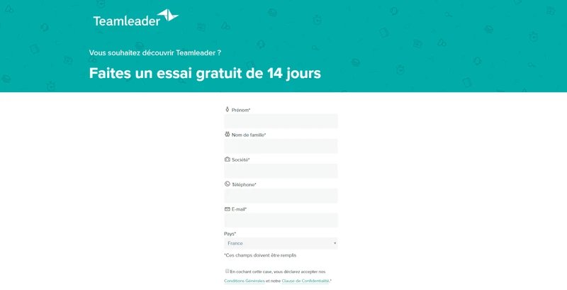
This is how the older version or control looked like:
And, this is how the new version or variation looked like:
The company saw the following results:

In the case of Teamleader’s Netherlands website, the variation achieved a conversion rate of about 54.8% against 48.7% for control. Meanwhile, the company’s Belgium website saw an increase of about 38.6% in its conversion rate (variation) against original 33% (control).
Conclusion
To conclude, form analytics is a process that provides you with all the essential conversion-critical information regarding the performance of your website’s forms. From tracking total time spent on a form to interaction time, hesitation time, drop-off rate, refill rate, and so on, VWO’s form analytics helps you figure out how you can improve the performance of your website forms whilst getting more leads and increasing conversions.
Frequently asked questions on form analytics
What is form analytics?
Form analytics is a monitoring tool to understand how users interact with your website forms. It can tell you how many visitors viewed your form, how many of them filled it out, and if any of them dropped off from the form.
How do you analyze a form?
The form analysis process has been made really easy and effective with tools like VWO Insights. You can drill down into users’ interactions with your website forms and understand what motivated them to complete a form versus what caused them to drop off without completing a form. To explore how VWO’s Form Analytics works, you can sign-up for a free trial today.
What is the form conversion rate?
Form conversion is a micro-conversion metric that tracks how many customers complete filling out a form and eventually submit it. A high form conversion rate is always desirable as this shows that your prospective customers have considered your offering as a solution to their problems. This micro-conversion metric is one of the stepping stones leading to the fulfillment of final goals like increased purchases and sales.
How do you increase form fill-ins?
To increase form field conversions, you must implement the best practices such as making some fields optional, writing a clear CTA copy, placing it above the fold, displaying security badges, and selecting a clean layout. To discover some great sign-up examples, you can read this blog.


