Dachfenster Rollo A/B Tested User Experience To Increase Conversions
About Dachfenster Rollo
Dachfenster-rollo.de is a Germany-based company in the business of selling window blinds and skylight curtains online. An exclusive importer and distributor of Bloc products in the country, Dachfenster also offers customized blinds for various window types.
The company hired ClickValue—an online digital marketing agency—to improve the conversion rate of its website. The agency used VWO tools to set up and run multiple tests.
Goals
The objective was to increase the number of visitors to the Dachfenster Rollo website convert to customers by making a purchase.
As a first step to identifying what elements needed to change, ClickValue analyzed the website. The focus was on one of the most important pages of the website – where visitors were required to select the brand of the blind.
Tests run
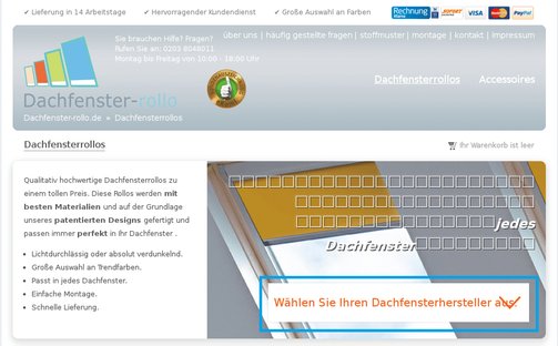
On the original page, visitors had to click a downward arrow that opened a drop-down list. They could then select one of the available brands and proceed to the next page to choose other specifications such as size, material, and type of blind they were looking for.
This is how it looked:

To push more people into the conversion funnel from this page, ClickValue decided to test it against 2 variations.
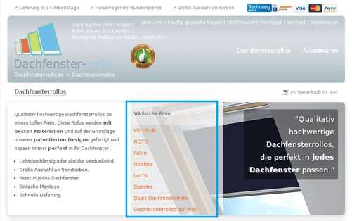
In the first variation, the drop-down list was replaced with the names of all brands listed in orange color. This was done with the objective of eliminating the need for visitors to click the drop-down list to find what brands are available.
This is how the variation looked:

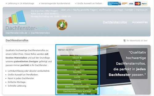
In the second variation, each brand name was a separate button in green color, with the buttons organized to look like a list. This is how it looked:

The test was performed for close to 2,000 visitors over 50 days. The goal being tracked was the final purchase, that is, conversion of visitors into customers.
Conclusion
Both the variations performed better than the original.
The first variation increased the conversion rate by 18.1%, but the confidence level was a low 86%.
After 53 days of testing, the second variation emerged as a statistically significant winner, increasing conversions by 33.4%.
Good design is the key to optimization. In this case, making the information visually easy to consume made all the difference in the conversion rate. By making all the information available to visitors upfront, the number of steps needed for users to reach the conversion goal were reduced.
In the first variation, all available brands were shown upfront, thus eliminating a click. The second variation was able to optimize the purchase process further by clearly showing all available brands in the form of clickable buttons.

Location
Germany
Industry
Services
Impact
33.4% increase in Conversion


