VWO Services Helped Utsav Fashion Increase Conversions through Data-backed Testing
About Utsav Fashion
Utsav Fashion’s journey began in 2000 with the opening of its first store in Jaipur, India. 3 years later, the online store was born and Utsav Fashion hasn’t looked back since. Today, the online store offers a wide variety of authentic and trendy ethnic fashion ranging from sarees, salwar kameez, and lehengas to contemporary Indo Westerns as well as a great collection of accessories. Utsav Fashion’s vision is to provide the best online shopping experience and take the best of Indian Ethnic Fashion worldwide.
Utsav Fashion has been using VWO Services for all its experience optimization needs since 2019 and has run many tests since. We got in touch with Shray, Product Manager, and Arvind Kumar, VP Engineering at Utsav Fashion, who are responsible for improving user experience and conversions on their website, to learn all about the recent wins they achieved.
Goals
The overarching objective of Utsav Fashion testing is to improve conversions, on their ethnic fashion wear eCommerce mobile website for the U.S traffic.
The tests discussed here had increasing transactions as their goal, which would ultimately feed into the overarching objective of improving conversions.
Observations
For the two tests discussed here, the challenges faced were unique:
Test 1 Challenges
- Data suggested that mobile traffic from the US had an alarmingly high, 67% cart abandonment rate.
- After initial research, the team noticed that there was no visible CTA to nudge users to complete the transaction.
- They also observed that users were engaging heavily with the order summary, and as order summary was part of the page content, it served as a distraction more than a facilitator while users filled the checkout form fields.
Test 2 Challenges
- The hamburger menu registered 30% of the total clicks on the homepage making it one of the most important elements on the mobile site
- In the current UI, users were finding it difficult to find the products they wanted
- The interaction within the menu itself was very low as the listed options appeared as links with no further breakdown of options
- In the control, sub-categories such as occasion, style, fabric were only available on the listings page. Users had to use listing page filters for every specific request (such as party wear saree or linen saree), increasing the time taken as well as the cognitive load on the users
Tests run
- The team made a few changes to the original checkout page:
- The main change was the primary CTA getting turned into a sticky bottom that also reflected the total order amount.
- The new CTA text ‘View Details’, when clicked on, reflected the order summary.
- The ‘Edit’ option from the order summary was also removed to eliminate the chance of users getting distracted from the primary CTA and ending up re-evaluating their carts
Here’s a comparison image of the control and variation for your reference:
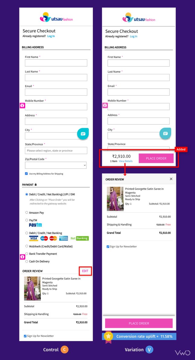
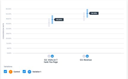
Result: The test ran for 16 days and variation won with a 9.98% improvement in purchase conversions. Additionally, revenue increased by 8.95%.
Take a free trial to know how A/B testing works.
Test 2 – Testing a New Hamburger Menu Layout and Design
Objective: Increasing the number of successful transactions
Hypothesis: Based on the above observations, the team hypothesized that improving the UI of the hamburger menu would increase its usage, leading more users to the product page, thereby, positively affecting both product discovery and eCommerce CVR.
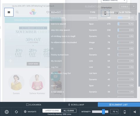
Solution: The team, before making changes to the original hamburger menu, used VWO Insights’ capabilities to assess how users were interacting with it. The element list capability offered under VWO Insights’ heatmaps showed that the hamburger menu registered 30% of the total clicks on the homepage:
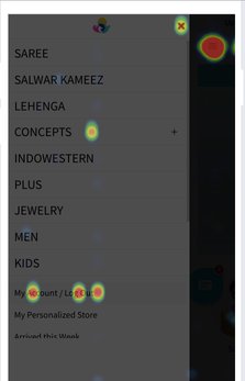
They also ran a mobile heatmap analysis on the control hamburger menu and noticed that barring one element labeled Concepts, none of the other elements listed on the hamburger menu received any clicks on them:
Based on all the valuable visitor behavior insights, the UI of the hamburger menu was redesigned with the introduction of sliding options that allowed users to see all the parent categories, their sub-categories, and all the options under those sub-categories. Here’s a comparison image of the control and variation for your reference:
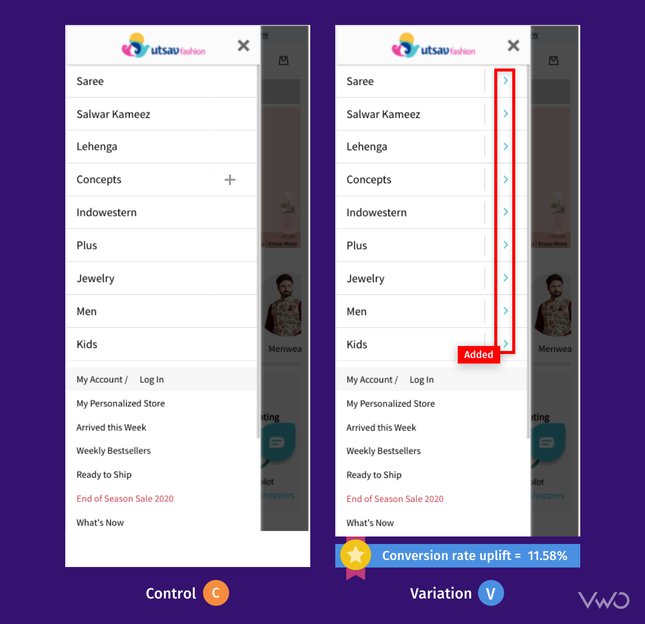
Results: The test ran for 14 days on all the pages of the mobile website and registered a staggering uplift of 11.58% in the conversion rate of purchases. Additionally, revenue increased by 12.22%.
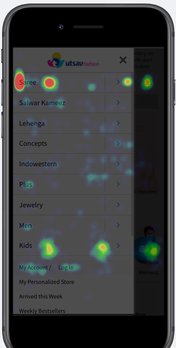
Post the completion of the test, a heatmap analysis of the variation showed that usage of the hamburger menu had drastically improved with the new UI:
It has been an exciting journey for us with VWO. The collaborative approach of the VWO Services team allowed Utsav Fashion to implement many features on our website based on customer behavior insights. The project forced us to deeply understand customer behavior and innovate fast. We successfully discussed, designed, and implemented a number of campaigns on their merit. I believe all these will help our customers immensely and make their buying journey enjoyable.

Arvind Kumar
VP, Engineering
Conclusion
In collaboration with VWO services, through continuous analysis of visitor behavior on their mobile website and through targeted testing, Utsav Fashion was able to not only increase transactions but also as an effect, significantly increase its revenue by a great margin. These 2 tests resulted in an overall 10.78% increase in Utsav Fashion’s conversion rate.
The team’s utilization of VWO Insights’ capabilities, like heatmaps and elements list, gave them a clear view of the direction the tests needed to take. The insights generated thus not only gave them data based on their users’ experience and behavior but also provided scientific backing to the tests that were run.
Start your free trial today to know how VWO can help you optimizing your website.

Location
New Delhi, India
Industry
Retail
Experiment goals
Increase the number of successful transactions
Impact
10.78% increase in Conversion


