YNAB Improved User Experience To Increase Conversions
About YNAB
You Need A Budget (YNAB) is a user-friendly application for personal finance management. The company teaches people how to become awesome at managing their money by following a 4-Rule methodology. And they sell personal budgeting software that follows this methodology. The software is elegant, simple to use, and does just what you need it do—meaning you don’t bog down in unnecessary features that eventually make you want to quit (and pull your hair out).
They used VWO for testing their new design.
Goals
The YNAB team wanted to increase the number of downloads for the 7-day free trial of their personal budgeting application. So the conversion goal tracked was the number of free-trial downloads.
Tests run
For their first test, they chose to optimize the product tour page. For software applications, the tour page takes up the job of convincing a casual visitor to try out the application.
Motivated visitors will anyway download the application, so it is the semi-interested visitors who need to be convinced.
To optimize the tour page, YNAB chose to do a simple A/B split URL test with the conversion goal as downloading of the free trial.
They designed the variation with the following objectives in mind:
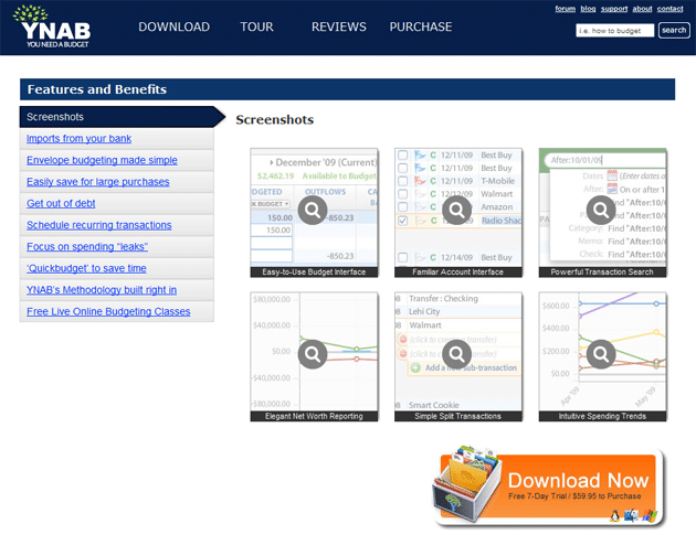
- Require less clicking by showing that all screenshots as nice, large thumbnails.
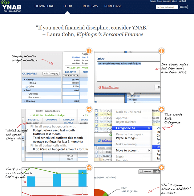
- Freshen up the design of the page (having handwriting-type captions).
- Strengthen the call to action with a prominently placed testimonial at the very top.
As you will see below, the major change was including many more screenshots and hence not requiring a visitor to click different categories to see what the app can do.
You see, semi-interested visitors are more likely to hit the back button than activity hunt for what your app can do. So, including all relevant functionality of the app in the form of screenshots on a single page did the trick of convincing them to download the free trial.
Here are the screenshots of variations:

Original/Control

Variation: 85% Increase in Downloads
Conclusion
The variation with more screenshots and lesser categories/links increased downloads by 85%. This result was statistically significant at 97% confidence, so YNAB has implemented it permanently for their tour page.
In their own words, here is what they concluded from the test:
We simplified the page presentation and strengthened the call to action with a very convincing and authoritative quote.
Like many other customers, they had great praise for VWO:
VWO was extremely valuable. We’ve been working with Google’s website optimizer for the past three years and we’re never going back. We were constantly having to jimmy-rig the script code, make sure it was not conflicting with Adwords code, or Google Analytics, etc. It was a big enough nightmare that we avoided testing as much as we could – something that cost us real money over that time obviously.
Are you wondering what is going to be the next page they are going to optimize? The home page, of course! YNAB will optimize their complete funnel, from the home page to the product tour to payment. We wish YNAB best of luck for their future tests.

Location
Lehi, UT (US)
Industry
Finance
Impact
85% increase in Conversion


