Adding Extra Information Helped EcoFoil Increase Their Number of Purchases
About EcoFoil
As a wise man said “choice often causes indecision.” Trouble with online retail websites these days is that they have huge catalogs of products and often such abundance confuses new visitors.
This is even more so the case when the product that is to be bought is not something we buy often, such as home construction supplies. We often either rely on the advice of construction workers or on online reviews. So, imagine the confusion a visitor will face when he needs to choose between ? Most visitors won’t know terms such as single or double bubble insulation and even if they find out, won’t be able to take a call on what would work best for them.
In this success story, EcoFoil, a leading supplier of radiant barrier and foil bubble insulation in North America, tries to help its website visitors facing a similar situation as above.
Goals
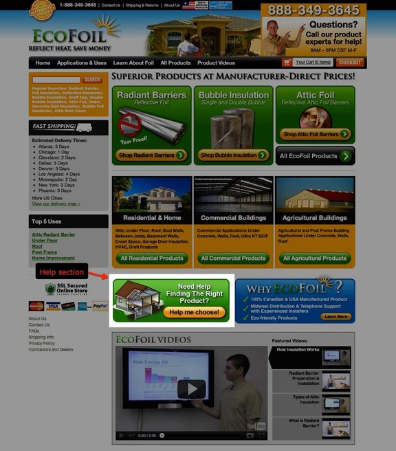
On its website home page, the Clickstop team has a Help section, which said Need Help Finding The Right Product? This section linked to a virtual map and that helped visitors figure out what product they needed, depending on which part of their home they were trying to insulate.
To ensure maximum benefit for most visitors, they used VWO to test different positions of this section on their home page.
Tests run
In the original design of their home page, the position of this Help section was below the fold where users had to scroll down to see it. Also, with another section adjacent to it, often it wasn’t noticeable.
Here’s how their home page looked:

Control (Help section center below the fold)
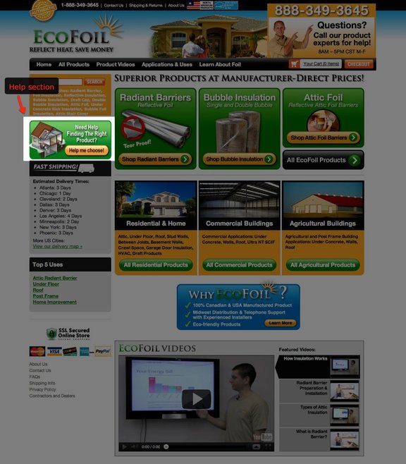
The team at Clickstop thought it would be better to put the Help section above the fold where even new visitors could see it without having to scroll down the page. So, they conducted an A/B test using VWO.
Here’s how the variation looked:

Variation (Help box moved to left sidebar, above the fold)
Conclusion
The team found that the variation indeed worked better. Much to their surprise, the variation with the Help section above the fold showed an improvement of 86% in purchases over the Control.
Needless to say, EcoFoil were excited about such an upswing in sales. Kendra Smith of EcoFoil also mentioned that VWO was crucial to help her confirm her hypothesis of increasing conversions by moving the help box above the fold on the webpage.

Location
Urbana, IA (US)
Industry
Manufacturing
Impact
86% increase in Purchases


