In the world of online business, making a connection with visitors is crucial. Imagine walking out of a store, and just as you’re leaving, a friendly salesperson offers you something special. In the digital realm, this is similar to what an exit pop-up does. It’s a clever little message that appears just as you’re about to leave a website.
Benefits of exit pop-ups
Recovering abandoned carts and missed opportunities:
Exit pop-ups might be lifelines for e-commerce sites. They restore abandoned shopping carts by encouraging consumers to complete transactions or by giving discounts to influence what they buy. It’s a final attempt to reach a customer who may never return.
Cultivating relationships:
Exit pop-ups can be customized to encourage newsletter sign-ups or social media follows. By doing so, they foster a sense of belonging and keep potential customers within your sphere of influence.
Data collection and customer insights:
These pop-ups serve as a valuable feedback mechanism. They can be employed to solicit opinions, conduct surveys, or gather user preferences, aiding businesses in refining their offerings.
Implementing exit pop-ups on the website
Picking the perfect moment:
The timing of an exit pop-up is crucial. Implement triggers based on user behavior, such as cursor movement or dwell time, to ensure they appear just as interest starts to fade.

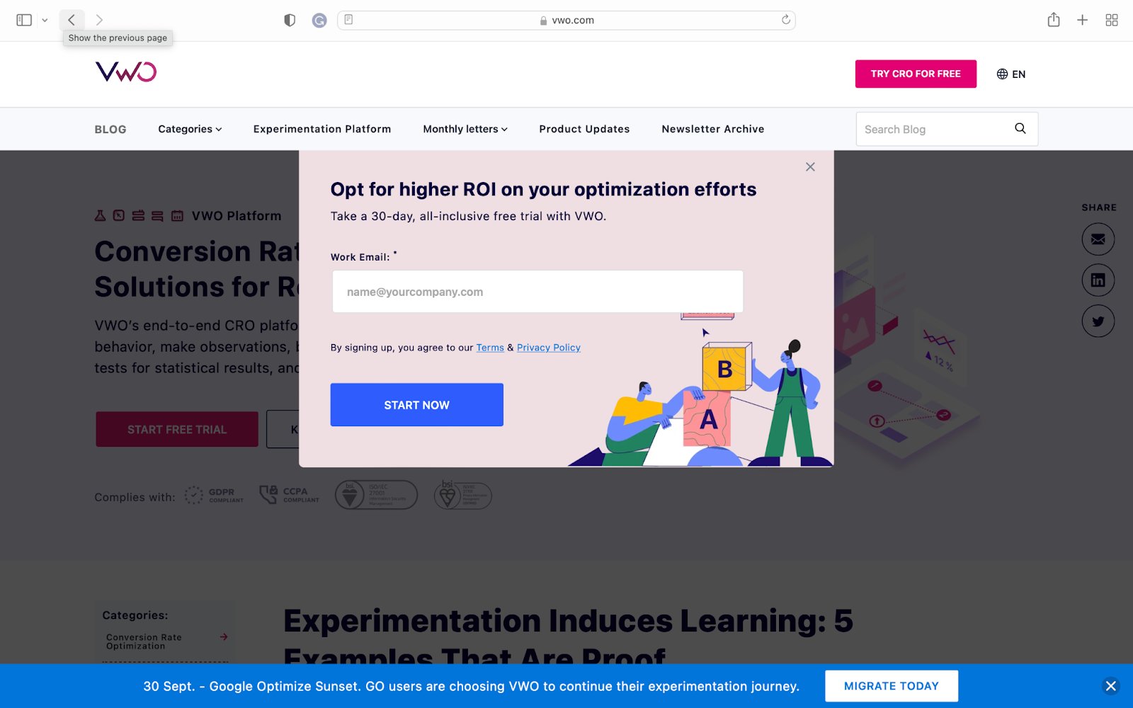
VWO’s exit-intent pop-up is a great example of effective lead generation. It offers a clear value proposition of optimizing ROI through a 30-day, all-inclusive free trial. The simple form and persuasive ‘Start Now’ button make sign-up easy for users.
Crafting convincing copy and design:
The message should be concise, persuasive, and visually appealing. It must resonate with the visitor’s needs or pain points, offering a clear value proposition.
A smooth user experience:
Ensure that the pop-up doesn’t obstruct navigation or hinder the user’s departure. It should be easy to dismiss, allowing users to proceed if they choose.
Offer incentives that resonate:
Tailor offers to match user intent. This could range from exclusive discounts, and free trials, to valuable content downloads. Personalization is key.

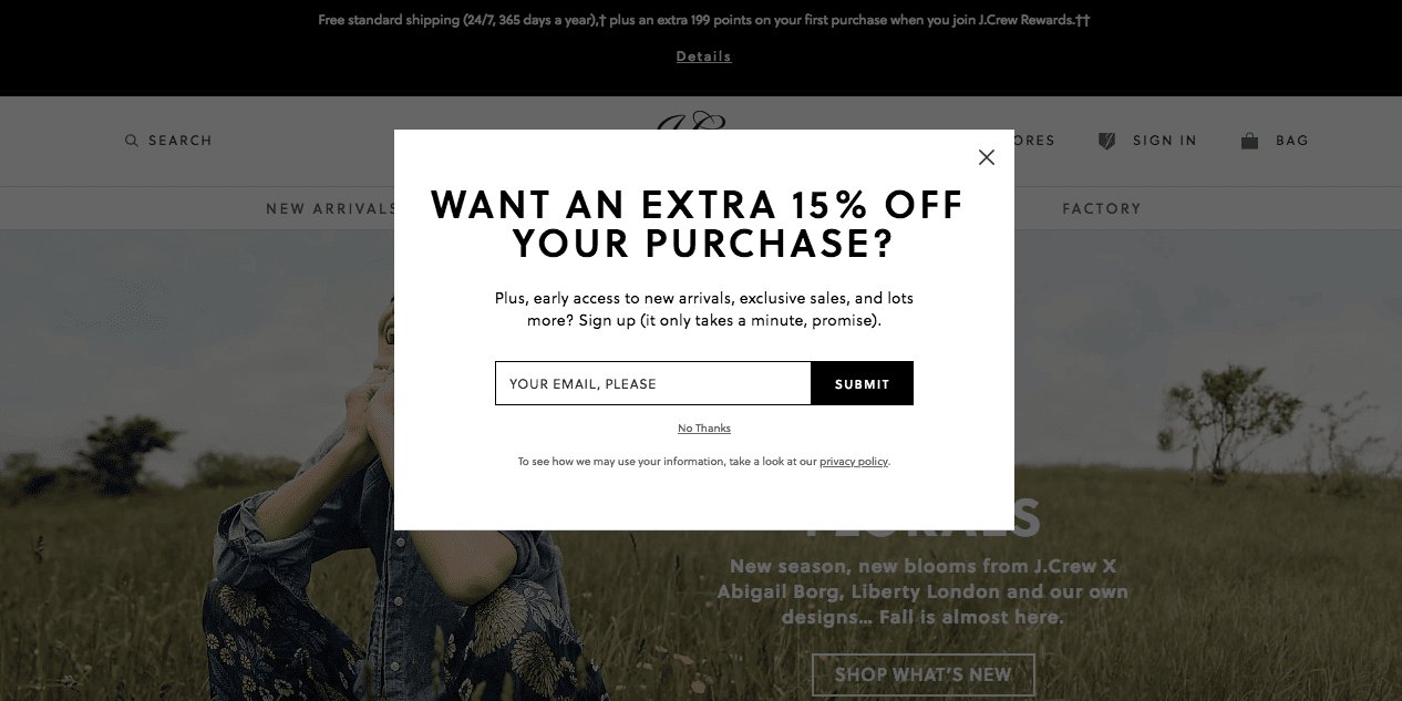
In this example, J. Crew does an excellent job! Just before you leave their website, they give you a 15% discount on your first purchase.
A/B testing and optimization:
Continuous refinement is vital. Conduct A/B tests to determine what resonates best with your audience, and iterate based on the insights garnered. To know more, take a free trial or request a demo.
Utilizing exit intent pop-ups on mobile sites
Utilizing exit intent pop-ups on mobile sites carries several important implications. Given that a significant portion of website traffic occurs on mobile devices, it’s essential to consider how this strategy can impact user experience and engagement:
- Use responsive design techniques to ensure the pop-up displays correctly on various mobile devices and screen sizes.
- Consider the timing of the pop-up trigger to maximize its effectiveness without causing frustration for users.
- Test the functionality on different mobile browsers to ensure compatibility.
- Ensure that the pop-up is easy to close on a mobile device, with a clearly visible close button or gesture.
- Optimize the content for mobile consumption, keeping it concise and visually appealing.
It is recommended to design distinct exit-intent pop-ups tailored for both desktop and mobile platforms. This approach ensures that you provide the optimal browsing experience for your audience, regardless of their chosen device.
Mistakes to avoid with exit pop-ups
Requesting excessive information
When a user is about to leave your website, bombarding them with a pop-up containing numerous form fields is counterproductive. They are already poised to exit, and this may hasten their departure.

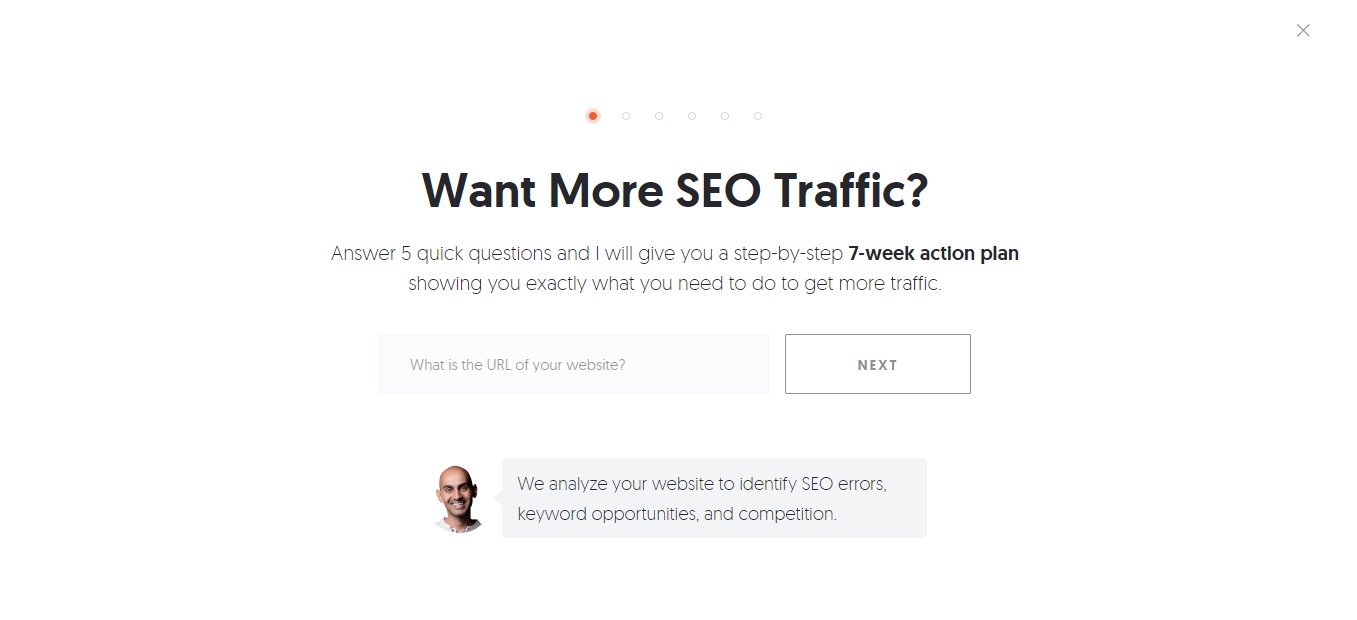
Neil Patel provides an example where he only asks for the website URL, keeping it simple and effective.
The purpose of an exit-intent pop-up is to engage and convert. Therefore, streamlining the conversion process (such as signing up) leads to better results.
Employing deceptive “X” buttons
While brands aim for successful outcomes with exit pop-ups, resorting to misguided tactics is not advisable. It’s crucial not to make it challenging for users to close the exit pop-up. The ‘x’ button should be easily visible and clickable. Both Google and users value a positive user experience.
Presenting irrelevant offers
When visitors navigate to specific pages, blog posts, or other content on your site, it’s vital to present an offer that aligns with their interests and intentions. This is particularly crucial if your goal is to convert visitors into subscribers. Tracking user behavior can help in delivering the right message at the right moment.
Conclusion
In conclusion, implementing exit pop-ups strategically can be a game-changer for online businesses seeking to forge meaningful connections with their visitors. Much like a friendly salesperson at a physical store, these clever messages provide a last-chance opportunity to re-engage departing users. They serve a multifaceted purpose, from recovering abandoned carts and collecting valuable customer insights to cultivating relationships and driving conversions.


