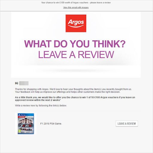
What is a call to action?
A call to action (CTA) is a written instruction in marketing campaigns that encourages or prompts website visitors to take the desired action. The action could be:
- Buying a product
- Subscribing to a newsletter
- Creating an account
- Requesting a quote
- Entering a contest
- Signing a petition
- Registering for a course
A call to action can take the form of a:
- Button
- Text hyperlink
- Pop-up box
- Banner
- Plain text without a link
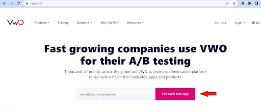
A CTA usually consists of two words, “Act Now” or “Buy Now” being some common examples. At times, it can be a sentence such as “Sign up today for weekly updates.” The possibilities are endless with the ultimate goal to motivate users to take the action.
Each CTA makes a point of letting visitors know that they can respond directly to a brand with a click, call, chat, reply, subscription, or purchase.
CTA in marketing
A call to action is an important tool for marketers in meeting their marketing goals. Some of the marketing goals include the below:
- Generating revenue for a brand or business
- Increasing brand awareness
- Spreading the brand message out in the market
When running a marketing campaign, the definition of success may include one of the following:
- Higher profits
- Subscriptions
- Social reach
- Sales leads
CTAs encourage visitors to perform conscious actions. With a good CTA, it is easy to quickly retrieve someone’s contact information and add it to the marketing funnel.
Benefits of call to action
A call to action acts as a signpost informing users what action to take next, without which they may struggle to see the way to buy a product or signup for a service. Placing simple, concise, and easy-to-read CTAs at relevant places on the website comes with multiple benefits for businesses. Some of them are below:
- Eliminates decision fatigue while providing a simple user journey
- Promotes deeper user engagement by directing them in the right direction – “Click here”
- Improves conversion rates
- Boosts lead enquires – “Free trial”
- Encourages visitors to purchase products or services while ‘Stocks Last’! – “Buy now”, “shop now”, “Get % off”, “Book now”
- Encourages customers to add products to the cart – “Add to cart”, “Buy now”
- Motivates learning about products or services – “Learn more”, “Discover”, “Explore”, “Enroll now”
- Promotes and shares brand awareness – “Like and share”, “Enter to win”
A simple button like “Download Report” is more than enough to guide a visitor to the next level.
Types of CTAs
Below are a few examples of the common CTAs used in marketing:
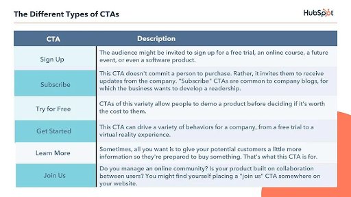
All the above-mentioned CTAs have a designated purpose, but the language can vary to give creative spins to generate leads.
Where to include a call to action
In any marketing campaign, CTAs can be used across properties accessed by the target audience. These include the following:
- Website: When users visit a website, it is a good practice to include CTAs in different sections like the homepage, giving visitors plenty of opportunities to click through and make a purchase. On a website, CTAs can appear at the following places:
- Constant headers
- Side panels
- Pop-ups, and slide-in content
- Product pages or checkout pages
- End of articles or landing pages
- Email campaign: Use mailing lists to send a large number of emails to subscribers. Place the CTAs in the body of the mail.
- Social media: Place sponsored ads on social media, such as Facebook, which has a “Learn more” button for companies to include with their CTAs.
- Google: It provides a click-to-call button for paid mobile advertisements which makes it convenient for the visitors to simply tap and connect with the advertiser.
Components of an effective call to action
As the users need a reason to act, the real trick to an effective call to action is not just to tell them what to do but why to do it. This means mastering the art of writing effective CTAs. Some tips to compose mindful CTAs are listed below.
- Use strong action words. Below are some common verbs categorized based on the purpose that can be paired with the offerings of a business:
| Most common purpose | CTAs |
| eCommerce | Buy, Shop, Order, Reserve, Save, Add to cart, View |
| Subscription | Join, Refer, Sign up, and Subscribe |
| Non-profit conversion | Donate, Give, Support, Adopt, Volunteer |
| Freebie giveaways | Grab, Claim, Download, Get |
| General | Learn more, See more, Find out, Check out, Click here, swipe up |
2. Create urgency – Take advantage of FOMO
3. Highlight the advantages to the user
4. Make sure the CTA fits with the brand’s DNA
5. Keep the CTA crisp, short and clear
6. CTA should guide the visitors exactly where it mentions
7. Make the CTA stand out from the rest of the content
8. Keep the tone enthusiastic and personal
9. Keep it device optimized
10. Avoid these mistakes
In the end, the best call-to-action content, and style mostly comes from A/B testing multiple designs and words. You can do so easily with VWO. Take an all-inclusive free trial to get started!
Some good-to-have CTAs on a website
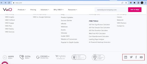
- Social media follow and share
- Subscribe
- Homepage callout
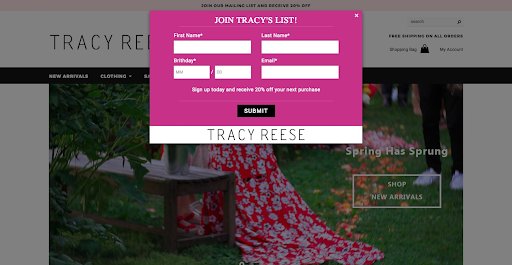
- Coupon code

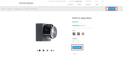
- Buy and Add to cart button
- Review and feedback
