Landing Page Testing: A Guide to Bring You to Speed
Landing pages are akin to elevator pitches.
A landing page, like an elevator pitch, gives a crisp introduction to your brand, the products or services you offer, and the problems that you solve. Landing pages like other web pages on your website have a common goal–to convert the visitor into a customer.
Just as a good elevator pitch takes multiple rounds of refinement, a landing page also benefits from continuous testing and optimization.
Download Free: Landing Page Optimization Guide
How to create a winning landing page testing strategy?
To begin with, it’s imperative to talk about the process of experimentation. Testing anything is typically better than testing nothing, but a structured program will bring predictability and long-term gains to landing page conversion rates, rather than ad-hoc wins here and there.
A comprehensive landing page testing strategy would look something like the one below, irrespective of what testing methodology, i.e., A/B, Multivariate, or Split, is used:
A set of data-driven hypotheses with clear prioritization – You can draw data-driven hypotheses by analyzing quantitative data such as website analytics and user behavior metrics, further supported by qualitative data like user feedback and usability testing. Based on the observations, you can clearly prioritize what hypothesis to create and how to rank them based on their perceived impact to drive positive results.
Well-defined and important measurable conversion goals – You must have a goal in mind that you want to achieve for your business by conducting a test. Specify that after you’ve formulated a hypothesis. Do you hypothesize that adding social proof showing product pages will improve transactions? You can set two goals – click on the add-to-cart button and total transactions. A higher conversion rate on your goal will tell you that your testing was on point.
Proper landing page testing tools with a variety of testing options – It’s a must to choose a tool that helps you conduct the desired type of testing. Go for a tool like VWO that supports all forms of testing – A/B testing, Split URL testing, and MVT. This way you can switch between different types of methods based on the requirements of a particular test.
Calculate the time and traffic required to run the landing page tests – Use A/B Split & Multivariate Test Duration Calculator by VWO to determine the required testing duration and number of daily visitors for accurate test results.
Create variations of different test elements and deploy tests – After completing a test, dedicate some time to interpret the results by analyzing the performance of every variation. Remember, sometimes, the results can be inconclusive or need further examination. To gain deeper insights, you can use qualitative tools like heatmaps, session recordings, and form analytics. On VWO, you can segment your test results based on different parameters and discover the deepest implications of your test results.
Document learnings from the tests – Documenting learnings from a particular test helps you refer to it when conducting the next tests. Moreover, you may have interesting observations from a lost test. A lost hypothesis might not show the desired outcome, but when you drill down the reports, you may see it performed well for specific segments. Jot such observations down to inform the future course of your experimentation program. A tool with project management capabilities allows you to document these learnings and even share them among team members.
Mature experimentation teams thoroughly analyze their test results across multiple segments to uncover instances where the losing variation outperforms the winner to extract more juice out of their testing and increase conversions.
Now that you know how to test landing pages, let’s get into some depth and analyze how landing page optimization can help you achieve your focussed conversion goals.
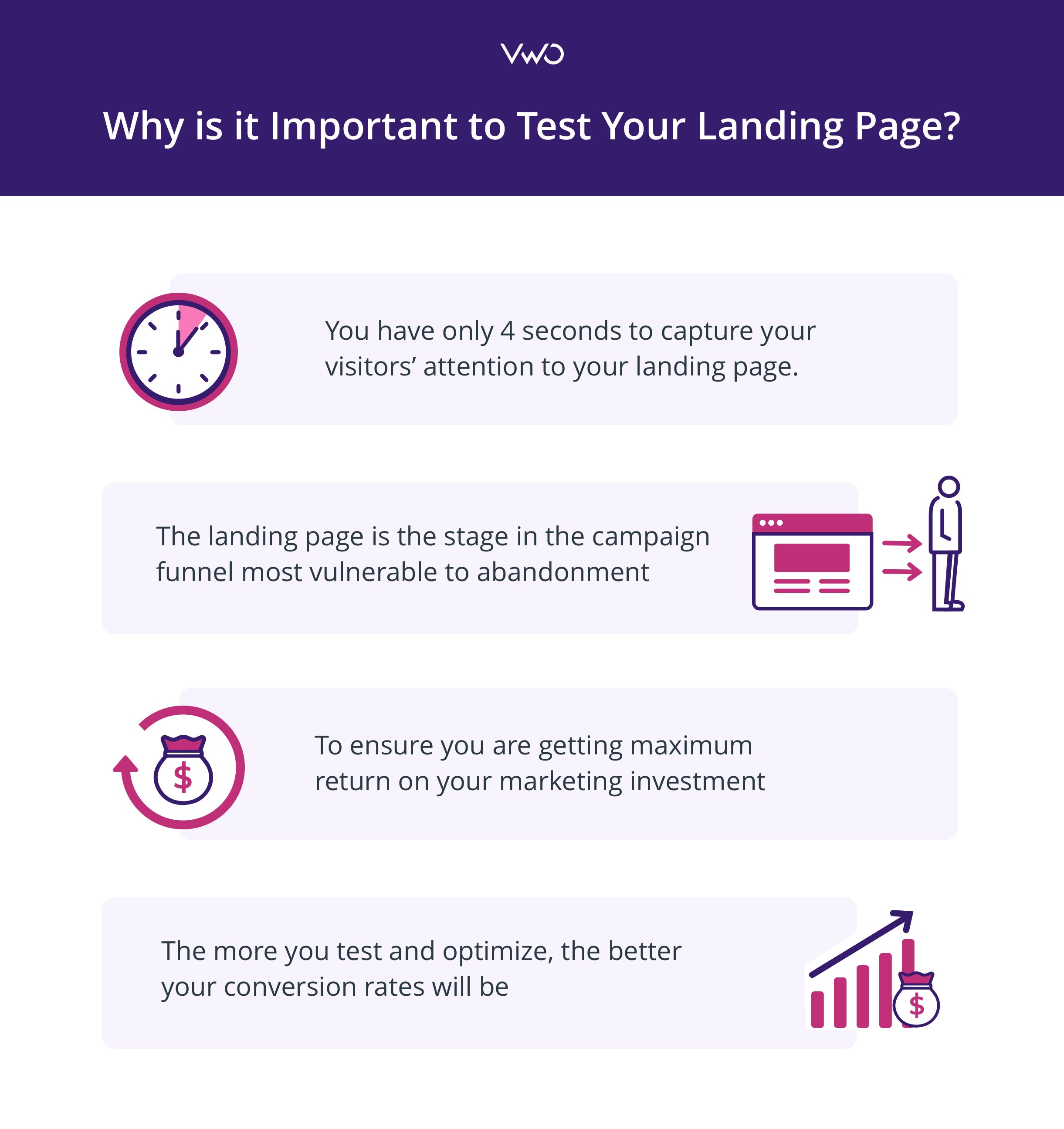
Why is it important to test your landing page?
- Optimizing for conversions – By systematically testing and optimizing different components of your landing page, like headlines, layouts, copy, CTA buttons, and images, you can identify the most effective combination that leads to a higher conversion rate.
- Improving user experiences – Analyzing test results will help you understand user behavior on your landing page and make data-driven implementations to further improve their experiences. This way you can identify and fix friction points that may be hindering conversions.
- Increasing ROI: If you have set a landing page as a part of your larger paid ad campaigns, landing page testing should be able to help improve ROI of your marketing campaigns by catering to what audiences have been looking for. A well-optimized landing page increases the chance of visitors to take the desired action that ultimately leads to campaign effectiveness and a higher ROI.
Types of landing page testing
A/B testing
A/B testing (also known as Split testing) for landing pages is the most straightforward and most robust approach to compare two versions of a landing page. The changes between the two variants could be small (incremental) or big (radical) depending on the goals of the test. Landing page A/B testing helps to zero in on elements and changes that impact a user’s behavior and continuously iterate towards the most effective version of the landing page.
As an example, a common use case for A/B Testing on landing pages is to swap web forms with chatbots. Most web forms are just repackaged versions of old paper forms. New age businesses are continually experimenting with chatbots to replace web forms to determine which among the two help increase conversion rates.
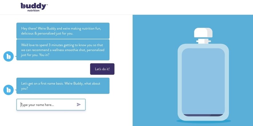
Image source: Landbot
Multivariate testing
Multivariate Testing (MVT) builds on the core mechanism of A/B testing to test for a higher number of variables on a page, in contrast to A/B testing on landing pages. As testing for multiple variations requires more traffic to reach statistical significance, multivariate tests are recommended for websites with high traffic.
Multivariate testing is a powerful weapon for landing pages that are seen by the maximum visitors on your website, such as those coming from search engines. Testing multiple elements such as hero image, headline, and website copy simultaneously becomes a child’s play with multivariate testing, as you don’t have to create separate versions of the same webpage for all possible combinations. Also, you can expedite the landing page testing process.
Hyundai used MVT to achieve a 208% increase in the CTR from the landing page for one of their cars. Since Hyundai’s car landing pages had a lot of different elements (car headline, car visuals, description, testimonials, and others), a multivariate testing helped understand which elements influenced a visitor’s decision to request a test drive or download a brochure.
Watch this webinar to learn how to analyze and test for improving your landing page performance.
Landing page testing in CMS
WordPress
Use this WordPress plugin from VWO to test single elements on your landing pages or run landing page split testing. You can customize templates, track conversion rates, view session recordings, and heatmaps or even run multivariate tests in case you want to test several elements at once.
Hubspot
Hubspot has an integrated Content Management System (CMS) and Marketing Hub that manages all of your content in one place and supports landing page A/B testing.

Analyze your landing page
For marketers, poor conversions on a well-thought and designed landing page are nothing but nightmarish. As a result of your involuntary reflexes, you pull your socks up and start swapping the images, improvising the page design, changing the color of the CTA button, and finally running an A/B test to see the results! But to your dismay, it does not impact your bottom line either.
Well, it is time to ditch your guesswork out of your conversion rate optimization program and get in the shoes of your prospects and customers to gather the essential insights. You will find all your answers there.

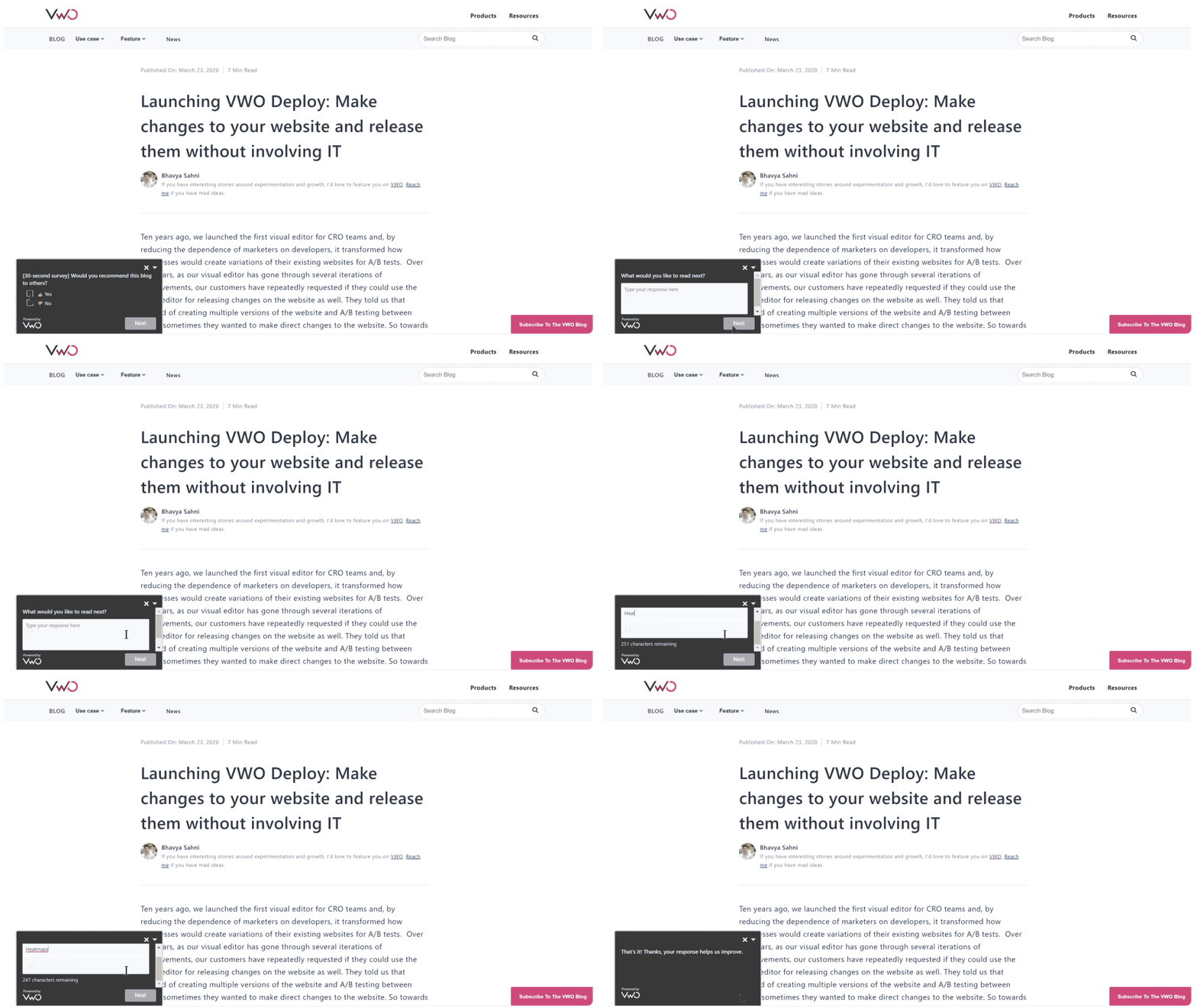
Survey
A web survey allows you to understand your target audience and their motivations and desires easily. Understanding your audience’s motivations and desires can be great fodder for a thorough testing and optimization process. The first rule of surveys is to understand that you’re asking for a favor. To maximize the number of responses from surveys but you can use these tricks:
- Reward or incentivize your audience: This might be something as simple as a free ebook or a gift voucher.
- Respect your prospect’s time: Ask relevant questions to your customers that you know you’re going to use. For example, you don’t have to ask them their age, gender, or location, if you do not need that information. Keep the flow streamlined.
- Ask open-ended questions: Allow yourself to be surprised by asking open-ended questions like, “What is that one big challenge you are facing in your marketing campaigns?” You may uncover pain points you didn’t know your target audience has.
Heatmaps
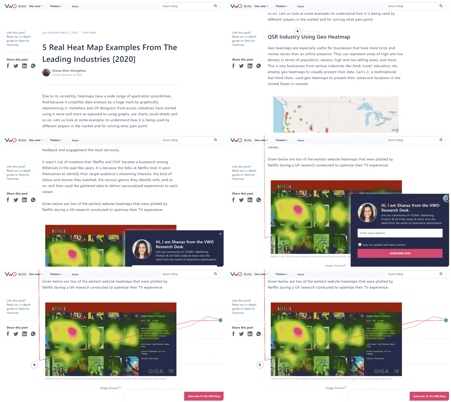
When it comes to user behavior analysis in the world of online businesses, website heatmaps are a polar tool to visualize and understand visitor behavior data. You can utilize heat maps to identify the best-performing sections of your landing pages as per their visitor interaction, and the sections that are performing sub-par and require to be changed.
Consider asking yourself the questions below to get the maximum insights out of your heatmap data and get to work:
- Are the visitors looking at the important elements on the landing page, such as headline, unique value proposition, benefits, and CTA?
- Are the visitors distracted by page elements that don’t push them towards the conversion funnel?
- Is your visitors’ attention straying as they’re not being provided with the information at the right place to complete the conversion?
Session recordings
Session recordings help you see how visitors on your website navigate through your landing page. These recordings capture clicks, taps, mouse movement, and scrolling across multiple pages on desktop and mobile devices.
Analyzing session recordings helps you to empathize with your customers. It places you in the customer’s shoes as (s)he traverses your landing page and enables you to identify and mend gaps in your customer journey, to achieve a higher percentage of successful sessions.
Form analytics
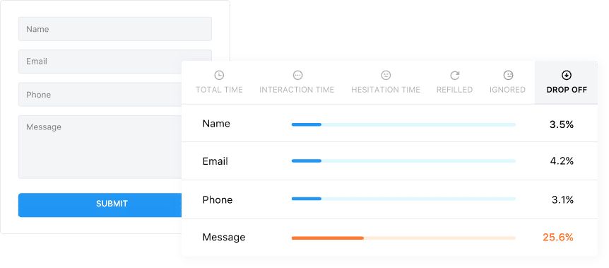
Forms are one of the most important if not the most important element of a landing page. Longer forms typically have higher bounce rates than shorter forms, but shortening forms isn’t enough. You need to realize what in your form is putting off your users.
Why are the users struggling to complete the form and hence impacting the conversion on your landing page? You can gather these insights using Form Analytics, which enables you to measure the visitors’ behavior on a web form such as interaction time, hesitation time, abandonment rate, etc.
Top 6 popular landing page testing software
Before zeroing on the software for testing your landing pages, ensure that you can easily set up your tests without a need for a developer to do the job. You must pick the one that has a Visual Editor to make changes quickly, if and when required. Also, it should be well-equipped with a variety of quality templates that can be amended and be suitable for the scale of business and sector, for example, field-level data collection options, layout, and style.
Having an integrated CMS and CRM in the software, along with account management that can be used by multiple users, will take you a long way in your testing experience journey.
VWO
VWO is an all-in-one experience optimization platform that enables users to improve key business metrics by empowering them to easily discover visitor behavior, insights, test ideas, and engagement across their entire journey. With VWO, you don’t need a separate landing page checker or analysis tool. You can analyze user behavior on the page and find where they click the most, where they drop off, and even run surveys to get their feedback. You can form hypotheses and test them using insights drawn from behavioral analysis. Be it split testing, A/B testing, or MVT, VWO lets you test your landing page using all of these methods.
Start your free trial on VWO and conduct an unlimited number of landing page tests in addition to availing tools that can be utilized for analyzing visitor data, understanding user behavior, and thus creating a repeatable and data-driven process for improving your website conversion.
Optimizely
Optimizely is one of the user-friendly landing page testing tools that helps improve user experiences. The platform comes with a landing page builder that lets you make changes to your page without having to code at all. You can also obtain statistically significant results and identify which version of your landing page is resulting in a higher conversion rate. If you want to compare two pages, Optimizely’s Redirect feature allows you to test the two URLs against each other.
Unbounce
Unbounce is a user-friendly software platform that helps businesses build, optimize, and analyze landing pages on their website. You need no technical skills to use this landing page testing tool, as a drag-and-drop visual editor comes in handy for an easy test setup. Apart from offering A/B testing on landing pages, Unbounce offers real-time data analytics and integration with third-party tools like CRM and email marketing services.
InstaPage
InstaPage is not only a landing page creation platform, but it also offers landing page A/B testing with real-time analytics. It provides valuable insights into visitor behavior through heat maps, mouse movements, and scroll depth on your website. As one of the leading landing page testing tools, InstaPage also allows server-side testing without affecting user experiences. One of its features to generate content with AI saves time and spurs creativity.
LeadPages
LeadPages stands out for its user-friendly interface and extensive collection of pre-designed templates. Users can easily create landing pages using the drag-and-drop builder without the need to write any code. It also allows easy customization and arrangement of page elements. LeadPages uses AI-powered templates, providing users with intelligent design suggestions based on their specific needs. You can also refer to its vast content library to access a wide range of images, videos, and other media to enhance your landing pages.
Google Optimize
Google has announced the sunset of Google Optimize and Google Optimize 360. Move to VWO with just one click.
Google Optimize is a free tool created by Google for conversion rate testing. This tool comes with integrated Analytics and Tag Manager. It strongly relies on the goals and audience that you set in Google Analytics to give you precise results. Compared with VWO, it does not offer tools such as session recordings, heatmaps, and surveys that can help you perform a landing page analysis based on user behavior on your website.
Download Free: Landing Page Optimization Guide
Landing page testing across channels
It is important to keep in mind that testing landing pages across channels has a different set of heuristics and mental models behind conversion rate optimization. Writing about these differences warrants a dedicated article, but I’d like to help you with brief pointers:
Landing page testing for Google Adwords:
By its design, Google Adwords is keyword-centric, and keywords are further classified by intent – informational, navigational, or transactional.
Testing landing pages for an Adwords campaign entails optimizing for intent more than other variables. Teams should look to identify and categorize all information that supplements the intent and work towards offering it with credible UI and UX for better conversions.
The theoretical principles behind testing for Adwords still remain the same—A/B tests still run the same way, and landing page split testing serves the same purpose. Nothing changes other than the philosophy of optimizing for keyword intent.
Landing page testing for Facebook:
Facebook, unlike Google, is geared for engagement dopamine. Users still use its search functionality but it’s not the go-to function for the social network. Successful Facebook advertisers need to execute two things well:
- Ensure that the ad creative grabs eyeballs in a feed replete with cat videos, memes, and threads smacking of political jibes.
- Ensure that the page they land on is a better experience than going back to Facebook (I know it is more complicated than that, but abstraction is key.)
Optimizing for landing pages meant for Facebook advertising is more complex than Google (because of dealing with cold traffic without intent). Still, there are a few proven ways to go about it:
Visually bold pages:
- Grabbing attention off Facebook can happen because of many reasons, but if there is an underlying theme to driving clicks your way, it is this — Facebook is a visual medium and you ought to have visual flair to your creatives. And since marketers should maintain ad scent, landing pages need to be visual too. Go for bright colors that stand in contrast to Facebook’s white and blue.
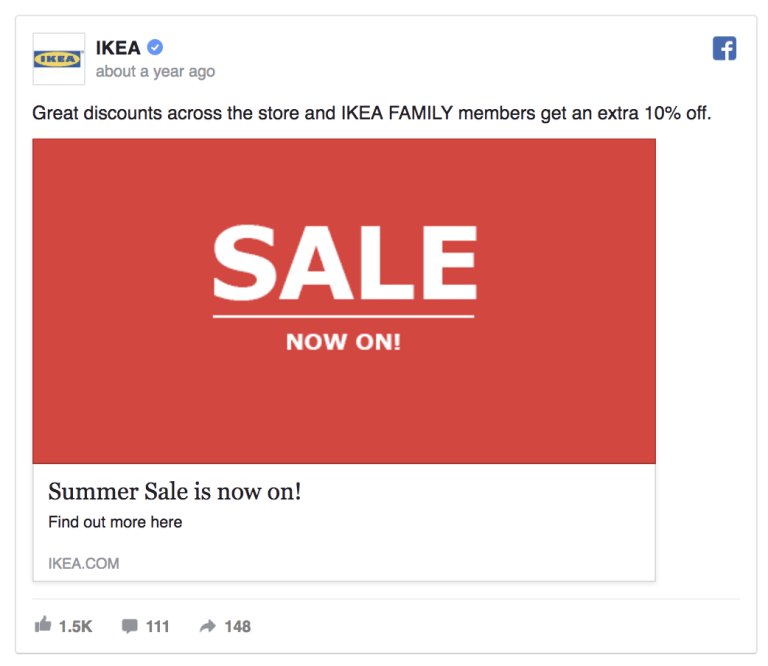
This ad by IKEA not only strikes minimalism but stands out because of the bright contrasting red and white color used with a straightforward, actionable ad copy.
Video-centric:
- With 4 billion daily views, video consumption over Facebook is taking off. Ensure that both your creative and landing pages feature videos so that you can maintain ad scent and grab attention.
9 most effective landing page testing ideas you must try
To create seamless user experiences, you must create landing page testing ideas centered around the elements that users engage with the most:
- Headline of the page:
Is your landing page heading clear and relevant to your users? It’s important to ensure that it informs your users and motivates them to take action. Run a landing page experiment where you tweak the title length, wording choices, and highlight the primary benefit visitors will receive from your offers. And see if these changes can help improve your conversions.
- Sales copy:
Just like the headline, the body copy of your landing page plays a vital role in clearly showing visitors the value they’ll get from your product or service. Highlight your unique selling proposition subtly and tie it to how it benefits audiences. For example, you can test and see if a quick explanation of your offers/combos above the fold (i.e., visible without the average user having to scroll down) can lead to a higher conversion rate.
- Pricing strategies:
The way you show your prices can have a big impact whether people decide to buy from you. Many brands have long been using a psychological principle called charm pricing, where they set a price like $499 instead of $500. It may seem like a small difference, but it can make customers feel like they’re getting a better deal. It’s worth trying out this strategy and seeing if it improves conversions.
- Call to action buttons:
When you test different versions of your CTA button, you can figure out which design, color, size, or text works best to catch visitors’ eyes and inspire them to click. Let’s say you have a CTA that says “Download our eBook”. That might not be as exciting as a CTA that says “Get your free eBook copy now!” The second option is more action-packed and tells visitors what they’ll receive when they click the button.
- Landing page image and video:
Test relevant images and videos to see what captures visitors’ attention and nudge them toward the conversion. You can try different types of images such as lifestyle imagery, illustrations, and product photos and experiment with different sizes and placements. Try different video lengths, styles, and narratives to see what creates the most persuasive experience for your visitors.
- Text font and style:
You might have written an amazing landing page copy with all the benefits and features clearly explained. However, all that effort can go to waste if the font size is too tiny and makes it hard for people to read. It’s important to ensure that the font size is just right, so your message can be easily understood by your visitors.
- Page layout and design:
You can try split URL testing on two pages with different page designs and layouts. It will help you understand which visual hierarchy affects what visitors notice first, how easy it is to read and navigate, and their overall experience on the page. Keep an eye on the design because it helps you find a look that matches your brand and appeals to your target audiences.
- Form:
You want to make sure the form on your landing page is not too long and overwhelming, but still collect the important information you need. That’s why it’s a good idea to analyze how well your current form is performing. You can try testing a shorter form with fewer fields to see if that boosts your conversions. Further, inline validation is a must to help users ensure that the information they enter is right and if it needs correction.
Optimizing your landing page for mobile means adjusting the layout, font sizes, and interactive elements to fit smaller screens, making it easier for visitors to navigate, read content, and interact with CTA buttons. You can also fix mobile-specific issues like loading speed. Mobile users expect fast loading times, so optimizing for quick loading will help minimize the risk of visitors leaving due to slow loading times.
Commonly tested landing page KPIs and metrics
There are a ton of metrics that landing pages should be optimized for. Writing for these metrics in details warrants a unique article, but I’d like to mention a few metrics that can serve as a starting point for you:
Average time on page:
- Though average time spent on a landing page is not a leading indicator to optimize for conversions, there is a significant bearing of time spent on conversions. For example, if you observe that average time spent on your page is less than 5 seconds, the immediate conclusion is that the page needs an overhaul around many factors – maybe its UI does not inspire trust or the messaging is awry. There are many ways to identify the missing pieces but the overarching theme is this – time-on-page is a proxy of willingness to convert and should be a key metric to look at.
Bounce rate:
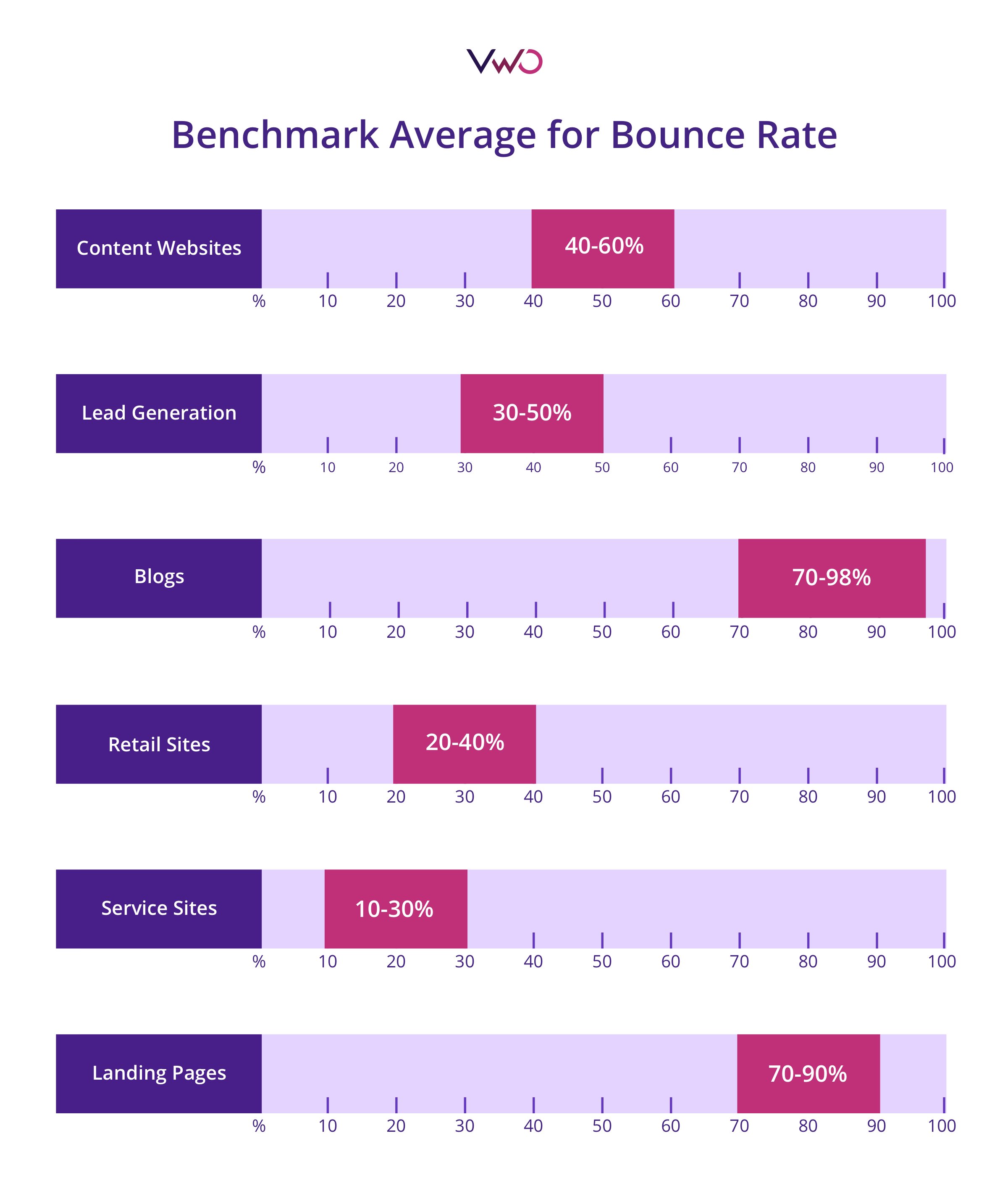
- With the proliferation of sophisticated metrics and dimensions to analyze, most old school metrics have faded away. Bounce rate, however, is still one of the oldest metrics that is still tracked fervently and has managed to stay relevant. A high bounce rate is an immediate worrying factor. Like low time on page, high bounce rates might have varying reasons (bad UI, missing information, uninspiring copy, no ad scent), and optimizers should keenly identify them. The following graphic from Instapage has some benchmark bounce rates for you to compare against:
Form abandonment rate:
- Almost all landing pages have a conversion zone for it. In most cases, it is a form that visitors are expected to fill. For eCommerce sites, it is an order placement form, while for B2B websites, it serves as a lead generation form.
- Content websites might startle you with a form to capture emails for notifying you when they publish new content. Whatever be the intent of the landing page, forms are a common binding thread. Optimizers should look to constantly evaluate their form friction areas and fix for more conversions.
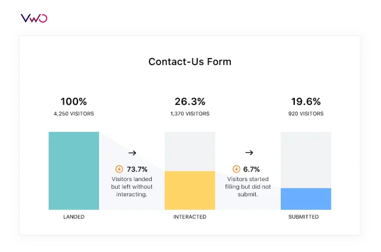
A typical form funnel analytics dashboard
Mistakes to avoid while testing your landing page:
A poorly written or poorly designed landing page can cost you conversions. As much as it is important to follow landing page testing best practices, it is equally crucial to steer clear of common mistakes. To ensure you create a landing page that converts, avoid the following:
- Sending traffic from an ad to your homepage.
Sending traffic from an ad directly to your homepage may not be ideal because the homepage is designed to cater to a wide range of visitors. On the other hand, by sending traffic to a landing page, you can provide visitors with the information they expect based on the ad they clicked. It reduces any sort of confusion and enhances the chances of conversion.
- Keeping the navigation menu
Remember, a landing page should have a specific objective, such as promoting a product, collecting leads, or driving conversions, thereby nudging visitors toward taking a particular action. Including a navigation menu can distract visitors and divert their attention away from the primary message and the call to action button. Similarly, avoid keeping any links (to subscribe or download) that do not pertain to the objective of the landing page.
- Keeping irrelevant pictures or images that don’t relate to the offer
Avoid adding any unrelated visual elements to your landing page. Including irrelevant images or videos can confuse visitors and make them question the purpose of those elements. Stick to visuals that directly enhance the message of your landing page.
- Hard-to-read text
Difficult-to-read text on a landing page can turn visitors away. Say no to unnecessary fancy language and jargon! Instead, break down information into smaller sections for easy understanding. Add white space, images, and other visual elements to give readers a breather and keep them engaged.
- Keeping lengthy forms with unnecessary fields, such as “title” or “fax”
When audiences visit your landing page, they are looking for relevant information and want things quick and easy. Avoid overwhelming them with a lengthy form with unnecessary fields. For example, if all you need is their working email address to subscribe, don’t make them enter their email too. By keeping things simple, you can save their time and make the conversion process smooth.
- Making visitors click to visit another page
Scrolling is better than clicking to another page; therefore, in case of space crunch, let the user scroll down and process your content.
How different brands improved conversions on landing pages using VWO
Penn Foster registered a 202% increase in conversions by providing only relevant information
Penn Foster, a for-profit online college in Scranton, wondered how to reverse the low results they were getting from their paid advertising efforts. They decided to create a new landing page that focused on providing relevant information and specific call to action buttons. They believed that this approach would not only increase conversions but also enhance the long-term value of their enrolled leads. The test showed a 202% increase in click-to-lead conversions and a noticeable rise in the click-to-enrollment rate as well.
Pluimen.nl increased revenue by 19% by reducing distractions on their landing page
Pluimen.nl is a Dutch company offering gift vouchers, which are redeemable in exchange for services like sauna visits, paintball games, dining, and more. They wanted to increase conversions and revenue on their landing page. Thus, they believed reducing distractions by minimizing the number of CTAs and links would improve engagement and lower the bounce rate. To test this, a new landing page was created with only one CTA and fewer links. The results showed an 8.5% decrease in bounce rates and a 19% increase in revenue.
Imsider increased form submissions by 10% by tweaking the landing page headline
Imsider.ru, a Russian company that helps new ventures establish their online stores, wanted to increase the number of leads generated through completed forms. They had a landing page featuring a contact form for visitors to fill out and subscribe to a mailing list. Those who submitted the form would receive a link to download a free eBook on opening an e-store. However, the number of subscribers was relatively low. They expected that changing the headline to something more catchy would improve form submissions. And it worked! The variation increased form submissions by 10%.
Conclusion
Remember that optimization is an iterative process. Frequently testing your landing page elements will surely improve your bottom line and give you a competitive edge over others in the industry. Not only will you have a lot of data to back up your decisions post the testing process, but you will be surprised to see the revelations these results would present to you. Test to find out.
Frequently asked questions
What is a landing page experiment?
A landing page experiment is nothing but testing different elements on a landing page or testing two separate landing pages and identifying which version drives more conversions. When you test two versions of the same element on a landing page, you run A/B tests. On the other hand, when you test multiple elements in various combinations on a page, you opt for multivariate testing. Now let’s say you want to test two versions of a landing page. In this case, you can try landing page split testing. Based on the conversion results, you decide which version to implement for a better user experience.
Planning a landing page strategy comprises the following steps:
Set a goal: Clearly state the goal of your A/B test. Why are you running landing page tests? Is it to improve click-through rates, form submissions, revenue, average order value, or any other specific metric.
Formulate a hypothesis: Outline what changes you want to make that you believe will help you achieve the goal of your test. Make sure the hypothesis is drawn from user behavioral insights. This way you can solve problems users face and improve their experiences on your landing page.
Create variations: Have your design team develop the new version of the element or page you want to test against the control or original version.
Decide testing duration: To achieve statistically significant results, you can decide the testing duration based on a number of parameters. Find the calculator here.
Analyze results: Once you have gathered enough data, analyze the performance of each variation. Compare the metrics of the different versions to determine which one performed better in achieving your goal.
If you want to know how to A/B test landing pages on VWO, here’s a quick guide for you.
Simply put, there are two methods to follow for landing page analysis. First, you can refer to quantitative tools like Google Analytics to track the performance of metrics such as conversion rate, page views, average session duration, bounce rate, and traffic sources. This data gives you an idea of how your landing page is performing in terms of numbers. Second, you can use qualitative methods like heatmaps, scrollmaps, and funnel analysis to understand how users are exactly behaving on a page. One of the landing page testing best practices is to club insights obtained from both of these methods. This way you can correctly assess the current performance of your page and formulate testing hypotheses based on them.
To test two separate landing pages, you can go for the split testing method. Split testing involves testing multiple variations simultaneously to identify the best combination of elements. For example, you might test different combinations of headlines, call to action buttons, images, copy, and layouts across multiple variations to determine the best overall performing landing page. But beware split testing requires a significant amount of traffic to each variation to obtain statistically significant results. If your website has low traffic volume, it may take longer to gather enough data for meaningful conclusions with this method.
A landing page is meant for users to take action – be it signing up for a free trial, purchasing a product, subscribing to your newsletter, and so on. So, tracking the right conversion metric that quantifies the desired action is important to measure your landing page performance. For example, form submissions for a free trial, transactions from product sales, or the number of eBook subscribers can be your metrics based on what you want users to do on your page.
If you have a single landing page receiving traffic from ads running on different platforms, you may also want to track sessions by the source to understand the behavior of audiences based on their sources. If you see leads from Facebook are not converting, you can strategize some other ways to retarget these leads or rethink your overall Facebook promotional strategy. Also, watch out for a high bounce rate, as this can mean the landing page doesn’t serve the purpose it claimed in the ad copy.
Test elements that will have the most impact on user experiences and play a direct role in improving conversions on your landing page. Starting from the headline and copy to images, CTA buttons, or social proof – you can test and optimize any element that users interact with to decide whether to transact with your brand or not.
Landing page testing can help you optimize various elements like headlines, copy, design, and CTAs for improved conversions. Continuous optimization removes friction that prevents audiences from converting and improving their experiences to take the desired action. Testing also boosts the ROI of your marketing campaigns by catering to what audiences look for and helping them solve their challenges.


![How to Build High-Converting Landing Pages [With Examples]](jpg/feature-image_how-to-build-high-converting-landing-pagesa8d0.jpg?tr=h-600)
