12 Conversion Optimization Tricks That Boost Cart Abandonment Results
Note: This is a guest article written by Brett Thoreson , the CEO at CartStack. Any and all opinions expressed in the post are Brett’s.
When selling online, cart abandonment is a fact of ecommerce life. Humans have a limited attention span (just 8 seconds long), as we are filled with deliberation, choices, distractions, and doubts. However, there are lots of tools out there to help you minimize cart abandonment, but we can’t eradicate it completely.
Download Free: Cart Abandonment Guide
However, all is not lost. Customers who have abandoned their carts can still be reengaged. And we’re here to help you with top conversion rate optimization tips that will turn those faltering customers into paying ones.
The Basics
Cart abandonment is when someone visits your website, adds items to their baskets, but for one reason or another, fails to finalize the purchase and leaves the transaction incomplete.
Conversion rate optimization (CRO) is a set of practices that helps you to convert visitors into paying customers and avoid, or turn around, cart abandonment.
Two impactful CRO practices that help with cart abandonment avoidance are:
- Cart abandonment software: Software that tracks a visitor’s journey on your website to: capture emails and track shoppers while they are on your site, watch for them to abandon a cart, and email them following their abandonment, enticing them back.
- A/B split testing: Running two versions of your website or page that are identical in intent (such as the checkout page) but different in style, allowing you to compare and contrast conversion rates between the two.
Power of Cart Abandonment Software and A/B Testing on Customer Conversions
Alone, these tools are impactful but together they can work in conjunction to produce much powerful results that will make your conversion rates soar and here’s how:
Cart abandonment software relies on shoppers (website visitors) entering their email addresses on your website form, while A/B testing provides you with the insight to optimize your website to ensure that shoppers (website visitors) input their email addresses.
Simply put, A/B testing converts visitors into leads and cart abandonment software converts leads into paying customers.
How to Use A/B Testing and Cart Abandonment Software to Get Email Addresses
There are lot of CRO tips for use when you are A/B testing to see what changes result in increased email conversions. We’ve put together our favorite tips here:
Where
Where you ask people for their email address, is hugely important and impactful. You can have a banner asking people to sign up. It can be part of a registration form, or you can use your cart abandonment software to produce exit intent pop-ups (displayed when visitors look as if they are about to leave). It is estimated that 35% of lost shoppers can be saved by using exit intent pop-ups, but test this for yourself to see if this is true for your customers.
Opt-In Changes
- Location
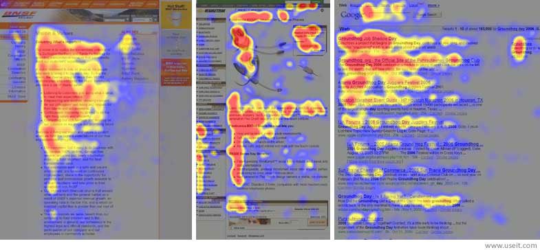
Visual tracking research shows that we browse websites following an F-shaped pattern, favoring the top and left-hand sides. Test your email address opt-ins at both these instances to see which captures more attention.
- Color and Font
Choosing the right color and font optimization for your call-to-action button is imperative. We’ll discuss color in a little more detail below. Testing background colors and contrasting text that can make your banner stand out, easy to read, and compelling to complete is a significant use of split testing.
- Lead Magnets
Lead magnets offer your customers something valuable in exchange of their email addresses. It can be a downloadable guide on this season’s fashions or a report on the top-rated headphones of the year. Test whether lead magnets work or not; and if they do, test many types. Opt-ins of this nature can see up to a 10% conversion rate.

Form-Based Changes
- Page Layout
As mentioned earlier, humans are easily distracted not only by outside sources but also by items on your website. For a particular VWO customer, removing the navigation menu resulted in a 100% increase in conversions. Try removing your navigation menu from the form page, to reduce distraction, and removing the option to leave the form, and see if these increase your conversions.
- Form Layout
Over 70% of online shoppers abandon their cart halfway through the checkout process, meaning that they are also halfway through filling out your form. Some cart abandonment software applications capture email addresses in real-time, even if the visitor doesn’t hit Submit. Therefore, test moving the email address field higher up on your shopping cart and checkout pages, to capture the email address before the visitors abandon the page so that you can send them a follow-up email reminder.
- Copy
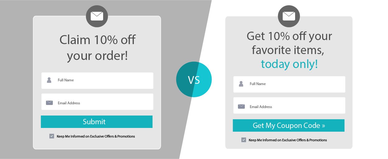
Words are powerful and emotive: They can make people comply, offer, or turn away. Consider how you are asking for shopper’s email addresses and then test different methods, such as explaining why, using personable language, emotive words, or by using less number of words.
- Field Population
Do visitors respond better to form fields that are pre-populated with example text (such as [email protected]), blank fields, or fields compatible with Google Autocomplete. Understanding what makes your form easiest to complete should help enable you to tailor it accordingly.
Exit Intent Pop-Up Changes
- Color
A pop-up needs to grab visitor attention, and the best way to do this is with color. Split test different colors that contrast with your website brand colors and “pop out.” You may also want take into account well-known color connotations, which differ across countries, cultures, and genders, such as:
Blue: Security
Purple: Luxury
Red: Urgency
Yellow: Caution
While you can’t adapt your website for everyone, you can adapt it to your customer base by seeing what works best for them.
Download Free: Cart Abandonment Guide
- Offers
A great A/B testing idea can be of using different offers to see which offers appeal to your customers more. Research shows trends such as 90% of online shoppers being influenced by the cost of delivery and discount days such as Black Friday, leading to billions of dollars worth of online sales. Test percentage discounts, free delivery, and money off to see what works best for your target audience.
- Wording
Your exit intent pop-up wording is crucial. When issuing a pop-up window, you are walking a fine line between frustrating and enticing your customer. If you are interrupting them, test your wording to make sure it demonstrates a good reason.
- Fields
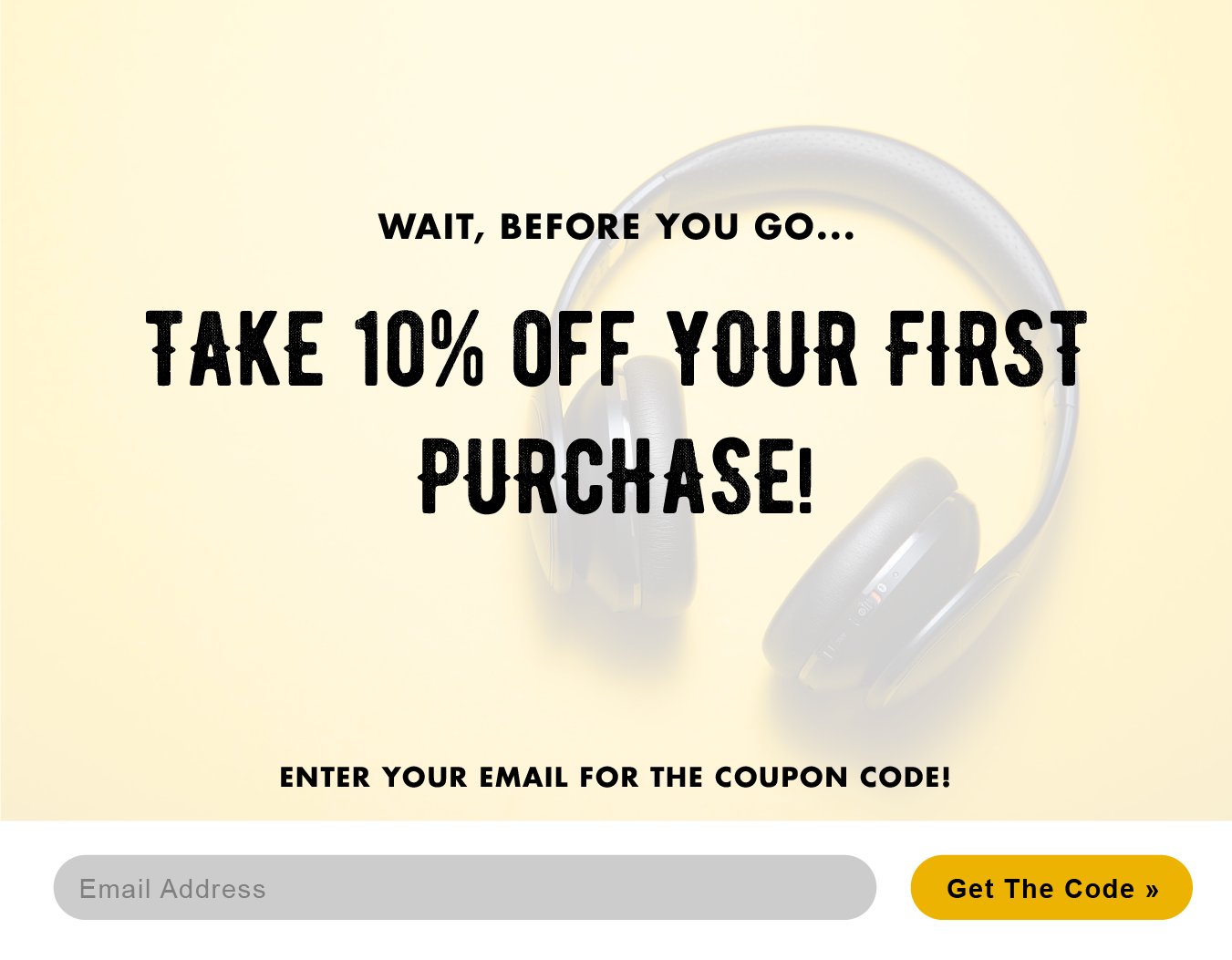
Another useful test for pop-up windows is to include the email address field in the exit intent pop-up itself. This will enable you to capture user email addresses in real time before they exit the pop-up screen.
- Size
Size matters when designing your exit intent pop-up screen. Should it take up the whole page or just the center? Should it be easy to click or difficult?
Results
A/B split testing is a great way to increase your email address conversion rates. It can be then directly used to fuel your cart abandonment software, with the ultimate aim of re-engaging customers who have abandoned their shopping carts.
There are many other tests that you can try for capturing email addresses before cart abandonment occurs. However, the following 12 are our favorites, because they work. Increasing the number of email addresses you capture before cart abandonment and using these addresses in your follow-up cart abandonment email campaign, you can convert over 20% of lost online sales.
Note: The author owns screenshots in the blog.


