15 eCommerce Conversion Optimization Tactics To Boost Your Sales
A seamless eCommerce customer journey is all about the transition from “buying” to “experiencing.” The key to growing your online business is to let your customers explore, decide, and share, and then learn from their experience.
Over the years, eCommerce A/B testing has evolved from a simple comparative study to a process backed up by a data-driven approach. Businesses and website owners can utilize this approach at every stage of their customer journey.
Download Free: Conversion Rate Optimization Guide
In this blog post, we take you through 15 tactics for eCommerce conversion optimization that will make your cash registers ring faster than ever.
1. Use Browsing History for Personalized Recommendations
Did you know that 45% of online shoppers are more likely to buy from an eCommerce store that offers personalized recommendations? So, if you aren’t leveraging user history on your online store to provide a personalized shopping experience and retargeting your customers, you are probably missing out on an enormous opportunity to increase your conversion rate.
Product recommendations are the ultimate eCommerce conversion optimization tactic that you need to include in your strategy. Keep track of customer data such as location, traffic sources, preferences, purchase history so you can highlight products that are on top of your customers’ minds.
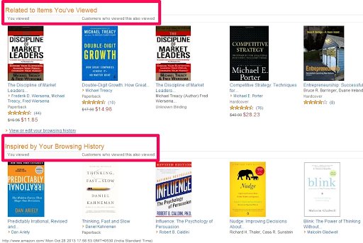
One of the biggest players in the eCommerce space when it comes to personalization of product recommendations is Amazon. Take a look at the screenshot below. Suppose you just viewed Dan Ariely’s book on behavioral economics. This is how your homepage is going to look the next time you land on it.
2. Have a Persistent Shopping Cart
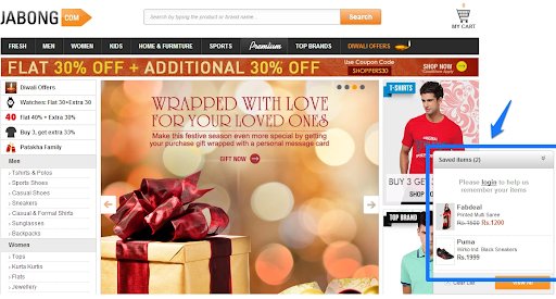
Do you see that widget at the right bottom corner of Jabong’s homepage? Yes, that’s your persistent shopping cart. These items were added to the cart a couple of days ago, and as you can see, the cart is still intact with the items. What do you think happened here?
A long-term cookie was established when the eCommerce site was opened. And now, the cart can be viewed during subsequent sessions for a given period of time.
Magento defines persistent shopping carts as carts that keep track of unpurchased items that are left in the cart and saves the information for the customer’s next visit.
A significant percentage of online retailers employ persistent shopping carts as it positively influences buyers’ purchase decision. This is because 56% of visitors tend to save their carts for later and take days or weeks to complete their purchase, and you need to ensure their carts are intact when they return.
3. Drop the Rotating Carousels
Agreed that carousels help you showcase more products, offers, and promotions. However, they also tend to annoy your visitors and tend to slow your website down as they aren’t SEO-friendly. Instead, stick to good old, appealing static images or use carousels that allow auto-rotation to stop on hover.
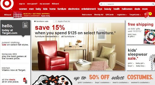
Take a look at how Target has spread out its offers, and promos on different sections of the homepage and done away with the slider:
Grizzlyzoos used VWO to run an A/B test on their homepage to compare image carousels with static images. The results showed that while the old version (with carousel) only got 2.06% clicks, the optimized version (static image) fetched 40.53% clicks.
4. Reveal “Free Shipping” (or Shipping Fee) on the Product Pages
High shipping charges are a leading cause of cart abandonment, and no shipping charges is what beautiful shopping dreams are made of.
eCommerce businesses that offer free shipping have multiple advantages over those who don’t. Read how adding free shipping increased AOV by 7.32% for NuFace.
But we all have our financial constraints. If you charge for shipping, mention that cost upfront. Ozscopes goes a step ahead and provides a shipping calculator on their product page:
A Comscore study revealed that 47% of customers would abandon their carts if they are charged for shipping during the checkout. So, make sure your customers aren’t faced with any unpleasant surprises as a part of the checkout process.
5. Bring All ‘Ways to Save’ Under One Roof
If there are multiple ways to claim discounts or freebies on your website – through coupon codes, loyalty points, and newspaper cuttings – then create a one-stop bar or menu for them. The bargain-hunting mamas will drop a tear or two out of sheer gratitude and will always love you the best for your considerate behavior.
6. Provide Live Chat Support
An effective live chat software provides a seamless user experience by addressing confusions and doubts instantly and conveniently, leaving less room for drop-offs. Also, calling customer support over and over again is the last thing a user trying to make an online purchase would want. If you are thinking of efficiency in customer service, think live chat. Guide that reluctant visitor who has been confusedly hovering over various elements by initiating a helpful chat session.
7. Encourage Sharing
In an analysis of over 37 million social media visits, Shopify discovered that on average, 85% of all eCommerce orders came from Facebook. Here’s another report on social commerce and internet retail growth, which talks about why social media should now be seriously considered for successfully running an eCommerce business.
8. Provide 360° View of Products
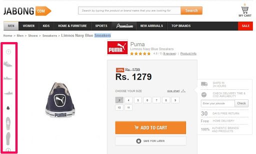
Larger product images increase conversions. But you probably know that already. Go one step ahead and provide a 360° view of your products. Let your customers have no doubts. Give them a closer real-life experience with a 360° view of products. This will give them the confidence in your items that product descriptions alone cannot provide.
Due Maternity added the 360-spin to their images, which increased their conversions by 27%.
Jabong puts this into action pretty well:
9. Don’t Blindly Trust the Trust Badges
Trust badges work like ice-breakers. It’s upon seeing these badges that a first-time visitor seriously starts considering a purchase. House of Kids put a trust mark to its advantage by using VWO to run an A/B test and saw a 32% increase in conversions.
You can establish a real guarantee of security for your visitors by using only the widely recognized trust badges. Displaying a dozen of not-so-recognized trust badges only seems like you are enforcing a false sense of security. Check out this post for more insights into building trust for your eCommerce business.
10. Create Urgency and Scarcity to Get Visitors Hooked
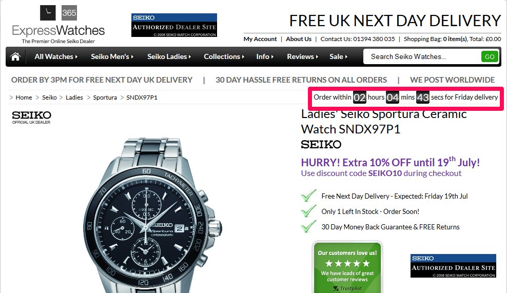
Time is running out. Only X more pieces available in stock. Attract visitors by highlighting the exclusivity of your products. Here’s how Express Watches uses a timer on their product page to create a sense of urgency:
11. Add Product Videos
Videos help people imagine how they will feel when they have the product in their hands. Simply Hike has videos for every product:
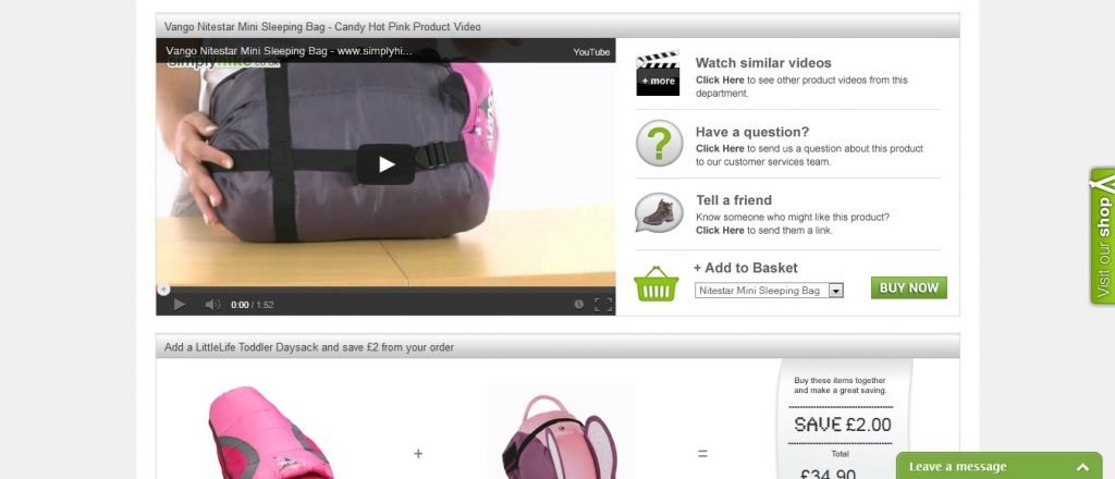
According to a report by Reel SEO, visitors who do not watch the video but still have the option to watch them, convert at a higher rate than those who don’t have the option. An article on Smart Insights quotes Matt Lawson, the conversion expert for Appliances Online, where he mentions:
“We have tested and proven that when someone watches our video reviews, they’re 120.5% more likely to buy, spend 157.2% longer on the site and spend 9.1% more per order.”
You got the gist. Here’s another post you can read on how to use videos to boost sales.
Download Free: Conversion Rate Optimization Guide
12. Make Them Generate Promo Codes
All credits to the conversion expert, Craig Sullivan, for this one. The trend is, you ask customers if they have a promo code in the checkout process. And give them a blank box to enter this code if they have it. There are SO many sites who do this to increase sales. But this one can often backfire. Majority of customers leave the site to google for active coupons. Often they get distracted with other stuff they find and never come back to complete their checkout.
Here’s what Craig suggested you can do about it:
Step 1 – Create a link that says, “Got a promo code?” instead of a blank box that asks you to enter the promo code.
Step 2 – Once the customer clicks on that link, open a collapsible div that shows two options:
a. Enter the promo code (for those who have it)
b. Generate promo code (for those who do not have it)
The promo code generated by customers will only be delivered when they complete their current transaction. This will avoid people leaving the site to find the coupon code if they do not have it. Plus, it will also motivate them to complete their current order, which should reduce your cart abandonment rate.
13. Post-Purchase Social Share
Thank you pages are often ignored when people talk about increasing the conversion rate of a website. But not optimizing your thank you page is like impolitely asking people to leave your home (or, website in this case). Sure, they have just bought something and might not be ready to buy something immediately.
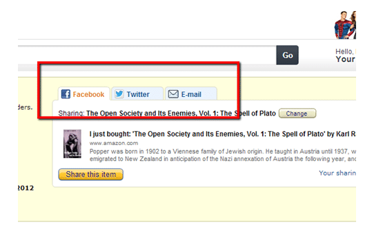
But this is where you can tell them what you want them to do. Amazon provides their customers with social media options to share the stuff that they have just ordered:
14. Use Reviews and Testimonials Judiciously on Product Pages to Gain Trust
Leverage social proof to positively influence your potential customers. Nothing compares to the power of reviews and testimonials in helping customers make a purchase decision and be optimistic about their choice.
According to the Local Consumer Review Survey 2018:
- Consumers read an average of 10 online reviews before feeling able to trust a local business.
- 57% of consumers will only use a business if it has 4 or more stars.
- 89% of consumers read businesses’ responses to reviews.
Here’s how Express Watches decided to use the above learning to reinforce its brand positioning.
To reduce visitor anxiety and achieve the desired results, they included a Trustpilot widget with some great customer reviews. These were tested against the erstwhile section Why Buy From Express Watches?
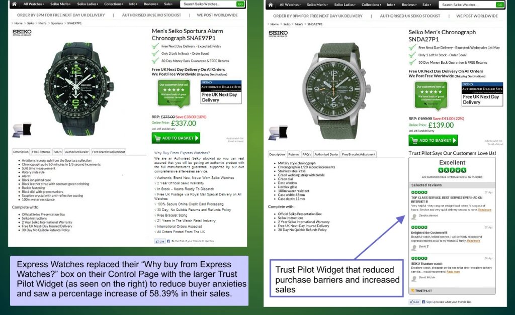
The variation was declared the winner with a percentage improvement of 58.39% and a 99% chance to beat original, as shown below.
To read the Express Watches case study in detail, click here.
15. Reduce Customer Friction Points at Checkout Pages
According to 40 Cart Abandonment Rate Statistics:
- 26% of US online shoppers have abandoned carts in a particular quarter solely due to a “too long/complicated checkout process.”
- $260 billion are recoverable through checkout optimizations of just US and EU e-commerce sales.
- 34% of US online shoppers have abandoned an order in a particular quarter solely due to the reason “the site wanted me to create an account.”
As an eCommerce business owner, it’s important that you regularly interact with your customers and new visitors to get ongoing feedback about their experience, as you wouldn’t want to lose them at the final gateway, that is, the checkout stage.
Here’s how PayU used this to their advantage:
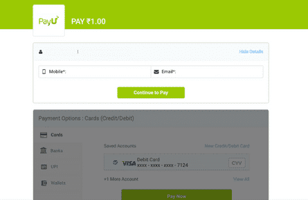
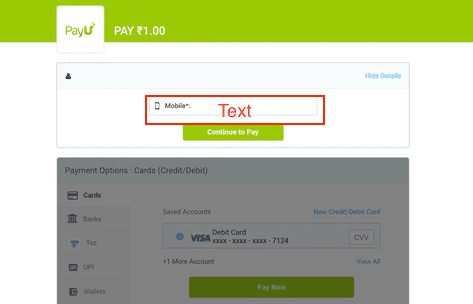
The concern for PayU was checkout page drop-offs. They used VWO’s Session Recordings and Heatmaps for their eCommerce website and found that providing communication information was a key friction point. They hypothesized that dropping the less important of the two fields—the telephone and email—would help them increase conversions.
They tested the variation without the email field against the control. The results demonstrated that dropping the email field showed a statistically significant improvement of 5.8% compared to the control.
Look at the comparison of the control and variation below:
In Conclusion
While the above A/B test ideas and examples for eCommerce testing provided you solid insights into what works; never follow them blindly. Be sure to create a strong hypothesis and test to validate it for yourself to see what works best for your eCommerce business. And don’t forget to share your A/B testing experiences at [email protected]!


![[CRO Best Practices] Insights From eCommerce CRO Apex Predators: Booking.com](jpg/feature-image_insights-from-ecommerce-cro-apex-predators_-booking.com-copya8d0.jpg?tr=h-600)
