5 Ways to Use Visitor Behavior Analytics to Increase Your Conversions
Conversions are one of the topmost pain points for most businesses today. Why? Because they’re highly unpredictable and yet are the most critical aspect affecting every business’s growth.
The unpredictability of conversion stems from the unpredictable behavior of us, humans. Just the change of the color of a CTA button or adding a single word to your landing page headline can bring about a drastic change in your conversion rates.
Download Free: Visitor Behaviour Analysis Guide
For example, Cocohanee, an eCommerce website, increased their number of transactions by 40% simply by adding their USP on the product pages and redesigning their menu! Who would have thought about that?
If only there was a way to understand and decode user behavior and use it for optimizing landing pages, right?

Though we cannot completely analyze and predict user behavior, user behavior analytics can help us speculate at least some parts of it and increase conversion rates.
You too, can use user behavior analytics to bring about a drastic improvement in your conversion rates and increase the ROI of your business (check out VWO Insights). Let’s have a look at how you can do that.
1. Use heatmaps for your landing pages
Heatmaps are a system for data visualization where you can view users’ behavior using a color-coded system. Using heatmaps, you can precisely visualize human behavior. The colors indicate the number of clicks on any part of the webpage.
Using heatmaps for your landing pages can be an excellent way to understand how your visitors are interacting with your webpage. You can understand where the users are focusing their attention.
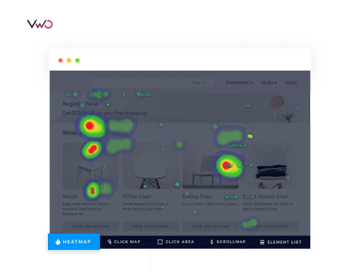
Using heatmaps for landing pages, you can find data about your landing page content, the images and videos that you have added, and the call to action button clicks. This way, you can find room for improvement and use it to improve your conversion rates.
You can also use scrollmaps to identify the ideal length of your landing page. Using a scrollmap, you’d know the ideal position to place your sign-up form and CTA to get maximum conversions.
You can use a mouse-tracking heatmap to track mouse movement. This way, you can identify the places where most of your visitors are hovering over. You can set goals for your heatmaps and document important observations. Based on these, you can come to accurate conclusions that will help you bring about drastic changes in your conversion rates.
Once you’ve found how your visitors are interacting with a particular element on your landing page, you can use A/B testing to test different variations of the same element. This way, you’ll be able to optimize your conversions.
A great example of the use of heatmap would be the case study of Paltalk, a B2C chat service based out of the USA. Using heatmaps, it was observed that users were not able to effectively view the different categories of virtual gifts. With a change in design for the virtual gifts menu, Paltalk increased their conversion rate by 11.32%!
Take a full-featured free trial with VWO to leverage heatmaps for your website.
2. Personalize the experience based on the user journey stage
Not every user of yours would be the same. Some would be new and unfamiliar to your brand. Some might have heard your brand’s name but don’t really understand your offering. While some others might have been stalking your website for a while.
This means users at different stages of their customer journey would have different perceptions about your brand and your offering. So, is it fair to target them with the same messaging and expect them to convert? Absolutely not!
Instead of targeting all your users with the same landing page and messaging, you can try to segregate your users based on their customer journeys and then target them with different landing pages. This strategy can be extremely effective in improving your conversion rates.
For the segregation of your customer data based on their customer journey stages, a potent Customer Relationship Management tool such as SuperOffice can be powerful. SuperOffice will gather all your prospect and customer data along with the information about the touchpoints with each of these users.
Using a CRM tool such as SuperOffice, you will be able to create customized target lists of users based on their customer journeys.
You can then target each of these lists with different landing pages, email campaigns, advertising, and messaging. You’ll definitely see a massive increase in your conversions this way.
Here are some other ways to personalize user experiences:
- Visitor data collection – Collect prospects’ data and use it to offer ultra-personalized experiences to them. You can collect visitor data by cookies, web beacons, email activity tracking, or even asking the visitors directly.
- Visitor profiling – Based on the customer and prospect data collected, you can create your ideal customer personas to offer personalized experiences to each of these personas.
- Set your goals – Before implementing personalization, it is good to set goals for the same. What do you want to achieve using personalization? In this case, it would be increased conversions but you can set a few other goals too.
- Plan and implement – Next, you can start working on your strategies for personalization. You can use A/B testing to try different variations of your personalization strategies. This way, you’ll get much better results.
- Measure success – Finally, you should keep track of your metrics and understand if your set goals were. This way you can keep improving your conversion rate over time.
3. Find the reason behind increased bounce rate
If you are experiencing increased bounce rates on your website, especially on your landing pages, then this is not something that you should ignore. Increased bounce rates can be a major indicator of the fact that something might be going wrong.
So, get down to the root cause of it. You can use heatmaps and session replays to understand the reason behind increased bounce rates. There can be multiple reasons for this. Some of them being:
- Inconsistent branding and messaging can drive away your website users. Hence, ensure that you use consistent branding and messaging along all the touchpoints.
- Slower page load speed can be a major reason why your users are bouncing.
- Your headline and the entire landing page copy may not be enticing enough for the user to stick around and convert. So, make sure to add a more benefit-driven copy that directly hits the pain points of the users.
- Add some more engaging elements such as an image, an illustration, a video, and some form of social proof. Adding these elements will persuade the user to put their trust in you and fill-up your form.
Once you’ve found the most probable reason for the increased bounce rate, you can use A/B testing to confirm the reason. For instance, if you think that the headline of your landing page is the reason for increased bounce rate, you can try split testing by varying your headline and optimize your conversions this way.
Download Free: Visitor Behaviour Analysis Guide
4. Vary your landing pages based on the traffic sources
Most businesses have multiple traffic and referral sources for their landing pages. Some part of your traffic may be coming from emails, some from social media advertising, while some from SEO.
The users from all these traffic sources would have come across different messaging. For example, your Facebook ad might read “Free landing page optimization tactics,” while another referral traffic source might have read “Free checklist for increasing conversions.”
The simplest way to gather customer information is by implementing the use of DNI (Dynamic Number Insertion) technology of call tracking into your SEO campaigns. It provides you a deep insight into traffic source, geographical location, which campaign drove the most traffic, and much more. It helps you to optimize your campaigns more effectively and target your landing pages according to the traffic source
Though these two messaging might be indicative of the same, it is better to stick to the exact same messaging throughout. Hence, you can consider having different landing pages for different traffic sources.
Doing this will ensure that your landing pages are appropriately customized for every user segment. And this will definitely lead to an increase in the number of sign-ups.
5. Use session recordings to optimize your landing pages
You can also use session recordings of your landing pages to analyze the user behavior with great detail.
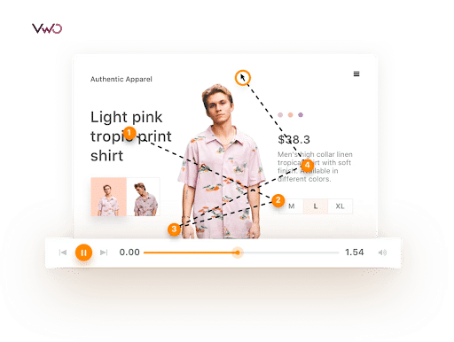
With each session recording, you can look for details such as the mouse movement, user clicks, scrolling patterns, and the area of your landing page where the user is spending the most time.
Using session recordings, you can improve the performance of your website’s core metrics by improving the site navigation, site design, form design, and form flow. You can run experiments and reduce bounce rates, ultimately leading to increased conversion rates.
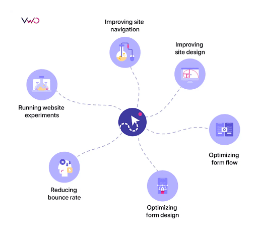
Using session recordings of your landing pages, you can understand common browsing patterns and distractions that are keeping the users from clicking on your CTA button.
There may be a huge number of reasons for reduced conversion rate such as a misplaced CTA, a distracting ad, or a lengthy form. Whatever the reasons may be, you’ll be able to analyze that through session recordings and make appropriate amendments.
Using this data from session replays, you can try to change your landing page structure, which will ultimately lead to increased conversions for your business.
For example, suppose you find many of your users are stopping at a particular point in your landing page. This may be because the users find this part more interesting and want to stop and read through it. So, you can consider placing this part above the fold to make your landing page even more impactful.
You can then use A/B testing to test if your observations based on session recordings are working as expected. Request a demo with the experts at VWO for valuable insights on your website.
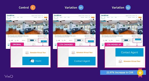
A good example would be A/B testing done on the Locations Hawaii website. Using 3-variation A/B testing where the CTA button was changed in each variant, the number of leads was increased by 23%!
Start using user behavior analytics to improve your conversions
You now know the various tactics you can use to analyze users’ behavior and come to precise conclusions based on it.
Using behavior analytics can be a major turning point in your business’s growth. So, start implementing these strategies right away and watch a massive boost in your conversions.


