8 Ways to Refine eCommerce Site Search and Navigation for Quick Product Finds
If they can’t find it, they can’t buy it. It’s as simple as that.
No one has the time to surf through your site for the entire day, hoping to find what they’re looking for. If the process is not as seamless as walking into a restaurant and ordering a dish, they will leave.
So how do you stop that? How can you reduce the time taken by your visitors to find the product they are looking for?
Website navigation and internal site search can help you sort product findability problems. Do add usability basics into the mix, or bad usability might just nullify your efforts.
Download Free: Usability Testing Guide
Once you make it easy for visitors to find their desired products on your eCommerce site, your conversion lift will be legendary. So let’s see what you can do about it:
1. Replace Drop-down Menu with an Explanatory Product Category Page
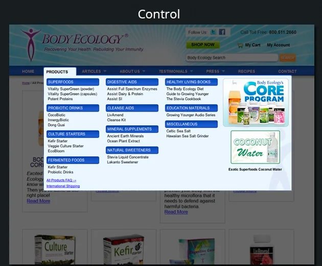
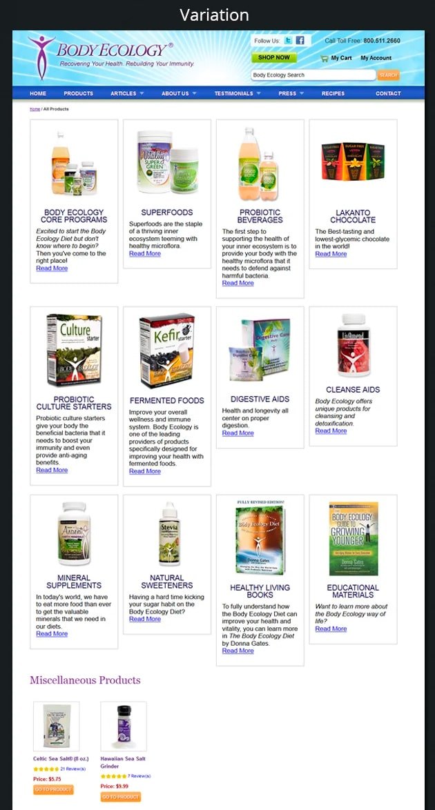
Frictionless Commerce used VWO testing to run a test on their client’s website, Bodyecology.com. They replaced the drop-down menu on the site with an explanatory product category page which increased revenue by 56.43%.
This especially makes sense as Bodyecology.com has complicated product categories like ‘Probiotic culture starters’. The product category page that replaced the menu contained a two-line brief of each category which helped visitors in understanding where they can expect to find the products they are looking for.
Below you can see the control page of Body Ecology website with the drop-down menu and the product category page that replaced it:
2. Dig into Your Site Search Data and Act on It
In a recent Conversion XL post that listed favorite analytics data of conversion experts, John Ekman of Conversionista mentioned ‘checking conversions for visitors who used site search’ as his favorite go-to report in Google Analytics (GA). Here’s what he said:
“On an average, I would say that the conversion rate for visits with site search is usually TWICE AS HIGH as visits without site search.”
Your report will look like this:
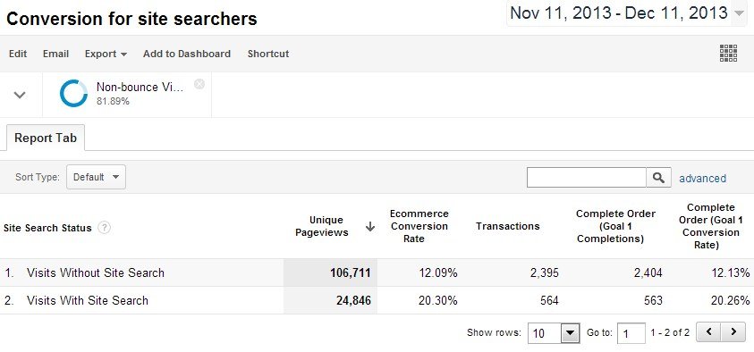
You can download his custom report from here to see if this is true for your site as well. Make sure your conversion goals are set in your GA. John recommends that you should subtract “bounced visits” from this report to get accurate insights. They are the visitors who haven’t explored your site at all. So including them in this analysis would mean inflating results for ‘visits with site search’ way higher than they are when compared with “visits without site search”.
Once you have this data with you and if conversions for your site are indeed better with search functionality, next thing you have to do is encourage eCommerce site search usage among your visitors. How can you do that? Let your search feature stand out on the page.
- Increase the size of your search box and add it on the top of the page (You could also place it in the middle, if possible)
- Make your search box sticky so that it is visible at all times while scrolling
- Add relevant call-to-action text such as ‘Search’ or ‘Find’ instead of adding a small search icon which many visitors might not be familiar with
- Give the CTA a contrasting color to draw attention
Want more insights? Dig into your site search data to find queries that returned unmatched results. This will give you insights about what more you can add to the site.
You can even try using the words used by visitors in your site search on the product pages to improve conversions.
3. Don’t Be Afraid to Add Same Sub-category Under Multiple Parent Categories When Necessary
If a sub-category qualifies under more than one parent category, it’s okay to include it multiple times than make the visitors look for it. For example, see the image below from Best Buy. It shows how the ‘Projectors & Screens’ sub-category appear under both ‘TV & Home theater’ and ‘Home & Office’ parent categories.
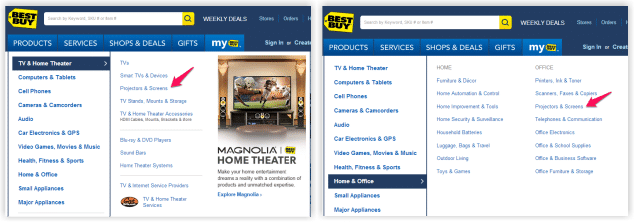
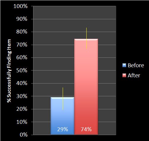
When the experts at Measuring Usability.com included one item of children’s furniture store under multiple departments, the percentage of users who could find the item increased from 29% to 74%.
There are two approaches that can be taken to implement this:
a. The multiple sub-category links redirect to the same domain, irrespective of what parent category it is listed under.
b. The sub-category links redirect to a similar page with slight changes to make that page more relevant for the parent category under which it has been listed. Please note that this approach will be a little more technically complicated as the number of pages you will have to manage will increase.
You will need to set up canonical pages to avoid SEO penalties that may arise due to duplicate pages. But since you will be matching user intent perfectly by customizing the sub-category page for its parent category, the expected conversion increase from this approach is higher than the first approach.
4. Use Autocomplete with Image Thumbnails
Autocomplete suggestions are great time savers for shoppers. And when you team them with image thumbnails and list their prices as well in search suggestions itself, you make things so much easier for your visitors. Check out search suggestions on Best buy Eye Glasses:

When Printerland implemented this smart search technique on their website, it increased their per visitor value by four times. They also found that visitors who utilize their autocomplete search feature are six times more likely to convert than an average visitor.
Download Free: Usability Testing Guide
5. Understand Your Buyer Personas to Provide Better Navigation
When you know the mindset with which your customers approach your website, it gives you an extra edge to convert them through relevant navigation. This is where you can utilize persona types in making it easy for your customers to find the stuff they are looking for. For example, if you’re a dancer looking for shoes on a Reebok website, the navigation below instantly leads you to the relevant category:
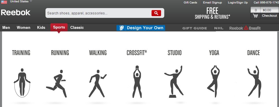
Such distinction based on personas is even useful for those who aimlessly browse websites to see if they find anything worth buying.
6. Add the ‘What’s New’ Category in the Navigation/Filter for Returning Visitors
Some of your visitors will be regulars. This means that they know your collection and store perfectly well. Since these visitors trust you and have probably even bought from you, they are more likely to convert than new visitors. Optimize your site to fit their browsing preferences.
Include the ‘What’s New’ feature instead of making them browse through your old collection again. Include it both in the top navigation bar and the product filter.
7. Never Return a ‘No Results’ Page
Every now and then a search query might not match any product in your collection. It’s fine. It happens. But why would you return a ‘No results’ page without any further navigation?
Give them some suggested categories that they might want to browse. Or, you can simply flash your contact number saying something like, “Unable to find what you’re looking for? Feel free to contact us directly at…”
8. Personalize Your Site Search Results with Third-Party Tools
Imagine a user looking for sunglasses on your website and as soon as he enters ‘Aviators’, he’s taken to a web page that contains all Ray Ban suggestions under $250 in the top three rows because the tool recognized the user’s price and brand preference based on his browsing history. Well, this is how powerful these third-party tools can be.
What more? They will even show correct suggestions for misspelled words and show image thumbnails in your search. If this makes you curious, you can check out tools such as Doofinder, Unbxd, or Cyber Site Search.
Note that these changes might take a little time to implement. And it might not be as easy as changing your call-to-action text or color. But the conversion boost from these changes can also be significantly higher than the usual small testing tweaks.
Website navigation and site search are the pillars of a good eCommerce business. If yoeu plan to try any of the changes suggested above, be sure to A/B test them first. Even if you are 100% confident of positive results, wait for the data to gain statistical significance and make the decision for you.


