How to Create Better eCommerce A/B Test Ideas From Conversion Research
It doesn’t matter how good your A/B testing tool is if you don’t have very good A/B test ideas for increasing your conversion rates. How good are your A/B test ideas? How often do they win?
The highest converting source of test ideas isn’t just best guesses from you or your boss, ideas from Google Analytics, or looking at your competitors for inspiration. So what is it?
It’s actually A/B test ideas based on feedback from your visitors and customers. I’ve been doing CRO for 15 years and have consistently got much better converting results from A/B tests based on conversion research insights from visitor surveys, customer surveys, user testing, and live chat analysis.

In this article, you will learn some of the best ways to start doing conversion research and gain better eCommerce A/B test ideas.
Create a visitor survey to discover their issues
One of the fastest and best ways to improve conversion rates for eCommerce websites is to discover what is causing your visitors to leave without purchasing, in particular, what their most common issues, doubts, and frustrations are. Here are some examples you may find:
- They are unsure of what size to choose
- They don’t understand how a particular product feature works
- They are confused about your guarantee
- They want to see more images of the product in use
Knowing their issues helps you understand what needs improving or explaining better on your website to ensure other visitors don’t have these same issues, and therefore they will purchase more often. From these insights you gain, you can then create higher impact A/B test ideas.
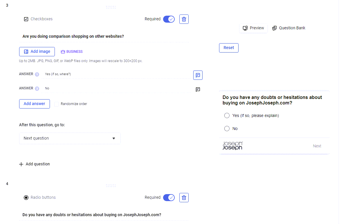
To discover these revealing insights, set up a short visitor survey using a tool like VWO Insights. This should make this survey pop up after users have been on a product page for about 2 minutes (no sooner, or it will annoy them) and include these essential questions:
- Do you have any doubts or hesitations about this product?
- Is anything missing or stopping you from purchasing?

You can either use a single question poll that appears in the bottom right, but to get more feedback I recommend using a full-page survey to ask 4-5 more detailed questions, like what their purchase influencers are, where else they are shopping, and questions about your product page like your images.
To increase your survey response rate, you should offer your visitors the chance to win a gift card for your website if they take the survey.
Watch session recordings for bugs and issues
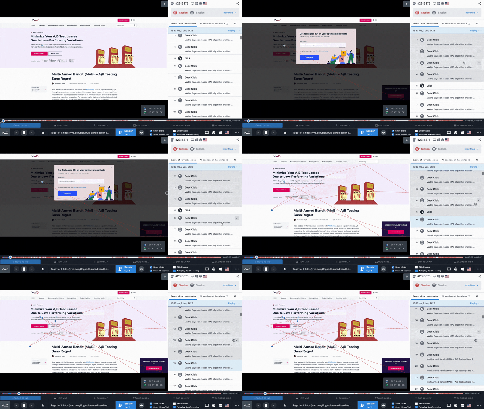
Another fast way to help you understand common user issues and bugs is to watch recordings of users interacting with your website. This can reveal many things that are not a good user experience, and even broken elements on different devices or browsers.

You can use this session recording feature in VWO Insights. This can be quite time-consuming to watch, so to get faster results you should filter and find session recordings with these potential issues in particular:
- Rage clicks. This is where a user repeatedly clicks on something. This usually indicates confusion or frustration that something isn’t working as they expect it to, or is actually broken.
- U-turns. These happen when someone repeatedly goes back to the page they were previously on, often indicating that they can’t find what they are looking for.
- Checkout abandonments. It’s very important to look for potential reasons why your users are leaving your checkout without ordering.
Make sure you watch recordings on both mobile and desktop as each will likely have different issues.
Discover the top website issues from your customer support team
A simple form of conversion research that requires no additional tools is to ask your customer support team for the most common website problems or issues they get from your visitors and customers. This is particularly good for discovering what product information may be missing on your product pages or FAQ that would convert users more often.
Don’t just rely on your customer support team to let you know these issues, as sometimes they will forget issues or may think they are not important, so may forget to tell you something that is actually very revealing or useful. That is why you should do a more detailed analysis yourself if you have live chat on your website.
To do a live chat analysis, simply log in to your chat tool and review all the recent live chats and do a search for words like ‘can’t find’, ‘issue’, ‘not working’, ‘problem’, or ‘confusing’ and see what issues you can discover. You will quickly notice patterns of the most common issues.
Find out what nearly stopped your customers from purchasing
Discovering your visitors’ issues is very important, but it’s even more revealing and important to understand what nearly stopped your customers from purchasing, and their reasons can sometimes be different from your visitors.
When you discover your customer issues, you can improve your website so that other visitors don’t encounter those same issues that may stop them from purchasing.
There are two ways to do this. The simplest and quickest way is by embedding a quick question on your order confirmation page, and asking this question:
- Was there anything that nearly stopped you from purchasing?
Asking this question will create a goldmine of insights that will help you create high-impact A/B test ideas. Here are some common examples of what I have found from doing this conversion research that nearly stopped customers from purchasing:
- They found the size guide too hard to use
- The product images weren’t detailed enough
- The navigation menu wasn’t very helpful
- Delivery was cheaper on another website
- The font was too hard to read on mobile
You should also create an in-depth customer survey and email this to your most recent customers.
This should include 5-10 questions about their journey through your eCommerce website, like what they thought of your product images, your checkout, and what they think could be improved.
Just like the visitor survey, you should incentivize this to get better feedback and more responses.
Do user testing to gain in-depth feedback from your target audience
Doing user testing on your target audience is another high-impact part of conversion research, as this is essential for understanding in much more detail what their issues, doubts, hesitations, and needs are.
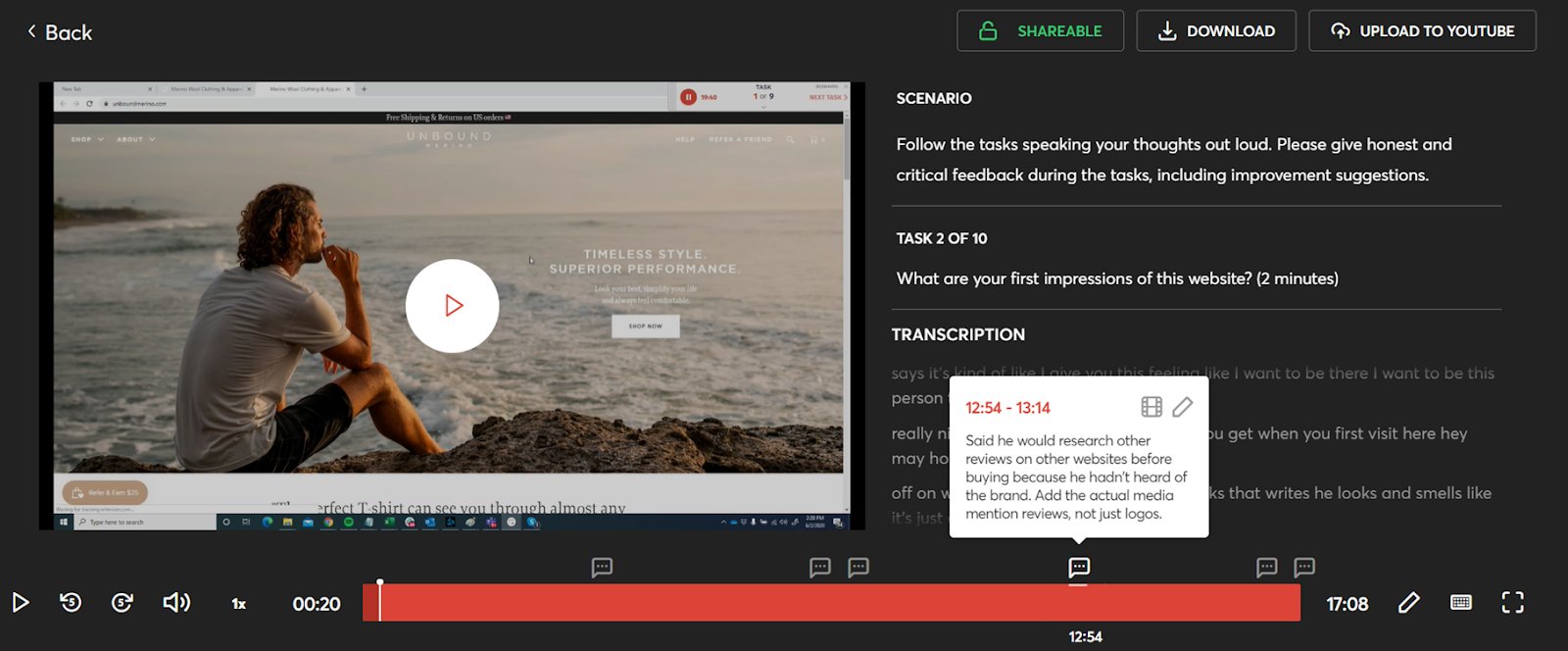
It works very well because you get a 10-20 minute video recording of each user tester using your website and answering questions and completing tasks that you give them.

The first step is to create a good list of about 10 tasks and questions that you want feedback about on your website. For example, ask what their first impression of your homepage is, how easy it is to use your navigation, and what they think of your product page imagery.
Here are the two questions that I’ve found to bring the most insightful answers:
- What are your biggest doubts or hesitations about this website?
- Would you have purchased from this website? If not, why not?
You also need to ensure you use demographics and screener questions to ensure that the user testers match your target audience. For example, you can select a particular age range, and ask a screener question to ensure you only get responses from user testers that are interested in what is on offer. For example, if you sell shoes on your website, you would ask ‘Have you bought shoes online before?’ and then reject anyone who answers no.
I highly recommend a tool called Userfeel to do this user testing, as they offer user tests from just $30—and you don’t need an expensive subscription, like with other tools such as Usertesting.com.
You will be intrigued about watching these user tests, and they not only help you find high-impact A/B test ideas, but also helps you think much better from the perspective of your website visitors.
Create A/B test ideas from insights and then prioritize them
Once you have completed each of these types of conversion research, you need to review the results and prioritize the more important ones, and then create A/B test ideas from the insights you have gained.
The first step is to create a spreadsheet and add all the main conversion research findings to it, along with how often they are mentioned or noticed, and then give each a rating out of 10 based on their potential impact on your website conversion rate and revenue.
For insights that get mentioned the most, or are from several sources of conversion research, give them a higher rating, as this indicates more proof that it is a bigger issue. For example, you may find out from both your visitor survey and live chat analysis that visitors are confused about how your guarantee works.
Then create A/B tests that relate to each of your highest-rated findings or insights – those will likely have a very high impact on your conversion rate and revenue, and will usually give much better results than simply relying on the best guess for what to A/B test.
Start this now and whenever you have a major launch on your website
These are just a few of the types of great insights and A/B test ideas you can get from doing conversion research and I suggest getting started with each of these now.
Then do this conversion research at least once per year, or every time you launch something major on your website, like a new product page or navigation, as it’s important to discover any new issues and gain more high-impact A/B test ideas.
You can also get a free CRO consultation from me to discuss how I can help you get the most out of your conversion research and CRO efforts, and increase your eCommerce conversion rate and revenue.


