If yes, then you will agree that training is a very important component of outdoor sports. The training simulates the real scenarios of the game to identify shortcomings and make improvements. Yet, its benefits extend beyond mere performance enhancement, as it also facilitates learning in areas such as nutrition and psychology, ultimately leading to an overall improvement in one’s sportsmanship.
Similarly, conducting online experiments is like training your digital property. It not only enhances your conversion rate but also provides valuable opportunities to gain insights into various facets of the digital landscape, resulting in the overall growth and development of your company.
Don’t believe it?
In this blog, we have aggregated five real-life examples to showcase how experimentation induces learning related to various aspects impacting your visitors’ digital experience like content, conversion funnels, experimentation approach, and design.
Let’s begin.
1. Dell Technologies
Dell Technologies, a technology giant, places significant emphasis on experimentation. The company’s commitment to this practice is exemplified by CEO Michael Dell’s occasional communication with the Digital Analytics team regarding ongoing tests. Experimentation has not only made a positive contribution to the multi-billion dollar revenue, but it also has induced some learnings for the company.
In one of the fireside chats with VWO, Narayan Keshavan, Head of the Design Analytics Team, shared his insights. The following learnings helped them improve their whole experimentation cycle and approach.
a. Don’t follow experimentation trends blindly
In one of their experiments for the website in China, the team at Dell tried to add a promo banner in the Navigation bar, a trend followed by a leading eCommerce website in China. But for Dell, the conversion rates dropped by adding a banner.
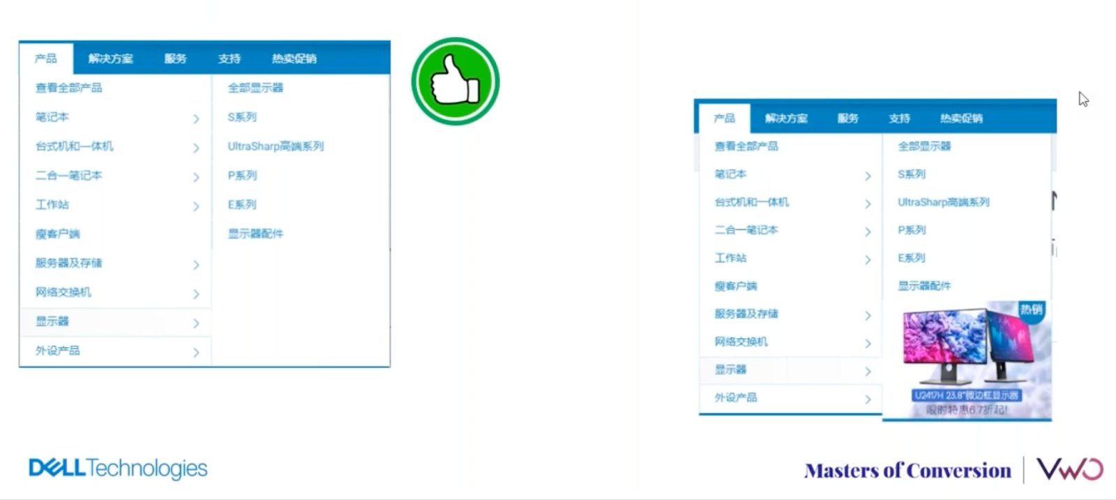
They learned that a trend should be followed carefully as every website is unique, and the user experience analysis should preside over each experiment.
b. Keep a neutral eye on an experimentation idea
The Dell Technologies team found that it’s natural to expect a lift in conversion rate from variations. But, the foundation of the whole effort is to run an experiment and not prove something. Thus, the optimization team must have a neutral approach toward each idea. It helps negate biases while running the experiment and post-analysis of the data.
c. Don’t fall for testing myopia
Testing myopia is a term used by the Dell Technologies team, which means you are so focused on improving a metric that you forget the effect on other metrics.
Let’s say you aim to enhance the Click-Through Rate (CTR) of the primary Call-To-Action (CTA) button on one of your landing pages. You conduct tests using captivating banners and observe a surge in the CTR of the primary CTA. While this experiment may seem successful based on this one metric alone, a deeper analysis reveals that the bounce rate has increased due to a decrease in website speed caused by the banner’s size. As a result, even though the conversion rate has improved from people who engage, many visitors are leaving the site without engaging because the page takes too long to load.
Therefore, it’s crucial to take a holistic approach to experimentation and analysis instead of obsessing over a single metric.
Watch the complete webinar:
2. Uber Eats
Uber Eats started its operation in South Africa as an online food delivery service. But can you imagine that it is now a virtual mall that sells jewelry, clothing, and other accessories? Here is the screenshot of its product page:
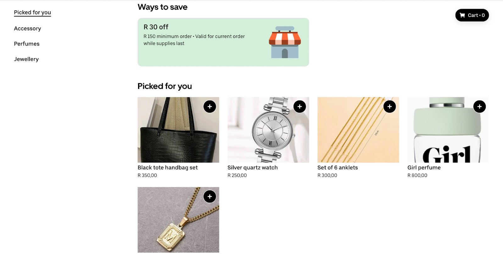
Starting with the food delivery and diversifying to become a virtual mall happened because of experimentation. Uber Eats in South Africa has ingrained a culture of experimentation, where they depend less on market research and more on experimentation in the real world. Experimentation has allowed Uber Eats South Africa to grow 149% month-on-month in its non-restaurant vertices.
Here is what the experimentation taught them and facilitated expansion outside food delivery.
a. A tool with an easy setup and automation enhances the experimentation culture
Uber Eats’ team recognized that a simplified experimentation setup means less dependency on development and fewer entry barriers, which motivates team members to partake more in experimentation. Also, by automating post-analysis and deploying the winning variation, the workload on the team is reduced, which speeds up the experimentation rate. It collectively promotes a culture of experimentation within the company.

b. It’s important to take time while creating a hypothesis
The hypothesis is the foundation of the experimentation, and even simple-looking tests might turn complicated if there is a fault in the hypothesis. A hypothesis must be based on data insights and behavioral analysis. Also, the hypothesis must specifically mention the website element that needs to be tested and the expected improvement that you expect at the end.
For instance, if a CTA button on a landing page with a low conversion rate is identified through heatmap analysis to have fewer clicks and less attention, changing the button color to make it more prominent could be a potential solution. In this case, the hypothesis could be: “Changing the color of the CTA button to X color will result in a Z% increase in conversion.”
In addition, the team at Uber Eats advocates for testing one hypothesis at a time with various methods like A/B testing and Multivariate testing rather than testing multiple hypotheses with the same method to achieve better results.
3. MakeMyTrip.com
MakeMyTrip.com is an online travel aggregator in India that gets 44 million visitors per month. The two-decade-old company has first-hand experience with digital transformation and changing user demands. The experimentation culture has positively contributed to the 64.1% Y-O-Y growth that the company saw in 2022.
In one of VWO’s webinars, Aakash Kumar, head of the user experience at Makemytrip.com, revealed some critical experimentation-induced learnings.
a. Fewer purchase cycle stages don’t necessarily mean more conversion
It’s a general notion that a few stages between awareness and purchase will lead to more conversion. However, the design team at MakeMyTrip.com found something interesting.
Their typical hotel search user flow started with searching for destinations on the homepage, which led to a page with a list of hotels. On clicking a hotel tab, a page opens with a hotel description followed by offered accommodation types. The team noticed that many mobile users who ended up converting were choosing the cheapest room option and there was a low conversion rate for premium rooms.
After conducting a thorough analysis of user behavior and data collection, the team found that the hotel details page’s description was causing users to scroll excessively, leading them to select the first room type they saw after scrolling. To address this issue, the design team introduced an additional step that allowed users to select the room type before completing the transaction.
The whole optimization effort led to an increase in the booking rate for premium room types.
b. Design changes should be gradual and not drastic
Drawing on their decades of experience in experimentation, the design team has discovered that design changes aligned with user needs should be gradual rather than drastic. Following the ideate-experiment-learn cycle during website design experimentation is crucial. Subsequent design changes can be based on the team’s previous experimentation and learnings, which helps to minimize risks and reduce negative impacts on the conversion rate.
Watch the complete webinar:
4. Netflix
Netflix has a culture of experimentation and learning, which helped it transform from a DVD mailing service to a streaming service giant with 230+ million paid subscribers worldwide. Here is what Netflix has learned about experimentation from decades of experience.
a. A successful idea can come from an unlikely source
Netflix has an open culture where anybody can see the running tests and associated results. The naturally low win rate of experiments brings humility and humbleness to the team. It opens up doors for every team member to share ideas and experiment with user experience. There are instances at the company where ideas from experts have failed, but ideas from executives and engineers have brought unexpected wins. The democratization has enabled them to get massive revenue-generating ideas from unlikely resources.
b. A failed experiment in the past can achieve success in the present
Customer behavior and preferences are evolving, and at Netflix, they have found that revisiting past failed ideas and deploying them at present can find success. Sometimes, the analysis of the failed ideas suggests that they may achieve success in the present or the new user group. So creating a repository of each experiment along with its analysis is beneficial to redeploy and find success in the future.
5. Frictionless Commerce
Frictionless Commerce is a 13-year-old digital marketing agency with a focus on enhancing the sales of Shopify websites by utilizing buyer psychology techniques to influence and convert new buyers. The agency has helped 118+ DTC brands and carried out A/B tests for them to improve conversion rates. Here is what the people at Frictionless Commerce have learned about buyer’s psychology due to these experimentations, which can help create copies and headings for landing pages.
a. Showcasing expertise and brand story create a sense of connection
People like to associate with brands who are experts in their domain and specialize in crafting the product or service. Additionally, a brand’s narrative, detailing its origins and the obstacles it overcame, can foster a sense of connection with the visitor and drive them further down the path to purchase.
b. Adding surprising facts can negate the midway quitting
Behavior analysis can help you understand the scroll depth at which most visitors leave. The team at Frictionless Commerce has found that adding a surprising fact at such points can reduce the midway quitting as it gives a burst of energy to a visitor to know more.
c. If doubts are not solved, then the visitor will leave
If a landing page fails to address a visitor’s specific query, they may feel hesitant to trust the product or service being offered. The team discovered that four particular factors – the absence of features, unclear pricing, subpar features, and confusing design elements – can all contribute to a negative perception and generate doubts in the visitor’s mind.
To avoid these pitfalls, marketers should aim to view the landing page from the visitor’s perspective and ensure that any potential doubts or concerns about features, pricing, or design are addressed and resolved through testing.
This learning, along with other insights, helped the company in shaping A/B testing campaigns for their clients.
One of their clients is into selling shampoo bars. The team at Frictionless Commerce carried out an A/B test which was influenced by the above learnings. Here are the controls and variations of the test created with VWO. You can see that the variation is trying to solve a doubt that will come naturally to a visitor’s mind.
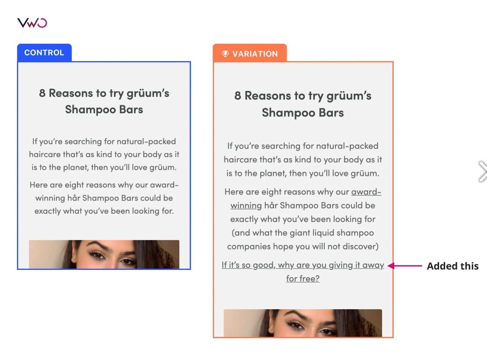
The test resulted in a 5.97% increase in the number of orders.
Begin your experimentation journey with VWO
The five examples show that experimentation not only enhances the conversion rate but also generates valuable insights that can lead to new user experiences, business ventures, and cultural shifts, ultimately propelling the company to greater heights.
Also, we saw in the case of Uber Eats, one of the key contributors to success is the availability of a user-friendly experimentation tool that enables the rapid scaling of experimentation efforts.
However, choosing an experimentation tool is not an instant decision. You have to evaluate the compatibility with your business and get hands-on experience with the tool before spending a buck.
To facilitate this process, we have created a 30-day free trial that provides full access to all the offered capabilities without any financial obligations.
So, If you are new to experimentation or considering a switch from your current setup, we recommend reading our detailed guide on VWO’s free trial, which provides complete information about working with the world’s leading experimentation platform.
]]>Businesses don’t wish for users to have a hesitant conversation about their product. Unfortunately, most free trials don’t hold true to user expectations. You sign up for a free trial, but some capabilities are always gated, making it difficult to fully evaluate a product before investing in it.
At VWO, we realize that users need to understand how a product and its capabilities fit into their workflow, whether they fulfill important business objectives, and satisfy relevant use cases. That’s why, with VWO, you get a 30-day free trial that includes all offered capabilities. The allotted visitor quota that comes with each capability gives sufficient time and bandwidth to experience all the benefits that VWO can bring to the table.
Experimentation is a continuous and interconnected process with data as its backbone. As shown in the loop diagram below, VWO’s suite of capabilities includes everything needed to run experimentation and personalization end-to-end. The free trial gives you access to each of these capabilities.
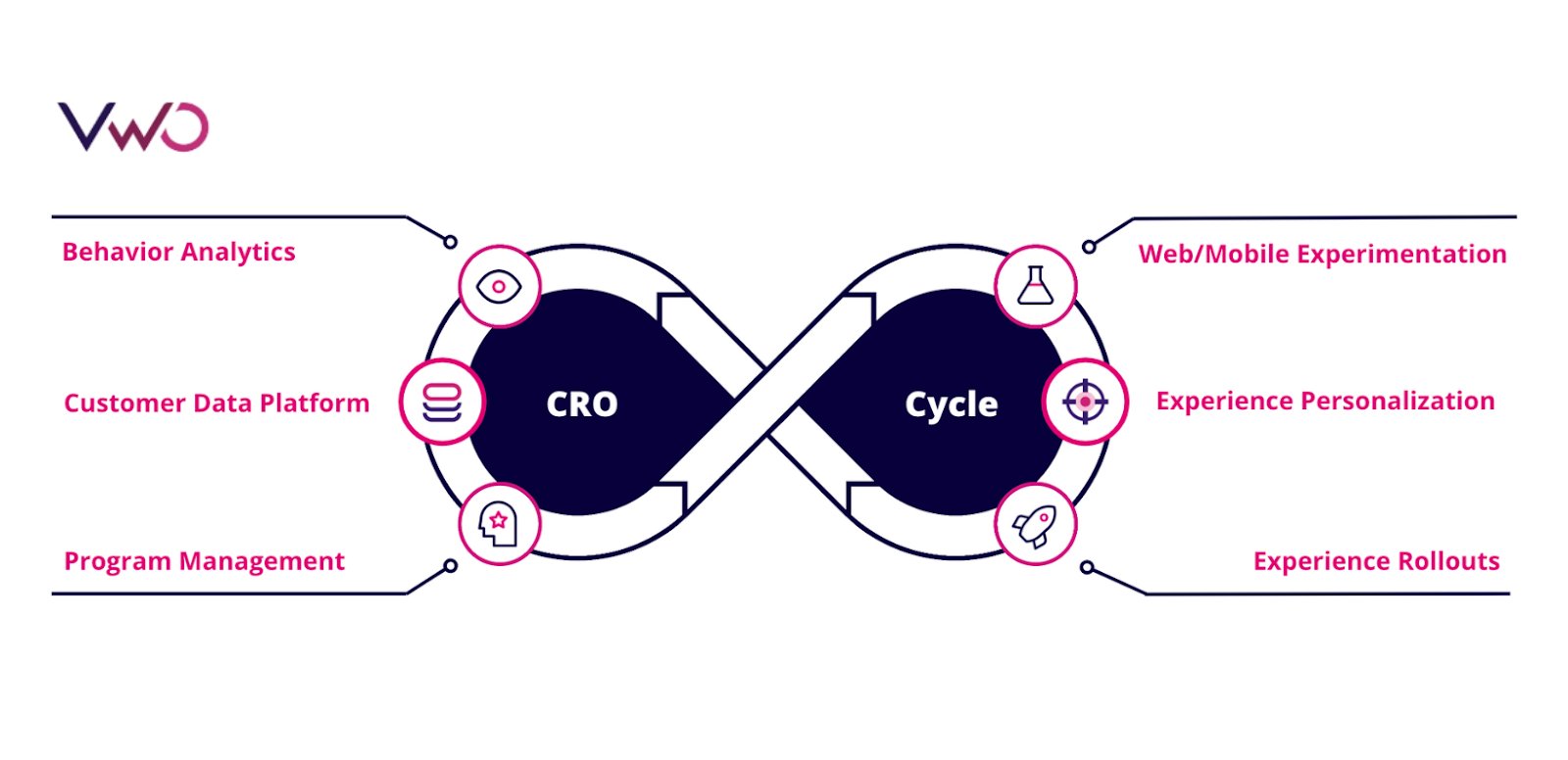
This blog answers questions that you may have about the free trial and explains what is included, how to access it, and the next steps.
1. Behavior analytics | VWO Insights
The process of experimentation starts with analyzing visitor behavior. With VWO Insights, you can analyze visitor behavior and identify bottlenecks in your current flow. Here is what you can do during your free trial:
- Goal setting to track the performance of pages and elements. You create pages and elements on a website with a specific purpose, and tracking how they perform is necessary. With VWO Insights, you can track the following:
i. Page visits to know the number of unique visitors who visit a page.
ii. Click on links to gauge the click-through rate of links, URLs, and URL patterns.
iii. Click on elements to track clicks on menus, videos, images, and other elements.
iv. Form submission to find the number of successful form submissions.
v. Revenue to track the earnings generated from each successful conversion.
vi. Custom conversion goals that are business specific.
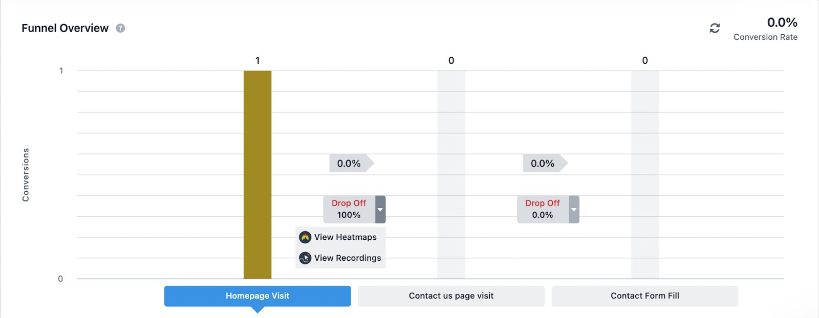
- Funnel tracking to visualize the visitor journey and know where they drop off. Funnel visualization, in combination with heatmap and session recording, allows you to know why visitors are converting or losing interest. For example, the following is a funnel overview of the lead generation journey in VWO.
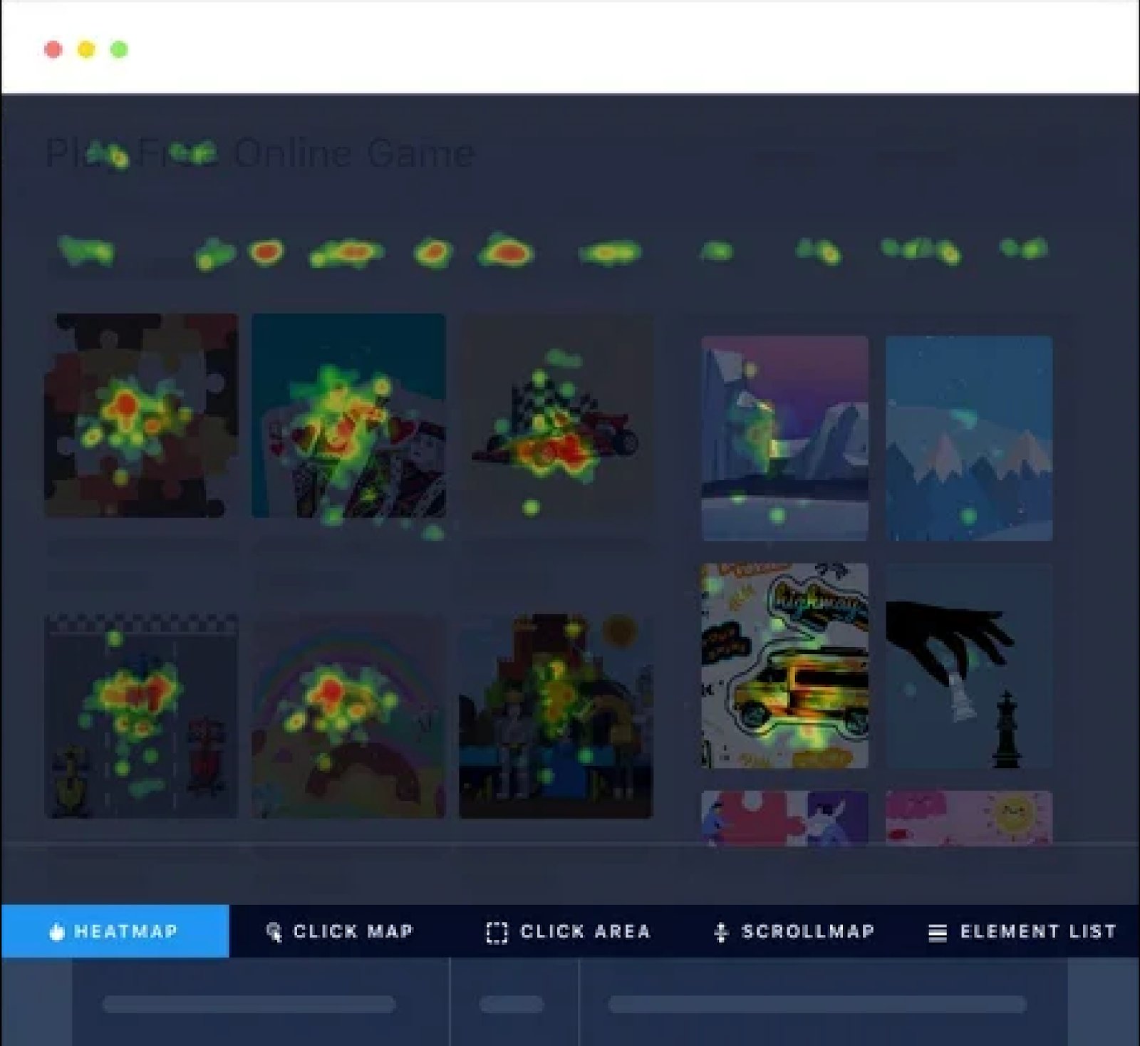
- Heatmap tracking offers a comprehensive real-time view of website visitors’ movement and behavior. You can gain insight into how website elements are perceived with features such as dynamic heatmap, clicks-map, scroll-map, element list, and click area.
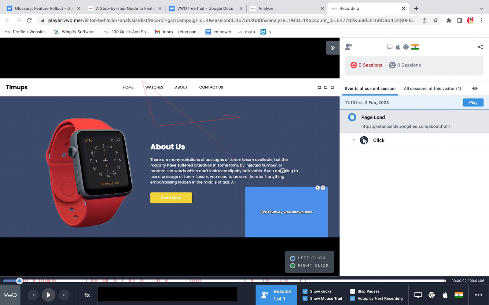
- Session recording to record visitor interaction for a single page or the complete website. You get to view the mouse movement and clicks to know how visitors engage with the overall website design, CTA position, content, and other aspects. With session recording, you can know the difficulties faced by visitors.
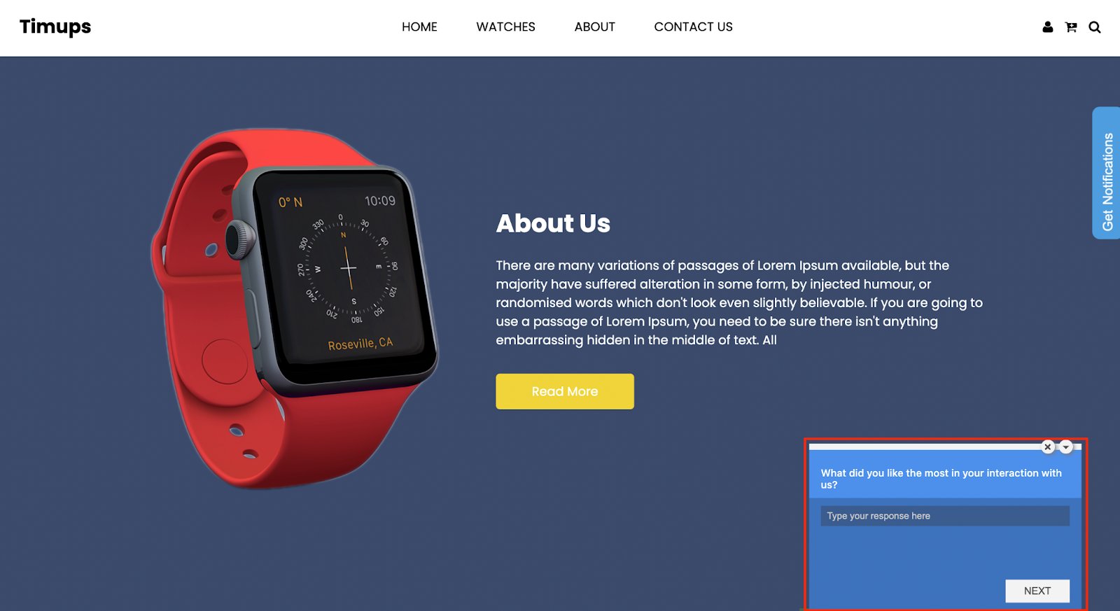
- On-page survey to collect visitor feedback on website experience. The survey can be triggered based on specific events like when the visitor lands on the check-out page and can be targeted for specific visitor segments. You also get the option to view session recordings of the survey to scrutinize its performance.
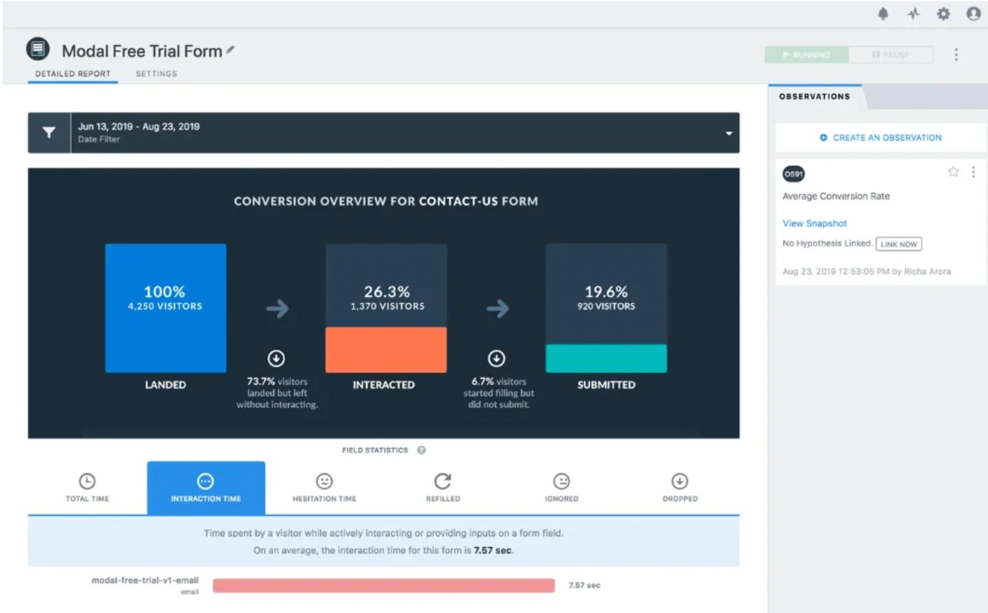
- Form analytics to analyze the performance of all types of website forms. Form analytics helps understand visitors’ interaction with your forms and the factors that lead to drop-off. You can identify which fields caused the most confusion, took the most time or needed the most revisions for the visitors.
Note: Except for the survey, visitors are sampled uniformly for tracking and analysis for all other products in the insights. You can read more about the sampling logic of VWO. When signing up for the free trial of VWO Insights, the visitor quota is allocated based on your website’s monthly traffic. You can select from the following options during the free trial sign-up process:
| Selection | Allotted Quota |
| Upto 10K | 10K |
| Upto 50K | 50K |
| Upto 100K | 100K |
| Upto 200K | 200K |
| Upto 500K | 500K |
| Upto 1M | 500K |
| More than 1M | 500K |
| I am unsure about my visitors | 100K |
2. Web experimentation | VWO Testing
Once you have gathered visitor behavior insights, you can form hypotheses for running tests. You can perform A/B testing, Split URL testing, and Multivariate testing with VWO Testing to optimize the website for various marketing objectives. Here is what you can do with VWO Testing:
- Define specific pages, URLs, and URL patterns for the test. Segment visitors for testing based on visitors’ interests, demographics, or any custom characteristics.
- Modify elements, embed media, and add widgets and dynamic text to create variations for A/B and multivariate tests with a drag-drop editor. Also, your development team can use an inbuilt code editor to make complex changes.
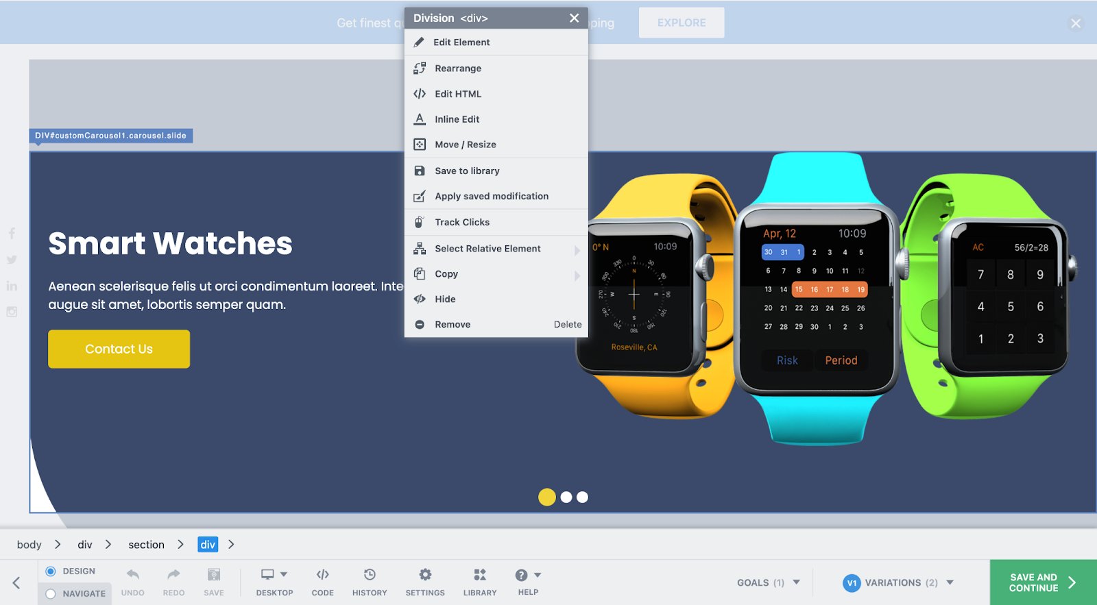
- Set goals for page visits, engagement, form submissions, clicks on links and elements, revenue, or a custom event.
- Allocate traffic to variations, integrate third-party apps for data transfer, and create mutually exclusive groups for similar tests, such as two A/B tests with different product prices.
- Get real-time reports that are easy to understand and equipped with over 20 predefined segments, like new or returning visitors, devices, location, etc., for detailed analysis. Additionally, you can compare the behavior of two segments, such as visitors exposed to a special promotion and those who were not.
Additionally, you get to,
- Tailor variations for particular devices or uniformly implement them on all devices.
- Organize your testing program with ease using the Kanban board, providing a clear and comprehensive overview of your entire testing pipeline. It enhances accessibility and transparency.
- Record learnings from past tests so that all teams can build better hypotheses and test them in the future.
- View the heatmap and click map for variations and control.
In the free trial, you get a quota of 10K visitors for VWO Testing. A unique visitor can become part of multiple tests but will be counted only once. Also, it is important to note that only visitors who become part of a campaign are counted and not the complete website traffic.
3. Server-side experimentation | VWO Fullstack
There are multiple use cases, like search algorithm testing for instance, for experimenting on the server-side to avoid flicker and ensure zero latency. You can perform server-side testing to test complex ideas with VWO FullStack. Here are the capabilities that you can explore:
- Run experiments and launch new features across multiple channels, such as web, mobile, email, etc.
- Test different variations of a product’s features, functionality, design, and pricing.
- Release new features to a small group of visitors or even to a production environment without releasing them to the entire visitor base.
- Connect the data sources with the popular tools used for data storage, business intelligence analysis, and customer data platform.
- Get advanced reporting and identify instances like a group of visitors demonstrated a substantial deviation in conversion rate compared to others for a particular objective or variation.
We offer an assisted free trial for VWO FullStack that includes backend installation and initial campaign setup. Also, you get a quota of 10K visitors per month in the free trial.
4. Mobile app experimentation | VWO Mobile App Experimentation
You can also use VWO Mobile App Experimentation to optimize your in-app experience. Here is what you can do:
- Test everything from simple CTA button changes to complex app flow.
- Measure ROI, and identify conversion triggers.
- Test new app features on a selected audience before making it live for all app visitors.
We provide an assisted free trial for VWO’s Mobile App Experimentation that includes backend installation and initial campaign setup. Also, you get a quota of 10K visitors per month in the free trial.
5. Personalization | VWO Personalize
You can tailor visitor experiences with VWO Personalize based on visitors’ past data. Your visitor data is secure with strong privacy and security protocols. Here is what you can do with VWO Personalize:
- Create personalized experiences for different visitor groups with a WYSIWYG Visual Editor.
- Monitor the performance of personalization efforts and assess their impact on different visitor segments with a central platform-level metrics system.
- Integrate third-party analytics tools, CMS, CDP, and ABM to fill lacking visitor information and understand customer behavior to create complex customer segments.
Similar to VWO Testing, for VWO Personalize free trial account, you get a quota of 10K visitors. A visitor can become part of multiple personalized campaigns and will be counted only once.
6. Rollout | VWO Deploy
Once you have your experimentation results, you can choose to push your winning version live using VWO. VWO Deploy allows you to roll out minor changes or revamp the website. Here are its features:
- Drag and drop editor to edit, resize, move, and replace the existing elements, and the option to add widgets. Also, there is a code editor to make complex changes.
- Live preview of the changes on different devices and browsers
- Ability to deploy winner variation from web experimentation.
- Option to roll out new changes to a segment of visitors so that you can release relevant changes as per visitor background and interests. For example, releasing a greetings widget for festive seasons as per geography.
For a free trial, you get a quota of 10K visitors for VWO Deploy. A visitor can become part of multiple deploy campaigns and will be counted once.
7. Customer data platform | VWO Data360
When customer data feeds into the experimentation and personalization loop, it keeps you on the right track. VWO Data360 is a customer data platform that provides a single and coherent view of all customer data. The platform allows data unification that can be later used for segmentation and targeting in campaigns. The Data360 module enables you to create and manage the following features:
- Attributes: Attributes are variables that help identify and segment visitors, including information such as traffic source, browser used, visitor gender, subscription level, and location.
- Events: Events refer to actions taken by visitors on the website, like clicking on an offer banner or making a payment. Each event has a name and set of properties that describe it.
- Metric: With our tool, you can establish and monitor your goals/key metrics for a thorough understanding of your conversions, such as form submissions, page views, and clicks on specific elements.
- Profile: With our platform, you access all the information of a visitor, such as their attributes, events, segment membership, metrics, and behavioral data all in one place. It gives you the ability to perform in-depth analysis and better understand the motivations behind their actions. You can also see data related to VWO Testing, Insights, Deploy, and Personalize campaigns of which the visitor is part
- Audit: It lives streams the website events as a list. It helps to know if the set events are tracked properly on your website.
During the free trial, Data 360 can be used without any monthly set traffic quota. You can track the number of times an event is triggered but not track complex metrics like average order value or total revenue. Additionally, in the free trial, only one numerical property can be set for an event. Custom attributes such as age, gender, etc., cannot be created. Finally, the free trial only allows you to view up to five profiles in user profiles.
8. Program management | VWO Plan
With VWO Plan, you can collaborate with teammates and other teams to prioritize, analyze, and discuss experimentation campaigns. Here is what you can do:
- Store all your thoughts, insights, comments, or ideas related to any aspect of your experimentation program in a centralized database.
- Capture behavior data and record your observations from VWO Insights. You can use these observations to document and prioritize experiment ideas on the Kanban Board.
- Prioritize and execute testing ideas from a shared dashboard.
- Track key business metrics and monitor their changes over time with ease through the experimentation program.
In the free trial, you get full access to VWO Plan.
FAQs on VWO free trial
You can create your free trial account here.
You can use VWO with all features and capabilities for 30 days.
You get a live demonstration of the product with self-learning videos to understand its capabilities and dashboard functions.
If you don’t subscribe to a paid plan, the account is deleted after 45 days of inactivity. However, you can export the collected data before the deletion day.
Yes. A free trial account gets email, chat, and phone support for the complete duration. Also, we share some testing ideas with you that you can use to get started with experimentation.
Yes, we offer a VWO Testing – Web and VWO Insights – Web starter pack in which you get free usage. You can learn more about VWO pricing and plans.
Conclusion
In this blog, we have tried to provide exhaustive information on the VWO free trial. However, if you have further questions, please get in touch with [email protected]. Our support team is available to guide you throughout the free trial. Alternatively, you can also request a live demo to see VWO’s capabilities in action.
So, boost your optimization efforts, and grab an all-inclusive 30-day free trial today.
]]>Have you also spent hundreds of hours gathering and analyzing website data to build experiences that show no change in conversions?
If this is your story, I’ve got two good news for you.
First, you’ve arrived at the right place. And second, you’re not alone!
The case of missing uplift in conversion and revenue
Take the case of an online phone accessories retailer who recently launched a new line of customizable, superior quality phone covers. Despite offering the best products, they were not even close to meeting their conversion goals.
The team decided to find out what was going wrong by tracking visitor behavior. Heatmaps and session recordings showed how visitors interacted with their new offering. After studying the data, some key findings surfaced:
- Visitors dropped off on the customize phone covers page
- Visitors who dropped off spent the most time on the phone specification & personal details pages
Looking at this data, the team narrowed down actionable insights –
- Reduced the number of steps on the customize phone covers page
- Make phone specifications more visual
- Reduced form fields on personal details pages
While this worked, it did not get the expected uplift in conversion, and the team struggled to find reasons and fixes.
Does this sound familiar to you?
While chasing data to fix isolated friction points in the funnel streamlines the buying journey, it does not make the journey contextual or relevant to user segments. Visitors expect relevant experiences and want to feel valued at every touchpoint.
A delightful experience is a mix of experience optimization and engaging with your audience at the right touchpoints. Personalization aids in achieving the latter by helping you release sharp audience-specific contextual and personalized interactions based on user journeys. For instance, rather than simply reducing form fields to reduce drop-offs, the phone accessories retailer can leverage personalization to auto-filter and show customization options relevant to the visitor based on the device they’re using or auto-fill details for repeat customers, and so on.
Similarly, if a visitor on your website is from the US while another is from Germany, the German visitor might expect a local language experience on your website. Or, users who have an affinity for luxury brands are likely to be put off if the most relevant results show discounted brands on the product listing page.
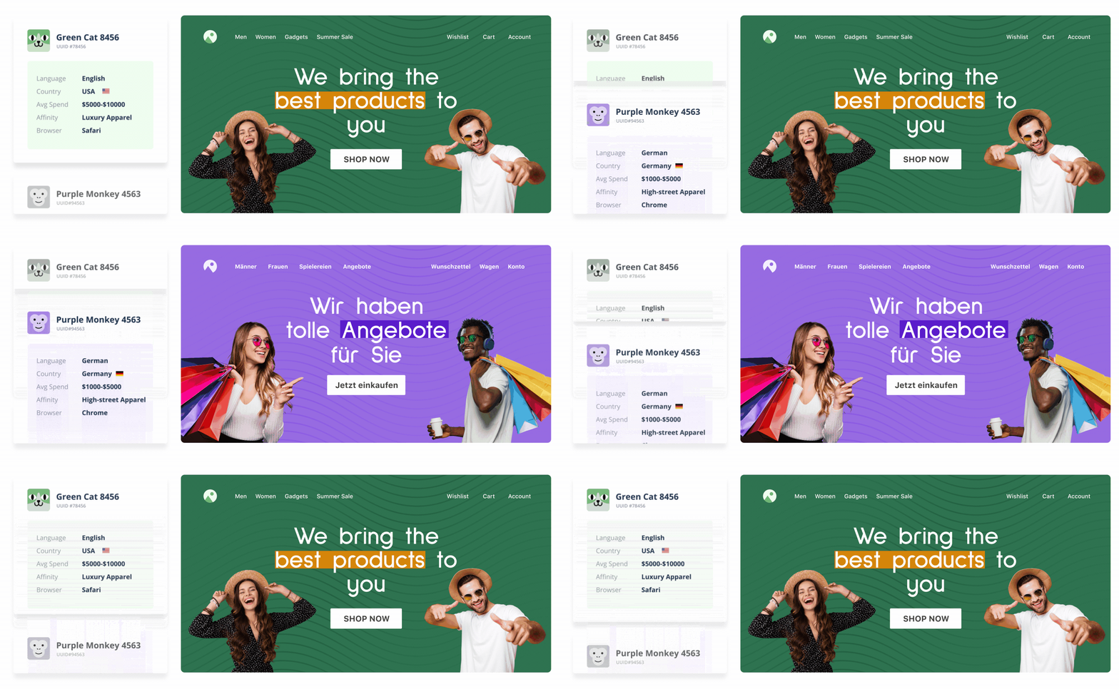
Besides this, visitors also need contextual information relevant to their journey to make a buying decision quickly. Personalization enables this. For example, you can nudge someone visiting a product page forward by showing positive product reviews as a notification triggered at the right time.
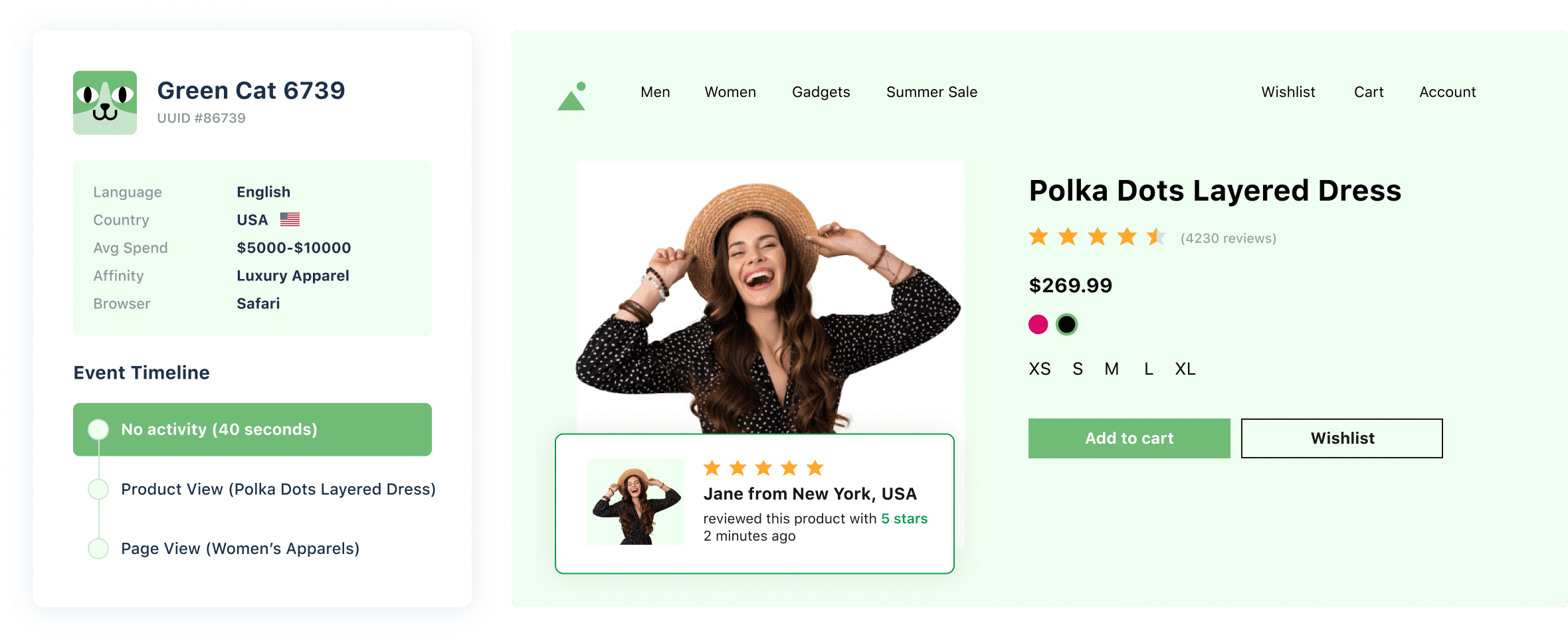
While these are some common examples of how businesses can create personalized experiences, there is no limit to what you can do. Irrespective of what your unique use case is, personalization always starts with your users’ data.
Data in personalization – All you need to know
Websites gather a vast amount of raw visitor data that has the potential to unlock valuable personalization opportunities. But to make the most out of the data you already have, knowing what type of data enables personalization is paramount.

A single view of enriched and intelligent data lets you craft experiences that convert. With digital advancement, surface-level personalization is not enough. The above data empower marketers to create behavioral micro-segments of website visitors, so they get personalized experiences at the right time in their journey. This data is collected from multiple sources and unified at one central customer data hub so that you can visualize and learn from your visitors’ behavior and leverage it in your optimization campaigns.
Let’s look at some ways you can define your audiences using raw customer data:
1. Pre-defined segments
You can build visitor cohorts using pre-defined behavioral, geographical, demographic, and contextual data in this segmentation method. You can also create micro-segments combining one or more of the above data sources.
The phone accessories online retailer mentioned earlier can use pre-defined data points (like device and browser used, location, behavior on site, past purchases, etc.) to create user cohorts, plan segment-specific campaigns, and only show them relevant content.
For example, they can segment visitors and deliver personalized content to reduce drop-offs on the customize phone covers page. Or show first purchase offers to new users to motivate them to complete the purchase. A micro-segment of iPhone 13 Pro users visiting the website for the first time and through a Chrome browser can be shown a special discount to nudge them to complete the purchase.

2. Custom attributes-based segments
Segmentation based on custom attributes helps deep-dive into visitor behavior and ascertain how specific segments respond to your experience. Contrary to pre-defined segments that cover generic visitor attributes, custom attributes help build cohorts using non-standard, domain-specific attributes that match your campaign goals. These are extremely flexible and allow you to create hyper-personalized interactions by filling in the gaps between pre-defined segments.
Imagine you are an eCommerce store collating and analyzing conversion rates. You notice that premium members convert at 10%, whereas general buyers convert at 2%. Using this data, you can go very specific, run targeted promotions for the general buyers to nudge them further into the funnel, and increase conversions from this segment.
Similarly, you can create custom segments based on attributes like visitors’ last visit to your website, guest visitors vs. members, monthly spends, buyer personas – discount, impulse or FOMO, frequent flyers, loyalty customers, top 5% ace gamers, and more.
3. Third-party data-based segments
Another data source that comes in handy when segmenting visitors based on external parameters is third-party tools and integrations.
For example, using Mixpanel, you can create cohorts of inactive users who haven’t used your product or app in the last week, craft re-engagement campaigns, and deliver personalized content to them for higher retention.
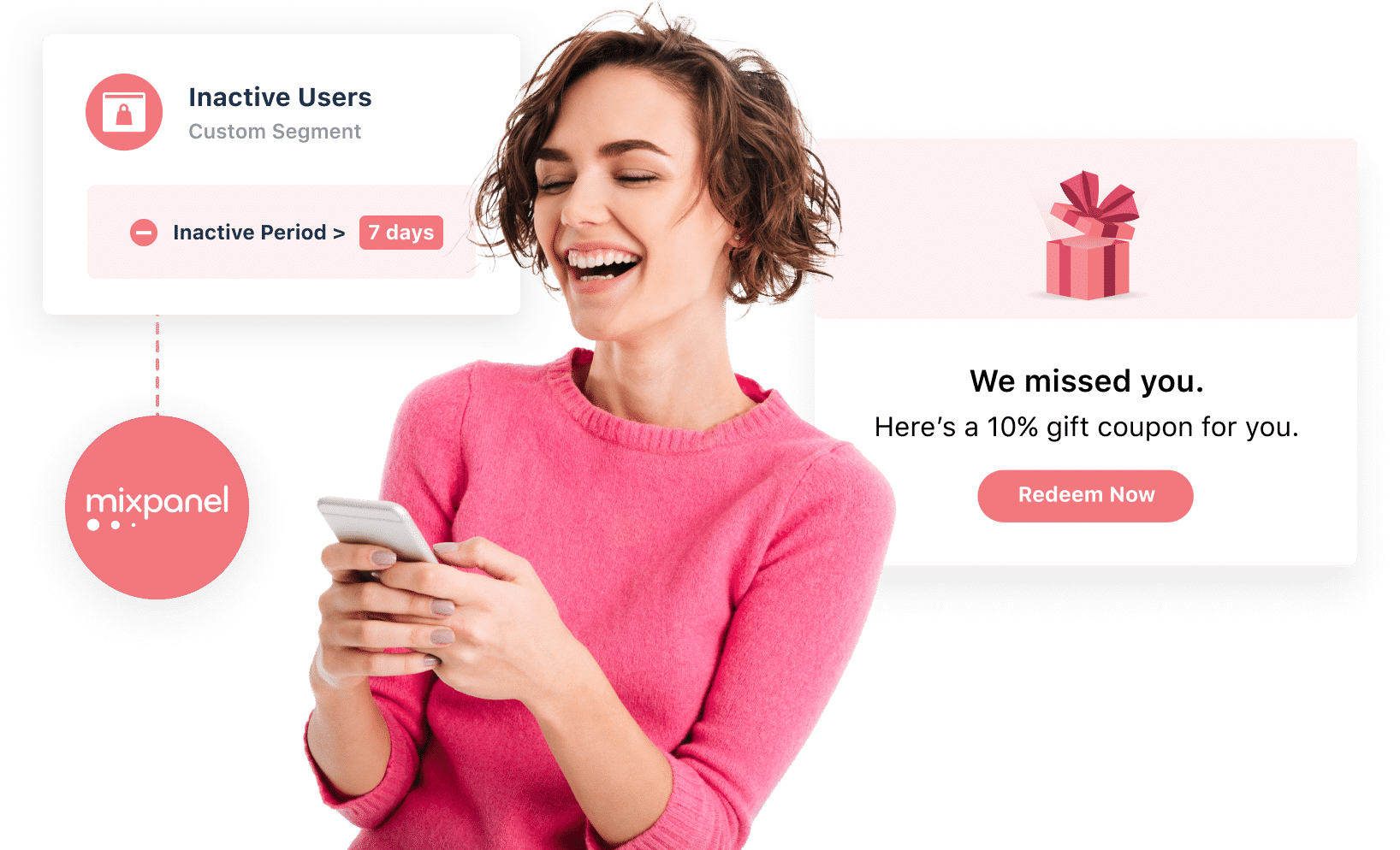
Similarly, using Clearbit’s data, like a company’s IP address, you can deliver personalized content on the homepage banner to visitors from a specific company or industry. B2B companies can leverage Demandbase to identify companies that match their defined ICP, create a segment of high intent prospects, and deliver meaningful information that helps convert companies on their very first visit to the website.
4. Uploaded visitor lists
Uploaded visitor lists consist of external data like stored cookie data, POS data, URL query parameters, premium user lists, etc., that you can import and use to create deep visitor segments. You can then run hyper-personalized marketing campaigns for these segments.
Let’s assume that you are an online gaming company. You want to target the top 10% of users of your game for a particular campaign. Working with the engineering team, you can get a list of every user that qualifies with their unique cookie value. You can deliver the desired experience using robust experimentation engines that let you upload this list onto its database.
These data sets create an invaluable collection of insights that can enrich your visitor interactions at every touchpoint. But knowing how and when to use them is critical to ensuring your campaigns’ success. Let’s look into some industry-specific use cases of personalization that help businesses create a differentiator from their competitors.
Personalization is for everyone
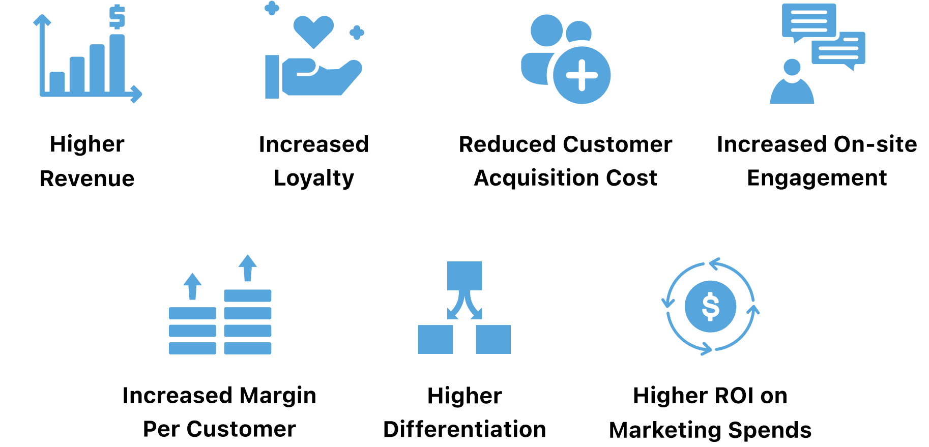
Whether you’re an online retailer looking to increase AOV, a SaaS firm striving to reduce churn, or a publishing house looking for more subscriptions, personalization helps businesses across industries gain deeper behavior insights and design delightful experiences that resonate with every visitor. If you are an online business looking to maximize ROI from existing traffic, build stronger visitor relationships and ultimately drive growth by delivering relevant experiences, read on to know how you can leverage personalization to activate your audience.
eCommerce
A study by McKinsay suggests that 80% of online shoppers want personalization from retailers. These potential buyers on your website that you want to convert come from varying geographies and demographics looking for various products. The same shopper may like shoes from Retailer A but not their joggers, some visitors may only shop during sales, and so on. And there is a cut-throat competition to acquire these prospective buyers. With personalization, you can dive deep into granular buyer behavior, and design tailored experiences so they choose you over your competitors.

Micro-segmentation for increased revenue
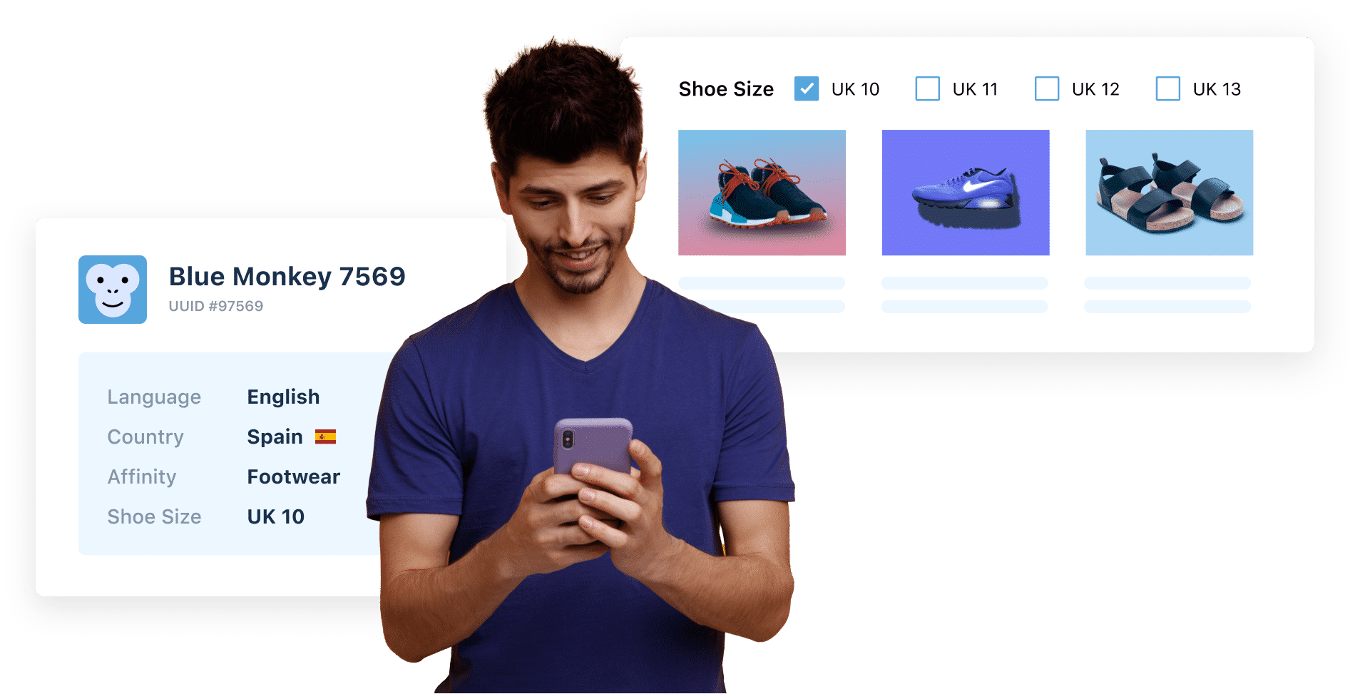
Using data like geo-location, past purchases, product affinity, etc., you can curate personalized offers and category pages, recommend products to cross-sell, upsell, and more.
For example, you can auto-apply filters on category, listing, and search pages, so visitors only see relevant products. This makes it easier for them to navigate through the products and increases sales.
SaaS
All SaaS companies aim to keep churn at a minimum. Their subscription-based model demands building long-term relationships. Leveraging personalization to design and deliver tailored experiences for visitors rather than a general spray and pray approach shows that the company values them and helps inculcate brand loyalty.
Personalized pricing and content for increased revenue
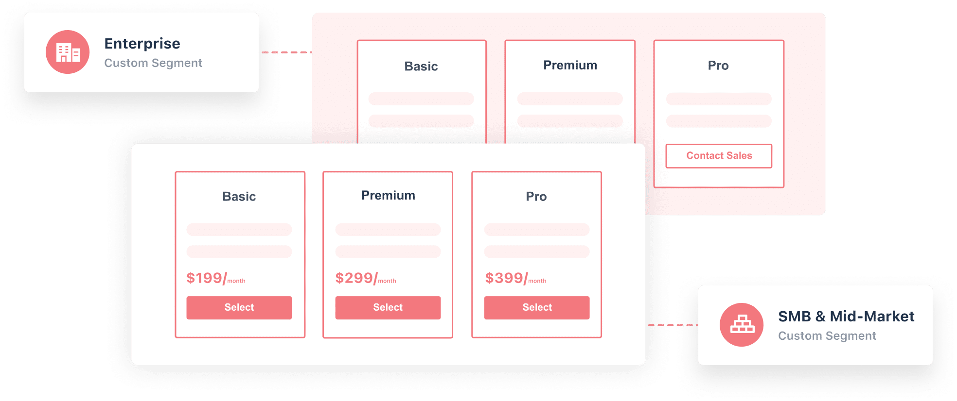
The pricing page is one of the most critical elements. You can create segments based on attributes like company size, revenue, etc., and craft experiences that match visitor expectations. For instance, you can personalize the pricing page to hide self-serve pricing and only show the “contact sales” CTA to Enterprise businesses while showing pre-set pricing to SMBs.
Marketers who evaluate a SaaS product conduct thorough research to find social proof. Using data from third-party tools like Clearbit, you can detect the visitors’ company/industry and trigger relevant logos, testimonials, and success stories. You can also track if the visitor has signed up for a free trial and craft the messaging so they only get content that nudges them further into the conversion funnel – from free trial to paid.
Travel
The travel industry caters to a diverse customer base. The needs and expectations of travelers keep evolving. Hence, it’s crucial to understand each visitor and curate personalized experiences.
Demography & purpose-driven personalization
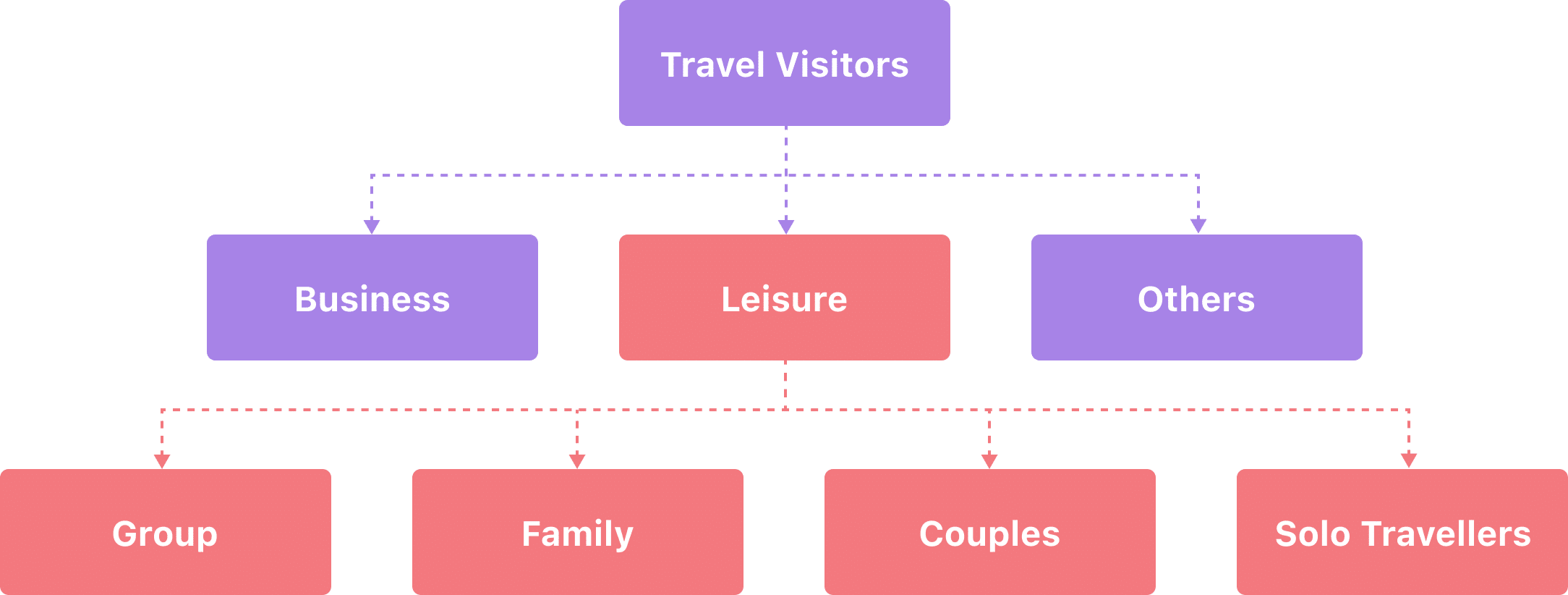
A majority of people travel for business or leisure. Once visitors enter travel details like date, destination, number of travelers, etc., websites can use the data to show them purpose-specific travel options & information.
For business users, show easy cancellation policies, boardroom facilities, how to get an invoice, etc. For leisure users, show activities, spa options, pool timings, 24-hour room service, discounts, etc. You can further break down the leisure demographic into more targeted groups.
You can also pair cookie data with previous purchases, pre-select options in the booking flow, or change the ordering of search results to show the most relevant result first.
E-Learning
People respond more positively to personalized content – interacting, watching, reading more, and ultimately converting.

Personalize learning flows
Many e-learning platforms offer a multitude of courses. But, only a few of them manage to retain learners. Personalization enables e-learning platforms to break away from the linear approach where every learner follows a pre-set flow.
You can personalize learning flows with dynamic feedback and/or contextual pop-ups. For example, you can ask learners to take a quiz at the beginning of the course to assess their abilities and recommend the next steps. This creates a personalized flow for each learner that matches their skills and expectations.
You can also offer dynamic feedback that reinforces good behavior or applauds achievements. For example, once a learner completes 50% of the course at a good pace and shows progress, you can trigger personalized pop-ups encouraging them to complete the course.
Leveraging contextual data about visitors, e-learning platforms can curate personalized pathways for each learner, thus giving them more control over the course they pursue.
Media
Personalization has already revolutionized content consumption and monetization. It helped Netflix become one of the largest OTT platforms. It has brought huge revenue uplift for social media giants like Instagram and TikTok by pushing content and ads based on what users engage with most on their platforms.

Personalized recommendations for increased subscriptions
When users easily discover content they like, they continue using your platform. And when they find value in your content, subscriptions skyrocket.
For instance, an online editorial news portal can increase readership and subscription by using behavioral data to show relevant news items first. If a visitor mostly looks for sports news, it can show them sports-related content first. If a visitor often reads political updates, show similar content to get them hooked.
How to personalize with VWO?
At the start of this blog, our phone accessories retailer had actionable data but lacked the means to design and release the right experiences across every touchpoint at scale.
To bridge this gap and empower businesses to deliver hyper-personalized journeys at a scale that accelerate growth, we recently launched VWO Personalize. With this latest addition to the suite of VWO products, we aim to connect every aspect of personalization so businesses across industries can unlock infinite growth possibilities. You can create multiple tailored experiences and target each of them to a different visitor segment in one single campaign without depending on your development teams.

VWO Personalize starts with helping you build cohorts using raw visitor data. It then lets you curate and release experiences using the widget library and code editor in our powerful WYSIWYG Visual Editor:
– Create personalized experiences in a couple of clicks using our Widget Library, where you can access a range of pre-designed, ready-to-use widgets. Drag and drop any existing template and design personalized experiences quickly. In the library, you can find widgets for banners, modals, scroll to the top, countdown timer, social share, and more. You can also use dynamic texts in the content to further hyper-personalize the web page catering to individual segments.
Suppose you want to run a sale campaign on your homepage for a specific visitor segment. In that case, you can go to the Widget Library in the VWO Visual Editor, select the type of banner you want to add to the page, edit its content, and voila!
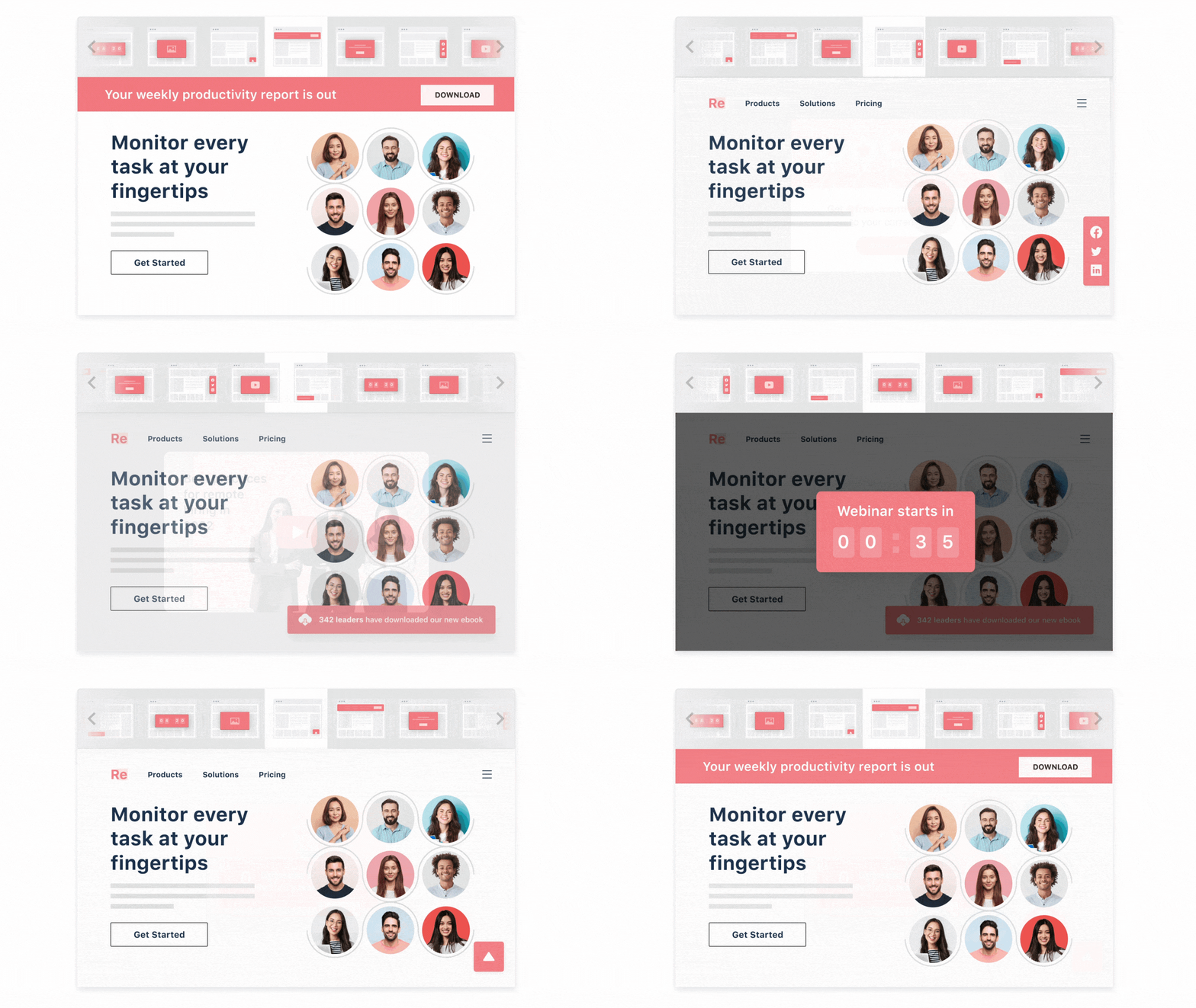
Similarly, if you are an online retailer looking to increase sales in the US region, you can add a sale countdown to specific product pages and deploy it for visitor segments you want to target. With our Widget Library, you can design as many hyper-personalized experiences for your visitor segments within minutes.
– When you want to deliver something unique, create custom templates with our Code Editor. Insert custom Javascript codes and variables into your website and build your own unique widget and experience that match your campaign goals.

Let’s say you want to add a hover effect on your product pages. Using our Code Editor, you can simply write a custom CSS or Javascript code and deploy it on the pages you’d like. Take a free trial or request a demo with our product experts to understand how VWO Personalize can help your business achieve unprecedented growth.
Personalization vs. privacy – Striking a balance
Throughout this article, we’ve discussed how visitors leave behind data trails with each online session. Companies capture this data daily to use it to personalize campaigns and interactions. But, the amount of data gathered also calls for concern about misusing visitors’ data without their knowledge. Inevitably, while visitors prefer personalized, contextual experiences, there is an inherent fear that couples it.
The question facing companies is how to use this data for personalization without breaching privacy and security. Many regulations like the European General Data Protection Regulation (GDPR) have been implemented to address this.
But companies need to take the onus of responsibility. To win visitors’ trust, they must do more than just fulfill the regulatory requirements.
Companies must ensure that their personalization practice is always compliant by adopting a privacy-first approach that ensures privacy and data safety. They must constantly update security controls with evolving data protection regulations and reforms.
Maintaining transparency about data collection, storage, usage, and what businesses do to ensure its safety is critical.
With VWO Personalize, you run data-driven campaigns and release hyper-personalized experiences while ensuring absolute data privacy. It is designed with a privacy-first approach, complies with global data protection norms, and comes with airtight controls that ensure your visitors’ privacy.
What next?
Customized covers of superior quality were the USP of our online phone accessories retailer. The irony was that most visitors were dropping off on the customized page itself. The changes made didn’t help since they were non-targeted blanket changes. Personalization fills this gap.
With personalization, our retail guy can:
- Implement auto-filtering and show customization options relevant to the visitor based on demographic data like age or gender & contextual data like phone model used
- Trigger location-specific payment options
- Trigger offers and dynamic content based on the buyer stage a visitor is on
This list is not exhaustive, and the possibilities to personalize are infinite. Visitors expect personalized experiences. If they don’t get it on your website, they will move on to the next available option. So don’t lose out on any more business. Start your personalization journey and unlock unlimited growth opportunities to scale your business now.
]]>From welcome emails to replenishment and from verifying profiles and codes to saving purchase receipts, email marketing is what drives revenue for most businesses. And ecommerce couldn’t be out of the picture.
Download Free: Cart Abandonment Guide
Abandoned cart emails are one of these types of email automation techniques that can make conversion rates skyrocket! But what are those emails exactly?
Cart abandonment emails are sent automatically when a user does not move forward with a purchase, despite having added an item in their cart. They are light-hearted, fun and almost expected sometimes, as there are various reasons why a customer may not complete a purchase.
But why are they fun? Why are they expected? And why are they needed? Well, let me tell you a thing or two…
Why do businesses need to invest in Cart Abandonment Emails?
So, you’ve set up your ecommerce store, right? Design, brand tone, data at the ready, your layout and the products are there… So, you take the next step: Awareness. Or, in other words, ads.
You can take your team in endless brainstorming sessions, you can have your strategists rake their brains and your creative team work wonders, but there will be something missing, without a cart abandonment email automation plan. Cart abandoners are the most “expensive” tribe of them all, as failing to re-engage them could be a lot like leaving money on the table.
Luckily, there are tools to help you design and implement strategies that will make even the most stubborn turn around and give you a happy smile.
For example, Moosend, which is one of the best Mailchimp alternatives, can give you the opportunity to combine every email marketing action, such as sending newsletters and transactional emails, such as the cart abandonment emails we’re talking about, all from one place.
“And why would I need to do that?” You’ll ask. So, let me clarify the reasons why, with some visual aid:
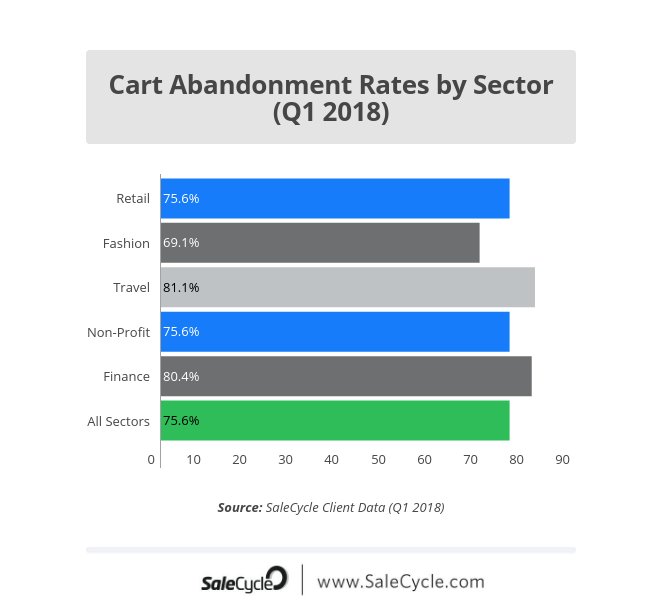
This statistic by SaleCycle, shows the cart abandonment rates by sector. Unsurprisingly, tourism is the first one to have been hit, which is completely normal, seeing as a booking can be impulsive but deciding on a destination cannot be which leads to customers abandoning their carts. The tourism sector is closely followed by online retailers at 75%.
Also, unsurprisingly enough, the cart abandonment rate for all sectors is very high. 75.6% high, to be exact. Which leads us to the following question: Why would a person be so quick to abandon their cart in the first place?
Pure, square logic indicates that since a visitor bothered with putting something in their cart, they want to buy, right?
Wrong!
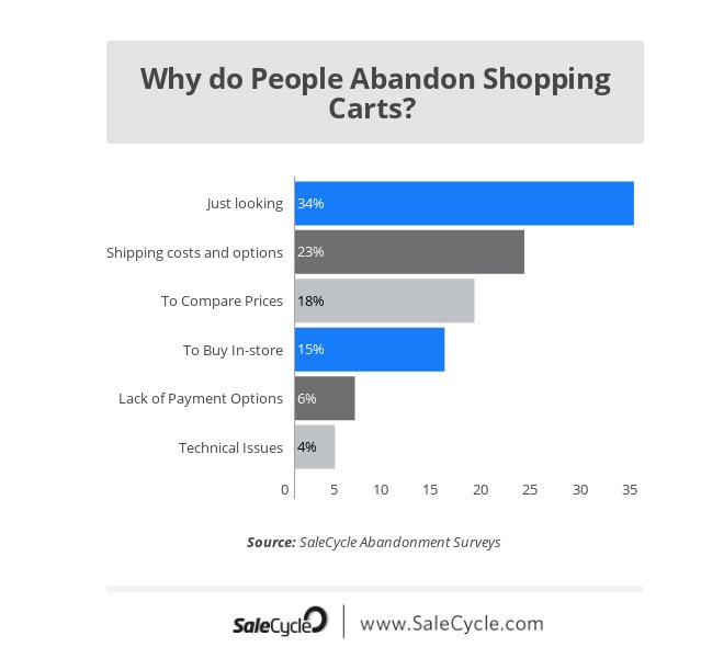
Most users add items in their cart just to keep them in one place while looking around. Kind of being in a big department store and looking at a shirt you’re not exactly in love with but wouldn’t mind trying on.
I’ve done the same thing a billion times because an item was on sale and I wanted to have it in my cart so that nobody else could access it (silly me!). I’ve also done the same thing in order to calculate shipping costs.
These two facts don’t indicate an intention to buy. Hence the need for cart abandonment emails.
The cart, to be honest, was over and done with as soon as I could see that the shipping costs were too high for my liking. I belonged to that 23% the above stat shoes.
So, fellow marketer, how would you entice a customer like me? What kind of email would you make sure I received?
And before you claim that an email is not the product so why would anyone be convinced through that email if they weren’t convinced by the product, blah, blah, I’ve got more numbers for you:
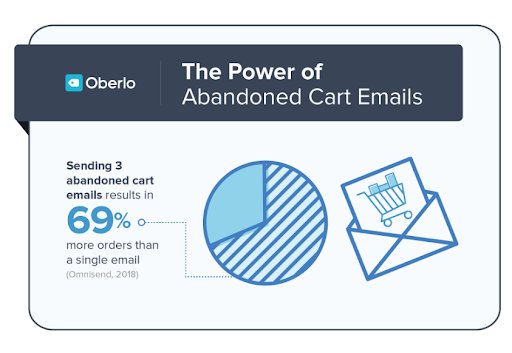
It seems like cart abandonment emails are doing pretty well, seeing as just three of them can result in a 69% increase of orders, as the stat above shows.
But this won’t happen just because you sent out a cart abandonment email and called it a day. You’ll need to stand out, do something that others don’t. Or perhaps, take a look at the best and steal their methodology!
Which is what I’m willing to help you do.
Examples and Tips
I’ve gathered some emails with high open-rates that I feel can back up the data I mentioned above and I will explain why, seeing as you’ll need some actionable tips to “study” (ie steal). So, let’s go:
Exhibit A
The first example for your “how-to” list:
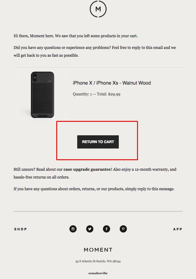
The Moment is an eCommerce store for anything and everything smartphone gear and a great example of a cart abandonment email with a tone consistent with the brand itself.
The questions in this particular email are the ones aiming to tell the customer how silly it was to abandon the cart just like that. Imagine the dialogue here:
-Did you have a problem with your purchase?
-No, I didn’t.
-Are you unsure about your order? Because we’ve got a solution for that.
-Oh why thank you!
-Let’s go back to your cart, then.
Easy, breezy, laid-back and friendly.
The first thing you should think of when coming up with content for a cart abandonment email should be a tactic that will make your call to action seem effortless, as if a friend was talking to another friend.
And our CTA here is doing exactly that: It’s made with a no-pressure, no-rush kind of logic, it’s effortless and friendly. Which really is the whole point, as we don’t want things to seem like a big deal. Baby steps.
The goal here is not to go for the hard sell, but to re-engage the customer by being the brand that misses them and wants to interact with them. Your copy doesn’t need to be too strong for something like that and there needs to be as little pressure as possible.
However, you’ll need to entice them a little, just to make them buy. Here, the enticing thing is that Moment has answers to your questions. Like so: “Are you feeling unsure? Well, fret not, cause we’ve got XYZ things to provide.”
Download Free: Cart Abandonment Guide
Exhibit B
The second example is none other than Adidas:
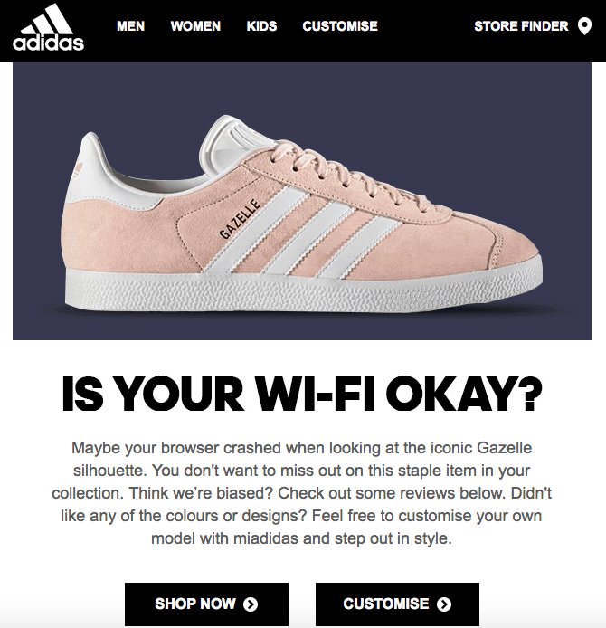
That brand goes and does it again! Of course, a multi-billion company like that one couldn’t have done anything less than perfect, but their strategy here is magnificent.
Not only are they showing the customer what they’ve left in the cart, but they also are pretty smart about it, with their friendly tone and their little joke.
They just don’t want you to miss out on this opportunity and they’ve got social proof on how good an opportunity that is, if we’re honest. “Just check out some reviews”.
-Oh but my friends at Adidas, I didn’t like the colors.
-You can make your own custom model, isn’t that amazing?
Go check the graph with the reasons why people abandon their online shopping carts again. You’ll see that this email has all the answers:
You weren’t ready?
Sure, check the reviews to make sure that you understand what you’ll be missing out on.
You weren’t too much into the design? Understandable.
Why don’t you try and make one of your own, that will be custom made only for you?
These itty bitty techniques make the user feel like they’re valued, cherished, as it seems like the company actually cares about their preferences.
And this can bring a whole lot of lost revenue in return.
Exhibit C
Let’s go for that cool, calm and fun California vibe, shall we?
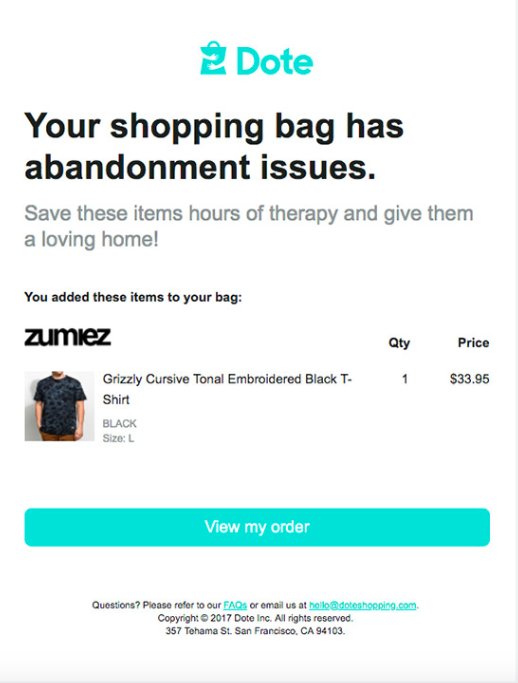
This one is one of my favorites ever.
Dote is an eCommerce store that is colorful, youthful and has that classic San Francisco vibe about it.
Do you see that reflected in the email? Well, I’d say so. The email itself is colorful, light, happy and doesn’t forget to incorporate humor while we’re at it. Which is something you should do for your brand as well, if, of course, your brand and humor go together.
What is important is to keep your brand tone intact at all times and Dote is doing exactly that, thus not confusing the customer.
So, now we’ve got our data, we’ve got our examples and tips on what to do and what would benefit your brand… Let’s move on to the final category.
Things to avoid
Nobody’s perfect and the point is not just to write fun and engaging emails, but to know what to do and make data-driven decisions along the line.
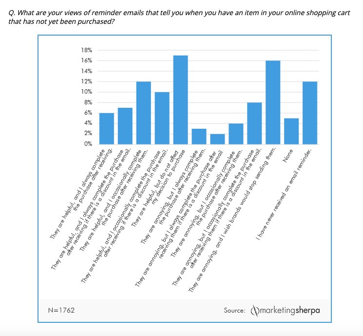
The graph above is more proof that cart abandonment recovery emails are helpful, but as you can see for yourself, there is a 38% that still finds them annoying. This is where my tips and tricks come in handy.
So, here’s the final list I’ve got for you: The basics on what to avoid, in order to make sure that your campaign will work and convert that 38% that was annoyed with your reminder:
- Don’t ignore your data
Everyone leaves a digital footprint, whether they’re a customer or a mere visitor to your website. You can use that footprint to extract data and make sure you understand which step of the purchasing process made your visitor drop out.
Once you’ve got that down, customize and optimize! Was the shipping cost too high? Offer free shipping or offer a discount to make it work!
Was the process too complicated?
Make it simple!
Whatever you do, just study your data like the gospel, if you want to reach your KPIs and make the most of your subscriber list. - Don’t ignore feedback
Let’s assume that your data doesn’t hold as much information as you would’ve liked, about the customer and why their cart was abandoned. Well, this is a sticky situation, isn’t it?
Here’s where you should send out a survey (or post it on your social media profiles, or both). This will make the customer feel cherished, unique, and you’ll establish an image of a brand that cares a lot about its customers and what they’ve got to say.
So, apart from trying to check your data each and every day, you can opt for a survey or some good ol’ “A dedicated agent is here for you, if you want to chat.”, of course including links to your customer service and/or social media pages.
The issue with many brands is that they don’t really try to change negative reviews. Therefore, the ones that do care about it, are the ones that stand out! - Don’t ignore the need to segment your list
I think this one shouldn’t even be here, seeing as list segmentation is one of the most tried-and-true techniques, up there with A/B testing. This pretty much means that if you haven’t done it already, you should.
Segment your list, in order to know where and how to send any and all kinds of emails in general and cart abandonment emails especially, seeing as not every user is the same and not every customer is at the same point in the sales funnel.
List segmentation, combined with your data, will give you endless potential when it comes to increasing sales, revenue and leading customers further down the sales funnel.
To sum up
There really is no need for you to go crazy with tactics, CPC ads and stacks full of data. You just need the proper tools to measure, segment and don’t forget a basic principle or two:
Always keep your brand tone and never forget that shopping cart abandonment emails can very easily look like they’re pestering people into buying.
But with a little humor and a little great copy and visuals, everything can happen!
]]>VWO is changing gears, and we want all our customers to know what is happening. Along with laying the foundation for brands to deliver great digital experiences at every touchpoint across their entire customer journey, we have also made some changes to the feature set and pricing of some of our existing plans and introduced a new VWO Testing Pro plan. Being a VWO Testing customer, you might be wondering what exactly changes for you.
Download Free: Customer Experience Optimization Guide
To start with, we immensely value our relationship with all our customers, and as a way to honor our existing commitments to you, we will be grandfathering your existing subscription’s terms & pricing. This essentially means that despite us introducing new plans, your current plan, and all its features and benefits stay intact.
Here is a summary of the most important changes for you:
- While there will be no changes to your current dashboard, the navigation bar has a new look:
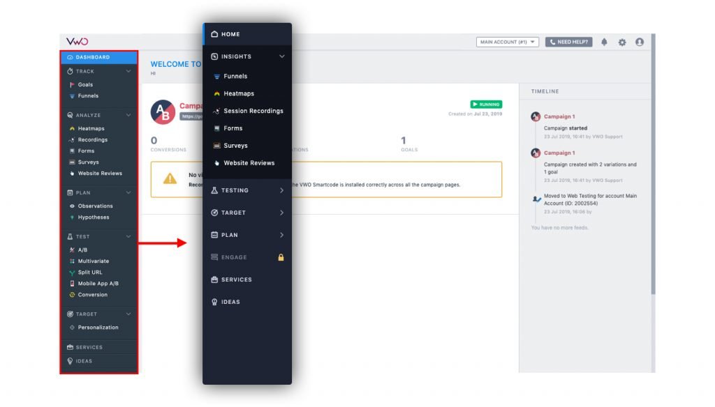
- The personalization and conversion tracking campaigns & variation heatmaps are no longer a part of the new VWO Testing only plans. However, your subscription will continue to have these features.
- The same goes for website reviews campaigns. This feature is now a part of the VWO Insights product but since we are grandfathering your account, you will continue to receive support for this feature as well. The only change is that you will be able to access Website Reviews under the Insights tab in the VWO app.

- Now, a visitor will only consume one unit of your visitor quota even if they become a part of more than one experiment in a trial period from the subscription start date. This gives you the power to run multiple experiments at scale. With this, we’ll stop rolling over the visitor quota to the next month or the next billing cycle.
- The new and updated VWO Smartcode will have the following changes:
- Asynchronous Version : It is advisable for all of our customers to use the new VWO Smartcode. This will be a single code which will work for all products in the VWO Platform – Testing, Insights and Engage, and will support all future updates. It automatically supports single-page applications (react, angular based websites). Also, the VWO Smartcode automatically mitigates itself in case it is installed multiple times.
- Synchronous Version: The code will work for all products in the VWO Platform – Testing, Insights, and Engage, and will support single-page applications (react, angular based websites) along with all future updates as well. Caching support is included too.
Please note: While your existing VWO Smartcode will continue to work, we advice you to replace it with the new one.
- Any new additional quota purchase to your existing plan will be as per the new pricing but we will continue to grandfather your account and you will have access to all current features.
- To start a free evaluation of any other product in the VWO platform, please feel free to reach out to us at [email protected] or fill the contact form from within the app. Please note, evaluating or purchasing any other product will not affect your grandfathering status for the VWO Testing subscription you currently have.
- However, please note that if you decide to upgrade your VWO Testing plan in the future, new terms and pricing shall be applicable and grandfathering will no longer be valid.
- Along with the launch, we have also updated our terms & conditions which are available at https://vwo.com/terms/. The current terms & conditions can be referred here The new terms and conditions will come into effect for you on September 15th 2019.
VWO Engage (PushCrew) Customers
With the launch of the VWO Experience Optimization Platform, we’re rebranding PushCrew as VWO Engage. For those of you who are unaware, both PushCrew and VWO are products built and managed by the same company. You can continue to use VWO Engage as a standalone product and also as part of VWO Platform. Being a PushCrew customer, you might be wondering what exactly changes for you.
To start with, we immensely value our relationship with all our customers, and as a way to honor our existing commitments to you, we will be grandfathering your existing subscription’s terms & pricing. This essentially means that despite us introducing new plans, your current plan, and all its features and benefits stay intact.
Here is the list of rebranding changes:
- ‘pushcrew.com’ will be automatically redirected to ‘vwo.com’.
- You will still be able to login from pushcrew.com/admin
- You will also be able to login from ‘vwo.com’ by clicking on the VWO Engage button in the login dropdown on the top right corner
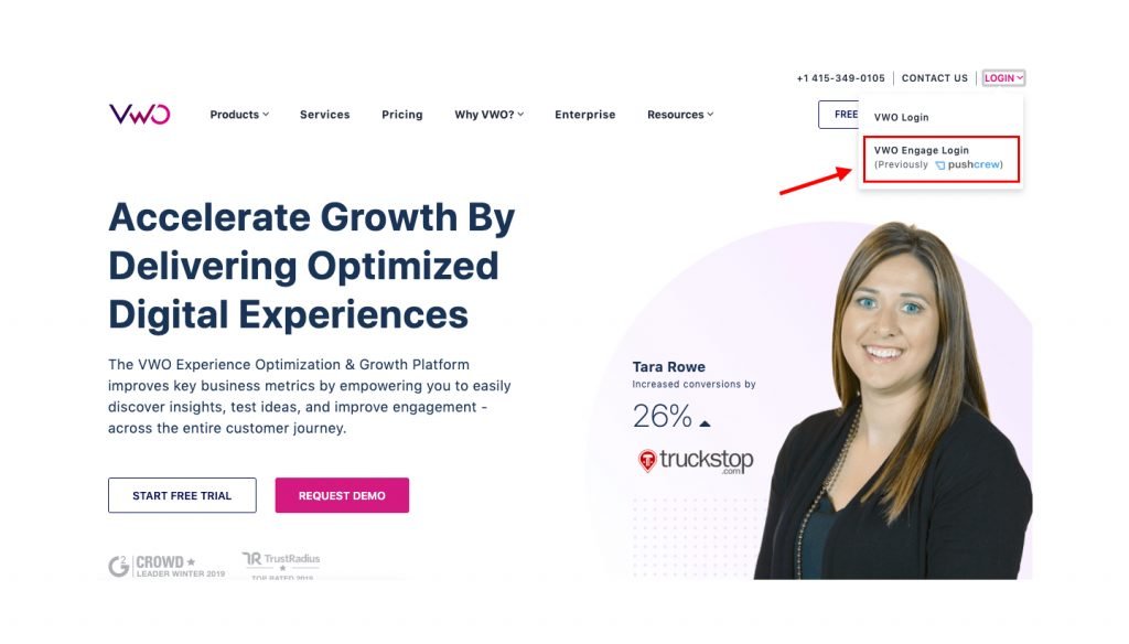
- The push notifications as well as the opt-in windows will continue to display ‘powered by PushCrew’. This, however, will change to ‘powered by VWO Engage’ from 15th September 2019 onwards (not applicable for Business & Enterprise plans customers).
- The PushCrew plans have also been renamed to align with VWO nomenclature as:
- PushCrew Premium to VWO Engage Growth
- PushCrew Business to VWO Engage Pro
- PushCrew Enterprise to VWO Engage Enterprise
- Any new additional subscriber quota purchase to your existing plan will be as per the new pricing but we will continue to grandfather your account and you will have access to all current features.
- To start a free evaluation of any other product in the VWO platform, please feel free to reach out to us at [email protected] or fill the contact form from within the app. Please note, evaluating or purchasing any other product will not affect your grandfathering status for the VWO Engage (Pushcrew) subscription you currently have.
- However, please note that if you decide to upgrade your VWO Engage plan in the future, new terms and pricing shall be applicable and grandfathering will no longer be valid.
- Along with this rebranding, PushCrew’s terms & conditions have been merged with VWO’s terms & conditions which are available at https://vwo.com/terms. The current terms & conditions can be referred here. The new terms and conditions will come into effect for you from September 15th, 2019 onwards.
Download Free: Customer Experience Optimization Guide
Current CRO Customers
VWO is changing gears, and we want all our customers to know what is happening. Along with laying the foundation for brands to deliver great digital experiences at every touchpoint across their entire customer journey, we have also made some changes to the feature set and pricing to some of our existing plans. Being a VWO CRO customer, you might be wondering what exactly changes for you.
To start with, we immensely value our relationship with all our customers, and as a way to honor our existing commitments to you, we will be grandfathering your existing subscription terms & pricing. This essentially means that despite us introducing new plans, your current plan, and all its features and benefits stay intact.
Here is a summary of the most important changes for you:
- With the launch of VWO platform, we have unbundled all our products to enable our clients to pick-and-choose what they want and build their customized CRO stack. Your current CRO subscription includes the VWO Insights, VWO Plan & VWO Testing products and all related features. You will now have the power to easily add VWO Engage and VWO FullStack to enhance your CRO stack.
- While there will be no changes to your current dashboard, the navigation bar has a new look:
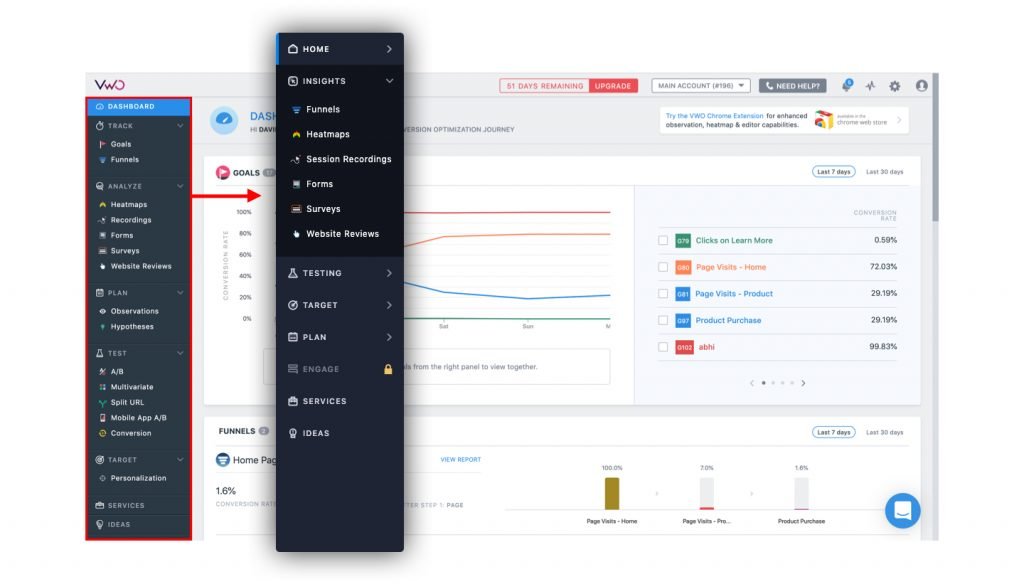
- The new and updated VWO Smartcode will have the following changes:
- Asynchronous version: A single code will work for all products in the VWO Platform – Testing, Insights and Engage, and will support all future updates. It automatically supports single-page applications (react, angular based websites). Also, the VWO Smartcode automatically mitigates itself in case it is installed multiple times.
- Synchronous version: The code will work for all products in the VWO Platform – Testing, Insights, and Engage, and will support single-page applications (react, angular based websites) along with all future updates as well. Caching support is included too.
Please note: While your existing Smartcode will continue to work, we advice you to replace it with the new one.
- The website reviews campaign feature is now a part of the VWO Insights product which is included in your subscription. The only change is that you will be able to access Website Reviews from under the Insights tab in the VWO app.
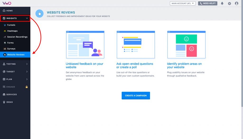
- Any new additional quota purchase to your existing plan will be as per the new pricing but we will continue to grandfather your account and you will have access to all current features.
- To start a free evaluation of any other product in the VWO platform, please feel free to reach out to us at [email protected] or fill the contact form from within the app. Please note, evaluating or purchasing any other product will not affect your grandfathering status for the VWO CRO subscription you currently have.
- However, please note that if you decide to upgrade any product included in your CRO subscription in the future, new terms and pricing shall be applicable and grandfathering will no longer be valid.
- Along with the launch, we have also updated our terms & conditions which are available at https://vwo.com/terms. The current terms & conditions can be referred here. The new terms and conditions will come into effect for you on September 15th.