
Johann, is the COO at AWA Digital, a leading international Conversion Optimization (CRO) agency, specializing in eCommerce.
He is also the coauthor of the book E-commerce Optimization, out in January 2017. He speaks about how they practice conversion optimization for different verticals of their eCommerce clients.
After reading this post, agencies will learn the nuances of CRO when applied to different eCommerce verticals such as Fashion, Homeware, and Consumer Electronics. They’ll learn CRO strategies that will help them make a stronger case for adopting CRO for their prospective eCommerce clients.
Introduction
1) How important do you think Conversion Optimization (CRO) is for eCommerce enterprises? Why?
CRO is one of the best growth strategies available to eCommerce firms. Turnover is not something you influence directly. It is the outcome of activities performed in other areas. The rate at which people buy from you and how much they spend when they buy, are within your control. In turn, these will increase the revenue and ultimately profit. This is what CRO is about.
On average, for every £92 spent on getting traffic to UK websites, only £1 is spent on improving the conversion rate. If you improve the ability of your site to generate money, your acquisition dollars stretch further as more of the visitors are converted to buyers.
2) Is there a difference in your approach to CRO for different eCommerce verticals? If yes, how?
Not really. We always follow an evidence-led approach informed by research, data analysis, and testing. That said, our implementation will not be the same on two projects as we are guided by the opportunities specific to that particular website.
As long as you follow the scientific method, which we outline in our book E-commerce Optimization, the same approach can generally be applied across different verticals. Broadly speaking, it’s a system of generating and prioritizing relevant ideas, and a mechanism by which to test those ideas.
3) Which are the major eCommerce verticals that you have worked with?
We have extensive experience in the fashion retail industry, having worked with top clothing and footwear brands from different countries. Furniture and homeware are two other categories we are well-known for.
Other big verticals for us include consumer electronics, flowers, gardening, gifting, health products, and outdoor travel gear. Our entire portfolio ranges from bathroom fittings to wearable technology.
Conversion Optimization for Different eCommerce Verticals
4) Do your CRO goals (micro and macro) differ for Fashion, Homeware and Consumer electronics based eCommerce businesses?
Our philosophy is to optimize for revenue, so in almost all cases, the primary metric is Revenue Per Visitor (RPV). If it’s an eCommerce business, Conversion Rate simply doesn’t give you the complete picture.
Secondary metrics, aligned with micro goals, vary widely. These are typically determined by the context of the experiment, rather than the vertical. For example, on a product detail page (PDP), you might want to track clicks on “add to basket” and engagement with product images. It helps to interpret the outcome of the test.
Sometimes we track key performance indicators (KPIs) outside of the testing environment. For example, experimenting with free delivery for a fashion client, we tracked product returns and married this data manually with test results.
5) What are the main “conversion funnels” for these different eCommerce websites? Do you see a difference in major traffic sources for the websites?
It’s not uncommon to see organic search being the major source of traffic for known brands. Often, the lion’s share of that is branded search terms, so in a way, it’s an extension of direct traffic. When a business is still establishing its brand, you’d expect to see more from paid search and other channels.
Many agencies limit optimization efforts to the website, which is a mistake. Social is an exciting area for some businesses, often rich with opportunities. Email consistently delivers good results for many of our clients and therefore, any gains in this arena can have a significant impact on overall business results.
Omni-channel, where we have a lot of experience, adds different dynamics. Not only do you see more direct traffic at the top of the funnel, but a large group of website visitors tend to browse with the intention to buy in-store. Or they may buy online, but only after visiting a store to “touch and feel” the product.
It’s important for the optimizer to take into consideration the entire journey, mapping out how the various touch points contribute to the purchase decision.
6) Which persuasion principles (scarcity, social proof, reciprocity, etc.) do you use in optimizing different eCommerce vertical websites?
We regularly use social proof, liking, authority, and scarcity. It depends entirely on the situation. We don’t actively look for ways to plug them in. Instead, we examine the data and use a principle if it seems like a relevant solution. For example, one of our clients sells plants by catalogue and online. A common sales objection was whether the flowers would look as good in the customer’s garden as they are in the product images. This prompted us to invite customers to submit pictures of products in their gardens, invoking the social proof principle.
Once we’ve decided to use a principle, we may run a few tests to find the best implementation.
If a principle is already present on the website, there could be ways of making it more persuasive. In some cases, a message can be distracting in one part of the funnel yet very effective in another area of the site.
7) Which are the common conversion killers for these different eCommerce enterprises?
Some are universal, for example, delivery. Not only do consumers generally resist paying for shipping, but long waiting periods put them off. If you charge for it, you have to treat it like a product with its own compelling value proposition.
In the fashion industry, it’s size and fitting. Will these boots fit me? How will this shirt hang on me? Is your size 8 the same as another manufacturer’s size 8? These are the common themes. Typical concerns in the furniture and homeware space are material composition, dimensions, and perspective.
Sometimes we’re surprised by what we uncover. One of our clients, a gifting site, had a great returns policy. Obviously this was messaged clearly on the website. However, we discovered that it actually turned out to be a conversion killer for them. Why? Many of the buyers were grandparents who didn’t want to contemplate the prospect of their grandchildren returning their gifts.
8) The buying cycle for each eCommerce vertical website varies. Does your CRO strategy take this into account?
Definitely. The buying cycle is something we map out carefully.
For us, it is crucial to get under the skin of the customer. We want to understand exactly what goes into a sale being made or lost.
It can also inform our approach with testing. Normally we’d run an experiment for two weeks. However, if the purchase cycle is longer than that for the majority of customers, we may extend the test duration.
9) Does seasonality have an effect on your CRO strategy for different eCommerce verticals?
Clearly, some verticals are affected by it more than others. Seasonality is partly a reflection of customer needs. It is easier to deal with if you have a solid understanding of the core needs. In some verticals like gardening, it might be a good idea to conduct user research in low and high seasons.
Some clients are loath to run tests during peak trading periods like Christmas sales. Our view is that it is essential to optimize the site for those periods, especially if they contribute to annual turnover in any significant way.
10) On which eCommerce websites do you employ upsell/cross-sell strategies mostly?
Because our primary metric is usually Revenue Per Visitor rather than Conversion Rate, a driving question for us is how to increase Average Order Value. Upselling and cross-selling strategies are, therefore, almost always on our radar. We have had great success, for example, by optimizing the presentation and algorithms of popular product recommendation tools.
Upselling and cross-selling may be thought of as “tricking” the customer into spending more money. However, we’ve seen how frustrated customers become, having to hunt for items related to the one they are considering. It actually improves user experience, which is then reflected in an increase in revenue.
11) What CRO strategies do you apply on product pages of different eCommerce vertical websites (for instance, on product descriptions, product images, etc.)?
On most eCommerce sites, the product detail pages, or PDPs, have the highest drop-off rates on the site.
Exit rates in the region of 90%, and even higher are not uncommon. It is where the visitor is asked to make the decision. This is where questions about the product itself, as well as the buying process, are often most prominent.
We don’t have a checklist of tactics to apply to PDPs. Our test ideas emerge from research and analysis. If you understand the customer and what goes into the purchase decision, you’ll know what to test. Think of it as optimizing the sales conversation. It’s all about how you influence what plays out in the visitor’s mind.
- Product description
If the visitors engage with product description, they may be closer to making a buying decision. Often this decision is based on the image, and reading the copy serves only to rationalize the purchase. Perhaps they are checking a few details or looking to answer a question about the product. The starting point for writing a good copy is knowing the customers and understanding their motivations and sales objections in relation to the product.
- Product images
Likely to be the focus of most attention on the PDP. Often a substitute for reading product descriptions, so make sure you have a good selection of images that will answer key questions. On a lantern page, customers might wonder about the light patterns on their wall. Show them! Images appeal to System 1 thinking, which means purchase decisions are made instantly without thinking it over. Good images help the customer imagine themselves using the item, which can be quite persuasive.
Over to You
Do you have anything to add or suggest to this interview? Write to us at [email protected]
]]>However, application of CRO in most organizations has been far from optimal, which inadvertently causes them to leave money on the table. This money can be reclaimed by having a structured approach to CRO. Further, suboptimal optimization programs lead organizations to draw wrong conclusions, or statistically unsupported decisions, from their A/B tests and damage what’s not broken. Add to it the time and resources that are spent on CRO, and the real cost of an ill-structured CRO program begins to pinch where it hurts—ROI.
An optimal or structured CRO program requires certain key elements that ensure its success. The elements include tools, skills, processes, goals, and culture.
VWO’s latest eBook “Key Pillars of a Successful Conversion Optimization Program” covers all these elements in detail. This eBook features insights from industry experts and provides actionable takeaways to help you set up a CRO program or improve an existing one.

The eBook contains the following chapters:
1) Culture of CRO
The culture of CRO can be established in an organization with a two-step process. It starts with getting complete buy-in for a CRO program from the top management. Next, the process involves acceptance of the CRO approach by teams across the organization.
The chapter offers the following takeaways:
- How to get top management buy-in for a CRO program
- How to ensure that CRO is accepted by multiple teams in an organization
2) Competent Tools
A big part of the success of an organization’s CRO program depends on the set of tools being used. The tools that are essential for a CRO program can be clubbed into the following:
- Website Analytics
- User Behavior Analysis
- A/B and Multivariate Testing
The chapter lists these tools and explores how they can be used to their full potential.
3) Key Goals
The effectiveness of a CRO program is heavily dependent on the goals you set. Without proper goals, a CRO program can lack direction.
This chapter offers the following points of learning:
- The importance of different goals in a CRO program—micro and macro conversions
- The appropriate time to use micro or macro conversions as the goal of a CRO campaign
4) People with the Relevant Skill Set
A CRO program involves a wide range of tools and activities. It demands a team of professionals that can coordinate effectively and make the most out of available resources.
This chapter highlights the following:
- The skills that are critical for proper functioning of a CRO program
- Job descriptions of different members of a CRO team
5) Documented Process
Last but not the least, a successful CRO program requires a well-defined process. It helps enterprises in identifying the most critical issues in their conversion funnel and treating those issues on priority.
This chapter offers insights on the following:
- Setting up a long-term calendar for a CRO program
- Prioritizing A/B testing hypotheses based on key attributes
- Building a knowledge repository of learning from the past CRO campaigns
Conclusion
For a CRO program to be successful, it needs to be structured and process-driven. There are different key elements that contribute toward it—people, tools, process, goals, and culture.
When all these elements need to be fully optimized, a CRO program can run at its full potential.
]]>Tomasz has several years of experience working on eCommerce conversion optimization and UX. He has previously worked with Zalando, Europe’s leading online fashion website.
Download Free: Cart Abandonment Guide

Tomasz Mazur, Conversion Rate Optimization expert at Peaks & Pies
Tomasz answers our questions about conversion rate optimization from the perspective of eCommerce professionals.
Regarding the CRO Team and Sponsors
1) What does your ideal eCommerce CRO team consist of?
The team composition varies with the company. However, there are a few key members that every CRO team consists of (or should consist of):
- A CRO manager who looks over the entire program—from strategy creation to website analysis and A/B testing
- A design professional
- A developer who can create functional test variations
The scale of the work of a CRO team mainly depends on website traffic. The objective is to make use of the entire website traffic always. Therefore, the greater the traffic, the larger a CRO team needs to be. Zalando, for instance, had a sizeable CRO team. I cannot disclose the exact number but there was a large number of CRO managers working on the entire website traffic. The web analytics team was also huge, working on the minutest of details on the website such as product sorting algorithms. There was also a user research team that was in charge of qualitative research; the team used methods like usability labs, prototyping, focus groups, user interviews, and so on. As Zalando was operating in 15 markets and had a dedicated mobile website, the large size of the CRO team was justified.
2) Who should be the owner of a CRO program in an eCommerce organization?
The ownership of a CRO program should remain with someone from the higher management who understands the business impact of CRO. This person is the sponsor of the program. With understanding of the business impact of CRO, the sponsor doesn’t necessarily have to exhibit knowledge of all the nuances of CRO. The sponsor could be the VP of Marketing, or the VP of Product.
Sponsorship is necessary to ensure proper delivery of resources to a CRO team.
Regarding Coordination with Other Teams
3) Does a CRO team require help from other teams in an eCommerce organization?
One team that works closely with a CRO team is Marketing (especially, the customer acquisition department). The KPIs of the marketing and CRO teams are often aligned. The input of the marketing team is quite valuable—they know the product and the behavior of the customers.
The customer support team also plays a crucial role in highlighting pain points across a website. This team acts as a channel for customer feedback and helps a great deal in developing hypotheses.
A CRO team also needs to have the product team on its side. The product ownership mostly lies with the product team and their buy-in is essential. I know a few organizations where the product team has a “Conversion Lead” who acts as a bridge with the CRO team.
Regarding the CRO Process
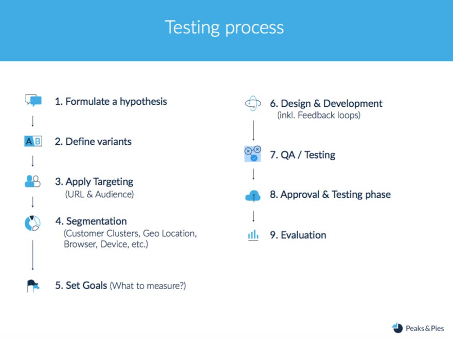
4) What is the CRO process that you follow?
The process typically consists of the following steps:
- Studying the quantitative and qualitative data of a website
- Identifying problem areas on the website
- Developing hypotheses that aim to address the problem areas
- Creating variations per the hypotheses
- A/B testing the variations
- Analyzing the test results and sharing it with the team
Here is a graphic illustrating the process we follow in Peaks & Pies:
5) How do you build a hypothesis?
I use website analytics tools such as Google Analytics to look for optimization opportunities across a website, for example catalog pages, product pages, and the checkout page.
When certain webpages are identified for optimization, these undergo rigorous analysis. I first check if a webpage has the essential eCommerce features (such as a recommendation engine on the home page) or not. If a certain feature is missing, we have got an opportunity for optimization. I use heatmaps and click-tracking tools to find elements or a functionality that require optimization. Gathering user feedback, taking help of usability testing labs, and checking out competitors’ websites are other ways of creating strong hypotheses.
I first check if a webpage has the essential eCommerce features (such as a recommendation engine on the home page) or not.
6) How do you prioritize A/B testing hypotheses?
I think a simple prioritization model like PIE—Potential, Importance, and then Ease—can work well for beginners. I personally like the model that is based on Potential, Confidence, and then Ease. This model gives a chance to the CRO team to take into account its past experience. A more sophisticated model can also include “political impact” as a criterion.
Moreover, prioritization needs to be a collaborative task to be successful. To estimate the “potential” of an A/B test, you might require the help of your marketing team. Similarly, the developers and designers can help you estimate the “ease” part.
7) What is the next step after hypothesis creation?
The next step is the design and development of a variation per the hypothesis.
However, before the variation is tested against a control, it must go through a thorough “quality assurance.” I think quality assurance is crucial for highly effective testing, but it is not emphasized enough in the CRO industry. You must make sure that all variations of an A/B test are free of bugs and issues.
Consider this: You are trying to improve a page that is already very optimized. You aim to achieve a humble 5% improvement in the conversion rate. If the variation doesn’t work for 5% of your traffic (because you forgot to optimize for mobile users or Firefox users), your test will invariably fail.
I think quality assurance is crucial for highly effective testing, but it is not emphasized enough in the CRO industry.
8) Is sales or revenue always the primary goal of your tests? Or do you look at micro conversions?
I would say the metrics or KPIs you are tracking should always answer your hypothesis.
In some cases, it is quite simple to track the revenue metrics (for instance, while adding new payment options on the checkout page). But in most cases, you have to track a combination of micro and macro metrics.
Download Free: Cart Abandonment Guide
9) How do you analyze your A/B test results?
To derive valuable learning from a test, we need to conduct a thorough analysis.
I look at both micro and macro goals to get a better context of the results. I also dig deeper by analyzing the test results for different traffic segments. For instance, I compare test results for new visitors versus returning visitors. You need to deal with a concept called novelty effect. Your returning visitors, when encountering a test variation, will recognize the changes on the page and might hold strong feelings about it (similar to how people strongly respond to major changes happening on Facebook or Instagram). However, new visitors will be unbiased with your test variation and would interact without any prejudices. Another set of segments that is relevant to eCommerce is mobile and desktop visitors. The behavior of both kinds of users can vary significantly.
I dig deeper by analyzing the test results for different traffic segments.
An analysis is always followed by summarizing the test results and recommending a plan of action. You check if the hypothesis was valid and whether you need to implement the winning variation or run a follow-up test.
10) If you find that conversions increased for new visitors but decreased for returning visitors, what do you do?
You need to derive learning from the test and realize why the difference in user behavior exists. For example, this could be happening because of an offer for your new visitors such as “10% off for new visitors.” While the new visitors would be encouraged to shop on the website, the returning visitors might feel like they are not being offered the best deal and feel cheated. Your next step would be to set up a system to identify new visitors and display the “10% off on first order” deal exclusively for them. You can additionally have a loyalty program in place for your returning visitors.
The goal of CRO is to not just have winning A/B tests, but also gain more knowledge about your users so that you can provide them a superior experience. Think about the bigger picture—the entire eCommerce ecosystem. If you find that your close-up product pictures work better than zoomed-out ones, you can communicate this idea to your display marketing team and help them create better ads. If you find that the “free delivery” offer works better than a “10$ free voucher,” you can share the knowledge with other teams such as customer support and product.
11) How important is a long-term A/B testing calendar for high-traffic eCommerce websites?
I think a long-term A/B testing calendar is essential for any kind of website. You need to have a prudent approach; clearly define all the tests that you can conduct, along with the time that each test is going to take.
Think of time as a resource. If you are not testing all the time, you are wasting opportunities to optimize your website (the same time that your competitors might capitalize to move ahead of you). With a long-term calendar, you can easily identify time slots in which you can fit quick A/B tests and utilize all your resources effectively.
You can also learn how to build a CRO roadmap for your organization.
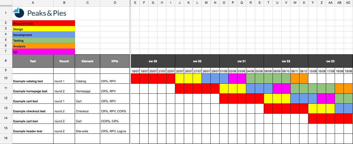
12) How important is a knowledge repository of past A/B tests?
A knowledge repository is crucial to make your CRO program effective. It helps you know what works for your users (and what doesn’t) and helps you create better tests in the future. It is also used to introduce newcomers to the testing culture of an organization.
With every test you perform, it is important to document the details. You can start with a simple Google doc, and later get a sophisticated and comprehensive spreadsheet. Share the document with the entire CRO team so that everyone is on the same page and can avoid repeating any mistake. When the number of stakeholders is large, you can even think of a weekly/daily newsletter.
I usually archive my test results for every quarter.
Regarding the Nuances of eCommerce Conversion Optimization
13) Which eCommerce webpages do you think are key to a CRO program?
All of them. It’s important to go through the complete customer journey and find optimization opportunities. The most common customer journey path is from the home page to the catalog page to the product page to the cart page, and finally to the checkout page. Of course, there are other customer journey paths as well.
It’s important to go through the complete customer journey and find optimization opportunities.
However, a good CRO manager should always be able to identify low hanging fruits. I have seen that home page is the most tested page of eCommerce websites—mostly because it attracts the largest amount of traffic. Next in the list are product pages. These pages have a lot of traffic from channels such as affiliate partners and display ads. Third in the list are the register or login pages of websites.
14) With a large amount of traffic, how long do you run a test?
It is necessary to run an A/B test until it delivers a statistically significant result. However, with eCommerce websites, it is also important to consider the business cycle. For instance, the business cycle for fashion eCommerce is about one to two weeks. So even when a test delivers results in a few days, you need to run it for an entire business cycle to derive useful learning.
15) How many A/B tests do large eCommerce enterprises roughly run on a monthly basis?
That completely depends on the scale at which an eCommerce website is operating.
Large eCommerce enterprises like Zalando easily generate a traffic of millions of visitors in a single day. For example, Zalando had traffic from numerous markets and it could allow even 100 tests to run at an instance.
16) How does a festival season or a “sale period” affect a CRO process?
I have a good amount of experience working with fashion eCommerce. I’d say that the sale period definitely has an effect on their CRO process. One of the main goals in a sale period is to clear out the inventory. This is when the principle of “urgency” is deployed heavily in CRO campaigns.
This is when the principle of “urgency” is deployed heavily in CRO campaigns.
For other eCommerce websites, the heavy-traffic period can be markedly different. For example, I am working with an eCommerce enterprise that sells premium alcohol. The on-season period for them is winters when people tend to stay at home more and buy alcohol (for personal consumption or as a gift). As a result, this enterprise is focused on optimization activities more during the winter season.
Your Turn
What do you think about this interview? Do you have any question of your own that you would like to ask Tomasz? Write to us at [email protected]
]]>Download Free: Conversion Rate Optimization Guide

Michal Parizek, Senior eCommerce & Optimization Specialist at Avast
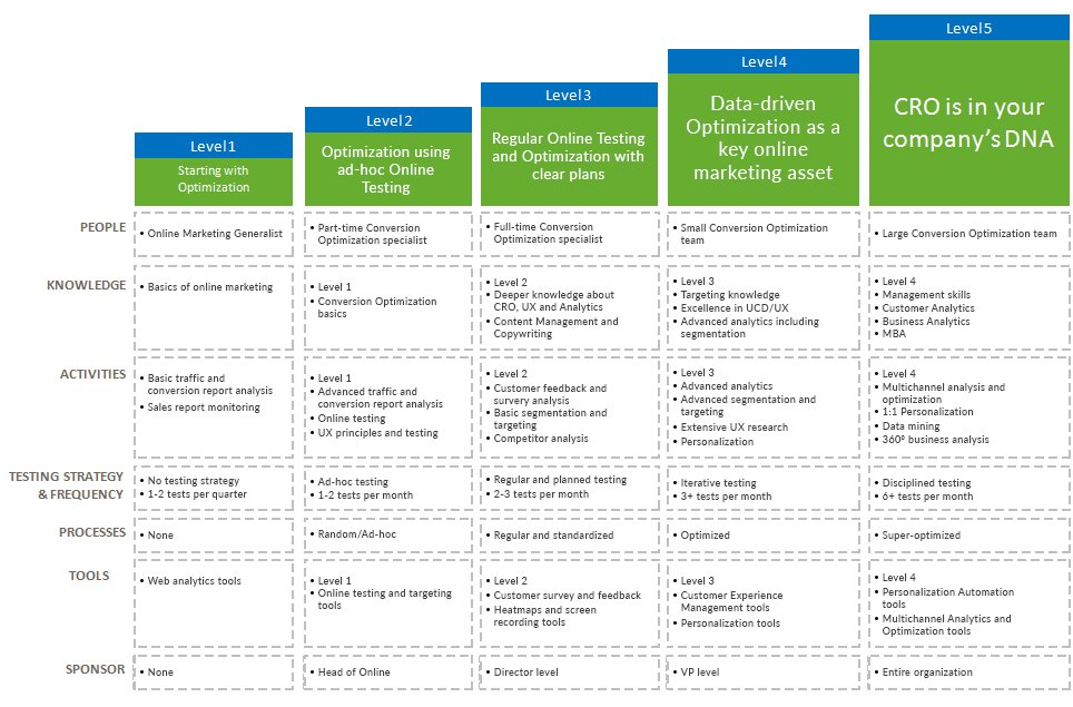
Michal has created the popular Conversion Rate Optimization Maturity Model, where he illustrates the core assets of a successful CRO program for organizations operating at different scales. Using the model, organizations can understand the current state of their CRO efforts and identify ways to improve their programs.
This is how the CRO maturity model looks like:
The questions in this interview aim to bring out actionable tips for organizations trying to bring structure to their CRO program.
Let’s begin.
Regarding the People and Culture Required for CRO
1) What are the essential skills or capabilities needed in a CRO team?
CRO is a complex discipline. In my opinion, it is a combination of a few, quite different skills.
- One of them is analytics. To have a successful CRO program, you need to understand your data and derive insights.
- Another skill is the user experience design. Being able to prototype great user experience is important.
- Then marketing and copywriting—working on pricing strategies, composing an effective value proposition, and other relevant activities.
- Other useful skills include statistics, consumer psychology, email marketing, and so on.
CRO can benefit from a range of skill areas. Therefore, it is very difficult to find great CRO consultants.
When you are building a CRO team, you should make sure you essentially hire an analyst, a UX designer, and a marketer/copywriter. These three I see as the key to driving an effective CRO program and results.
2) What does Avast do to create and spread a culture of CRO within the organization?
CRO has a good position in Avast culture. We are keen on A/B testing every major change in our sales flows or website. Data-driven decisions outbalance the gut-driven ones, even though there is a room for improvement. When I think about the reasons, I think there are mainly three things:
- No data silos: Everyone can have access to pretty much every data in the company.
- Sharing knowledge: We have been practicing A/B testing in the company for over four years, and the practice is now deeply rooted in our eCommerce department. Senior employees share their knowledge with the newcomers and help to spread the CRO culture.
- Effectiveness: Particularly when Avast was much smaller than today, we counted literally every penny we spent. (Was the initiative worth the cost? How much did the $1,000 investment in that partnership return us?) Being small is an advantage since you need to monitor your spend and earning closely, and it naturally forces you to be more data-driven.
Regarding the Importance of a Sponsor
3) How does the absence of a sponsor affect an organization’s CRO program?
It makes things more difficult. It is not just about the budget, but also about time and resources. You are fighting two enemies at the same time, low conversion rate and your boss. It is not very easy to practice CRO in such circumstances. In the end, to be successful, you need to get the buy-in from the sponsor—either your boss or the management.
4) How can you convince the top management to back your CRO program?
From my experience, the strongest argument for a CRO program was always the “results.”
Speak in terms of dollars. Prove how much money your organization gained because of the CRO efforts. And explain how much money your company can gain in the future if you get more resources, time, or money. Don’t forget that tests with negative results are equally powerful since you can argue how much money you can lose if you did not practice A/B testing.
Download Free: Conversion Rate Optimization Guide
Regarding the Research Methodology in CRO
5) What is the importance of pre-test analysis or research?
It is the absolute key. If you just throw ideas to your A/B testing tool, your success rate will suck and you will waste time and resources. Arriving at hypotheses, scientifically, is essential. (In my previous job at Liberty Global, we did not pay a lot of attention to research and we were not very successful in our CRO activities.)
Also, the pre-test analysis can help you identify the test feasibility—if you are able to get results in a meaningful time and/or if you know how many variants you can afford to have.
6) What are the essential tools required for the research?
You can segregate them as quantitative and qualitative:
- The quantitative tools include analytics, reports, heatmaps, and session recordings. They help you identify where the problem is.
- On the other hand, the qualitative tools help you find out why people take certain actions on a website. These include usability testing, card sorting, surveys, interviews, focus groups, and so on.
7) What are some of the basic mistakes people often make with pre-test analysis?
The biggest (and a common) mistake is the absence of a pre-test analysis altogether. Then there are, I believe, the other common analysis mistakes: wrong interpretation of metrics, sampling issue ignorance, common sense absence, no test feasibility analysis, and more.
Every test specification should contain the research part—explaining why a particular test should be executed and what insights led you to the test idea.
From my experience, tests which have a solid research in the background have a higher success rate than the tests without any research.
Regarding A/B Testing Practices
8) How important is it to keep a long-term calendar for testing experiments?
A test calendar helps to focus on important tests being launched on time. It is also vital for resource planning and for bringing all stakeholders in the loop. We usually do a quarterly overview of what tests we’d like to run and then we specify and add details on a monthly basis.
9) How do you prioritize tests?
I often use a rather simple formula. First, I list all the possible tests we could run in a certain timeframe. Then, to every test I add two estimates:
- Effort: How many hours/days are required to execute the test? (It’s even better if you can translate that into monetary values.)
- Impact: How much money will be returned if the test is successful. Rather than thinking if the test can increase conversion rate by 10% or 15%, pay attention to where the test is running and what element you are changing. Do a pre-test analysis and calculate how many conversions a particular page generates. By using research or common sense, identify the importance of the changes. For example, in most cases, changing prices will have a bigger impact than changing button colors on a homepage. After you have executed several A/B tests, you will get an idea what matters and what does not. And this will help you set better expectations.
When all your tests are listed with effort and impact estimates, congratulate yourself. Now, it is easy. You execute the tests with the highest impact and least effort first. Then in the long term, you focus on the tests with a high impact, but also with great effort. In the meantime, you can execute the tests that don’t have a huge impact, but are easy to launch. And, you avoid ideas that require a lot of effort, but have almost no impact.
10) Can failed/inconclusive tests still provide value?
Yes, they can! If the test is designed and executed correctly (variants differ in one element, flawless measurement, sufficient data, no bugs in all variants, and so on), it provides great value regardless of the results. As long as you can learn from a test, it is a good test. Failed tests help you see which way you should not go. Inconclusive tests (again, if the tests are done correctly) tell you that perhaps the testing element does not matter much and you should test something else.
I really like what Ron Kohavi says,
“A valuable test is when the real results differ from your expectations. You learn the most in these cases and the learning matters the most in the long term.”
11) What are the common post-test analysis mistakes?
One of the common cro mistakes is not making sure if the test results are trustworthy or statistically significant. We sometimes tend not to analyze these thoroughly. The XX% lift always sounds appealing and we want to believe it (particularly when we have also designed the test—that’s why it is wise to always have somebody else to have a second look). But do we have enough data? Are the results consistent with time? Do we have traffic split balanced? Is the conversion lift driven by the change in design or just by chance? If we ignore chasing these findings, we can easily implement changes, which may not have any effect, or even worse, may decrease our performance.
The other common issue is not monitoring post-test results in the long term. Do we see the XX% lift after the winning variation has been implemented? Once we have a successful test, we tend to switch our attention to another issue and another test and we forget to monitor the previous effect.
Regarding CRO Tools
12) What are the key attributes based on which a CRO tool is chosen?
Usually, costs and benefits are the main attributes we look at. You must look at both costs and benefits from a wider perspective. Costs are not only the money you pay for the tool, but you also need to include implementation cost and maintenance cost (including the extra staff you need to hire to work on the tools).
Trying to estimate the business impact of the benefits of these tools is often challenging. Many CRO tools focus primarily on driving insights, and it is difficult to evaluate these in terms of $. Fortunately, many tools offer free trial versions, so you can get an idea on how useful they can be for you.
13) When would you say an organization should invest in developing in-house CRO tools?
When a tool is key to your business, and the cost of developing (and maintaining) the in-house tool outweighs the cost of having a third-party tool.
Regarding Coordination Between Teams
14) Does the CRO team need to coordinate closely with any other team in an organization?
It does need to cooperate with several teams. From my perspective, the following two are the key.
- First, they need to have a close relationship with the business intelligence department to get correct data.
- Second, they need to have a dedicated team of developers to execute the ideas that CRO team creates.
- Then, there are many other vital cooperations. A support team has always been a great source of customer feedback; and for a CRO team, it is wise to be in touch with them. The product itself is a conversion asset so be in close touch with a product management team. How the product is marketed often defines the quality (and quantity) of leads and website visitors. Therefore, marketing is then another team I recommend being close to.
Your Thoughts
What do you think about the essential assets of a successful CRO program? Do you have any more questions for Michal?
Write to us at [email protected]
And, as more and more enterprises become aware of the benefits of CRO, you would expect that most of them are putting CRO to practice.
Unfortunately, that is not the case.
Many organizations still haven’t included CRO in their “growth activities” suite. Even among the few organizations that are practicing CRO, more than half don’t have a structured or documented process in place. Moreover, a lot of these organizations have little or no budget allocated for CRO.
Download Free: Conversion Rate Optimization Guide
This clearly indicates that the top management at enterprises are not yet convinced about the effectiveness of CRO.
If you are trying to introduce a CRO program in your organization, this post is for you.
We have listed five key ways through which you can influence your top management to buy into CRO.
1) Highlight Improved User Experience as a Double Win
Improving user experience is one of the top objectives of many organizations. Talking about the same can get your management’s interest in CRO.
Conversion rate optimization, in essence, is all about improving user experience. The underlying principle is that if a website offers unmatched user experience, visitors would convert more. (For example, nameOn improved user experience on its “cart page” by removing distracting CTAs, and saw an increase in conversions by 11.40%.)
CRO aims at helping you simplify every task that users have to complete on a website. Creating prominent call-to-action buttons, removing distracting elements, and streamlining navigation flow — these and other similar actions to help users complete a task quickly and improve user experience.
A superior user experience helps an enterprise in many ways. Some of them are mentioned here:
- Better customer acquisition and retention because of a higher satisfaction level of visitors and existing customers.
- Greater word-of-mouth publicity because of a higher satisfaction level.
- Reduced overhead costs; minimal spend on support because visitors face less issues navigating through a website.
Now, we know that measuring user experience can be difficult — it’s not a quantifiable unit. Still, there are metrics that can indicate an upgrade in user experience. One such metric that you can use is Net Promoter Score, or “NPS.” This term is simply derived by asking users this question: “How likely is it that you would recommend us to a friend or colleague?” You can monitor NPS for your business before and after the implementation of your CRO program. If there’s an increase in NPS, it’s safe to assume that the user experience also improved.
2) Present a Competitive Analysis
Sometimes, “the competitors are leveraging it” can be the one reason that can help you influence the top management for starting a CRO program.
Or better, you can convince your bosses by showing industry leaders (or, companies that they admire) practicing and winning by using CRO.
You can start by building a list of companies that your bosses look up to. Next, analyze the tools these companies use for website analytics and optimization. Tracking the tools used by these companies should not be difficult: You can take the help of BuiltWith or Datanyze (or any such software) to do that. (You can even employ browser extensions such as Ghostery to identify tags of different web apps that are active on a company’s website or app.) Shortlist the companies that are using tools for website analytics, A/B testing, user behavior analysis tools, and so on. The software mentioned above can also give you an idea about how much these companies spend on CRO technologies. The higher the spend, the more involved the companies are with CRO.
Additionally, you can search for CRO-related case studies involving these companies. In fact, case studies that highlight CRO activities in any company from your industry can be effective in influencing the bosses.
3) Stress the Gaps in Your Current Approach
Often, the top management in enterprises is under the impression that its teams are already working on optimization. They, possibly, see CRO as a part of marketing team’s responsibility. The truth, however, is that a CRO program relies as much on marketing as it does on IT.
The essential members of a CRO team typically consist of the following:
- Strategist: Focuses on managing the program and deciding the goals. Usually knows the most about conversion journeys, personas, and persuasion design. Owns the KPIs.
- Analyst: Looks at the data before and after an A/B test, connects it with other important data sources, and helps everyone understand the test outcomes.
- Conversion Centered Designer: Focuses on conversion centered design.
- Copywriter: Someone who’s great with the written word and can write to reduce anxieties, ease friction, and persuade and delight visitors.
- Developer: To help you run your tests with optimized front-end code and send events or record goals in your analytics software.
A single team member can many times take up more than one of these roles. Nonetheless, the lack of any member possessing these skills in a team can lead to a substandard CRO program. Such a program might or might not deliver favorable results, that is, increased conversions. What is equally important is the (timely and transparent) coordination among these team members. The same can be ensured by having a documented CRO process in place.
A documented process helps you create a long-term calendar of CRO activities and sort these on the basis of their priority. Without that, you might end up conducting low-priority A/B tests that have little effect on the bottom-line. Another major risk is missing out on the learning from the first CRO activity and, therefore, not applying it to the later activities. (For instance, without a structured process, you might not archive the learning from a failed A/B test. And, because of that, you might continue creating A/B tests that run on hypotheses similar to the one that failed.)
Get your bosses’ attention to all such gaps (and possible pitfalls) in the existing strategy and practice regarding CRO.
Image Source: onlinebehaviour
Download Free: Conversion Rate Optimization Guide
4) Show Them the Money
For many enterprises, the marketing budget is majorly spent on traffic acquisition through channels such as pay-per-click (PPC), social media, and SEO.
However, it’s always difficult to generate satisfactory return on investment (ROI) from such channels.
- It’s a tough task to ensure the desired quality of traffic through such sources. Users that are not your target audience can also visit your website through these channels. (The “targeting” options can be specific only to a certain point).
- It’s not under your control on how you perform across these channels over a long period of time. For instance, a change in a search engine algorithm or an increase in cost-per-click on a PPC platform can always spoil the result/ROI of your traffic acquisition efforts.
CRO, on the other hand, lets you improve your sales figures by working on something that you’ll always control — your website. CRO aims at increasing the number of conversions from the existing traffic of your website. (Many times, even a small increase in the conversion rate impacts the revenue significantly. For example, BrookdaleLiving.com managed to increase its monthly revenue by $106,000 because of a modest improvement of 3.92% in the conversion rate.)
Now, while pitching the idea of CRO to top management, it is essential to highlight the forecast of such improvement in sales and revenue.

Kieron Woodhouse, UX Head at MVF Global, shares how financial projections helped them start their CRO program: “It’s important to speak to different parts of the business in a language that’s appropriate and tailored to their requirements. The commercial part of the business will expect a detailed analysis of how following a CRO program could positively impact the business. At MVF, before our CRO team was created we put forward a detailed financial projection of all of our top performing landing pages and estimated potential uplifts of 1%, 5% or 10% as a result of our actions.
This approach made the decision very easy for the commercial part of the business to understand and meant we had their complete support before the project began. Of course, it’s also important to have multiple scenarios to help pre-empt performance and manage expectation.”
5) Show Them the Data
It is always easy to convince the top management when you back your pitch with data. And with CRO, you get all the data that is needed.
The success of a CRO program can always be measured on the basis of quantitative metrics — sales and revenue, or micro and macro conversions.
This is in contrast to some of the brand-related campaigns that run on other channels such as PPC and social media. Often, those campaigns work on “improving the brand value,” the ROI of which can seldom be measured.
Further, the whole process of conversion rate optimization is scientific and is based on informed decision-making. There is little room for guesswork.
You use website data and user behavior patterns to identify the pain points on your website (and areas where the conversion rate can be further improved):
When traffic on your website is not converting, you fix the pages with the highest bounce rate and exit rate. When visitors don’t click a specific CTA button, you observe visitor recordings and heatmaps to identify the elements that are proving to be a distraction. When you do not get enough visitors to fill your website forms, you run a form-analysis to check which form fields cause friction. When you are not sure what is stopping visitors from converting on a web page, you employ an on-page survey to learn about that. The use-cases of CRO are endless.
Arguably, the best way to convince your bosses about the benefit of CRO is by showing them a quick but effective A/B test. Use methods similar to the above to identify optimization opportunities that have the highest potential for improvement. When you succeed, share the results emphasizing the improvement in the bottom line. This is bound to get you your bosses’ attention.

Angie Schottmuller of Three Deep Marketing suggests, “Tests with interesting results quickly get management attention, and an addictive demand for more testing invariably follows.”

Nate Shurilla, CRO consultant at iProspect Japan, reveals a similar approach they follow: “We typically do a trial run before full-out testing. We’ll do a little analysis of one page and come up with a small test or two, and then show the results in our full pitch. Explaining how we can then replicate and expand upon those results site-wide usually gets them on board, especially when they see how even a little jump in CVR has huge effects on their revenue.”
Final Thoughts
Importantly, keep building your case for the need of CRO.

In the words of Jacob Baadsgaard, founder and CEO of Disruptive Advertising, “Don’t pitch once and back off if the idea isn’t immediately accepted. Challenge yourself to view this situation as your own CRO effort on converting your manager/boss! Those that are persistent and back it up with good data will win in the long run so don’t give up.”
Over to You
What do you think will invariably convince top bosses in an organization to run a structured CRO program? We’d love to know your thoughts. Write to us at [email protected]

The website redesign.
It is often the big money ticket for a business; the project upon which a lot of faith is placed, and improved numbers are expected across the board.
Ideally, it is expected to provide a significant improvement in sales and leads figures, based on a modern, seamless and intuitive experience for the visitors that is future-proofed for the constantly changing marketplace.
Unfortunately, the numbers from PRWD’s survey show that this is not always the case. In fact, a few businesses even find a decline in sales after undergoing website redesign.
Download Free: Website Redesign Guide
So if you’re currently in the middle of a website redesign (or planning one in the near future), have a quick look at the infographic below.
Following on from PRWD’s last infographic on the effectiveness of website traffic acquisition strategies, this infographic provides insight into why a website redesign for many of the UK’s biggest businesses don’t provide a jump in sales and leads.
At the end of the infographic, there are key takeaways that can help you get the most out of a website redesign.
Click here to get the full infographic
![[Infographic] Why-website-redesign-doesnt-always-work](https://static.wingify.com/vwo/uploads/sites/3/2016/06/infographic2.png)
Download Free: Website Redesign Guide
What Do You Think?
Have you ever done a website redesign? What would you do to ensure that a redesigned website improves the bottom-line?
We’d love to know your thoughts. Write to us at [email protected]!
]]>Moreover, the ads work on real money and can often prove costly. For this reason, unoptimized or ineffective ads can hurt a business.
Download Free: A/B Testing Guide
This post offers you tips that can help you optimize your ads and campaigns on Google Adwords and increase your website traffic and conversions.
On using keywords
All Google Adwords campaigns fundamentally work on keywords. The choice of your keywords determines the success of your campaigns to a great extent.
Here’s a simple video by Google to help you understand the use of keywords better:
For starters, don’t use generic keywords; go for specific keywords instead. More targeted keywords reach users who are already interested in your offering and thus offer a greater chance of conversions. For example, users searching for “5-inch android mobile” will probably convert more than users searching for just “mobile phone.”
There are different ways to formulate your keyword strategy and gain control over who sees your ads. You need to pick one (or a combination) of those ways that serve you best.
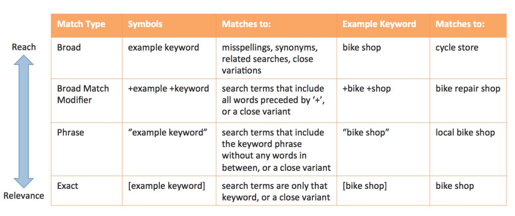
Employ the best keyword matching option
Different keyword matching options control how similar your keyword needs to be with a user’s search query to display your ad. The match types consist of the following:
- Broad match: Your ads will be shown for searches having phrases similar to your keyword, keyword synonyms, singular/plural forms, possible misspellings, related searches, etc. This is the default match type for your keywords if no other match type is specified. Putting all your keywords on the broad match can prove to be costly, as your ads might end up getting served to irrelevant users.
- Modified broad match: Ads will be displayed on searches containing the keyword or close variations—but not synonyms—in any order. This gives you greater control over your ad impressions, allowing you to avoid generic users.
- Phrase match: Ads will be shown for searches containing the exact phrase as the keyword or a close variation of the phrase. Phrase match allows you to target users that are your potential customers.
- Exact match: Ads will be displayed only for searches that are an exact match to the keywords. Operating solely on exact matches minimizes your chances of getting ad impressions. You run the risk of missing out on potential customers.
Here’s a graphic depicting the different match options:
Identify your negative keywords
Negative keywords help you tell Google when not to display your ads. It, especially, helps you when your keywords have a lot of similar but unrelated phrases.
For instance, at VWO, we run ads for searches such as “AB Test.” Now, with a broad match, our ad may reach a user searching for “AB Personality Test.” We don’t want that, and so, we put “personality” under our negative keywords.
Negative keywords play an essential role in bringing the most relevant users to your ads.
For instance, some of the common negative keywords for eCommerce sites are “Free” and “Cheap.”
Use your brand keywords
Running ads for your brand name (or brand-related keywords) might seem unconventional, but it quickly catches up with businesses across multiple industries.
The ads based on your brand keyword have multi-fold benefits:
- You can establish authority over the search engine results page. With your brand all over the results page, users are bound to be positively influenced.
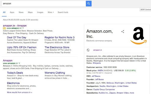
- Your competitors might be trying to get hold of users searching for your brand. The chances are that your competitors are already attempting to capture your brand keywords by featuring their ads. For instance, check out this search query for “Hubspot”:
- The results page above displays an ad by Intercom (a competitor of Hubspot). This ad by Intercom can steal potential Hubspot customers.
- You own whatever goes into the ad. You can direct users to specific landing pages (maybe to your highest-converting pages) different from your organic links. You can also mention offers/lucrative deals that otherwise are not mentioned with your organic links.
- You already have a rapport with the people who click on these ads. They know you and possibly want to do business with you. The chance of conversion with these ads is potentially higher than your regular ads.
Try your competition keywords
When you find your competitors trying to target your brand keywords for their ads, you can fire back doing the same. You can run your ads for searches, including your competitors’ names.
Just having your ad on top of a results page when users are searching for your competitors can give a boost to your brand awareness.
Ad copy optimization
The copy of your ad is what entices users to reach you. Since ads from your competitors will probably surround your ad, your ad copy needs to stand out and attract users’ attention.
Below are a few points to keep in mind while optimizing ad copy:
Make your ads benefit-driven
Users of search show a variety of intents through their search queries. Potential ad viewers are the ones who are looking for solutions to issues or problems they’re facing, not just for academic curiosity. Your ads should deliver them the solutions.
Your ads need to be benefit-driven to lure users. Anticipate the issues faced by your potential users, and offer them a solution featuring benefits.
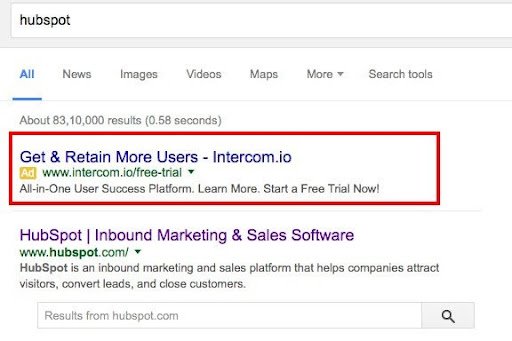
Here is a fitting example:
The above ad caters to users who are searching for dentists. The ad not only claims to offer information on nearby dentists but also provides an option for booking an appointment. Even within a tight word limit, the ad succeeds in squeezing multiple benefits to users: feedback on dentists, fee details, zero commission, etc.
Like the example above, your ads can feature benefits (USPs) that differentiate your service from your competitors. Highlight factors that make you unique.
Your ad copy should talk about fulfilling the end goals of users and more.
Download Free: A/B Testing Guide
Utilize ad extensions
Ad extensions are additional links that can accompany your ads. They are generally appended at the end of an ad—below the ad description.
Ad extensions include links such as “Download App,” “Call Us,” “Get Directions,” and more. You can also feature reviews and ratings for your services in your ads.
In Google’s own words, “Ad extensions create more reasons to click your ad.”
Below is an ad from Mixpanel as an example:
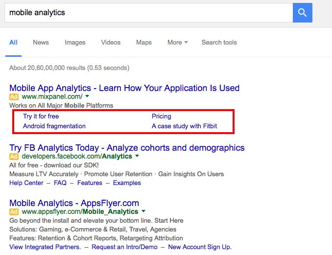
In addition to the pertinent ad copy, the ad also features site links as ad extensions. The links can give users more reasons to click on the ad.
Read more about ad extensions in this guide by Google.
Have a compelling call-to-action
A call-to-action (CTA) is perhaps the most crucial element of an ad. While the ad copy pulls users’ attention, a CTA ultimately nudges the users to make a click.
A CTA tells users what the next step is after they click on an ad. With CTAs like “Buy,” “Sign up,” “Watch Demo,” “Book Now,” or “Get a Quote,” users are aware of the action that should follow.
(Note that CTA here differs from the CTA we use within landing pages, forms, pop-ups, etc. Here, the CTA is not a clickable button, but only a phrase prompting users to take action.)
For instance, ATD, a services company, optimized its CTA copy to resonate better with users and saw a 60% hike in their conversions.
Now let’s take a look at this ad for the search query “buy domain.”
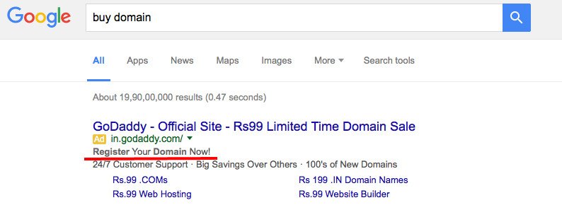
The ad description has a clear call-to-action: “Register Your Domain Now!” The CTA clarifies to users that clicking on the ad will lead to a domain registration page.
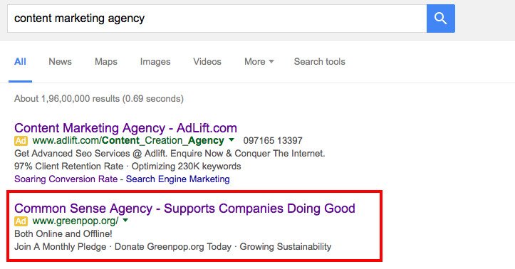
Now, look at this ad, which is just the opposite. The ad is as generic as it gets and does not prompt users to take any action.
Use persuasive strategies
You can persuade users to click on your ad by employing certain psychological tactics. The tactics include scarcity, urgency, authority, and social proof.
Scarcity and urgency can be incorporated in your ad copy using words/phrases such as “Last 2 Days of Sale,” “Just 10 Items Left,” “Order Now to Avail Discount,” and more.
Below are some examples of using authority and social proof to persuade users with your ads:

Make your landing page experience consistent with your ads
Your landing page needs to be coherent with your ad to keep users from bouncing off. If that doesn’t happen, you’ll lose on potential conversions and negatively affect your ad rank.
Check out this ad for the search query, “holiday package”:

The ad succeeds in grabbing user attention by displaying a heavy discount of 87%. Upon clicking the ad, here is the landing page that follows:

Surprisingly, the 87% discount is nowhere to be seen on the landing page. The only discount mentioned on the page is a holiday deal with 47% off. Users can’t see the content they expected to find. They might even feel cheated by the ad. This leads to a poor user experience, and the chances are that users won’t stay on the page for long and leave.
Making your ads and landing pages offer the same user experience is known as maintaining an ad scent. To do that, you have to follow these three practices:
- Match the copy of your landing page to the copy of your ad.
- Build the content of your landing page with your ad message as the focus.
- Design your landing page as per the design of your ad.
Consistency with an ad is not the only factor upon which users will judge your landing page. Your landing page experience depends on various other factors, too. Some of them are:
- Transparency and comprehensiveness of the information provided on the page.
- Ease of navigation on the page.
- Presence of a strong CTA on the landing page
- Presence of trust signals (testimonials, success stories, ratings, etc.).
Keep track of your quality score
Google Adwords provides a quality score for each of your keywords on a scale of 1-10 (10 being the highest). Google determines the score based on the quality of your ads and landing pages.
Google says, “Having a high-quality score means that our systems think your ad and landing page are relevant and useful to someone looking at your ad.”
You can easily find the quality score of your keywords within your Adwords account:
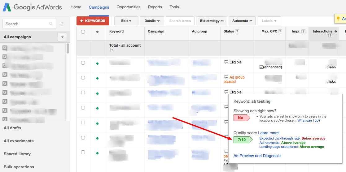
A higher-quality score is beneficial to you in several ways:
- It makes it easier for your ads to be eligible for an ad auction.
- Higher quality ads often have a lower cost (CPC).
- Ads with a high-quality score can show up at a higher position on a page.
- Some ad extensions require a minimum quality score to be incorporated into an ad. A high-quality score helps there.
Your turn now
Since you pay Google for running ads, you should take a wise step as a business to A/B test your campaigns and optimize them continuously to gauge which variation works in favor of your business conversions. On that note, do let us know about your optimization strategy for running Google search ads. Want to add something to this post? Please write to us at [email protected].

However, you cannot always objectively point out the qualities (or the flaws) in the design, especially if you’re not a designer.
As marketers or front-end developers, you might often find it challenging to come up with designs that effectively engage your target audience and nudge them to take the desired action.
Download Free: Website Redesign Guide
What might help here is a thorough understanding of CRAP. C.R.A.P., a design principle developed by Robin Patricia Williams, stands for Contrast, Repetition, Alignment, and Proximity.
By leveraging CRAP, you can consistently deliver effective designs, whether it’s for a website, a landing page, a checkout page, an eBook, or just a banner ad.
These design practices, when applied together, more often than not lead to brilliant designs that delight users and get them clicking.
This post elaborates on each of the CRAP principles to help you understand what goes behind crafting engaging designs that improve your UX and conversion rates.
However, you cannot always objectively point out the qualities (or flaws) in design, especially if you’re not a designer.
Even as marketers or front-end developers, you might often find it challenging to come up with designs that effectively engage your target audience and nudge them to take the desired action.
What might help here is a thorough understanding of CRAP. C.R.A.P., a design principle developed by Robin Patricia Williams, stands for Contrast, Repetition, Alignment, and Proximity.
By understanding CRAP, you can consistently deliver effective design, whether it’s for a website, a landing page, an eBook, or just a banner ad.
The four design practices, when applied together, more often than not lead to brilliant designs that delight users and get them clicking.
This post elaborates on each of the CRAP principles to help you understand what goes behind crafting engaging designs that improve your UX and conversion rates.
Contrast
Contrast is all about making distinct elements stand out and is used to drive a user’s attention to specific elements in a design. It is defined as “the state of being strikingly different from something else in juxtaposition or close association”
For a layman, contrast may just be limited to black and white (or a similar combination of other colors). But, there is much more to contrast. Besides differentiated colors, contrast can be established using different element types, shapes, sizes, and so much more.
Here’s how you can create contrast in a design:
Color
Color contrast is one of the most fundamental design principles that most of us are familiar with. Even so, its application can still prove to be tricky in some cases.
This contrast can be established using a combination of colors that lie opposite each other on a color wheel.

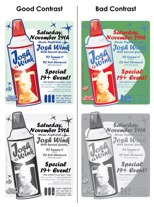
As a thumb-rule, high contrast is required between the text and the background colors. However, having contrasting colors for multiple elements can make a design look messy sometimes.
Moreover, contrast is not just about using complementary colors but you must also ensure that participating colors in a design don’t strain users’ eyes.
Below is an example of bad contrast using complementary colors:

Below is an example of good contrast using different shades of the same colors used in the above example:

A quick way to know if your design has optimum contrast is by looking at its grayscale version.
This can be easily done by using any popular image editing tool.
Here’s a sample:
White Card Courses used VWO to test their home page color scheme and hypothesized that having contrasting colors for important page elements such as the header, hero message, and the CTA button would help in effectively directing visitors’ attention to each of them.
Take a look at the control and variation from the A/B test:
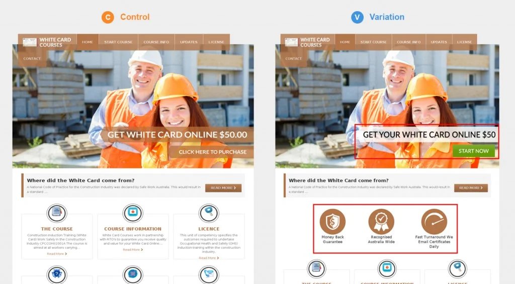
As a result, the variation successfully beat the control by recording a 32% increase in visits to the payment page from the home page, and a 20.9% increase in clicks on the payment page.
Among other factors that played an important role in this experiment (including tweaking messaging and adding trust badges), contrast had a pivotal impact on the page’s performance.
Upon analyzing the results, the team figured that the use of similar color schemes for all three critical homepage elements was causing a barrier in grabbing visitors’ attention towards each of them specifically.
Upon using a contrast of colors, not only was this barrier done away with, the three sections got their identities that demanded attention as soon as someone landed on the page.
Size
Contrast can be maintained between discrete elements, especially text, using different sizes.
To draw users’ attention towards a certain element, keep its size significantly larger than the surrounding elements.
Below is an example:

Incidentally, we, at VWO, realized that the text on our blog was lacking contrast in some areas. Specifically, the h4 text and the paragraph text didn’t have much size contrast. Take a look:
We soon changed the font size and style of our heading tags, giving them better contrast against the paragraph text, as well as between themselves.
Here’s how it looks now:
The contrast in size can also be effectively used in designing your call-to-action (CTA) buttons. A large-sized CTA can attract appreciable attention from users.
Here’s a CTA button that is rather large in size compared to its complementary text below:

Shape
Contrast in shapes of elements helps you guide users’ attention and break the monotony in a design.
Contrast in shape can be as basic as adding round corners to your quadrilateral elements, or as extreme as using circular elements together with square ones.
Infographics, particularly, use contrast in shape to good effect. They incorporate elements with dissimilar shapes to illustrate information.
Also, watch the VWO Podcast with Conversion Scientist Brian Massey to know how data-backed design can boost conversions.
Repetition
Repetition is how you maintain consistency in a design. It helps users get familiarized with the way information is presented to them.
For instance, bullet lists use repetition of circular dots to present information. The repetition of dots helps readers scan and read the list quickly.
Additionally, the repetition of elements is what gives an identity to a design.
Repetition can be practiced with the colors, shapes, textures, sizes, and other attributes of the elements in a design.
Let’s take an example of a badly designed website: “ARNGREN”.

Although the above website has a lot of issues with its design, we’ll stick to talking about the lack of repetition.
The website uses different font types and different sizes. The color of the different text elements, too, is not consistent. The images used are of different styles, ranging from real-life pictures to stock images to a sketch. It goes without saying that putting repetition (or consistency) to these website elements will help in improving the user experience.
There are various websites on the internet that are designed similarly as the example above. They are constituted majorly of plain text and a few images. However, repetition in their design makes them much more comprehensible. Take a look at the below example:
The above website, too, contains just plain text and a few images. However, with the repetition of font type, size, color, and style of the images, the design looks neat and scannable.
Companies build their brand by using repetition of design attributes across their physical and digital presence. They use a predefined set of colors, fonts, and rules of application that gives consistency to their appearance across multiple channels. Repetition is responsible for building brand awareness and recall.
Take a look at the presentation deck below:
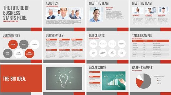
The slides convey a repetition of a set of colors, and the style of text and images. This helps users identify each slide as a part of a bigger whole (or a brand).
If you are not happy with the conversion rates your website is producing, revamping it is a smart idea.

Download Free: Website Redesign Guide
Alignment
Alignment dictates the way every element is placed in a design. It is the concept that advocates organizing information to create order.
With alignment, no element in a design is positioned arbitrarily. Each element visually connects to the other elements, leading to cohesiveness in a design.
The two basic kinds of alignments are edge alignment and center alignment.
“Edge alignment naturally positions elements against a margin that matches up with their outer edges.”

“Center alignment places design elements so that they line up with one another on their center axes.”

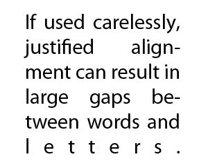
For text, different styles of alignment are: left, right centered, and justified. Left and right alignment are the most common among them.
Centered alignment can work for a small amount of text. (But, the same style when applied to a big chunk of text can prove to be difficult to read.)

Justification works fine when the text has a long line-length, small font size, and shorter words. Narrow columns and long words can pose readability issues when justification is used.
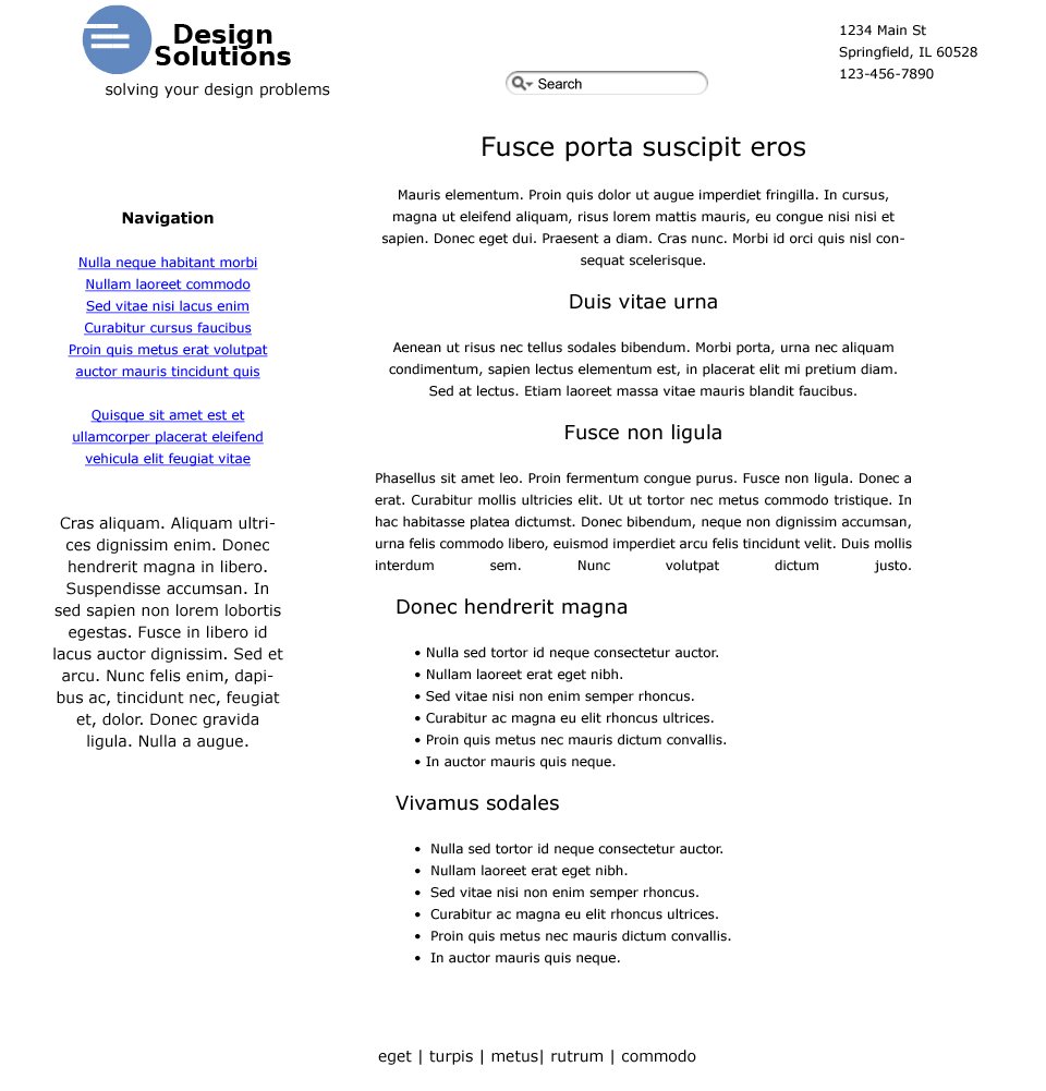
The following example shows how proper alignment can greatly improve user experience.
Steven Bradley tried to improve a sample web page that had improper alignment. Here’s the original page:
And here’s the same page with a robust alignment:
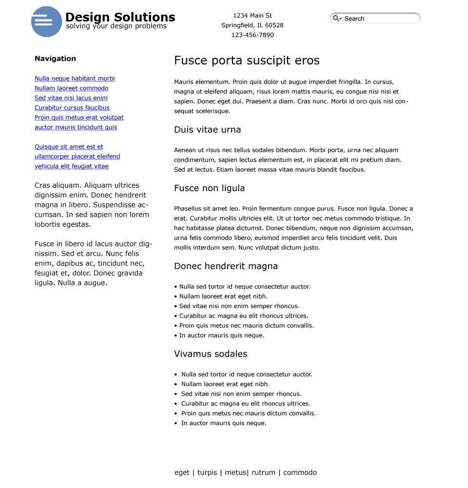
Notice how Steven worked on the logo, too. He aligned the text and the icon in the logo.

The new logo also features repetition with two longer lines of text (instead of three disparate sized lines).
Proximity
The principle of proximity states that elements that are associated with each other should be placed closely (grouped together), and vice-versa.
The application of proximity, especially in web design, can lead to a better user experience.
An amateur designer might try to utilize the complete real estate of a design, trying to spread elements evenly throughout. Such a design will make it difficult for users to determine elements that are related to each other (and those that are not), resulting in a poor user experience.
Here is a simple example:

While both the cards above contain the same information, the way it’s presented is different. The information on the card on the left has been distributed evenly. But, the card on the right has the information placed with better structure; the related information points have been grouped together.
You can notice the law of proximity applied to our own blog. Take a look at this screenshot from one of our previous posts:
It’s clear how the heading is closely attached to its descriptive paragraph. Further, there is a noticeable gap between the two blocks of text, indicating a dissociation.
WebDesignerDepot says, “A website that uses proximity in its architecture and design does not overwhelm the user with information”
WebDesignerDepot also gives an interesting comparison of two news websites: “Los Angeles Times” and “The Globe and Mail”. It highlights, using the below screenshot, that the LA Times effectively employs the law of proximity. The header, the sections of information, and the ad space have sufficient gaps between themselves, giving readers a pleasant reading experience.

In contrast, ”The Globe and Mail” looks cluttered. This is mainly because there is not enough differentiation between the various information blocks. For instance, the two ads appearing on the top of the page negate the effect whitespace has in making the website logo prominent. It’s difficult to keep track of information on this web page.

Along with designing the website by using these fundamentals, the trick is to have the ability to experiment and deploy fast to gauge user responses. VWO Visual Editor makes it very easy.
Bonus content: Watch the video to know what makes a great user experience in the fast-changing eCommerce and retail space.
Wrapping up
Putting together these four design principles can drastically improve the quality of design. Use these principles as a checklist to ensure that your website design offers a great user experience.
However, don’t just take our word for it. Experiment with your site design and graphics to figure out what exactly works for your target audience and positively impacts your key metrics. A/B testing the designs of your web pages, landing pages, social media, and other marketing collaterals, using a/b testing tools, will help you zero in on the one that best engages your audience so you can make that live universally.
From simple UI-based changes like the color and placement of your CTA button to a complete overhaul or redesign of your most critical landing pages, you can test it all with VWO’s robust A/B testing capabilities. If that sounds too good to be true, sign up for a free trial or request a demo to assess if it meets your desired requirements.

Maintaining a blog offers multi-fold benefits to a business.
A blog not only helps a business position itself as a thought leader, it also helps the business establish a dialogue with its target audience, collect leads and provide an SEO boost. Now consider this, 70-80% of all search users ignore paid ads, focusing mostly on organic search results. Your blog pages can bring you more visibility in the SERPs and drive organic traffic.
Download Free: Grow Website Traffic Guide
That said, it takes considerable effort to reap benefits from a business blog (or a marketing blog).
A business blog requires continuous optimization to attract visitors, and nurture them into becoming customers.
Optimization needs to be done across the structure (SEO), design (user experience), and content (usefulness) of the blog.
This post offers the following key ways you can optimize your business blog:
Identify Your Audience
Running a blog without knowing who you’re writing for can be a waste of time and effort. What if the majority of your blog content caters to only a minuscule section of your intended audience?
You need to know who your readers are. You can identify them based on multiple characteristics, such as their demographic attributes, professional details, and where they lie in your conversion funnel.
Based on such characteristics, you’ll be able to create personas for your users. Having 3-5 reader personas will help you write for all your audience, while being specific to their interest areas.

In the words of Krux, “With personas, businesses can be more strategic in catering to each audience, internalize the customer that they are trying to attract, and relate to them as human beings.”
Improve Readability
There are different ways to make your blog more “readable” for your audience. These ways can be broadly divided into three categories:
- Legibility: Clarity of visual design and typography.
- Readability: Complexity of words and sentence structure.
- Comprehension: Ease of understanding the text and drawing valid conclusions.
Improving the legibility of your blog is the most fundamental of these three aspects.
Put greater emphasis on your blog content by employing white space.
Reduce distractions (e.g., widgets, links, banners, etc.) on your blog that potentially take readers’ attention away from the main content. You can do that by either providing great contrast to your main content from the distractions, or removing the distractions altogether.
The Backlinko Blog, for instance, has absolutely no distractions:
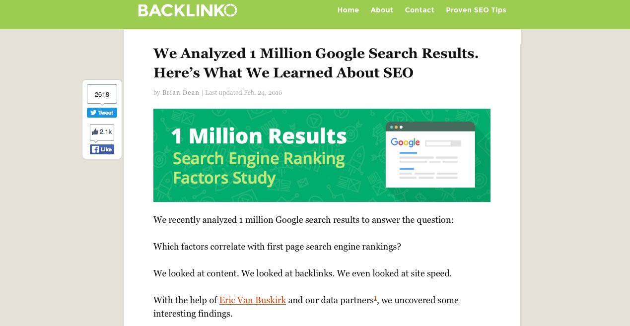
Furthermore, you can evaluate the typography being used on your blog. Check to see if your font is too small, or your paragraphs are cluttered, or the headings are not distinguishable from the paragraphs.
Conduct user testing for your blog to find out the most effective typography and formatting style for your blog.
On the other hand, the readability of your blog content depends on the written text. Various readability tests help to know if your content is easy to grasp or not. Implement different persuasive copywriting techniques, and check the kind of vocabulary you’re using. User personas will again help you here by giving you an idea about your readers’ comprehension level.
Make Blog Subscription Straightforward
What is the one thing that (almost) every blog wants its readers to do? The answer is “subscribe to the blog.”
It’s only logical to make subscribing to your blog a cakewalk for your visitors. However, there still are a number of blogs that don’t enable easy subscription.
Firstly, your subscription box must be featured on all the pages of your blog. Next, your subscription box should be clearly visible to users to take an action. How about offering a freebie with a subscription? Ensure that the offer itself doesn’t overshadow the subscription box.
The Zoho Blog, for example, does not flaunt a subscription box. The blog instead offers a “Sign Up for Zoho CRM” button, which takes users to a new page with a form. It’s on the form page that Zoho provides a checkbox (along with other form-fields) saying “Subscribe me to Zoho Newsletter.” (This is perhaps because Zoho wants more people to sign-up for their CRM than for their newsletter.) However, users who don’t want to sign up for the Zoho CRM have no way to subscribe to the blog.
Offer Easy Navigation
You don’t want your readers to come to your blog, read once and leave. You want them to stay for as long as possible, and develop a liking for it.
To keep them hooked to your blog, you need to provide easy navigation within the blog. Links to “Previous posts,” and “Related Posts” help. The more content your readers consume, the higher will be the chances they’ll transact with you eventually. Additionally, the lesser that visitors bounce from your blog, the better it will rank on search engines. (More on this later in the post.)
To help readers who are interested in specific keywords or content, include a section listing all the post categories. Below is a neat example taken from the Unbounce Blog:
Your blog can also be a great place to nudge users to try out your product or service. If you think that your audience (or a specific segment of audience) is interested in becoming a customer, you should provide them with relevant navigation options. The Kissmetrics Blog does this smartly:
Provide a Prominent Search Box
Many times, visitors on your blog are unable to track the content they wish to read. They don’t want to go through multiple listing pages, or an infinite scroll to find that content piece. This is when search boxes come in handy.
An inconspicuous search box helps no visitor. Try to keep your search box large enough to be noticed by users, and preferably place it above-the-fold.
The Salesforce Blog features a distinct search box located on the header of the blog, which stays put even when users scroll down:
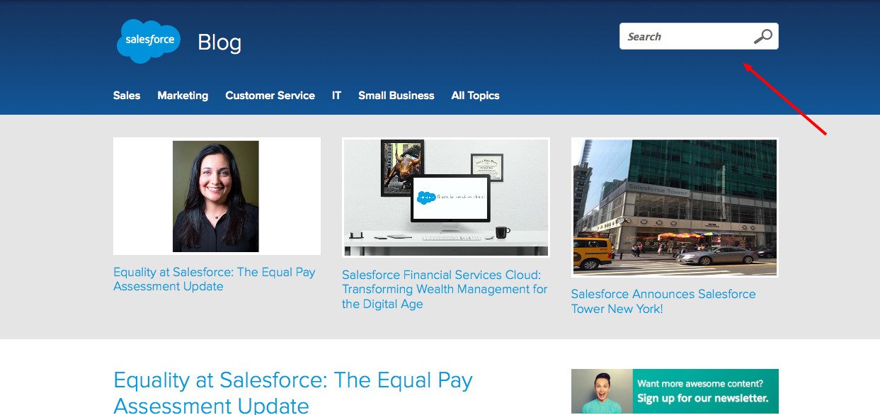
Download Free: Grow Website Traffic Guide
Optimize Your Social Sharing Options
Social media is the one of the biggest platforms where a blog can get traffic from (along with search engines and email). And for most blogs, it’s the preferred medium for content promotion.
So if you, too, want to extract the full juice out of social media, your blog needs to have optimized social sharing options.
Ensure that your social share buttons are professionally built, and blend well with the overall theme and design of your blog. The buttons should be easy to find on the blog, and allow sharing on all of the relevant social media channels. Display the number of social shares along with the buttons to establish social proof.
Here’s the “sticky” social media share bar on the Social Media Examiner Blog. The bar flaunts the extraordinary number of social shares that the blog garners:
Below is an example from the Aweber Blog. The social share buttons on the blog lie at the end of their each post, and have a rather small size. The sharing options also doesn’t have a button for LinkedIn. These sharing options can be easily missed by some readers.
In addition to the above points that are largely associated with user experience, a blog also needs to be optimized for search engines.
There are multiple on-page optimization techniques that can help your blog reach the top results in search engines:
Minimize Page Load-time
It’s no news that website load-time is one of the more important search engine ranking factors. Bryan Dean from Backlinko says, “Fast-loading websites are significantly more likely to rank in Google.”
Considering this, your blog needs to have a quick load-time for SEO, and for better user experience.
To reduce load-time, you need to make your blog leaner. Eliminate unnecessary elements (or code) from your blog, so your blog becomes “lighter.”
Start by identifying widgets and plugins that don’t serve much purpose on your blog. Without these widgets and plugins, your blog can load faster.
You can also look for images, other media, or javascript code on your blog that can be done away with.
On your blog homepage, stop using infinite scroll if you have one. Practice pagination of your blog posts. Also, limit the number of posts shown on a page.
Cut Down Bounce Rate
Low bounce rates are associated with high Google rankings.
Reducing bounce rate should be your priority not just for ranking well in search engines, but also for increasing the binding power of your blog.
You can minimize your bounce rate by featuring relevant internal links that readers can move to. The links can be on the lines of “Relevant posts” or “Suggested posts.”
Additionally, you need to link ‘to’ your existing posts in your new content pieces. This practice is known as “internal linking.”
Moreover, you should have all the external links on your blog open in a new tab.
Also, review your blog data to find the bounce rate for mobile users. If the bounce rate is high specifically for mobile users, it’s an indication that your blog lacks mobile optimization.
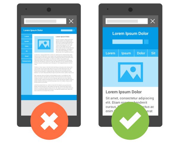
Other SEO Tweaks
Place Keywords Appropriately
Make sure you include your target keywords in all the critical HTML tags of your blog. Use the title tag and meta tags to strategically place your target keywords.
Add “alt-text” for Multimedia
For all the multimedia featured on your blog, you need to accompany them with appropriate alt-text. The alt-text should again be keyword driven, and comprehensive.
Search engines crawling your blog identify the multimedia using their alt-text.
Choose URL Strategically
The URL of each blog post should include the keyword(s) you target with the post, but not be too-long.
If you have a WordPress blog, you can install plugins that can help you make these tweaks. Our favorite SEO plugin is by Yoast. The plugin tracks the SEO for each of our posts, and gives an actionable report at the end.
Here’s a screenshot of the plugin in action:
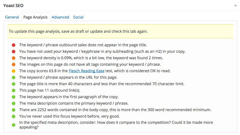
Historical Optimization
If you’re lacking resources to publish new blog content regularly, or you want quick SEO results for your blog, go for historical optimization.
Historical optimization is about improving your existing blog content that already receives decent traction into something that brings great business to you.
It consists of a couple of strategies:
- Optimizing blog posts that attract huge traffic, but does not convert much.
- Optimizing blog posts that are highly-converting, but do not receive appreciable traffic.
What Do You Think?
Did you find any of the above tips useful? Did we miss any important optimization technique? We’d love to hear your thoughts. Please email your thoughts to us, at [email protected]
]]>