Brookdale Living Used A/B Testing To Increase Website Conversions
About Brookdale Living
BrookdaleLiving.com offers senior citizens planning to live independently various solutions such as community living facilities, caregiving, and nursing services, and so on.
Brookdale hired digital marketing and analytics firm Fathom to optimize its website to boost conversions. Fathom used VWO for its work.
Goals
The goal of this campaign was to boost conversions from the Find a Community page.
Tests run
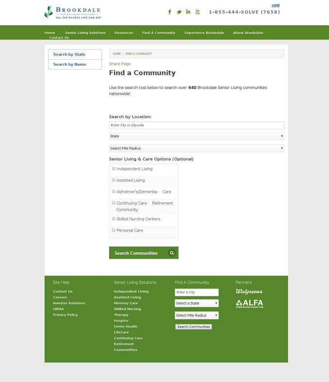
Brookdale Living’s Find a Community page was truly bare-bones. There were no graphics, testimonials, or other content that would encourage visitors to convert. This is how the original page looked:

Not surprisingly, conversions were poor.
Matt Fieldman, Senior Account Executive at Fathom, first redesigned the page by adding content, testimonials, credibility logos, and USPs, among other elements. He then created 2 versions of the page (one with a picture and another with a video) and used VWO to conduct an A/B test to determine which would be more effective in driving conversions.
Matt’s hypothesis was that the video version, which contained customer testimonials, would perform better than Variation 1, because it provides clear social proof.
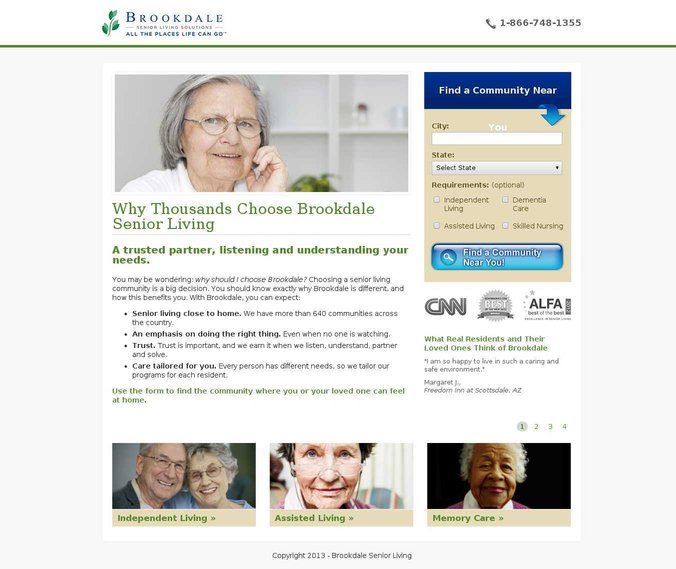
The first variation with an elderly woman’s photograph looked like this:

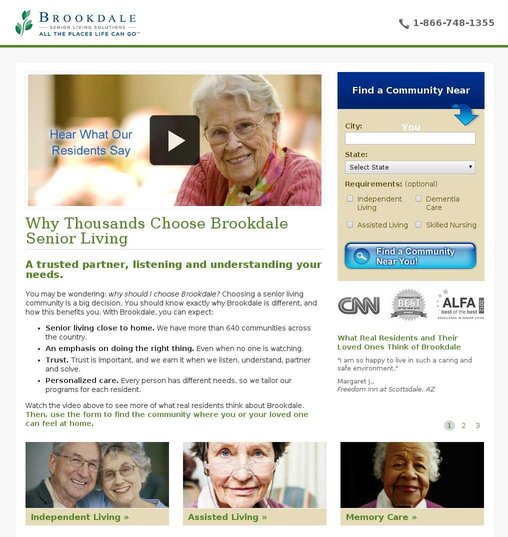
The second variation had a 2-minute video that replaced the woman’s photo. The video showed many senior citizens talk about their positive experiences with Brookdale. Everything else on the page remained the same.
Here’s the video. This is a screenshot of the video version of the page:
The test was run for 2 months on over 30,000 visitors.

Result: 3.92% increase in conversions; US$100K incremental monthly revenue.
Conclusion
When pitted against the original, the page with the image outperformed the video version. Variation 1 recorded a 3.92% increase in Find a Community searches (with a confidence level of 99.99%) while the video version recorded just a 0.85% increase in searches.
Matt estimated that even the seemingly modest 3.92% increase in community searches would result in a US$106,000 additional monthly revenue.
As always, it is instructive to analyze why the variations did better. Even further interesting is to figure out why the conventional wisdom of using testimonial videos (which has become a venerated best practice) lost to the version with a static image.
Matt used Fathom’s most-successful landing page template to redesign the Find a Community page. By adding relevant elements, he ensured that the redesigned page spoke to the 4 major online consumer personas expected to visit the website:
1) Methodical consumer
This type of detail-oriented users try to read up every bit of information present on the page. Matt used additional explanatory content to speak to this category.
2) Spontaneous consumer
This type already has the intent to purchase while visiting a website. Matt used a clear and concise search box with an arrow pointing toward the City field to speak to this customer type. He also cuts down on the number of fields – a practice that has increased conversions for many VWO customers.
3) Humanitarian consumer
This type wants to know who you are and whether they can place their trust in you. To assure customers and allay their fears, Matt used testimonials and logos – 2 tried and tested elements.
WikiJob, a UK-based VWO client, tested a customer testimonial on its product page and saw 34% increase in conversions. Similarly, another company increased conversions by over 72% by adding a trust badge.
4) Competitive consumer
As the name suggests, this type wants to know why they should choose you over competitors. Bullet points that called out Brookdale’s unique selling points (USPs) were put up on the page to get their attention.
A VWO client increased CTA click-throughs by almost 50% by changing its CTA text to a better value proposition.
Why the image version worked better than the video version
It would be fair to say that Matt wasn’t the only one surprised by the results. Given a choice between a video or a photo, most people would opt for the former. Here’s why videos are hailed as a preferred choice over static images:
- Zappos’ sales went up from 6% to 30% by using video demos on product pages.
- Stacks and Stacks found that those shoppers who saw videos on its product pages were 144% more likely to add to cart.
- CrazyEgg got an explainer video made which helped them generate an additional income of $21,000 per month.
Analyzing the “fascinating counter-intuitive nature of the result,” Matt came up with some possible reasons why the image version worked better than the video version:
1) Brookdale was already an established brand and so the video acted as a distraction for most visitors
At the time of the test, Brookdale had been around for over 3 decades and was listed on Nasdaq. It was already a well-known brand and people did not need much convincing to convert on the website. Visitors had done their research and came to the website knowing what they wanted. For them, the marketing video was a distraction. Especially because the video had people talking about specifics such as “food” and the “caring nature of the staff” at the communities. It is possible that the visitors did not have these criteria in mind when they came to the site. After watching the video, they thought of “food” and “staff” as important factors in their decisions, and possibly bounced off the website to read up on what the competitors offered in these areas.
2) Most users fall into the spontaneous customer type
Matt felt that customers want to convert quickly and are not interested in the video. “As you can see, we were wrong. We now understand our customers better: they aren’t interested in marketing videos so much as they want to convert quickly and easily on the page”, he said.
At VWO, we don’t fully believe that selecting and purchasing senior citizen solutions are spontaneous decisions, which is why we don’t fully agree with this reason. But it is still a possibility to consider.
3) Target audience has a slower Internet connection, so videos might not work for them
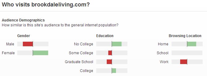
Alexa indicates that Brookdale’s target audience is over-represented by women who haven’t gone to college and who browse Internet from home.

A report on the average home internet speed in the US tells us that people who didn’t go to college are less likely to have high-speed broadband access than those who went to college.

It is, therefore, fair to conclude that a majority of Brookdale’s visitors did not have access to high-speed broadband connection. A slow internet speed might have led to a painful video watching experience, and hence the image version worked better.
Thanks to Tommy of ConversionXL who pointed out to us the third reason.

Location
Tennessee, USA
Industry
Real Estate
Impact
3.92% increase in Conversion


