Do long-form sales letters still work? Even for “Professional” businesses and startups?
This is a guest post by Jeremy Reeves, who is a direct response freelance copywriter and conversion rate optimization specialist who helps businesses uncover hidden assets, boost conversions and maximize profits. See how he can help grow your business at “JeremyReeves.com”
Depending on how long you’ve been a subscriber to VWO blog, you may or may not have seen the article I wrote last year about why long-form salesletters STILL work in most industries… even in today’s market.
Download Free: A/B Testing Guide
(You can read “The Anatomy Of Long Salesletters” here)
That article stirred up a tremendous amount of controversy because, well, many people have biases about what does and doesn’t work.
One of those biases is the “professionalism” (or lack thereof) of using long-form salesletters in today’s marketing environment.
As a hardcore split-tester myself, I really only care about what works. Personally design doesn’t matter much to me unless you can prove to me that a “pretty” design converts higher than a more minimal design. Then I’m all for it.
However, it’s becoming more clear that design is being used as a credibility and professionalism booster, so I’m beginning to put my own preferences aside and join the crowd. That’s why in this article I’d like to show you a few examples of how people are mixing the power of long-form salesletters with the professionalism many of today’s consumers are coming to expect.
Plus, as a little bonus, I’ll even do a quick critique on each of these websites to show where I believe they’re making mistakes and have potentials for increased conversions. This article is very content-packed, so get your pen and paper ready 🙂
Example #1: SEOMoz
As you can see in the picture below, SEOmoz is testing a tabbed layout. They split-test their website like crazy (one of the reasons they’re so profitable) so this may or may not be their winning version. However it’s a good example of what can be done.
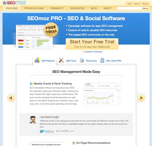
As you can see, they’ve broken up the main selling points into several tabs.
SEO Platform & SEO Tools – This tab is equivalent to talking about the features and benefits of your product/service, and would make up the bulk of any traditional salesletter. However instead of laying it out in a vertical fashion, they simply split it up into two different tabs. The theory for this is that it shortens the perceived page length and makes it easier to digest.
Resources – This is more features & benefits. However one thing I think they’re missing is talking about why it’s better than their competitors. From what I’ve seen, very few companies offer the level of ongoing training that SEOmoz does… yet they aren’t prominently talking about the extra value you get as a customer. They simply show what you get with no further explanation, no comparison charts, etc.
Who Uses PRO – This is equivalent to the social proof you’d normally have in a traditional long-form salesletter. I think they need to load this page to the gills with as much social proof as possible. That includes who uses it (as they have), success stories, testimonials, case studies, news and media mentions, etc.
A Few Ending Thoughts On This Page – I’d like to pull from the hundreds of split-tests I’ve done for both myself and my clients, plus countless hours of research into what works and what doesn’t and say a few comments that might help them (and you) increase conversions.
First… they’re missing two critical elements. A guarantee, and success stories. I saw two or three success stories but they were hard to find and even harder to read. Remember, people buy because the perceived value of your product/service outweighs the risk of purchasing. Without a guarantee, that’s hard to do. And without a plethora of testimonials, case studies & success stories, it’s hard for them to trust you.
Second… I’ve tested this tabbed layout a few different times with clients and it’s never won. However that’s not to say it won’t work for your business. Remember, as a marketer you know nothing until you test it and get a valid result.
Third… I think they’re making a mistake by having the price at the top of this page. My guess is that people would come to this page in the early stages of their buying cycle, and therefore weren’t ready to hear the price yet because they weren’t fully sold. This is a critical piece in the selling process, and I believe they’re making a mistake. But again, only testing will tell 🙂
Download Free: A/B Testing Guide
Example #2: Basecamp
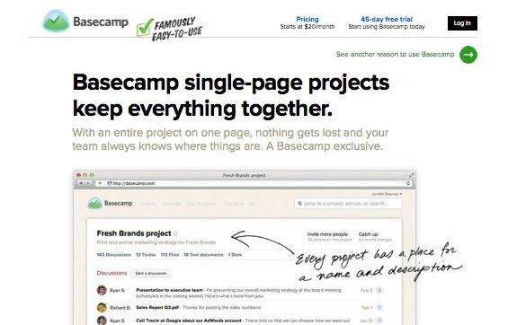
Basecamp.com is one of my favorite websites to continually spy on and look for new ideas. Again, they have an amazing testing philosophy and split-test like crazy. I’ve also used their software and love it.
Click to expand
The problem they have is that their product is so good and has so many unique features/benefits that it’s hard to talk about them all. If they were to use a single long-form salesletter, my guess is that it would be nearly 50 pages long.
Because of that, they talk about some of the features/benefits most important to their customer and then list out all the reasons people should use their product. All 24 reasons.
Here are a few things I would test and/or fix on this page.
Pricing At The Top – I believe they’re making the same mistake as SEOmoz. And again, I may be wrong but people “typically” aren’t ready for the price before reading about what the product/service can do for them.
Proof & Risk-Reversal – I’m very, very surprised to see this page doesn’t place much emphasis on proof or risk-reversal. In this age, those two factors are two of the most important factors you have at your disposal to build trust. They have a little social proof on the page, but it’s near the bottom and, in my mind, almost an afterthought. It’s also hard to read. I’d recommend bringing it up as well as making it much more prominent.
The Copy – They seem to only be hitting on very surface level benefits. Things like being more organized, being able to chat freely, and coordinating schedules.
The problem is, surface level benefits don’t do much in terms of selling. What they need to do is talk more about what those surface level benefits DO for the end user. For example, being more organized means you and your employees save time, become more productive and increase the bottom line through increased production.
And then they should add a strategically placed testimonial of a person who’s done just that.
See how much more powerful that would be than simply saying “you’ll be more organized”?
Video – Some products simply “need” a video to show how powerful they are and how valuable they can be to the end user. This is one of those products. They could either have a video on the page showing people how it works, or even hold webinars showing people the ins and outs of how it could help them. My guess is they’d raise conversions by 30%+, easily.
Copy Doodles – Believe it or not, the handwriting you see on this page has its roots in old-school direct response copywriting when marketers would write out a printed letter, mark it up by hand and rescan it to create the final letter. I’m doing that exact same strategy for an offline client right now.
I LOVE doing these and love how they used them. However one thing I would change is the font they’re using. To me it’s so hard to read that I don’t even attempt it. Instead I glaze over the entire section.
Call To Action – The call to action they have can be fixed in several different ways. First, they should talk about the guarantee. I would even consider having a guarantee on the free trial. After all, even though it’s free, it’s still a time commitment so there’s still risk involved.
Second, I would test having that form in a different color and a different shape. I’d go with a more vertical look instead of horizontal, as it seems cluttered.
Third, the line under “Sign up for a 45-day free trial of Basecamp” is nearly impossible to read.
Closing Thoughts On Using A Long-Form Salesletter In Your Business
Please, don’t be afraid of trying something new. You’ve just seen two industry leaders who took the idea and selling power of long-form salesletters and spun it in their own unique way.
One of the biggest mistakes I see people make is thinking “that doesn’t apply to MY audience”. Do yourself a favor and hide your ego and beliefs about what works and what doesn’t for a few seconds. Be bold and try something new. Trust me, you’ll love what happens.
The vast majority of breakthroughs happen when something is radically changed in a business, not through “safe” tests. If you’re looking for a potential breakthrough in your profits, I highly recommend getting out of your comfort zone and trying something new. It’s the only way it’s going to happen.


