How to Convert User Feedback Into A Goldmine for A/B Testing
We have finally learned to mock HiPPOs, as they no longer can serve as a reliable basis for making decisions. Gut feelings don’t always work and businesses cannot afford to act upon them.
That is why we A/B test to verify our hypotheses. It is a clear solution to the problem of being unsure whether your ideas will actually work. Sometimes ideas come from inspiration and sometimes they come from research. If these two fail, panic ensues; unnecessarily, as you’ll see below.
There is a low hanging fruit, one that is a goldmine for A/B tests: feedback. Feedback coming from your users and customers pinpoints all the issues they are facing and allows you to instantly identify possible hypotheses for your future A/B tests.
Download Free: A/B Testing Guide
Users Know Your Product Better: Listen To Them
A/B tests are great for optimizing content. All decisions come from evaluating the performance of tested elements. A/B tests aim to achieve an expected result and start by establishing a hypothesis. Design, or changes in design, revolves around user behavior and designers’ aim is to bring the product towards the people.
Yet, sometimes it is users who bring your product closer to you.
See, you probably know well that people are not that easily programmed. We can’t just go to Google, enter “How to make people do X on a website” and browse through results that tell us “Red CTA button will increase your conversions tenfold”. Because then you will be making the carnal mistake of thinking it’s design elements that bring out the desired changes in people; While actually, it’s user behavior that steers design changes.

We need to constantly ask ourselves “who is using our product?” and then design according to what we learn about the users.
A/B test hypotheses gathered from users can indirectly solve one of the issues often covered when discussing A/B tests. Kohavi et al. point out limitation of A/B testing, where it’s mentioned that they provide quantitative metrics without explanations. Yes, usually you are able to verify only which variant is more successful, but you do not understand why. Knowing why can be the basis for future improvements in order to ensure coherence of your designs. Hypotheses gained through users are already able to tell you why people want a change.
A/B tests help find which changes convert best, but they don’t reveal why.
Guys from Dropbox created a simple solution for people who wanted to share their files effortlessly. However, their road to success was not as effortless – they needed to iterate their product and marketing based on feedback they received from their users.

HackerNews gave efficient feedback for Dropbox creators, and they used it in order to improve their landing page and value proposition.
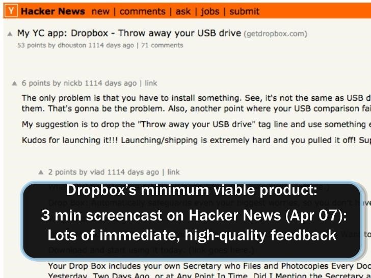
Of course, the actual process that Dropbox followed must have been more developed and extensive, and so should be yours. The feedback you receive serves as a great basis for any further developments. If your users are pinpointing an issue, you need to use it as an opportunity for improvement. However, every conscious designer realizes that his or her ‘ideas’ are not always the best solution to a problem.
That is why we A/B test to verify the hypotheses based on the feedback.
Since we learned that feedback is of paramount importance, it is best to focus now on the methods that can be used to gather it.
How To Gather User Feedback and Fuel Your Hypotheses
Being a thorough listener and gatherer of customer feedback can be an arduous task. However, many methods make that process fundamentally easier.
#1 Live Chats
are a great way of cumulating info about smaller and ongoing issues, which can be resolved on hand. They do not necessarily need to be A/B tested, but sometimes users and customers may point out issues that are seemingly small, yet can result in rather large changes on the website – these do require A/Bs.
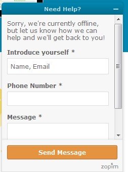
With live chats, you can also immediately ask important questions that would enhance your process of introducing improvements. Simply asking “why” and learning the answer will inspire you in various aspects.
Related Post: How Badly Does Your Online Store Need Live Chat Support
#2 Exit Intent Popups
Exit-intent popups are another option. If you set up a script that shows a popup when a user attempts an exit, you can align it with the user’s action and see when they decide to leave. Pairing it with a response coming from them can paint a bigger picture showing the reasons behind their actions, in this case – their exit.
Or you can ask them to subscribe.
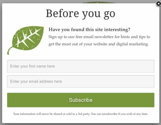
Sample situation: “I’m leaving because the page is unreadable!” says the customer. The data from other tools (for example heatmaps) show that the user scrolled only halfway through the page. It indicates that these areas need grave improvement (and so does the content below, as it doesn’t attract enough attention). Comparing this to other data coming from other visitors may narrow the problematic areas even further. A great basis for formulating a hypothesis of an A/B test (e.g. The article headlines are uninteresting).
#3 Feedback Widget
Feedback widgets present on the website are a third form of gathering feedback. They are usually attached as clickable boxes to the website, at either side of the screen.
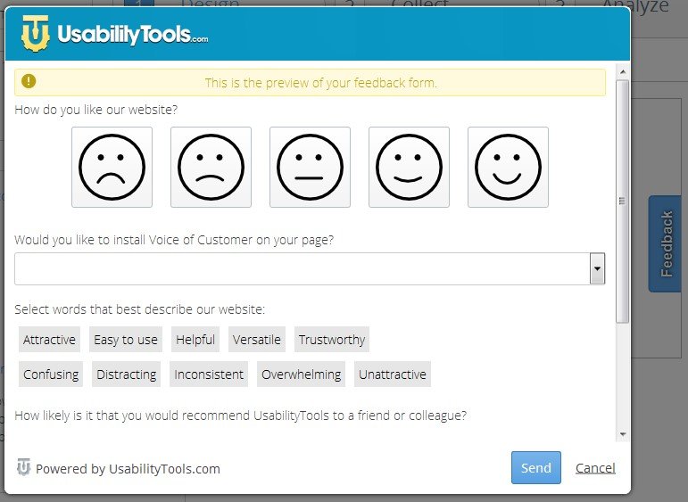
Users can click them and provide answers to questions or general open descriptions on issues about which they want to talk.
If you are suspecting that there is a problem with a given element on a page, you can inquire about it and verify whether you should pursue that topic any further. Here’s a great source of possible questions you can include in your widget, which you can use as a basis for gathering your A/B test hypotheses.
#4 User Forum
The last form of gathering feedback has been already aforementioned using the Dropbox example. You can set up a contact forum (or use an already existing one! Go to reddit.com and find a specific subreddit, for example), where your users (or future visitors) are able to create discussions and talk about your website. Problems might be unusually isolated, and other users can verify that for you, so you can verify what the priority is.
Download Free: A/B Testing Guide
Common Mistakes in A/B Testing
Remember, there are certain mistakes that you should avoid in order to make your A/B study viable.
First, be sure that your results reach a statistical significance. Basing yourself on a small portion of the results will not verify your project efficiently. Second, be sure that you have enough traffic, as studies dragged out in time might even make some changes obsolete – time, technology, and people progress unbelievably fast.
Related Post: 5 Reasons Why Your A/B Tests Fail (and how not to)
Moreover, be sure not to go crazy with the variations – too many of them and you will spend too much time on the study, thus invalidating the study. Also, prioritize ideas that are quick to implement – more often than not a small change can yield very positive and fast results.
What It All Boils Down To
A/B testing is a very efficient way of verifying your projects. However, gaining ideas for them may be more difficult than it appears, and sometimes these ideas can be more or less shots in the dark.
By focusing on customer or user feedback, you can quickly gain inspiration for your tests and find areas that need improvement. Show your visitors that you care about their opinion, and they will feel appreciated by your efforts.
Note: The author owns screenshots used in the blog.



![7 A/B Testing Examples To Bookmark [2023]](https://static.wingify.com/gcp/uploads/sites/3/2019/12/Feature-image_7-AB-Testing-Examples-To-Bookmark-2021.png?tr=h-600)

