Less is More: Why Providing Your Customers with Fewer Options Will Increase Your eCommerce Sales
You know the drill: You arrive home after a long workday, curl up onto the couch, and turn on Netflix to find a movie or show to lose yourself in. You end up spending what feels like hours browsing, but still can’t decide what to watch.
Sound familiar?
If so, then you’re not alone. The abundance of options that we’re confronted with on a daily basis is known to paralyze us and cause us to put off making a decision, including in eCommerce.
Download Free: Improve Conversions In 60 Days Guide
Further, having more options makes us less satisfied with our decisions because we keep thinking about everything we missed out on (the opportunity cost a.k.a. buyer’s remorse).
The famous Jam Experiment proved this. Here’s what happened: Psychologists, Iyengar, Jiang and Huberman, went to a grocery store and offered one group of customers 24 different types of jam. To another group of customers, they only offered six different types of jam.
The study with 24 jams attracted more people but resulted in far fewer purchases. 30% of people bought jam when there were only six to choose from, while just 3% bought jam when there were 24 on display.
And it doesn’t stop there: Having fewer options has also been shown to boost happiness, decrease buyer remorse, and increase the probability of repeat purchase.
A study by Shah and Wolford found that providing more choices helps to boost sales…up to a certain point. After a certain number of options, you’ll reach a point of diminishing returns. But where is that sweet spot for your business—how many options are too few and how many are too many?
The answer depends on your products and customers, so the only way to find out is to test. That said, there are a number of key principles you can follow to reduce decision fatigue and maximize overall purchases.
How to reduce decision fatigue and increase conversions
Harvard defines “decision simplicity” as is the ease with which consumers can gather trustworthy information about a product and confidently and efficiently weigh their purchase options. Decision simplicity is key to driving conversions and increasing customer retention.
One obvious way to increase decision simplicity is to offer your customers fewer options and reduce the number of products in your eCommerce store. But decision simplicity goes far beyond that.
Here are the top nine strategies to reduce customers’ cognitive load, boost decision simplicity, and increase sales.
1. Have Just One CTA
Emails and landing pages should have just one main call-to-action to guide the user towards the end goal.
NameOn, a Scandinavian e-tailer, was losing over 30% of customers just before checkout. On reviewing the checkout process, they hypothesized that having nine calls to action on the cart page was confusing users. So they created another variation with just one CTA on the page, directing shoppers to check out. The page with just one CTA performed 11.40% better, leading to $100,000 in additional yearly sales.
Whirlpool created an email campaign that had one primary CTA directing their customers to their rebate page, along with three other secondary “Learn More” CTAs.
But Whirlpool wondered if the secondary CTAs were distracting the recipients from the primary CTA. So they created another variation with one primary CTA and no secondary CTAs.
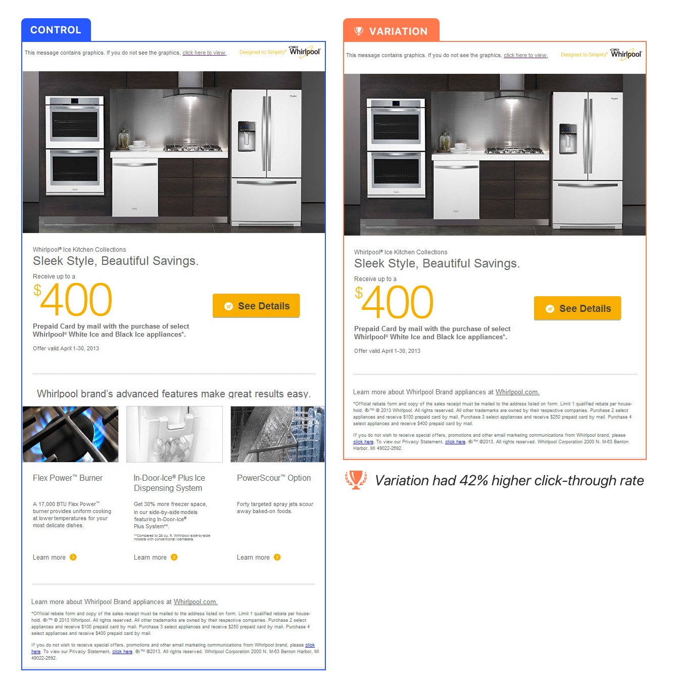
The email with only one CTA had a 42% higher click-through rate.
With several CTAs on the page, it’s easy for people to get distracted and confused, even if your primary CTA stands out.
So consider eliminating anything that distracts from your main CTA, whether it’s on your checkout pages, landing pages, product pages or in emails. Think of the one action you want the user to take, and make that crystal clear. Plus, the more you can segment your audiences, the more personal you can get with what that CTA is.
2. Bundle your products
Product bundling is combining several complementary products in a package at a cheaper price than it cost each product individually.
It works not only by increasing value perception, but it also reduces cognitive load for the buyer.
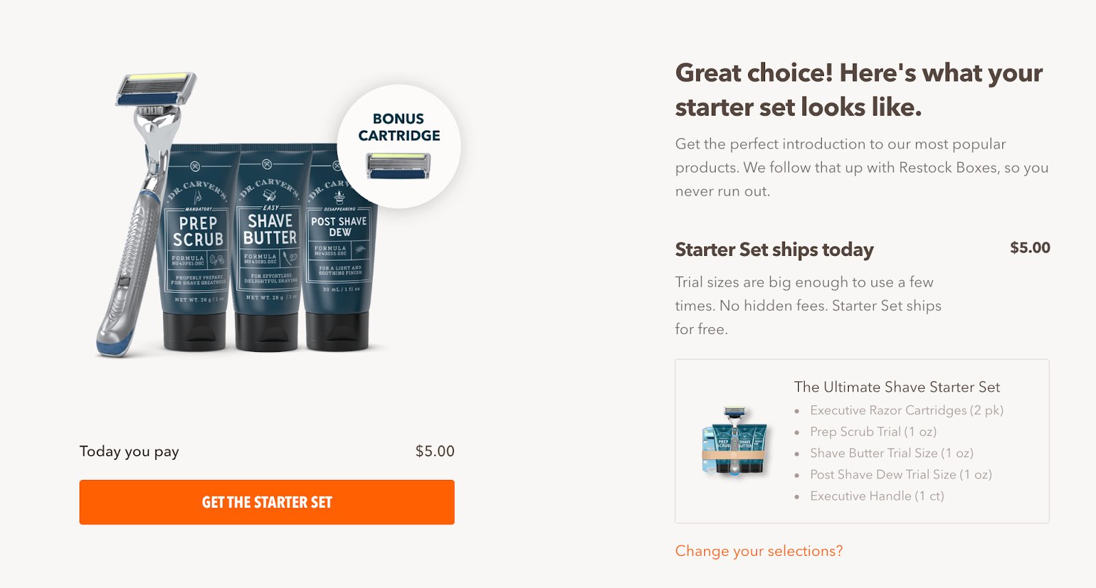
Dollar Shave Club is a brilliant example of an eCommerce brand that built a business on bundling. Amazon has also consistently used bundling to increase cart value while developing loyalty in customers. Use historical sales data to understand which products are commonly purchased together, then test the effectiveness of bundling with real users to understand how it can work best for you.
3. Provide social proof
Have you ever seen a line outside a restaurant and immediately felt an urge to eat there? This is the power of social proof in action.
Social proof is an innate psychological phenomenon whereby one’s decision is influenced by other peoples’ opinions or behavior. It’s as old as time, and the eCommerce industry is continually finding new ways to leverage it to drive revenue growth.
Here are a few of the top performing tactics for harnessing social proof. Display product reviews. Add “best-seller” tags to your top-selling items. Or show user-generated content (photos taken by customers) in the photo gallery, as the mattress brand, Casper, does on their homepage. Quote sales or customer numbers for high-selling products. Add testimonials from happy customers.
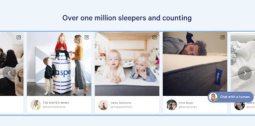
Knowing that other people have purchased and been happy with your product will encourage your shoppers to make a purchase as well and feel more confident in their decision.
4. Provide personalized choices
Rather than presenting customers with a bunch of random options, use data to understand and present a smaller number of products which are most relevant to them.
In a post-purchase email campaign, Indochino selected three different shirts that matched the suits customers had just bought and promoted them as a bundle.
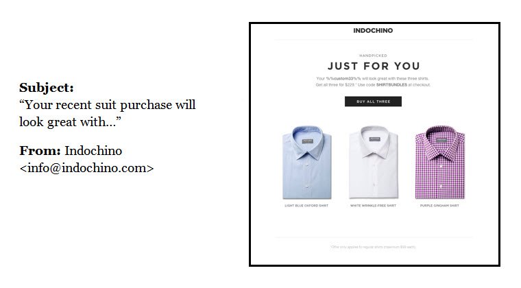
This email strategy increased the brand’s revenue by 540% compared to their normal promotions. It worked because it presented each customer with just one highly personalized and simple offer. It didn’t make them have to think.
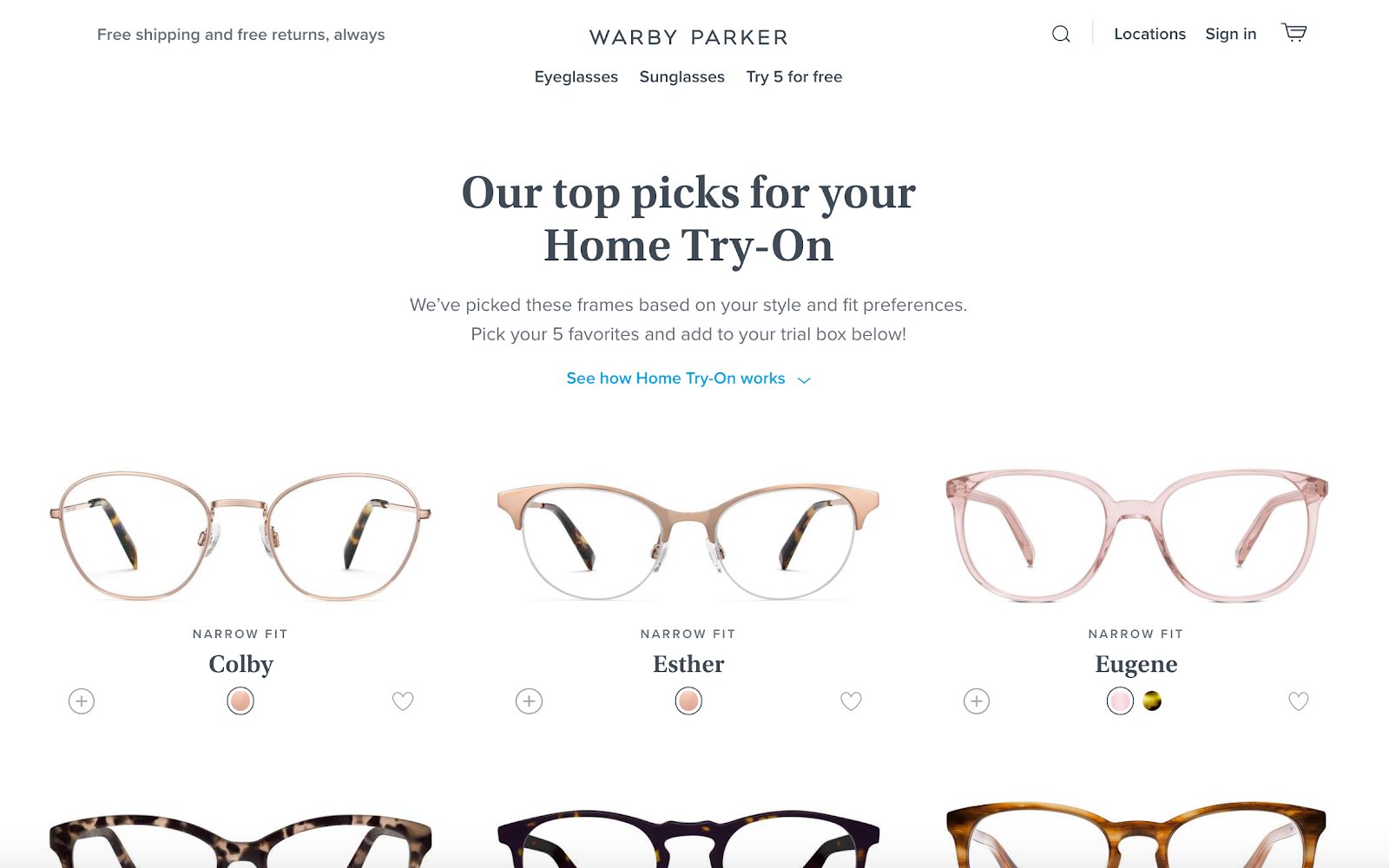
Personalization can work even if you don’t yet have data about the customer. Warby Parker encourages website visitors to take an eight-question quiz to find out what type of glasses are best for them. Once the quiz is complete, they see a curated selection of glasses that are relevant to their needs. Users will often be happy to give information if they trust it will be used to make their experience better.

Once the quiz is complete, they then provide them with a curated selection of glasses based on their answers.

Download Free: Improve Conversions In 60 Days Guide
5. Simplify your website
It’s not only about how many options you provide your customers; it’s also about how you present them.
Take a look at Bellroy’s homepage, for example.
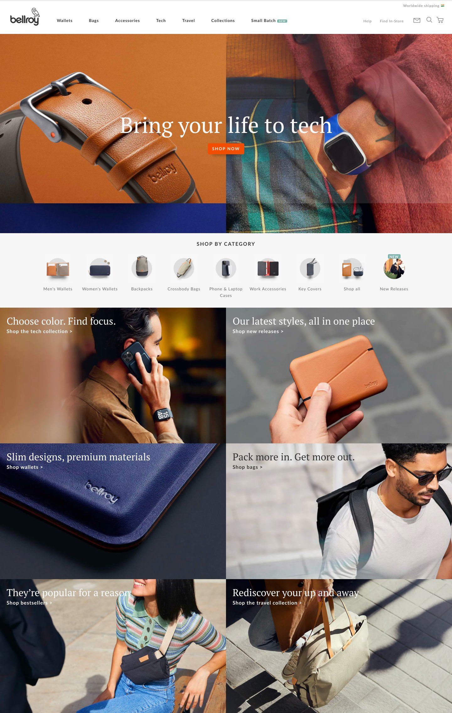
Notice how they don’t overload their website visitors with information and products right off the bat. Rather, just below the fold, they display their best-selling items, and below that, they show the different product categories, making it easy for their shoppers to find what they need. They offer a variety of choices presented in a way that makes the shopping experience enjoyable and effortless.
In addition to a beautiful design, make sure your website is easy to navigate and explore. Make it easy to search and find a product if the customer already knows what they want. As Bellroy does, categorize your products in a way that makes it easy for your shoppers to find what they’re looking for.
Also, check out the VWO Podcast with CRO expert Darell Williams to know how you can use Hick’s Law to simplify choices.
6. Allow users to easily compare products
Don’t you hate it when you’re browsing a website and can’t figure out what you want to buy because you don’t know the difference between the products? For example, take a look at this Bose product page for headphones:
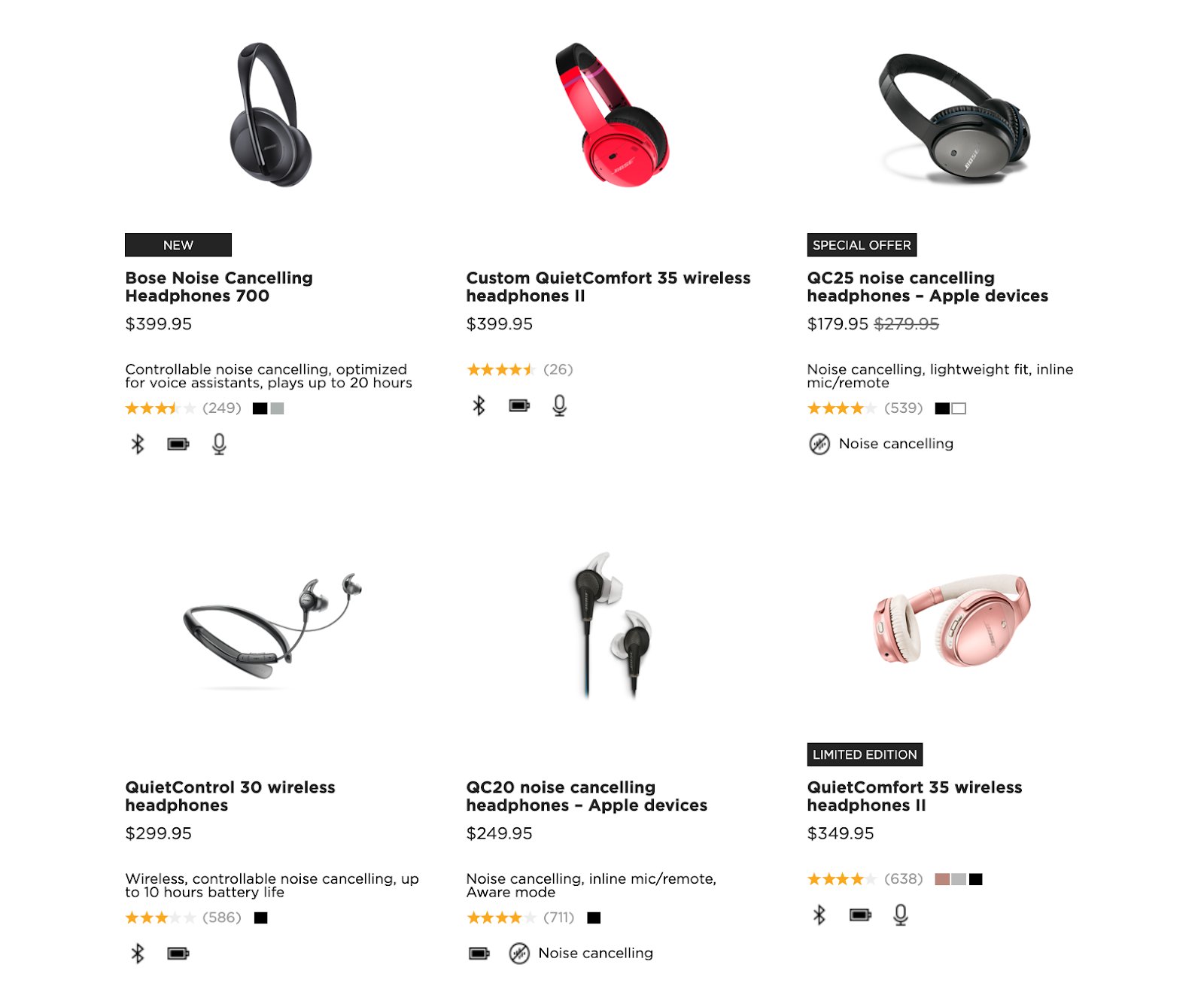
It’s confusing because there are different prices but it’s not easy to see why and make a direct comparison.
On the other hand, Apple allows a direct feature by feature comparison of its products:
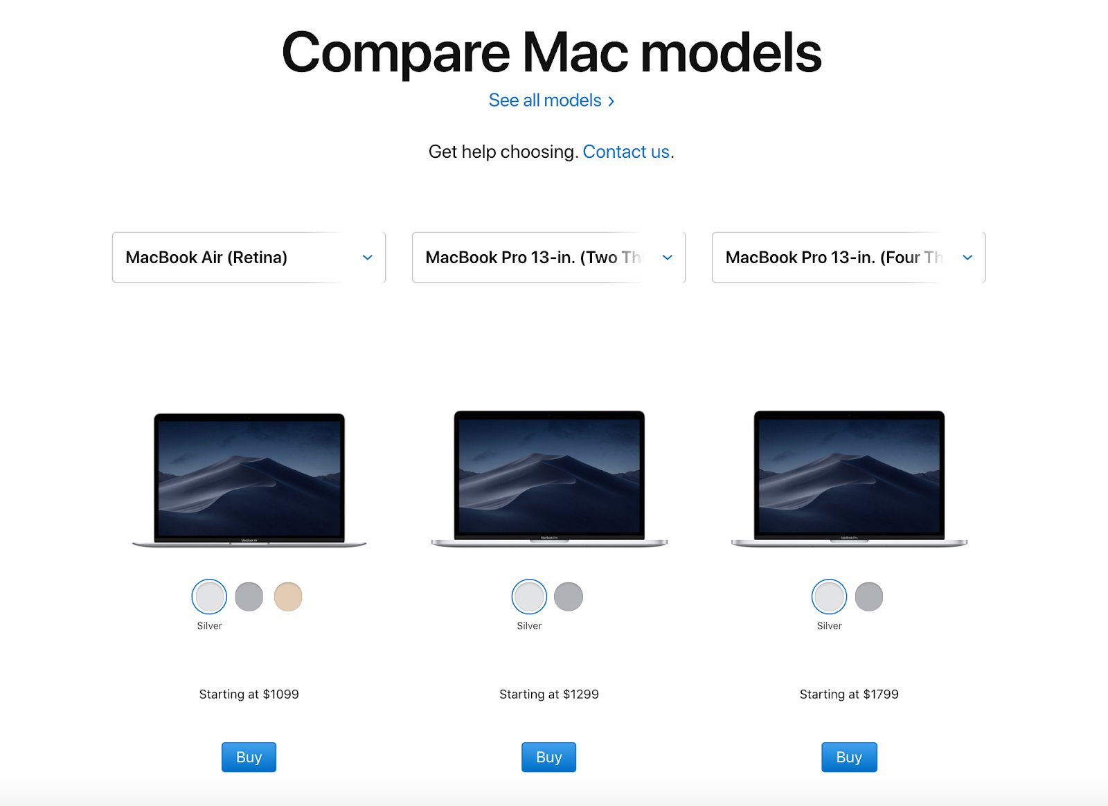
Shoppers can easily see the differences and make an informed choice based on their own needs and budget.
Bottom line? Make it very clear what your product features and benefits are. If you have products that are similar to one another, make comparison easy for the customer, as Apple does.
7. Offer a generous returns policy or guarantee
One of the key challenges in eCommerce is that the customer can’t touch or try out the product. This creates more pressure on the decision-making process, especially for first-time purchases. To reduce this pressure, offer a returns policy and guarantee that’s simple, clear and hard to refuse. For example, offer free shipping and returns or a guarantee that meets or beats competitors. Or, as Warby Parker does, you could allow your customers to try out your products before committing to a purchase.

But even with a generous policy, it’s still a hassle to return products. One survey found that 27% of shoppers dislike purchasing online because they don’t want to have to deal with returning it if it doesn’t turn out right.
Partners and integrations like Happy Returns can help to cost-effectively give customers the confidence that if they need to return it will be easy.
8. Use data to highlight certain products
There’s a reason why brick-and-mortar stores have displays in their windows. By showcasing certain products, they grab people’s attention and pull them inside.
The same goes for your eCommerce store. Highlighting certain items in your store, like best-selling or recently added items, is effective because it helps to make the decision easier for customers. Here are a few badges that you could add to your products:
- Top-rated
- Best-seller
- Recently Added
- On Sale
- Limited Edition
In particular, highlighting best-selling or top-rated items adds an element of social proof. You could simply display a “Best-seller” tag next to your most popular items or you could devote an entire page to your best-sellers.
For example, Amazon has individual pages devoted to its best-selling items in each category:
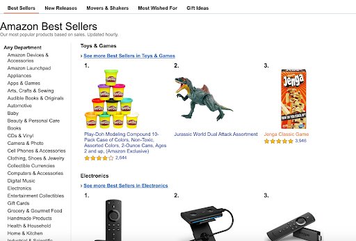
You could even use data to display relevant and useful product information. For example, if you sell a variety of jackets, add badges to each jacket to show shoppers the types of weather each jacket is suited for (snow, rain, wind, cool weather, etc.)
9. Provide customers with support
According to eConsultancy, 83% of shoppers need support at some point during the buying process. And they expect to get it quickly; 48% of shoppers will abandon the site if they don’t get the help they need within five minutes.
So how can you provide them with that support? Install live chat on your website — and ensure it’s manned by personnel from your organization. Also have your contact details and customer service response times clearly indicated so customers know when they’ll hear back from you.
Recap: Easing customer decision-making to increase eCommerce sales
Shoppers are overloaded with options and information every day. Having many choices might attract them at first, but it will often result in decision paralysis and buyer’s remorse. To prevent this from happening, follow the 80/20 rule: Focus on the 20% of your products that are generating 80% of your sales…and prioritize the rest.
Also, remember that reducing cognitive load isn’t just about reducing the number of options you offer your customers; it’s also about making the whole shopping and decision-making process as easy as possible.
And whatever you end up doing, be sure to test to find out which tactics are most effective for your store and audience.
If you do all of that, then you’re sure to reduce your customers’ cognitive load, ease their decision-making process, and most importantly, increase eCommerce sales.


