Improving and Testing Helped LKRSM Increase Its Sign-ups Using A/B Testing
About LKR Social Media
For a long time now, A/B testing experts and consultants the world over have been advising their clients to go for quick wins on a landing page. When we talk of quick wins, nothing is quicker than changing the headline copy.
Unfortunately, in larger organizations, it’s also the one that causes a lot of heartburn because marketing and branding executives are uncomfortable positioning their offerings in the completely new ways suggested by optimization experts. Today’s success story shows why it makes sense to be continually testing and getting quick wins.
Laura Roeder Social Media (now MeetEdgar) provides social media marketing training for small businesses based out of Los Angeles. Their online shops include Zero to Facebook, Your Backstage Pass to Twitter, and Creating Fame.
Goals
For years, they had been using the headline “Could You Use a Free Plan For Promoting With Social Media?” on their home page, directing visitors to sign up for their newsletter “The Dash.”
For the headline test, Laura wanted to test something that was more conversation and sounded less like marketing copy.
Tests run
Laura wasn’t sure if her idea would work because the new headline just refers to a newsletter, but not what it was about. That meant visitors wouldn’t be able to tell what they were signing up for.
However, she let her intuitions be and turned to VWO to A/B test her idea.
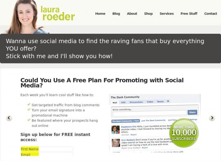
This is how the original version, or Control, appeared:

Old headline “Could You Use a Free Plan For Promoting With Social Media?”
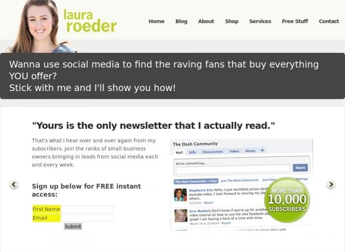
This is how the variation appeared.

New headline “Yours is the only newsletter that I actually read.”
Conclusion
Even though the variation headline was a winner from the word go, she let the test run for 12 days.
After that period, reports showed that the variation headline increased signups for the newsletter by 24.31% with 97% chance to beat original.

The main takeaway in my opinion is to do something a little different that gets attention. We all know that visitors have a VERY short attention span, but we get so focused on mimicking what competitors do that our sites end up reading like boring brochures. Also, there’s no better source of feedback than real customers! That’s where I got the idea for the headline in the first place, it’s a piece of feedback that we get constantly.

Laura Roeder
CEO
The best part is that Laura didn’t stop at that. In fact, she’s almost always testing and the current landing page of the website has undergone many changes. It employs loads of best practices and is an excellent guide for anyone interested in optimizing their landing pages.
Quickly rounding up the best practices on this home page, they are:
1. A headline that catches the visitor’s attention
2. A sub headline that provides social proof as well as a call to action to sign up for their newsletter
3. Another call to action that includes an all caps “Free.”
4. Large button that is easy to click and also has a contracted arrow pointing toward it.
5. A large amount of social proof…see how social proof helped in increasing revenues by €50,000.
6. Eyes looking toward the primary headline. Here’s some awesome research on how this affects visitor behavior.
7. Human photos have shown to increase conversions even when intuition says they shouldn’t have.

Industry
Agency
Impact
24.31% increase in Sign-ups


