ICoupon Blog Tested a Security Badge for Increased Click-Throughs
About ICoupon Blog
ICoupon Blog is a coupon website that provides coupons and rebates for different services and products. At the time of this success story, it was just 5 months old.
They used VWO to increase click-throughs on their coupons.
Goals
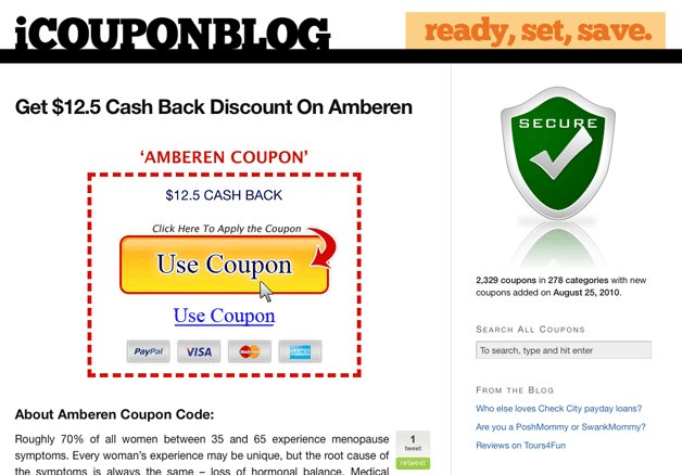
To test whether having a large Secure icon in the sidebar would help with the conversion rate. The ICoupon Blog team thought that the icon would help, because it would push down other (distracting) text in the sidebar.
Tests run
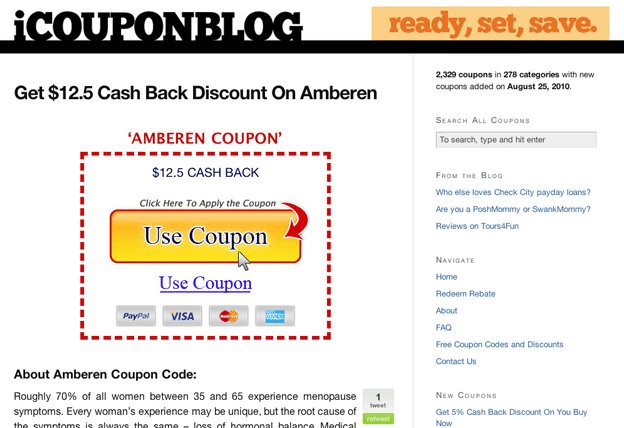
What the ICoupon Blog team tested was whether having a large Secure icon in the sidebar would help with their conversion rate. Based on past industry experience, they thought that the icon would help because it would push down other (distracting) text in the sidebar.
Here are the variations they tested:

Version A - With Security Badge in the Sidebar

Version B - Without Security Badge in the Sidebar
Conclusion
They also had some user testing done, and everyone seemed to notice the Secure button a lot. It was one of the most prominent parts of the page. So they thought removing it helped focus the user on what they wanted them to push.
They found that the variation without the secure icon had over 400% improvement on conversions as compared to having the image. [Note: The results are statistically significant.]
Strangely, removing the icon dropped site engagement by about 17%. However, with their business model, a “bounce” is actually a good thing, so site engagement isn’t as large of a factor. In a nutshell, in this particular case, it looks like the Security badge distracted the visitors from the main focus of the page.
Lessons, as summed up by Bradley Spencer from ICoupon:
Make each page designed to get the user to do one thing, and try to focus all of their attention on that one thing.
He also added a word about VWO, which was used for the test:
VWO was invaluable. We would have kept wasting user’s attention with that icon without VWO.

Location
US
Industry
Services
Experiment goals
Increase in CTR
Impact
400% increase in Click-through rate


