A/B Testing for Big Wins – When You Should Do It & How You Should Do It
Button colour tests. Font size tests. Headline tests. Run them all you want.
But remember that your website’s conversion rate is only as limited as the risks you take. Small tweaks = small wins. If you’re craving for big wins, you’ll have to make big changes.
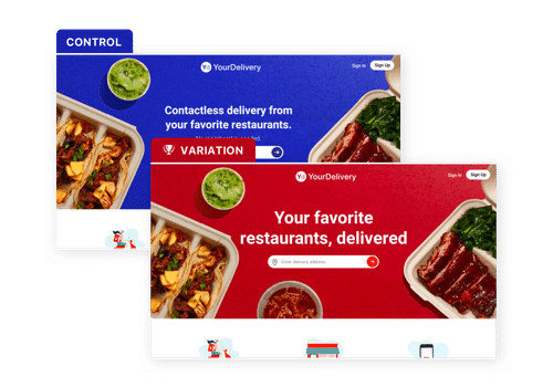
I understand that you want to “play it safe” and be cautious. But sometimes you should test a radical website redesign against your original one, instead of testing small tweaks over and again.
Download Free: A/B Testing Guide
Scenarios When a Radical Redesign Makes More Sense than Testing Small Tweaks:
When You Have a Low-traffic Site
The problem with a low-traffic site is, small tweaks will take a long time to reach the 95% confidence level for a valid test result. But if you test two radically different designs against each other, you will require a smaller sample size and the conclusive results will be reached in much lesser duration.
You can see the table below elaborating this, where the test duration has been calculated from our Split test duration calculator:
Assumptions:
Number of visitors: 500 per day
The current conversion rate of the site: is 2%
Variations: 2
| Percentage Increase | Split Test Duration |
|---|---|
| 5% | 1254 Days |
| 10% | 314 Days |
| 15% | 139 Days |
| 25% | 50 Days |
| 50% | 13 Days |
Assumptions:
Number of visitors: 20,000 per day
The current conversion rate of the site: is 2%
Variations: 2
| Percentage Increase | Split Test Duration |
|---|---|
| 5% | 31 Days |
| 10% | 8 Days |
| 15% | 3 Days |
| 25% | 1 Day |
| 50% | Less than 1 day |
As you can see in the above tables, the higher the expected increase in the conversion rate (which also reflects how big the change made by you), the lesser will be the duration for which you will have to run the test.
The only difference between the two tables is the number of daily visitors received by the sites.
This clearly shows that a high-traffic site can test small changes as much as they want. But for sites that receive less traffic, it is best to make big changes (at least to start with). After this, you can tweak your new, winner-design and optimize it further for small wins.
When No Matter What Tweak You Test, You Get Negative Results
When you focus on small tests only and test every element that you can find on the page, there will come a time when any tweak that you make will only give you negative results. This means that your current design has reached its maximum conversion potential, also known as the “local maximum.”
Solution? Test your fully-optimized page against a new design that is entirely different from your current design.
When Your Current Design Has Huge Scope of Improvement
If you’re a beginner in A/B testing, it’s perfectly fine that you start with 2-3 small tests first because you’re testing the waters. And if you’re someone who needs to convince your management of the power of AB testing, small tests are again your best bet.
But if you are well aware of conversion optimization practices and see a huge scope for improvement in the current website design, be bold and start with testing a different design at once.
Wasting time on testing smaller tweaks on the current design that needs a complete overhaul is a mere waste of time.
When You are Not Ready to Settle for Less and You Want Big Wins
Small tweaks can only take you so far. But if you hear about huge wins and wish when you will hit the jackpot, it’s time you leave the “safe harbour” of running small tests and testing some radical redesigns.
This involves high risk, yes. But if you do it right, your chances of hitting your jackpot will also be much higher.
But wait…”how exactly can I do it right?” Is that what you’re thinking? Read the approaches given below and you will hopefully find your way to a great hypothesis.
4. Approaches to Come Up with a Solid Hypothesis for a High-Converting Redesign
1. Take Them Closer to the Must-have Experience
The must-have experience is allowing visitors to understand the true value of the product by trying it out themselves.
Reduce the number of steps or even the number of clicks that a user must complete to try out your product. If your product is powerful, making people realize how useful your product is, can do wonders for your conversions.
Eliminate any complicated steps or requirements, unless necessary. The lesser the effort required by the user, the better it is.
Hello Bar understands this perfectly well and guides visitors to try out their product with a single click on their homepage. Here’s what their visitors see on the next page:
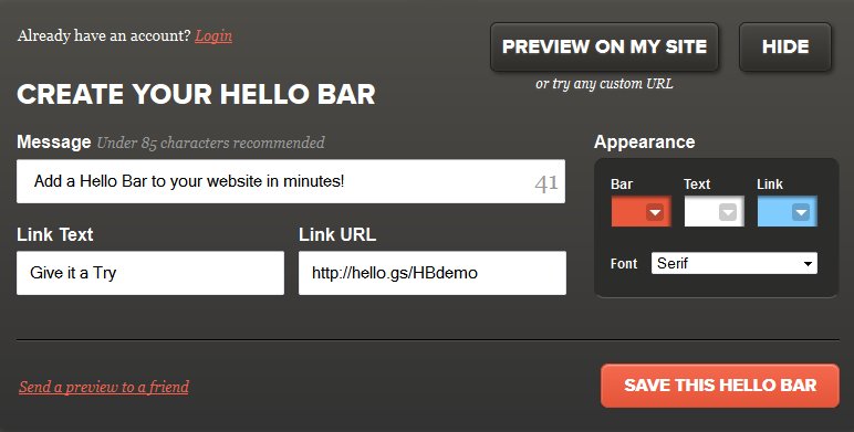
Notice how the fields above do not ask for any personal information of the user at all. Visitors can try out their product right away without giving any email address, or name, or filling out signup forms.
The point is, that your conversion goal should come after the must-have experience and not before it.
It might seem like this approach is only fit for SaaS websites, but that’s not true. See the “Click to look inside” option provided by Amazon:

If the nature of your business does not allow you to provide this must-have experience on your website, you can treat your final order or sale as your must-have experience.
Adding a sign-up goal before their must-have experience (final sale), may make you lose tons of money. This is why guest checkouts are so popular these days. And how can you forget the awesome 1-click checkout of Amazon?
Start from your conversion funnel in web analytics. Lookout for steps where you are getting the most drop-offs.
Consider if you can completely skip any of these steps, or at least reduce the friction for visitors by reducing the number of clicks or form fields that are in their way in getting closer to the must-have experience.
2. Challenge the Approach of the Current Design
Testing a radical makeover doesn’t mean that you design a page randomly that is drastically different from your current website design.
The point here is to focus on challenging the assumptions or approaches of the current design and testing it based on a solid hypothesis.
For example, Sierra Tucson is a rehabilitation facility that tested a radical redesign on its web page. They found that their trust-focus landing page converted better than their luxury-inclined page. This got them 220% more leads.
Download Free: A/B Testing Guide
3. Conduct Customer Surveys
You cannot be your customer. To understand what special points about your product or service resonate best with your audience or if they have any concerns or apprehensions, conducting customer surveys can provide great insights.
Once you know what your customers like the most about you, you can emphasize it on your page to get positive responses. You can combine this with heatmaps/clickmaps in your VWO app to see what interest your audience the most and redesign your page accordingly.
One of our customers recently conducted a customer survey, followed by testing a radical redesign against their original page. The insights from the customer survey were used to design almost every element on the redesigned page along with the changes in the copy that used the same words that their customers used in the survey to define the core benefit of their service.
The redesigned page increased their sales by 64.8%. You can read the complete case study here.
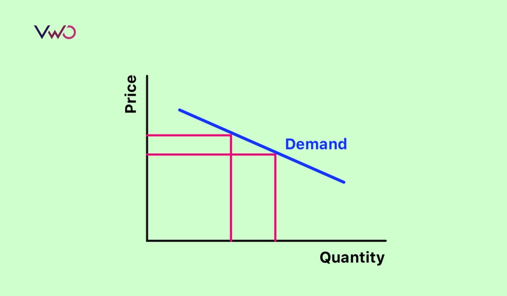
4. Test Pricing Experiments
When it comes to prices, asking people how much they would pay for a particular thing is not a good idea. After all, spending hypothetical dollars is a lot easier than spending real ones. This is why experimenting with prices is a long shot. And when you have A/B testing to do it in real-time, what’s better than that?
One of the most popular pricing experiments you must have seen around is the prices ending with the magical number, 9. For example, a $1400 bed will be displayed for the charming price of $1399.
You can even try playing with your pricing plans. One of our previous customers gave up his Freemium plan which increased his paid signups by 268.14%. This test involved a lot of risks but the percentage increase from the test sure made it worthwhile.
Contrast is another great concept that works well with pricing. Conversion expert, Peep Laja, explains this well in his post about pricing experiments:
Nothing is cheap or expensive by itself, but compared to something.
Once you’ve seen a $150 burger on the menu, $50 sounds reasonable for a steak. At Ralph Lauren, that $16,995 bag makes a $98 T-shirt look cheap.
What’s the best way to sell a $2000 wristwatch? Right next to a $12 000 watch.
Just like in any other business, you will have to take calculated risks to grow your online business too. As long you are making informed, data-driven risks, rather than random testing, it should be fine. Remember, with greater risks come greater rewards.


![A/B Test Duration Calculator [Free Downloadable Excel]](https://static.wingify.com/gcp/uploads/sites/3/2011/04/Feature-image_AB-Test-Duration-Calculator-Free-Downloadable-Excel.png?tr=h-600)
