How to Design Your “Unsubscribe” Page to Hold Subscribers Anyway
As a responsible brand, you insert the “unsubscribe” links or buttons to emails. But let’s face it: When subscribers want to leave you, it hurts. They are moving on to a relationship with other businesses, and you can’t do anything to win them back.
Or can you?
A quick question: What does your “unsubscribe” page look like? The catch is that businesses often overlook the power of this marketing instrument. When designed and used right, your “unsubscribe” page can help manage the contact’s base, optimize a conversion rate, and make consumers think twice before leaving you.
Download Free: Website Redesign Guide
In this guide, you’ll find alternative business goals to accomplish with an “unsubscribe” page and learn how to design it so that it would serve to save relationships with your customers.
The role of “unsubscribe” pages in customer retention, compliance, and user experience
An “unsubscribe” page opens when a user clicks on a corresponding link in newsletters or sales emails. Its primary purpose is to confirm that a person wants to break up with your business and stop getting messages from it.
But experienced marketers look beyond this traditional notion.
They use “unsubscribe” pages as a chance to retain subscribers, offer alternatives for better compliance, or capture user feedback to improve the experience for future subscribers.
Not only can a well-designed “unsubscribe” page convince users that they should stay on your mailing list and keep receiving value, but it also helps you clean the contacts’ base. Only those loyal to your brand or interested in your products will stay, which is an excellent way to focus on proper segmentation and protect your business emails from being reported as spam.
For many brands, an “unsubscribe” page is a chance to create a positive user experience. It’s the last touchpoint of a user with your business emails, so it needs to be good enough to leave a positive impression about your brand. While your newsletters may not be attractive to unsubscribers anymore, your value proposition might.
Five extra goals to accomplish with your “unsubscribe” page
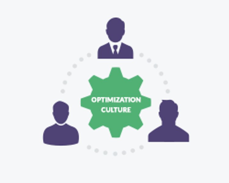
Think of an “unsubscribe page” as a tiny yet significant step to adopting a culture of experimentation in your organization. It’s a tool helping you improve user experience with no risks to your business. It’s your chance to learn more about the target audience and optimize all the processes to their needs.
Ensure that you use “unsubscribe” pages to their full potential. An efficient page can help organizations accomplish at least five business goals:
1. Gather feedback
Use an “unsubscribe” page to ask subscribers for valuable feedback. Most templates include the “I no longer want to receive your newsletter” option, but it doesn’t tell anything about the reasons why a person leaves you. Their feedback should allow you to learn and improve the user experience.
So tailor the answers to “Why unsubscribe” to your business needs. Keep the form simple and with the possibility to give open-ended responses. Make those questions optional, and let unsubscribers know their feedback will help you become better.
You can also capture user feedback on the unsubscribe page by quickly building and running VWO’s on-page surveys.
2. Offer alternative subscription plans
Some users might disagree with the frequency of messages they get from your organization. Or, they’d like to choose the types of emails to get from you. Use an “unsubscribe” page to offer them alternative subscription plans and the opportunity to change newsletter preferences. And yet, the “Unsubscribe” option should still be there.
But what is the best alternative? The answer to that lies in testing/experimentation. Use A/B tests to show different alternatives and deploy the ones that are most suitable to your business.
3. Take leads to other channels
Unsubscribing from your newsletters, users might still want to hear from your organization but from channels other than email. Show them other possibilities to stay in touch with your brand: add social media buttons, links to your community, or landing pages to your “unsubscribe” page design. Motivate consumers to stay with you there.
4. Make them rethink about unsubscription
When designing your “unsubscribe” page, please keep in mind all possible scenarios. Sometimes, a user might hit the link by accident, with no intention to unsubscribe. Or, they might change their mind on the way to the page.
Or, you can offer them some added value so they would like to stay with you. Think of a final, too-good-to-refuse offer. In the beginning, write a friendly text saying you’re sad to lose the subscriber. Come up with a reason that could make them think twice about breaking up with your organization.
5. Reinforce brand identity
Unsubscription from your newsletters shouldn’t make you give up caring about the user experience. As you know, a customer journey goes far beyond subscribing and unsubscribing to emails. Use the design of an “unsubscribe” page to reflect the corporate identity of your organization. Personalize it, thank a user for the time together, show that you still care — it’s all about your brand authenticity and reputation.
How to design “unsubscribe” pages to make them work
And now, for the most interesting part –
Depending on your business goals, from those mentioned earlier, consider the following tips on designing an “unsubscribe” page to get the most out of it
1. Brand it
Make sure your “unsubscribe” page looks original and refers to your brand identity. Please don’t make it another gray “You’ll no longer receive our emails” web page. Design it with brand colors, images, icons, and any other key brand assets.
Online graphic design tools, instruments like an icon maker, and libraries of customizable email and web templates will help you brand a page the best way possible.
2. Allow staying with you
When designing, please avoid one-click unsubscribe buttons – create a page where a user can confirm the cancellation. Therefore, you’ll save consumers from accidental unsubscriptions. Make sure that your unsubscribe page is in compliance with internet laws (like GDPR, CCPA, etc.) that matter to you.
Also, a good practice would be organizing your “unsubscribe” page so that visitors might change their decision and re-subscribe again. Present a field or a bright “re-subscribe” button after final confirmation. You never know the user’s true intentions, so always leave yourself a chance to recapture those in doubt.
3. Leverage personal touch
Personal touch and compliments are what matters, especially when it comes to sincere goodbye. Make your “unsubscribe” page clean, simple, up to a point, yet personal. Users should know you’re sad that they are leaving, but you understand and value their decision.
Think of writing a text that would look and sound like a human, not a robot. Avoid long paragraphs with professional slang and jargon in complex sentences. Use words with a positive context to win subscribers’ favor, but remember your brand tone of voice.
A charismatic image or GIF, brand colors and fonts, and a straightforward but honest message — all of them promote your brand identity and make users remember your organization even after they’ve unsubscribed.
Download Free: Website Redesign Guide
4. Use humor if appropriate
Interactive content elements such as GIFs, quizzes, memes, and short videos are your chance to grab users’ attention and motivate them to take the desired action. Consider implementing them in an “unsubscribe” page design if the communication tone of your brand allows it.
Even if a user still decides to unsubscribe, such content tricks are a great way to humanize the experience, make them smile, and build a positive image of your brand. They’ll leave your email subscription with a complimentary view, which is critical for marketers working on brand awareness and trust.
But there’s a catch.
Humor is a subjective thing, so be careful when choosing jokes or funny memes/videos for your “unsubscribe” page. Use them only if you’re sure the target audience is on the same wavelength as you. The best option would be to use A/B testing to understand a user’s reaction to such content.
5. Offer alternatives. Always
When designing your “unsubscribe” page, leave room for words or buttons that would allow you to hold users.
- Allow them to choose what they want to get from you: Offer alternative subscription plans or an opportunity to pick the frequency of getting your brand emails.
- Include links to buttons to your social media accounts: It will help you hook users and convert them via alternative communication channels.
- Add links to your landing pages: Play on their FOMO (fear of missing out), engaging them to visit your website once again.
In a word
An “unsubscribe” page is not just for confirmation that a consumer wants to leave your organization. When designed right, it can make subscribers change their mind, take them to other sales channels, or offer them alternative options to stay with your brand and therefore optimize your conversion rate by far.
Do your best to brand it for better identity and user experience, add personality and humor whenever appropriate (remember to test it to see how it goes), and think of a “What’s in there for me?” option to offer on the page that motivates unsubscribers to stay.


